abstract forms
"Abstraction brings the world into more complex, variable relations; it can extract beauty, alternative topographies, ugliness, and intense actualities from seeming nothingness". - Jerry Saltz
what does abstraction mean to me?
For me, abstraction is something almost impossible to describe well, and something so alien that it is simply a concept, not something we can realise in real life. It is, in its essence, the essence of things themselves. Objects and visual forms at their most basic have the ability to be very emotive and to cause the eye to look for complication that is usually there, which in turn creates a play between the brain which is attempting to find with lines and shapes that can be incredibly simple, creating meaning.
Abstraction is not simply a transferal of an objective view to a style per se, but rather a complete change and simplification which imposes a change in the way in which people view it. It becomes abstraction within itself and so opens up to any interpretation presented to it, unlike many other forms of art and photography.
Abstraction is not simply a transferal of an objective view to a style per se, but rather a complete change and simplification which imposes a change in the way in which people view it. It becomes abstraction within itself and so opens up to any interpretation presented to it, unlike many other forms of art and photography.
galleries
The following artists are demonstrations of both the infinite capacity of the genre of photography, and the ability to create such a varied array of images with simply just the medium of paper and light save a few exceptions. These artists each present a different way of viewing that is so incredibly varied, yet they share the same tightly bound genre.
Francis Bruguière
|
|
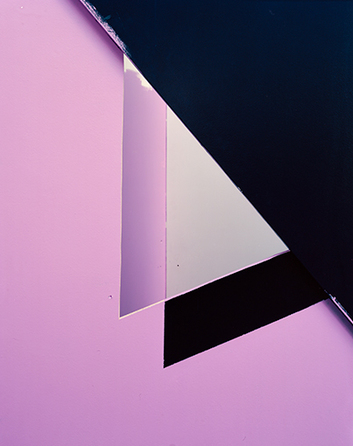
Francis Bruguiere was a photographer from the USA who experimented with abstract and thus representational photography. For his process, he uses cut and bent/folded paper and directional light to create compositions of abstract form, taking advantage of the mediums qualities and creating complex and beautiful patterned compositions as a result.
I find Brugierre's work not very abstract to be honest. I can often differentiate what each substance and tone in the images refer to, whether it be space or the paper, whereas many of the other artists are able to trick me. I feel that his work is often maximalist concerning the amount of shapes, lines and images he includes, however this is interesting as it differs from other work greatly. |
JAROSLAV RÖSSLER
|
Jaroslav Rossler was an avant garde photographer from czechslovakia who was famously regarded for combining different genres including cubism, futurism, constructivism, new objectivity and abstract art. His photographs are exploratory of simple objects and shapes, experimenting with double exposures and photograms.
I find Rossler's work fascinating as it uses light and focus far more than the other photographers, and his is heavily associated with Bauhaus ideas and qualities, making very simplistic and unusually composed images that question you as you look to attempt to decipher as to what they are. |
|
JERRY REED
|
|
Jerry reed is a modern artist inspired both by Bruguiere and Rossler. He has an approach that is formal, objective and analytical which is indicative of his nature due to his background in science.
I find his images so clean, mathematical and abstract, that often they don't spark any emotive response aside from perhaps their tonality . However his work is proof of the power of minimalism is photography, especially concerning abstraction. |
VJEKO SAGER
|
Sager is an artist who created a well known series titled "antimatter" consisting of cut paper abstractions yet not exploring contrasts of light and shade but subtle shifts in tone with short and straight lines that cause disruption to the paper's surface.
I find Sager's work odd in many ways and very unnatural, as nothing similarly looking to his work would ever exist in nature, therefore "antimatter" does make sense as a title. I do think that the combination of curved and only straight lines is fascinating aesthetically when it comes to his style. |
|
TAMARA LORENZ
|
|
Lorenz is a German abstract artist who uses various shapes to construct images with incredibly abstract properties using vivid colour and strong lines, shapes and textures. Each image appears to form its own world in a sense and provoke varying emotions. The viewer almost cannot find meaning through this, forcing a purely visually based interaction with the pieces.
I believe that I find Lorenz's work most fascinating of all of the photographers I have looked at thus far. I find her plays on light, colour scheming and her complex and often confusing illusory plays on perspective and depth inspiring and would like to include these ideas and techniques into response. |
abstraction: discussion
This is a mind map I created in class during a discussion about the subject while looking at other people's abstract work. These ideas link clearly also with ways in which one may produces a group concerning numbers of abstract images, through logical links between them. Through these connective genres, the mind appears to find themes within abstraction.
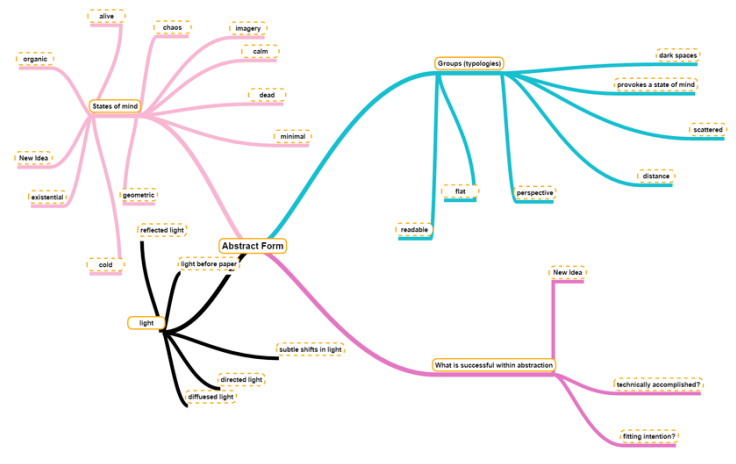
methods of making groups
- through matches in formal elements e.g similar texture
- through polar opposites
- through pure intuition of the mind (random choice)
- through a rule e.g gradient of colour
- through pure blind choice (placing anywhere)
- through another medium e.g another person making choices under your instruction
- through colour
- through emotive meaning to the artist
response: 2d colour
quadrilateral
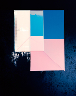
This is one of Lorenz's images that I took a liking to due to its colour scheme. I thus chose my own colour scheme that was similarly vibrant, therefore also emotive and perhaps joyful or playful. I see this image intuitively as a kind of window, perhaps not literally, and the scheme is sunset-like although shifted. The colouration of the whole image in many ways is the source of the mood.
|
|
|
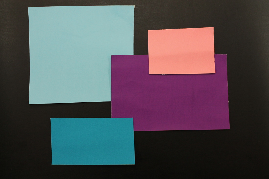
To begin in understanding how to go about abstract art photography, I felt it was necessary to break it down into simply the process itself, as my brain does not work through guesses or uninformed choice, but by strict trial and error, which in one sense contradicts abstraction, as it will become ordered, but also benefits its visual effects. Intuition however is not separated from abstraction, and for me is incredibly useful, systematically therefore using it to create abstract images in this instance.
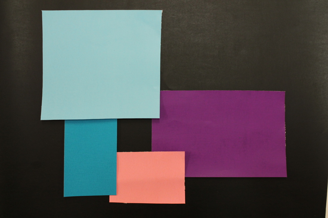
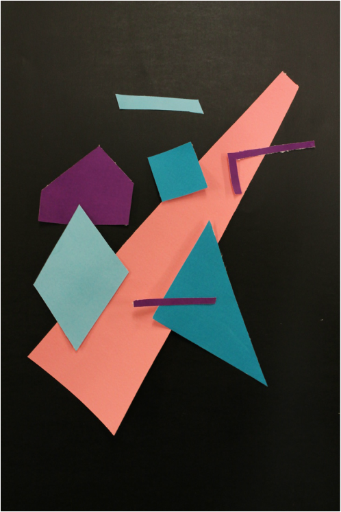
This is a series of two dimensional abstract images with only quadrilateral shapes, experimenting with layering, joining them by a rule, such as having two vertices touching the edges of another quadrilateral, or creating a separate negatively inferred shape with them. All of these experiments help me to create motifs that are reproducible and interesting to include within compositions that I shall later make.
This is a series of two dimensional abstract images with only quadrilateral shapes, experimenting with layering, joining them by a rule, such as having two vertices touching the edges of another quadrilateral, or creating a separate negatively inferred shape with them. All of these experiments help me to create motifs that are reproducible and interesting to include within compositions that I shall later make.
|
|
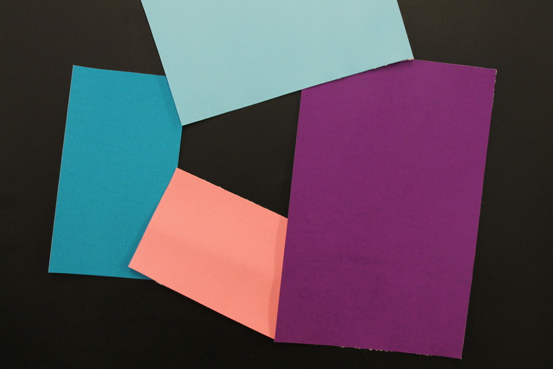
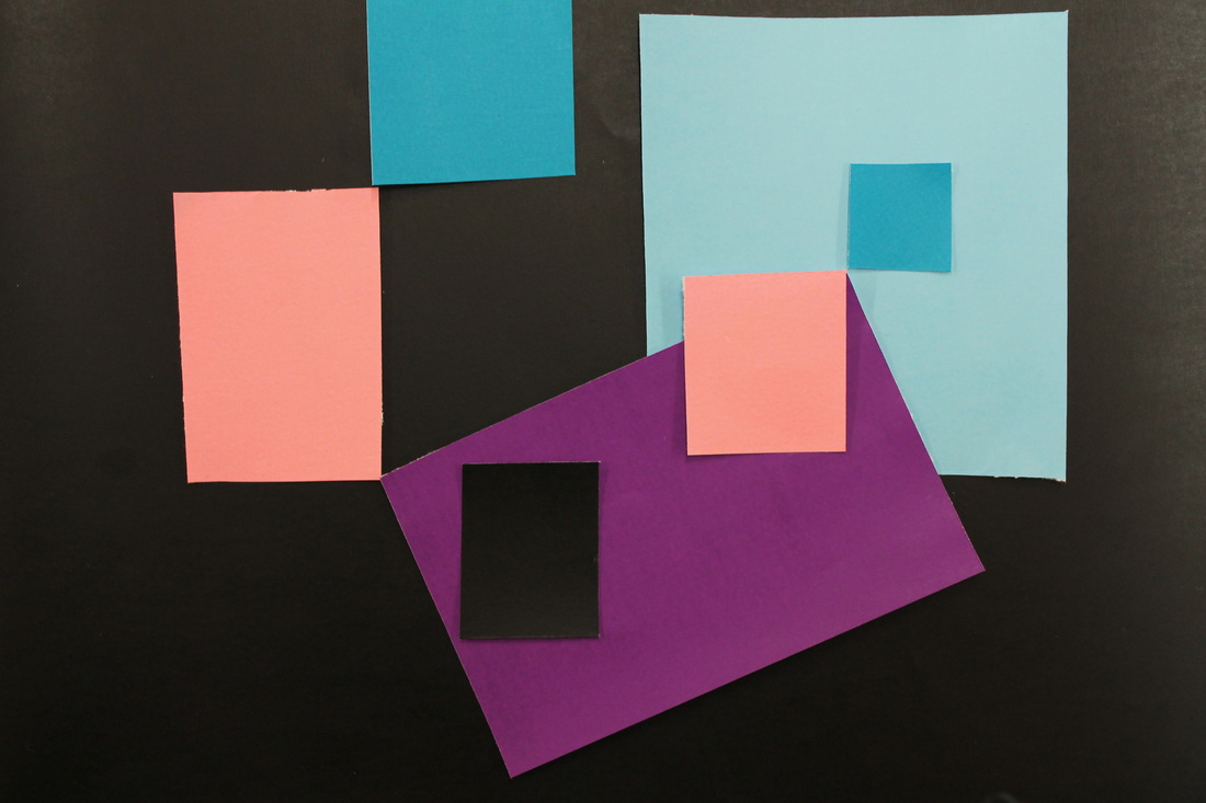
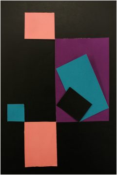
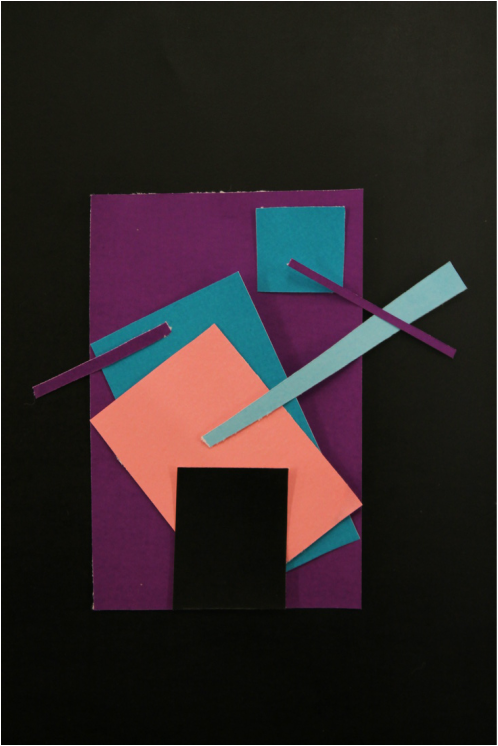
These are some more extended compositions combining some motifs and elements of the previous series. I believe they add considerably to the images previously made. I included some motifs which I believe are similar to Tamara Lorenz's style, such as, in the first image, having duplicated motifs such as the two pairs of pink and blue squares and tilted square meeting at two different corners of others. These motifs each connect, even though it is within the context of abstraction, logical links produce an order within the chaos that produces beauty. I also included a play on negative space with the black square to subvert expectation of block colour, as I believe each composition being similar in the way in which they contain only squares was lacking in its ability to provoke interest.
For the second image, I also placed squares internally, using the previous rule of edge touching within each other in size order to create a moving/spinning effect, and to separate three triangles from the purple square which contrast the rest of the shapes.. Overall, these image were a large success and sit comfortably in the minimalist category, having few motifs to concentrate the viewers focus unto them. From this perspective, the images almost start to take on qualities and resemble objects. I see, in the first image a bed with pillows upon it. A carpet. Shoes on the floor and bedroom furniture. In the second image I see a figure sitting upon a sofa, perhaps watching television surrounded by clean pale furniture.
For the second image, I also placed squares internally, using the previous rule of edge touching within each other in size order to create a moving/spinning effect, and to separate three triangles from the purple square which contrast the rest of the shapes.. Overall, these image were a large success and sit comfortably in the minimalist category, having few motifs to concentrate the viewers focus unto them. From this perspective, the images almost start to take on qualities and resemble objects. I see, in the first image a bed with pillows upon it. A carpet. Shoes on the floor and bedroom furniture. In the second image I see a figure sitting upon a sofa, perhaps watching television surrounded by clean pale furniture.
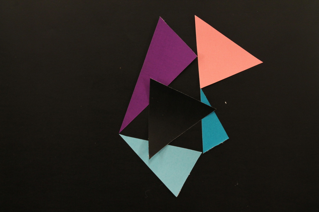
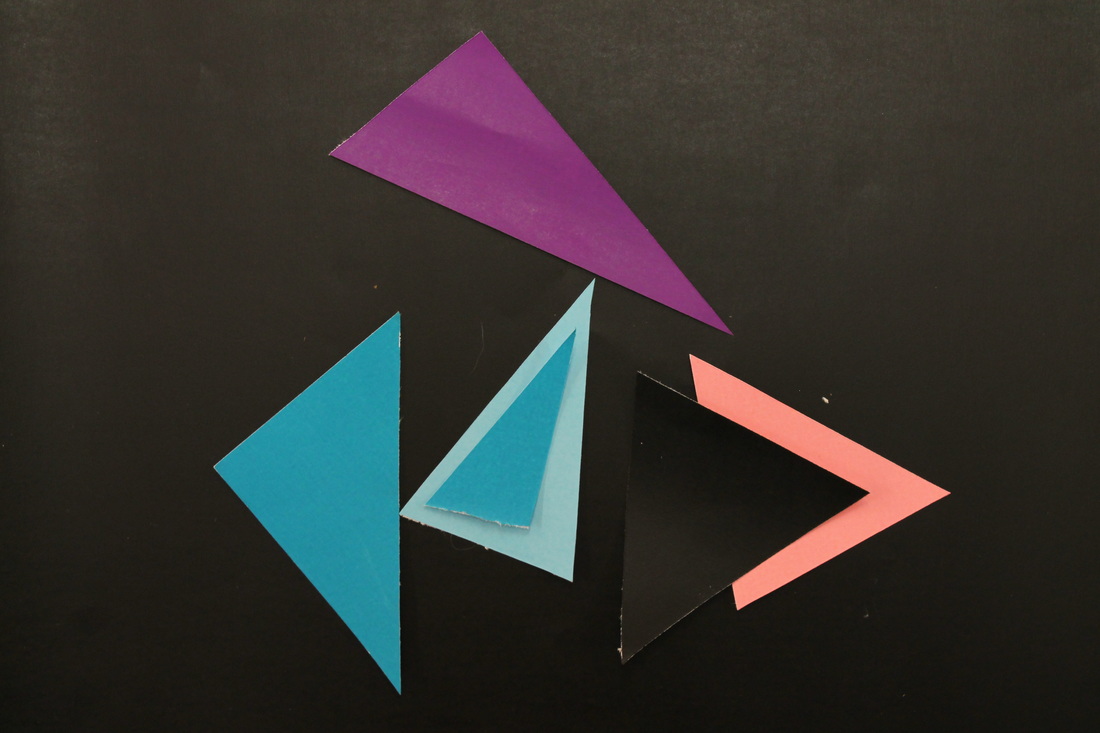
triangles
|
|
These are two images from Lorenz I have taken inspiration from to make the images below. As is evident, they have similar motifs in an effort to play with their effects and the perception of them. I also wanted to achieve my own similar effect in comparison to these images, which I perceive to be rather neutral and devoid of emotion as they appear to me as very mathematical.
|
|
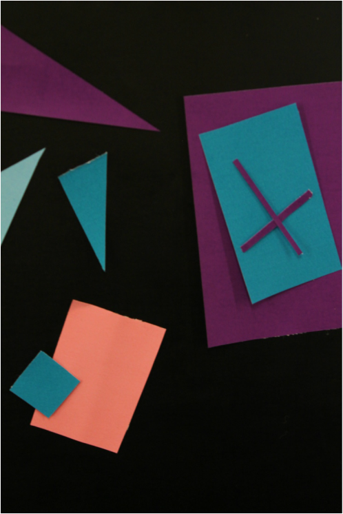
These are two experiments with triangles also in an attempt to create interesting motifs through the process.
I feel both images achieve a type of mathematical coherence that is in many ways very clinical and consistent, the first more than the second. The first has an appearance made from coloured and one black triangle. The coloured creating a triangle in negative space, the black subverting this into a star and creating more perceived triangular part in its placement through the coloured squares and its almost unnoticeable outline.
The second image is more coherent in my opinion, as it creates triangles in negative space, and seperates the motifs in an evident way. Such as the triangle situated within another or the layering of a triangle upon another. The directions of the triangles in the image however were made to be rather more chaotic, contrasting their ordered and similar nature.
final compositions
I find Lorenz's work that contains thin lines that contrast the whole particularly interesting as they add delicacy and variation to the composition. They act as leading lines and instantly draw the eye through what it follows and interact heavily with what contrasts their chosen thinness.
These are three pieces of abstract imagery I have created as my response to two dimensional abstract colour, almost like small final pieces, drawing together motifs and ideas, colours and composition derived from previous experiments.
I find this composition to be one of the most odd and varied, and not containing shapes I have used at all in the previous responses. I arranged it in an active attempt to create something quite kitsch and childish, while remaining abstract, as I was reminded of this by my own choice of colours. I wanted however also to subvert this, using an odd central shape and rather more regular surrounding ones. It almost appears as an emblem of 'fun' in an almost ironic way as an abstract piece. It seems very childish in this respect.
I find this composition to be one of the most odd and varied, and not containing shapes I have used at all in the previous responses. I arranged it in an active attempt to create something quite kitsch and childish, while remaining abstract, as I was reminded of this by my own choice of colours. I wanted however also to subvert this, using an odd central shape and rather more regular surrounding ones. It almost appears as an emblem of 'fun' in an almost ironic way as an abstract piece. It seems very childish in this respect.
This piece shows in one way the difference in atmosphere that just clumps of different shapes can create. The triangles creating a sharp and cold atmosphere while the quadrilaterals create a warmer but more plain and mathematical one. They are therefore separated by my own compositional choice, but this is also amplified by their shape and coherence, as if each group of shapes is facing one another off.
This was the only abstract image I made that had an intention to look similar to something. Although it was not fully intentional, I ended up creating a type of face from the shapes, containing all of the features on the face aside from hair.
It in a way was subconsciously inspired by that of a cubist style, perhaps Picasso-esque in its depiction. It is an interesting idea to test the ambiguous line between something evident, and the eye's interpretation of it as something existent in the world rather than a mix of colours, shapes, textures and lines.
It in a way was subconsciously inspired by that of a cubist style, perhaps Picasso-esque in its depiction. It is an interesting idea to test the ambiguous line between something evident, and the eye's interpretation of it as something existent in the world rather than a mix of colours, shapes, textures and lines.
Response: 2d black and white
3d black and white
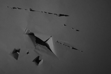
rips
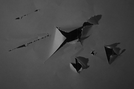
This is a series of images inspired by Rossler but with an added element: rips instead clean cuts. This I believe creates a very interesting aesthetic, as if they have been forcibly made. The movement in the rips can be felt and traced back through direction, whereas Rossler's cannot, as they are thin clean lines. Also, the directional light affects the outcome of the rips also, making the texture due to the rips duplicated by the shadows and enhanced, also adding another element to the pieces, as they are in three dimensions rather than simply two.
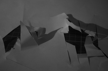
This is the same piece of ripped paper but photographed upside down as a simple experiment. This in many ways is a confusing approach that was done on a spur, yet I believe it works. It acts almost as an optical illusion, such as the famous cube one, seeming outwardly ripped, yet when looked at once again, inwardly ripped, due to the lighting in the image.
|
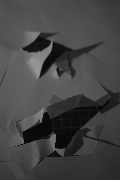
This is another response that was intentionally made to seem very messy and unclean. I created a series of rips within two places on the paper as a test, in an attempt to see what would happen, exposing a dark area which is void-like. I am not sure what the use or effect these holes have is, but I personally like them, as they are contrasted in their marks that revealed them, one with lines toward the center in a circular fashion, and the other with straight parallel lines.
|
layers (focus)
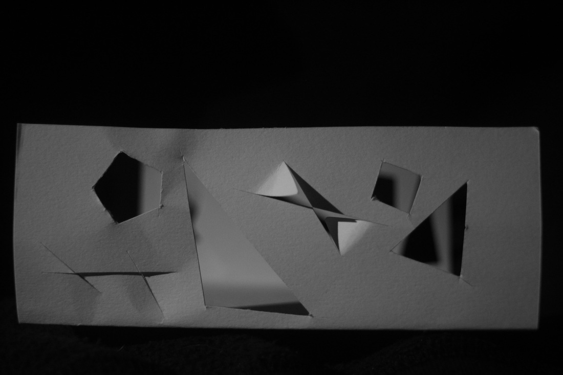
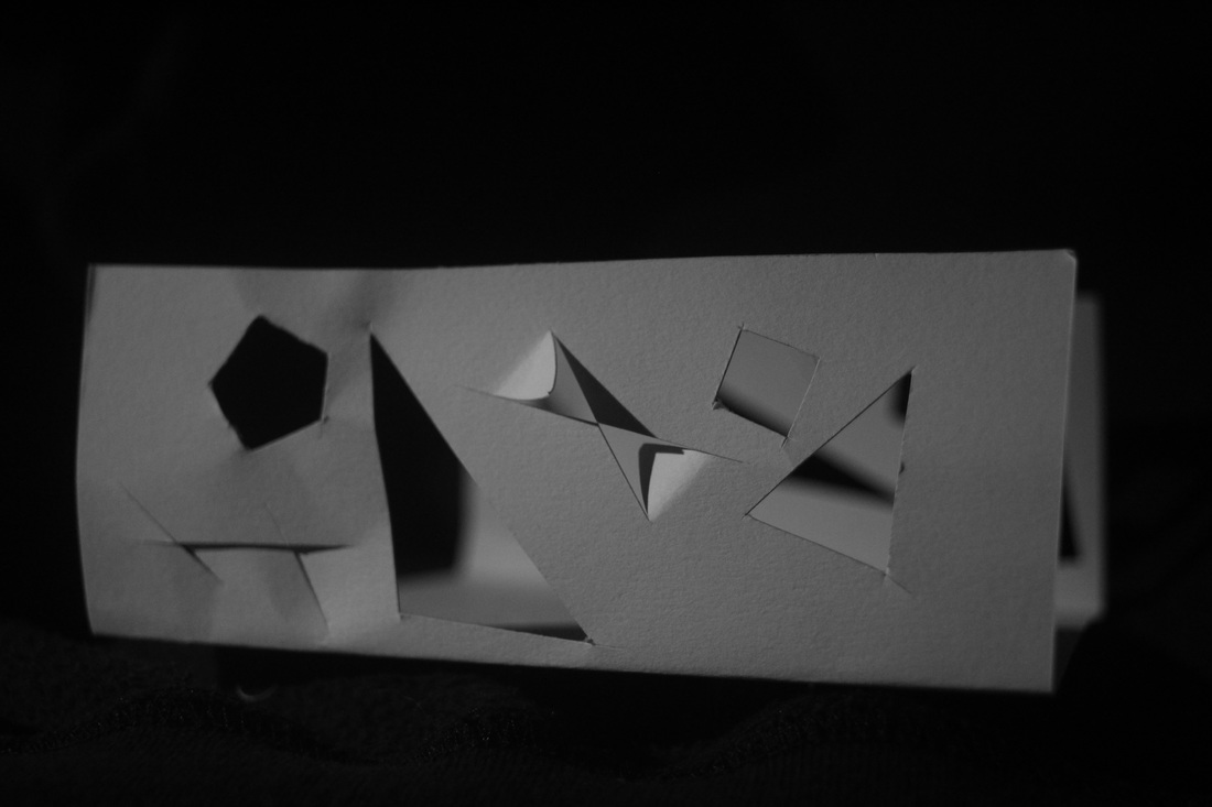
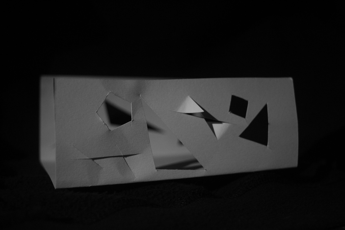
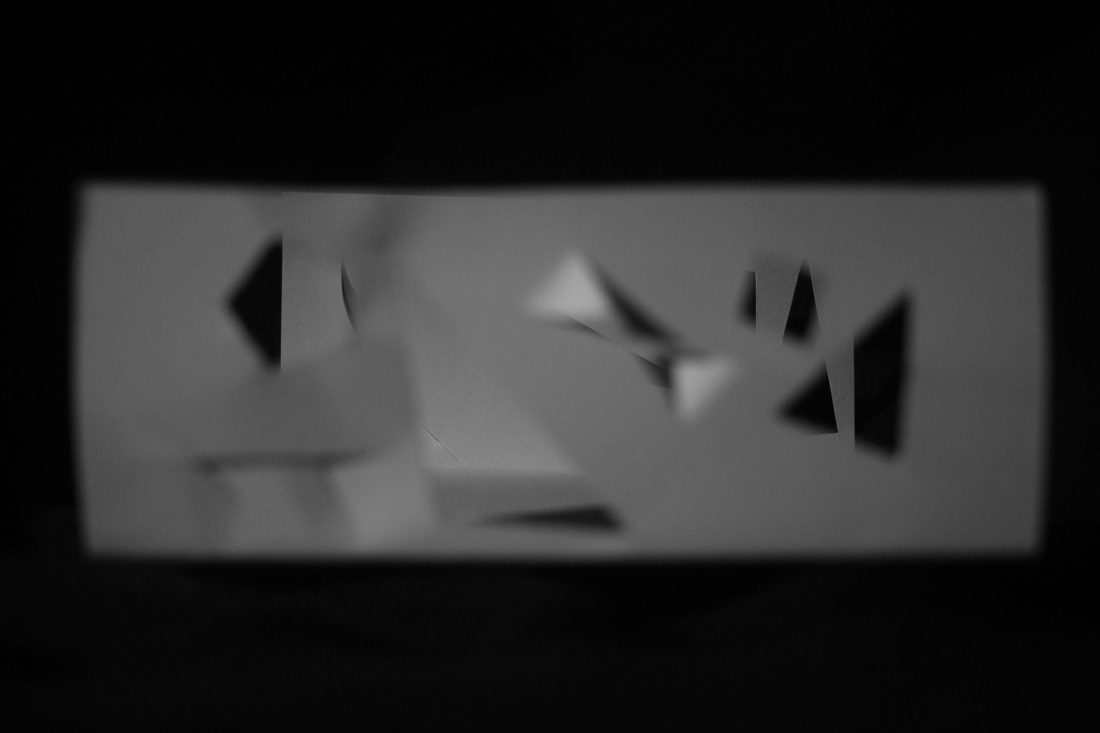
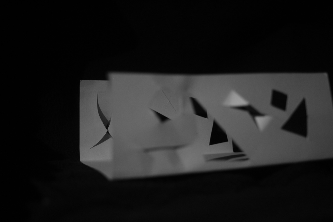
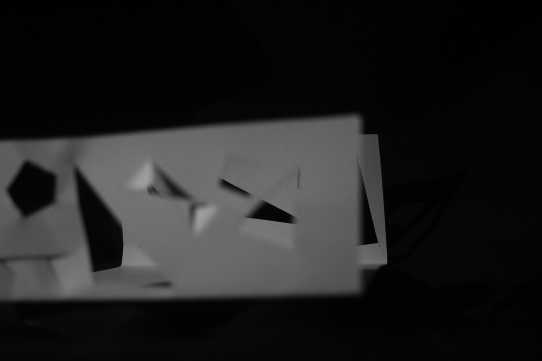
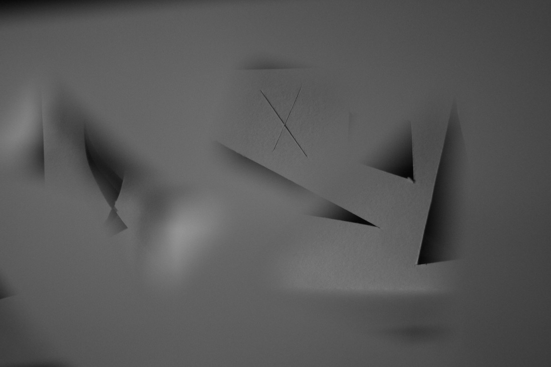
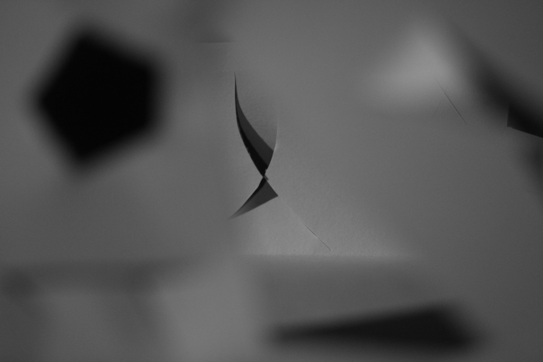
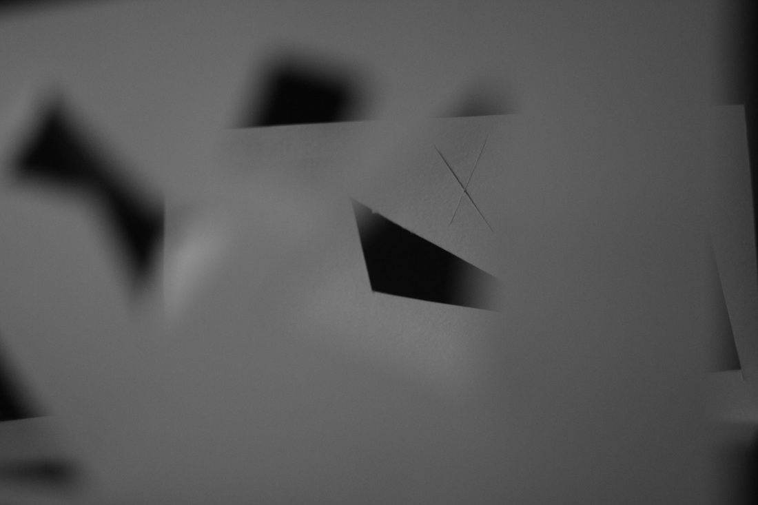
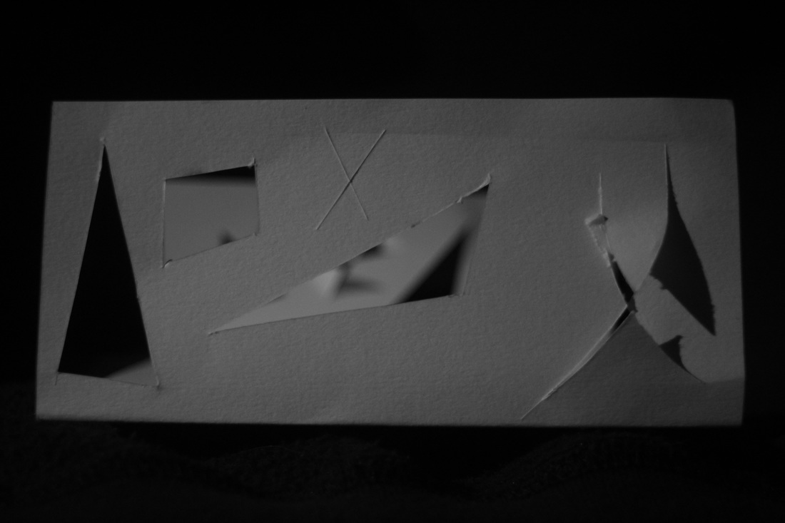
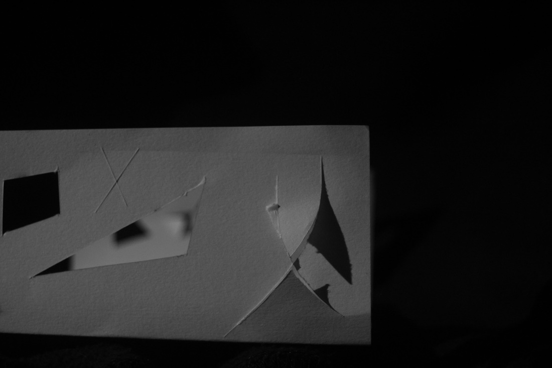
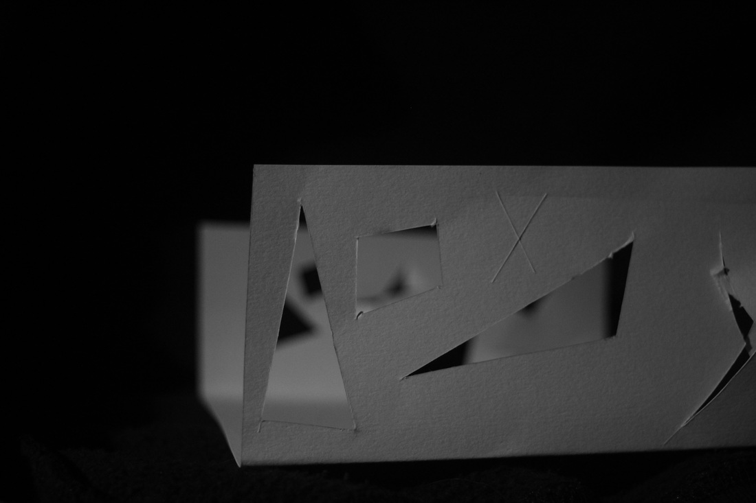
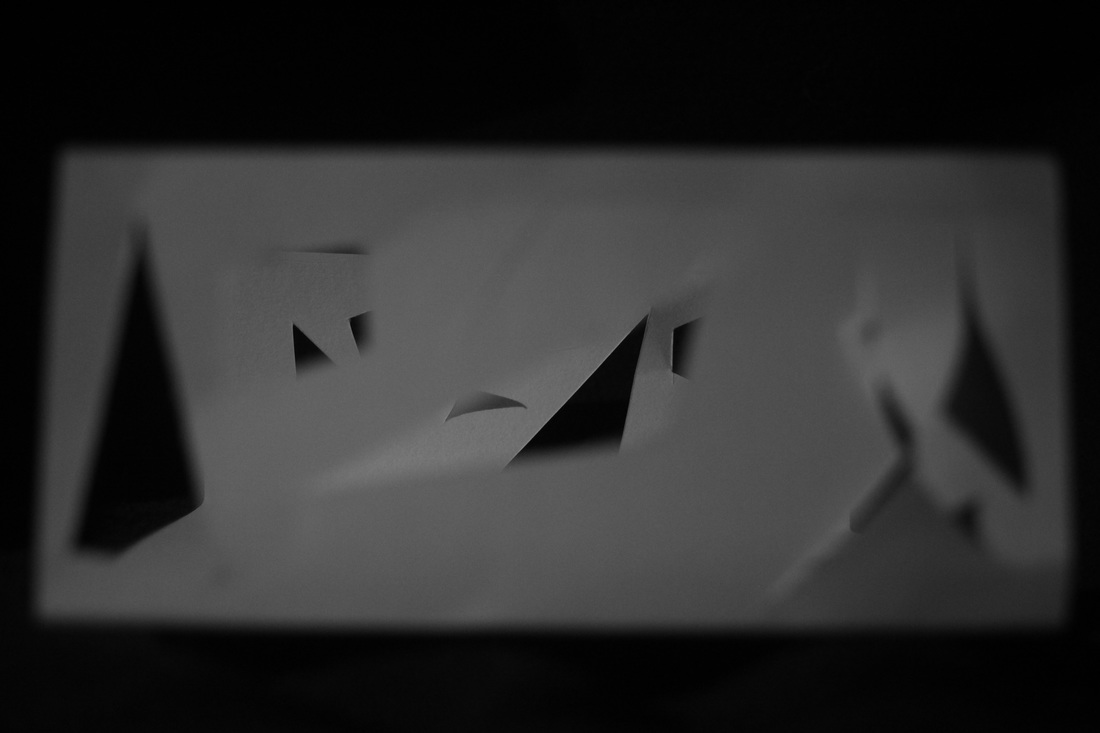
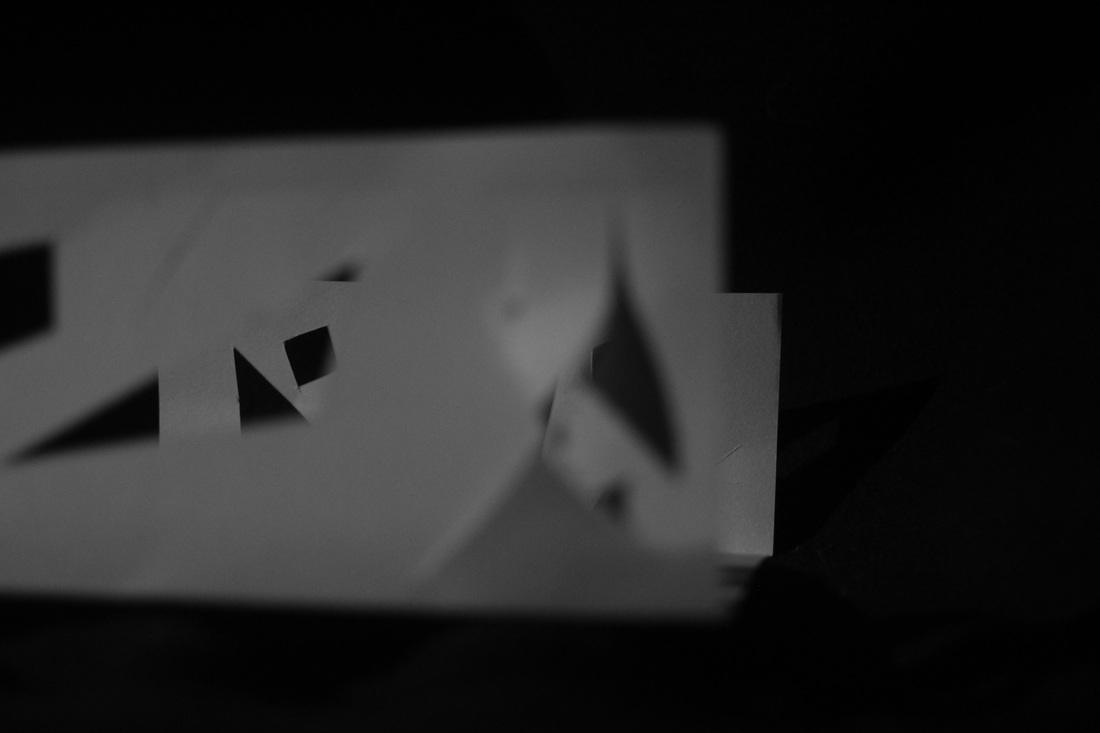
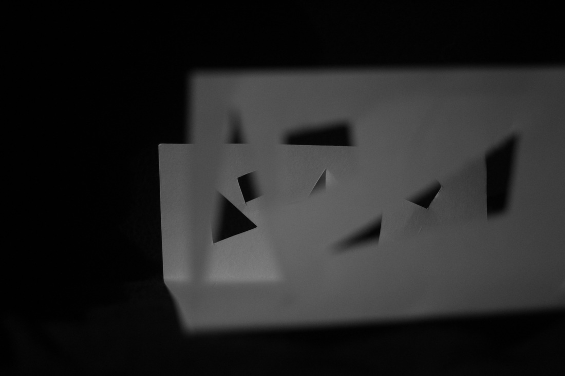
This is a series of photographs taken of what could be considered an abstract installation scaled down. I used a folded piece of paper with cut out shapes and lines in a rather sporadic way, just so the impression of the idea could be put across, as it did not matter necessarily where the shapes were placed. I did this on both sides of the paper so that when folded, it would create holes to look through, with smaller shapes behind, creating a very intriguing effect, having shapes being created in a transient and passing way as the viewer walks or moves and views through each shape. It would be difficult for the viewer to return to any remembered position to view it, each experience of the sculpture therefore remaining different and random. A new abstract photograph or painting is produced each time the viewer moves.
shape cylinder
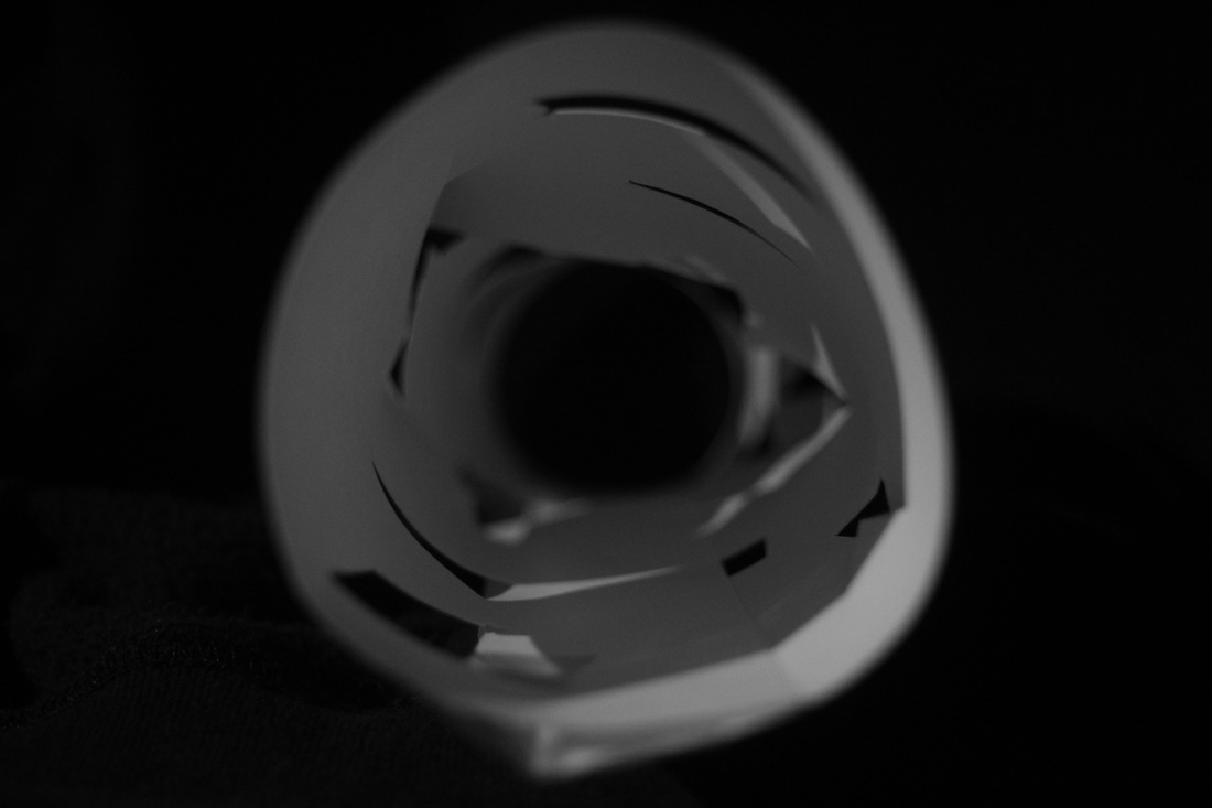
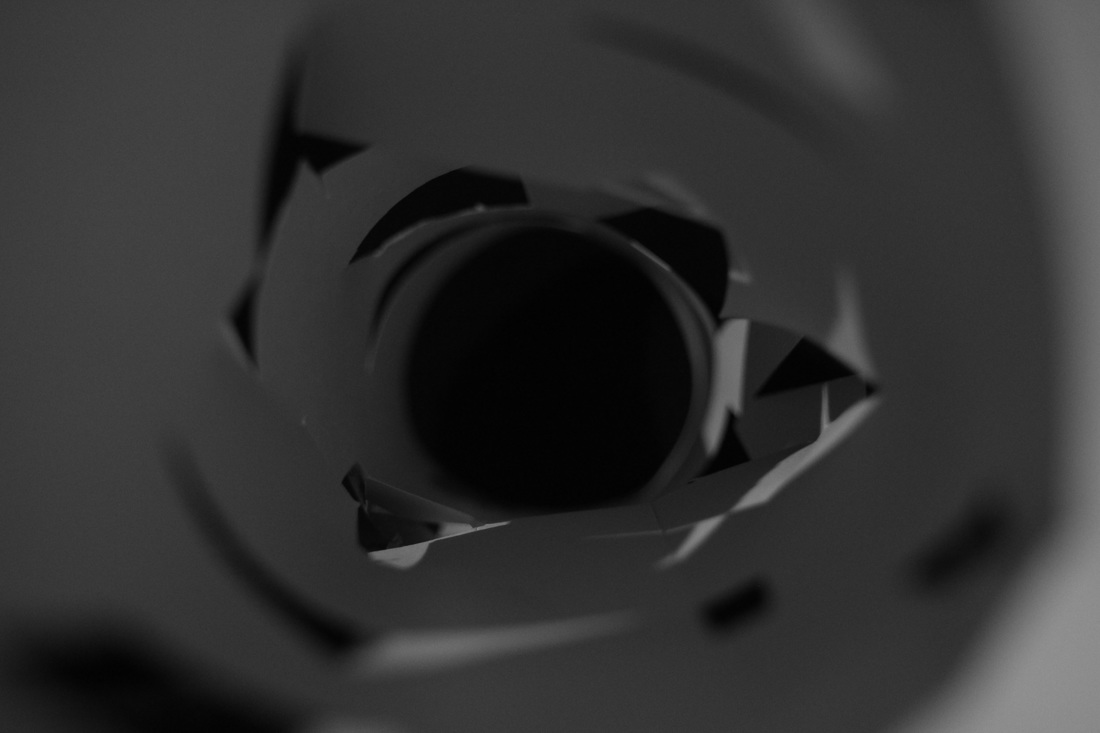
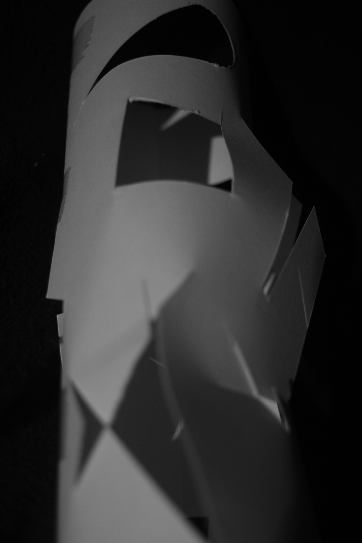
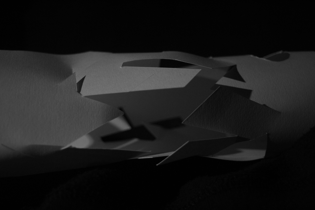
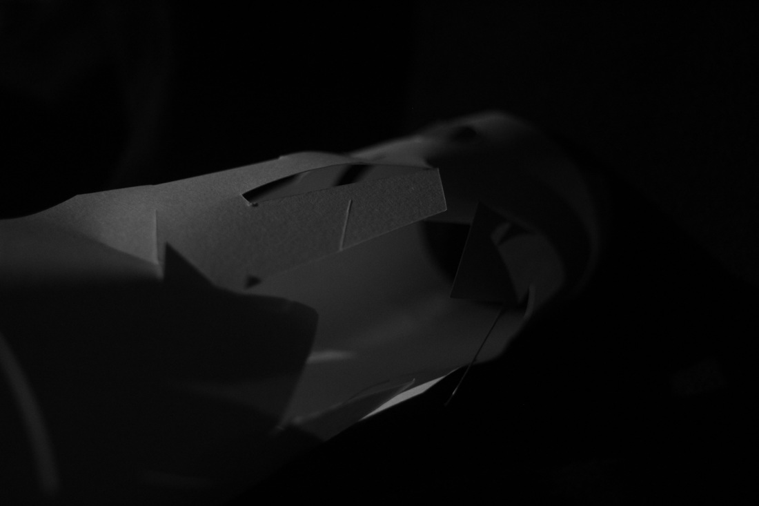
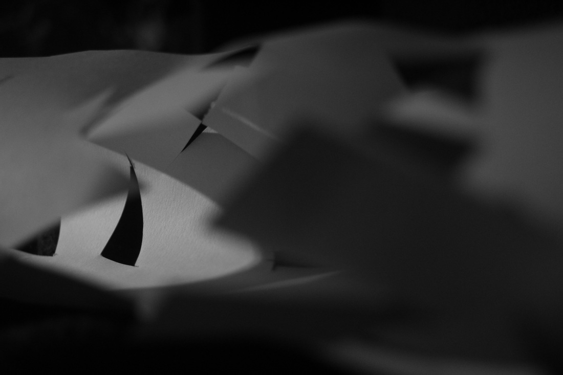
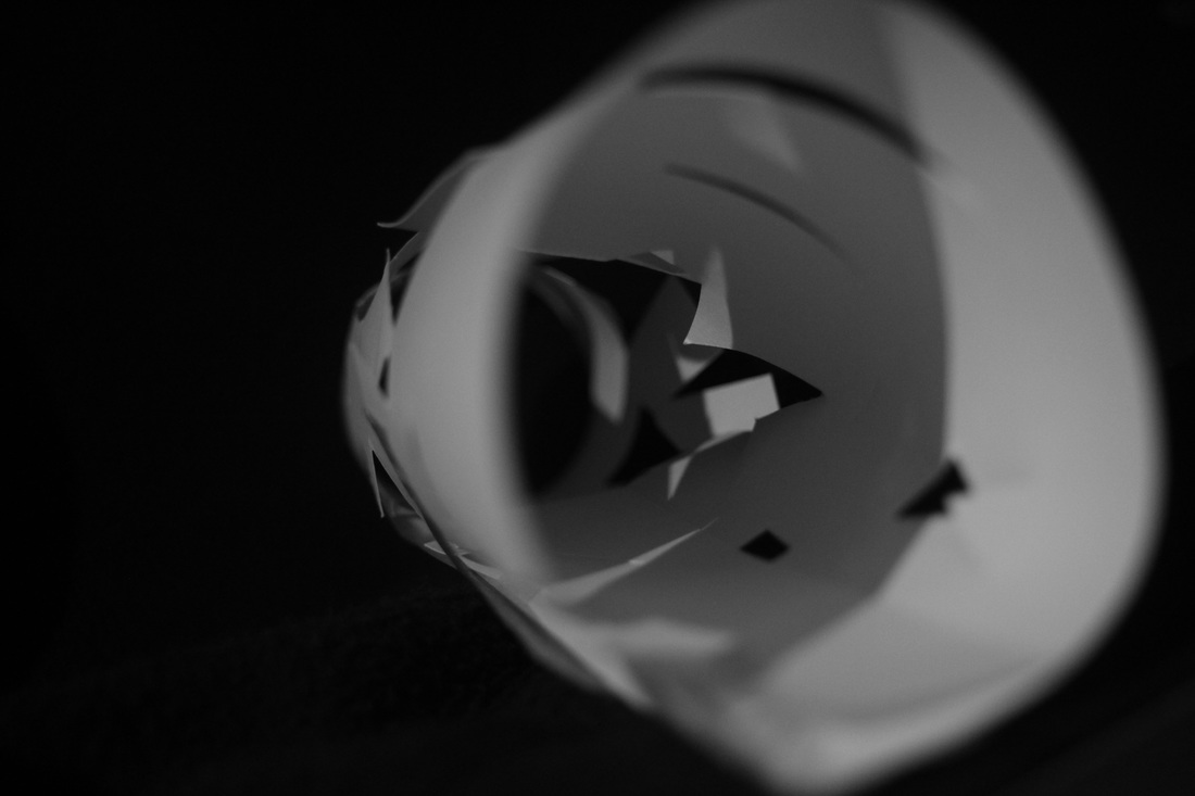
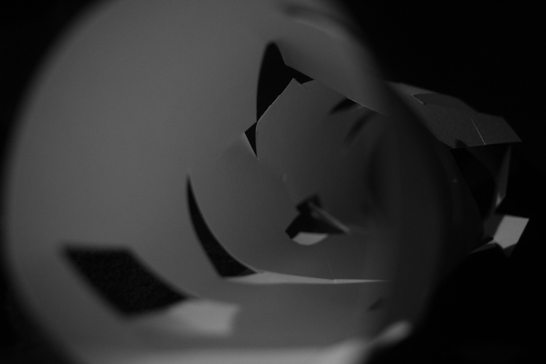
This series of images is an experiment in both shape, depth and light adding to the previous idea, and building upon its foundation of intent, except with the very different and contrasting concept of a cylinder, to record the effect this has on light and perception. To do this, I had the idea to create a cylinder from paper which had been scored with lines and shapes. Again, the viewer and their perception of the piece is subjective and vital to the meaning of the piece as they move, viewing the piece in different ways, especially when close to it, the experience is shifted and the light interpreted in a different way due to the movement of the viewer themselves. Looking from outside the cylinder is also another experience concerning light, as there are even more of a variety of ways and perspectives to look at it from that there are countless possibilities of different images being formed from the shapes perceived through each perspective.
sculpture
|
|
Moholy Nagy's light space modulator is a kinetic light installation that is fascinating in many ways. It appears to be a metal frame with a motor that moves many different and varied parts of the machine. The individual parts are composed of many different objects or structures, such as glass, metal grids, bars, auditory parts and coils. The structure spins in a circle, stopping every so often.
|
The machine is evidently designed as an abstract piece, although still pulls into question its use from first glance. In many ways it resembles Nagy's paintings in that it looks incredibly similar to many of them shape wise, even simply the ones displayed in the background of the video. The piece also appears to appeal heavily to all the formal elements, making it more image oriented rather than conceptual. The metal grids, shiny surfaces, thin lines and odd and varied shapes show this evidently.
However, it is not simply visual stimuli that make the piece. Auditory events and circular movement also contribute to the effect of the piece. As the piece rotates, it has a ball that falls every so often, reminding the viewer of its reality. The rotation itself is also very interesting as it suggests almost an infinity of repetition while also allowing viewing of all angles of the piece. It could in one sense be seen as a painting or image, but as one that is constantly changing and morphing into different forms, which may be the epitome of the will of an abstract artist. These are the many reasons why this sculpture is successful on many levels within the genre of abstract form.
However, it is not simply visual stimuli that make the piece. Auditory events and circular movement also contribute to the effect of the piece. As the piece rotates, it has a ball that falls every so often, reminding the viewer of its reality. The rotation itself is also very interesting as it suggests almost an infinity of repetition while also allowing viewing of all angles of the piece. It could in one sense be seen as a painting or image, but as one that is constantly changing and morphing into different forms, which may be the epitome of the will of an abstract artist. These are the many reasons why this sculpture is successful on many levels within the genre of abstract form.
