the previous project: the photobook
For my previous project, I have explored the theme of smokers in a way centering on the subjects themselves in relation to their surroundings, through black and white film for a large majority of the project. I feel I want to explore areas of photography previously unknown to me, into the abstract and colourful, the absolute opposite of my usual black and white, clean, typically composed and recognizable images as well as exploring human subjects less, and if I am to, perceiving them in a way that does not dehumanize, but sees the organic as part of our surroundings as my last book explored very heavily the idea of the fleeting act.
saul lieter
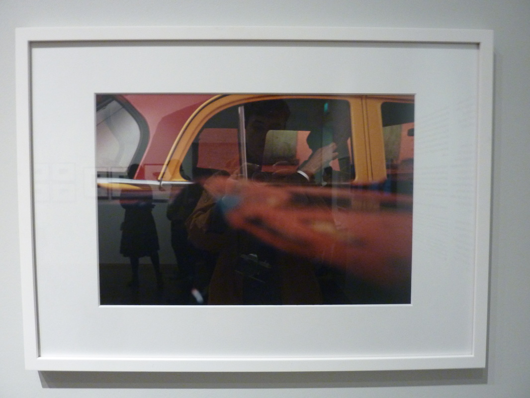
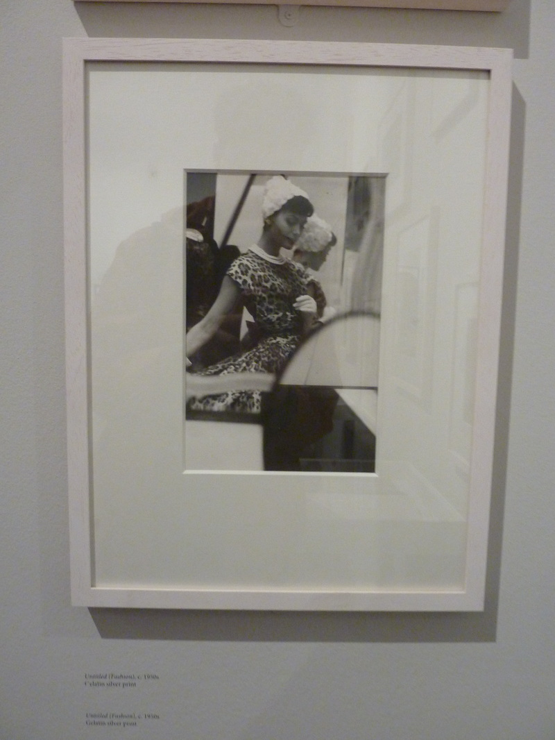
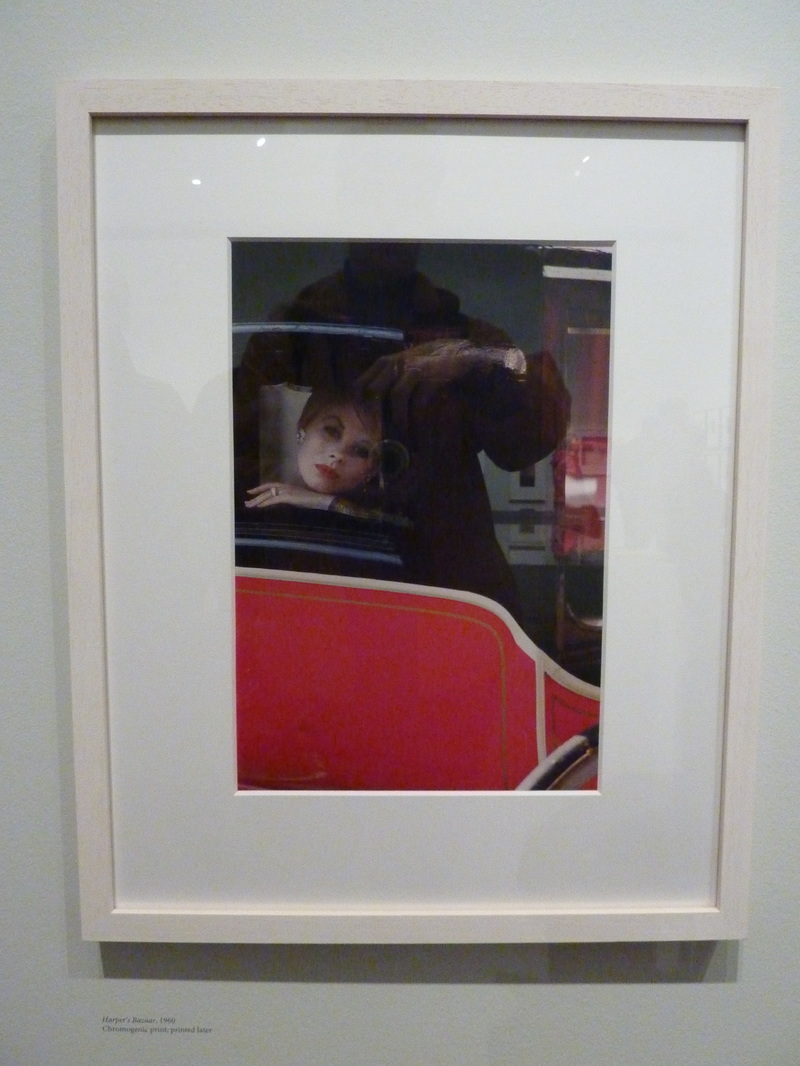
Saul Leiter is gradually gaining recognition in modern times for being a prolific new york photographer. He moved to New York, a centre at the time for artistic practice and in many ways a cultural centre blending both eurpoean and more american artistic ideals and styles. He began, at the beginning of his career, working as a fashion photographer for Elle, Vogue and Harper's Bazaar, his now recognised style of compositional colour matching being built up. His style was evident in these photographs, often thinking outside of the box compositionally and in subject matter, contrasting heavily the photographers at the time who shot for the same and also similar companies.
saul leiter fashion photography
saul leiter street photography
|
|
|
The success of Leiter's style is interesting in a number of ways, similarly to the work of newly discovered and acclaimed photographers such as Vivian Maier for example, contributing to his success, and deservingly. The success of Leiter's photographs can generally be split into subject matter, colour theory and the compsition that supports the photographs.
subject matter
Leiters subject matter is often contrasting to that of many other street photographers, but in many ways also a subversion of the conventional at the time.
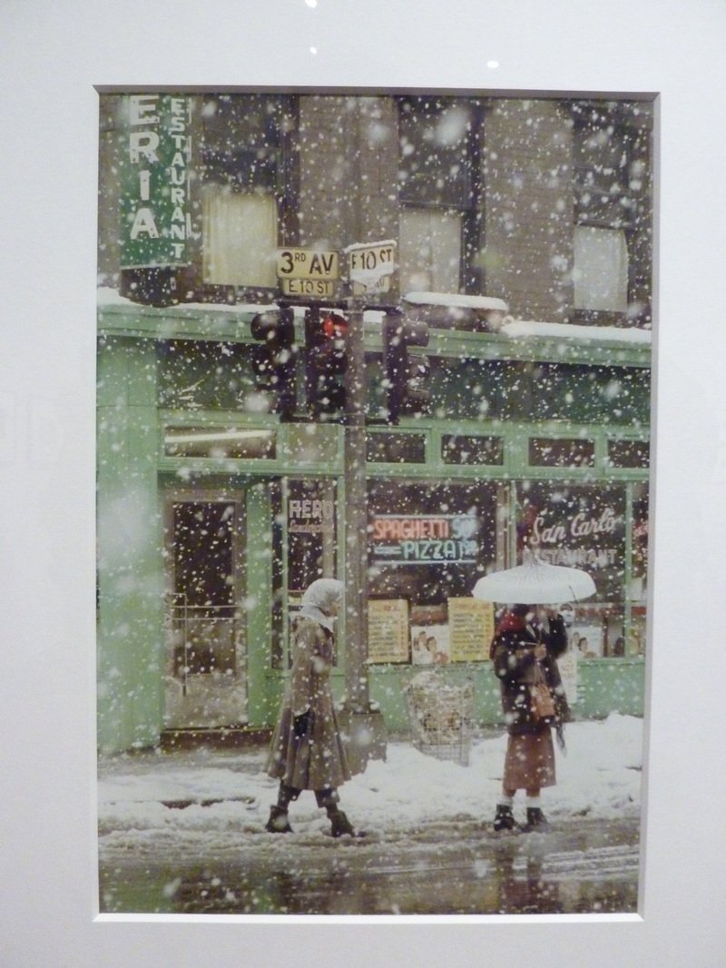
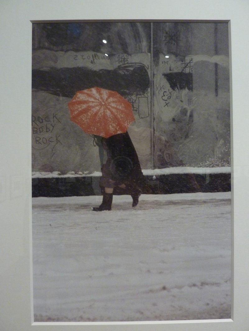
At the time Leiter was working, street photography had very specific conventions, usually following Bresson inspired rules with street photographers almost always shooting in black and white, and mostly interesting street scenes or portraits being the subject matter for the photographs. Leiter however, rejected these irrational and traditional rules almost entirely, using colour film and most commonly using the obscure within his photographs, not that which is in plain sight, which, if his photographs were published or shown, would have been contraversial.
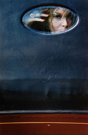
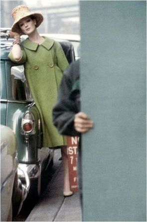
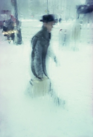
Leiter's subject matter is very much in connection with the urban surroundings, and a very interesting twist on both people and objects they come into contact with in the photos, humans being seen as not just within, but as part of the scenery. A good way of describing how I see Leiter's eye is two dimensional rather than three dimensional, objects, people and their surroundings not being taken for their meaning, or what they are seen to be in their definition, but rather seeing the photographic scene as a collage of many shapes and colours, which we ascribe names to. In this way, Leiter's work becomes abstract. I belive that the only reason humans are photographed more often than not with Leiter is due to the fact that they form new and unprecedented shapes and forms that are fleeting in their relationship with their surroundings, rather than shapes already present, which could be seen to be less interesting and also have less a sense of excitement, activity and motion.
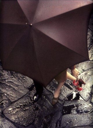
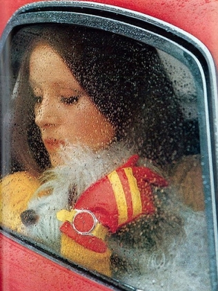
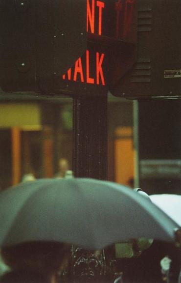
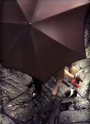
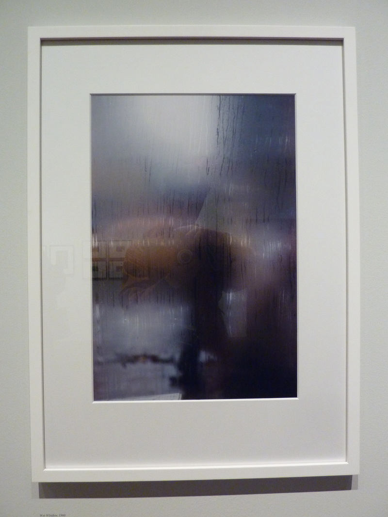
I have found, that when looking through Leiter's photographs, some specific motifs and ideas come through from the majority of photographs. These are umbrellas, reflection, colour matched objects, bright clothing, translucence, text, obscured and obscuring objects, and any scene that seems to involve looking into, such as windows, or simply compositional windows of obscured edges or parts of the image. To achieve using these motifs in Leiter's work, he seems to have photographed quite close up, or perhaps used a zoom or large focal length on his lens. These motifs I could, in practice use to explore any area in relation to his work.
At the time Leiter was working, street photography had very specific conventions, usually following Bresson inspired rules with street photographers almost always shooting in black and white, and mostly interesting street scenes or portraits being the subject matter for the photographs. Leiter however, rejected these irrational and traditional rules almost entirely, using colour film and most commonly using the obscure within his photographs, not that which is in plain sight, which, if his photographs were published or shown, would have been contraversial.
Leiter's subject matter is very much in connection with the urban surroundings, and a very interesting twist on both people and objects they come into contact with in the photos, humans being seen as not just within, but as part of the scenery. A good way of describing how I see Leiter's eye is two dimensional rather than three dimensional, objects, people and their surroundings not being taken for their meaning, or what they are seen to be in their definition, but rather seeing the photographic scene as a collage of many shapes and colours, which we ascribe names to. In this way, Leiter's work becomes abstract. I belive that the only reason humans are photographed more often than not with Leiter is due to the fact that they form new and unprecedented shapes and forms that are fleeting in their relationship with their surroundings, rather than shapes already present, which could be seen to be less interesting and also have less a sense of excitement, activity and motion.
I have found, that when looking through Leiter's photographs, some specific motifs and ideas come through from the majority of photographs. These are umbrellas, reflection, colour matched objects, bright clothing, translucence, text, obscured and obscuring objects, and any scene that seems to involve looking into, such as windows, or simply compositional windows of obscured edges or parts of the image. To achieve using these motifs in Leiter's work, he seems to have photographed quite close up, or perhaps used a zoom or large focal length on his lens. These motifs I could, in practice use to explore any area in relation to his work.
colour theory
The often intense colour in Saul's photos is due to his use of what was at the time the new colour film, kodachrome, which was released when he began shooting. Other street photographers rejected the use of this film, and it was considered amateurish, yet Leiter chose to use it, opening a whole other variable to photographers in a time period when the use of the variable of colour was dismissed. This however, allowed Leiter to create a plethora of work unique in comparison to any other photographers at the time.
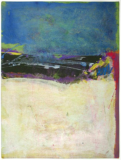
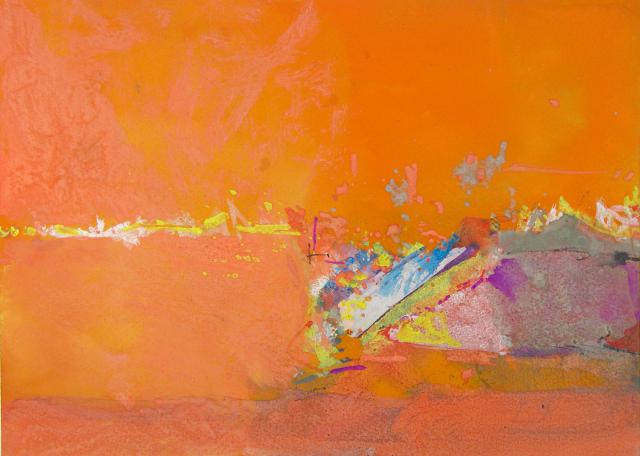
Abstract expressionism is also certainly an area of fine art practice worth considering in relation to Leiter's work in the 40s and 50s, as it was an influence on him while he was working, due to the mix of east coast American art and Europe's emerging modern art scene. Looking closely at his images, this influence is evident, with Rothko-like colours running through each image, in gradients and in opposition to one another.
Abstract expressionism is also certainly an area of fine art practice worth considering in relation to Leiter's work in the 40s and 50s, as it was an influence on him while he was working, due to the mix of east coast American art and Europe's emerging modern art scene. Looking closely at his images, this influence is evident, with Rothko-like colours running through each image, in gradients and in opposition to one another.
composition
Leiter's choice of composition is one of the main areas I would like to apply to my own work. It is evident, as in any good photographers work, that the rule of thirds and straight horizons are taken into consideration in each image, whether abided by or not. Leiter does this, but goes about composition in a more attentive way, through both obscuring and through the interaction of colour that he was presented with. Leiter obscures or hides areas often around the sides of images, most commonly utilising depth, which is collapsed in the finished photograph, giving a surreal and uncommon perspective and inducing a type of romantic curiosity in the viewer.
saul leiter gouache paintings
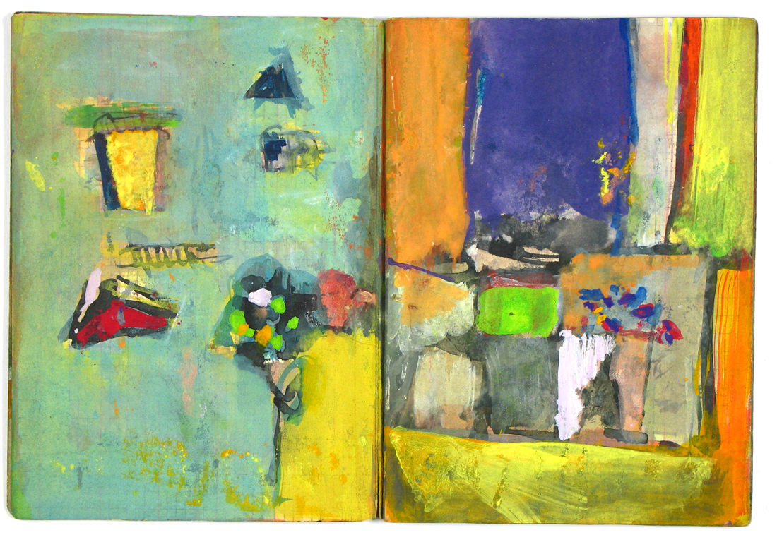
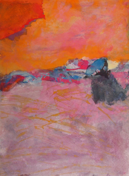
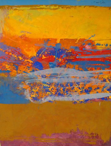
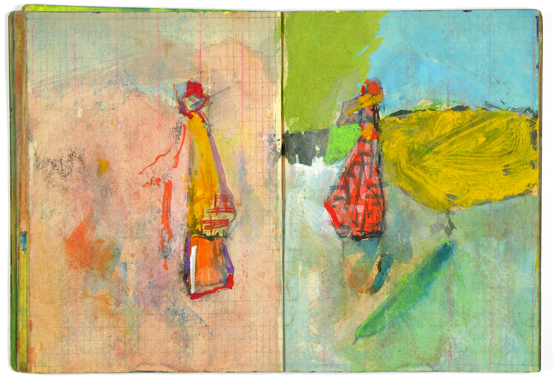
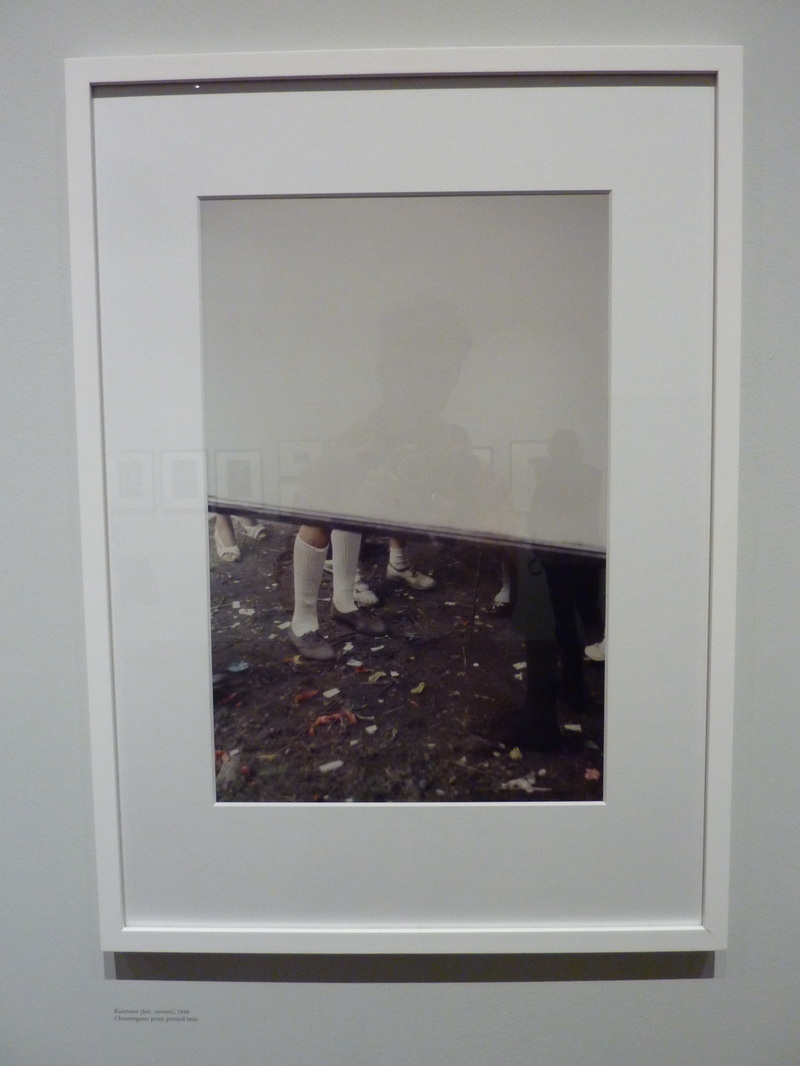
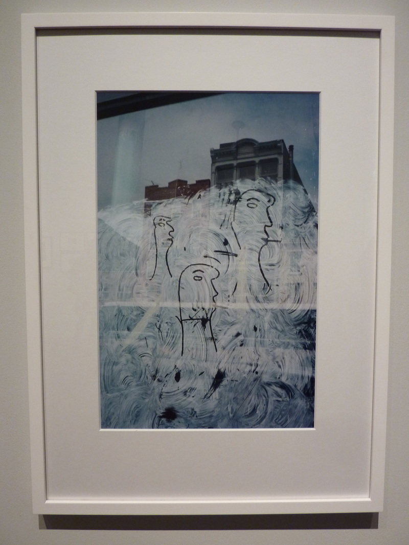
I decided also, when researching Leiter to have a look at his paintings, which at the time he was photographing, he wished to be known for. Whilst practicing his street photography now well known by many, Leiter worked as a painter, although did not gain much success in this area. His artistic practice within art however is in many ways paralleled with that of his photography. He often painted over photographs of nudes and figurative images in gouache, but also made small scale abstract work in the same medium, his knowledge and love of colour evident in the attention given to their relationship to one another. They serve from a photographic perspective to decompose Leiter's method of viewing the external world, into its intrinsic and basic colours and shapes.
gallery visit
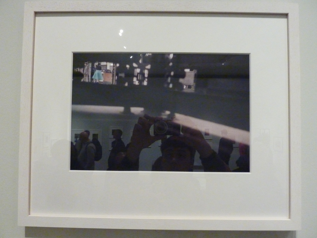
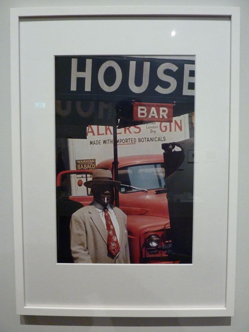
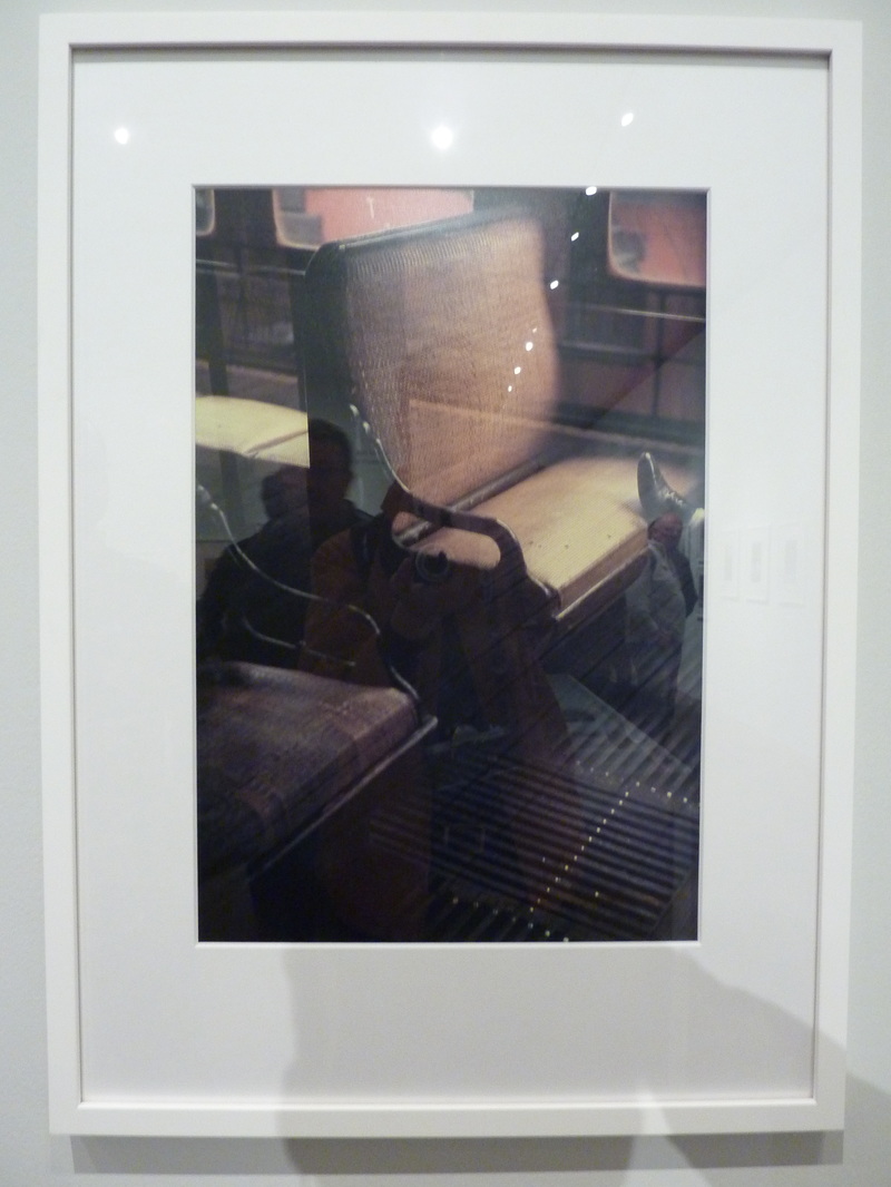
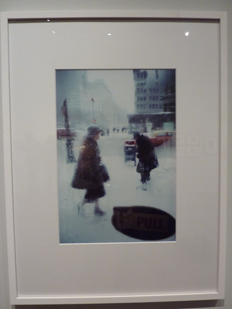
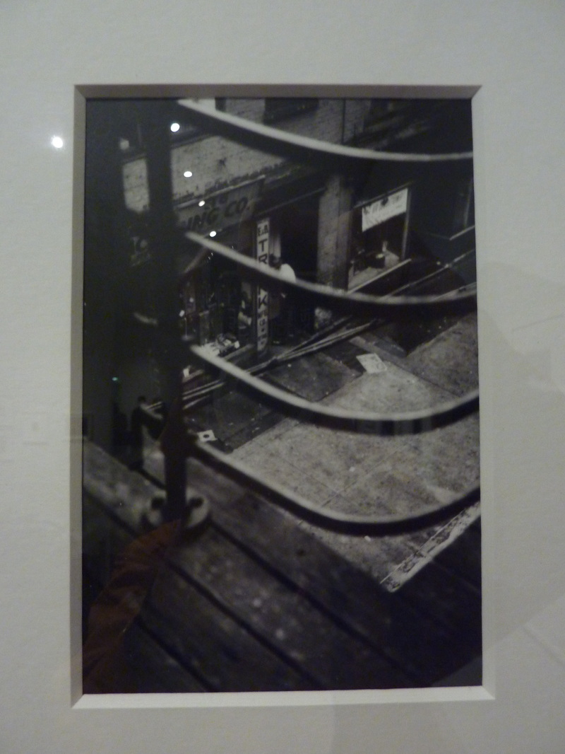
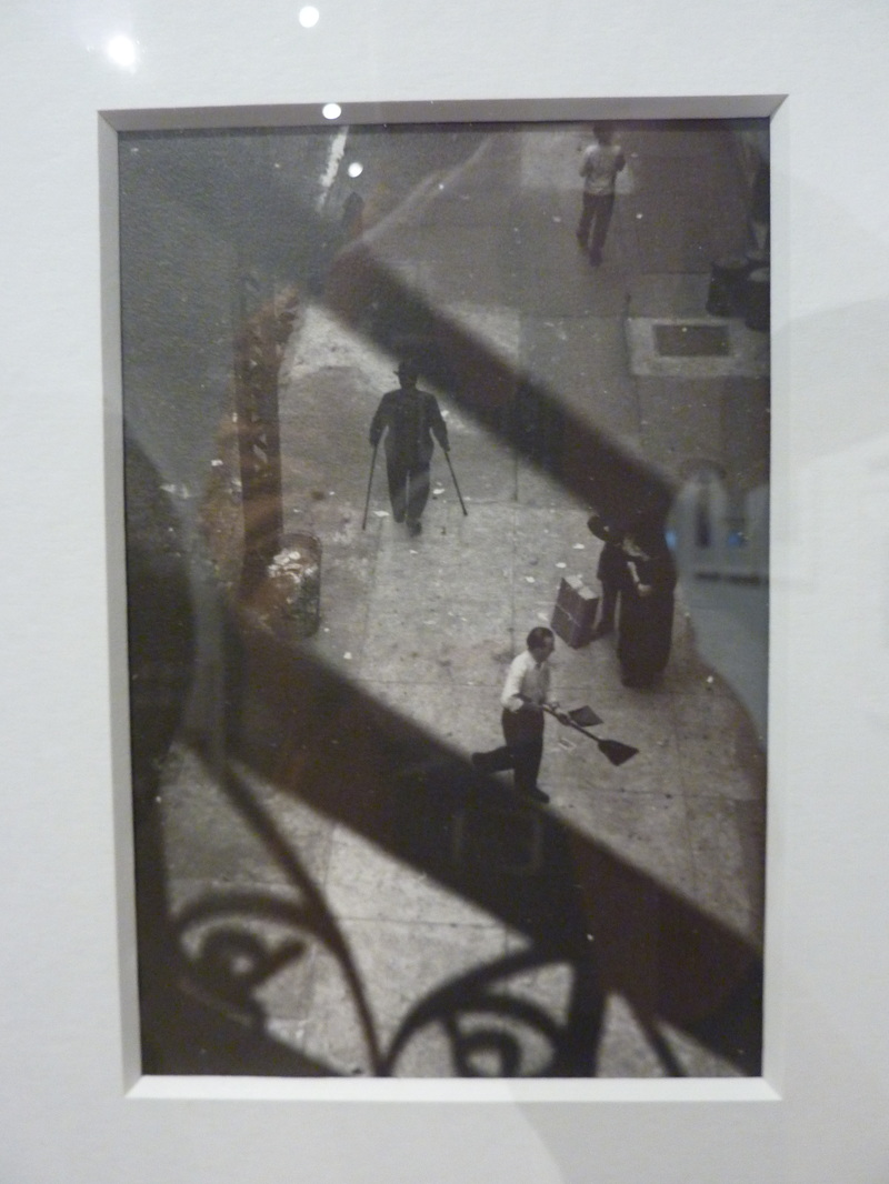
These are images I took while visiting the Saul Leiter show in the photographers gallery. The images I took of his consisted of both black and white, heavily compositional images, with his famous colour images, often with more odd in their subject matter. They are those I found personally most inspiring and most attractive int he show and would also like to to influence a new personal practice in colour.
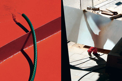
siegfried hansen
Siegfried Hansen's is a German street photographer who shoots predominantly in Hamburg with his work well recognised for its incredibly unique take on the genre of street photography. His work is bauhaus influenced but not learnt through any formal art or photography practice. His work can be divisible in my opinion into three separate areas.
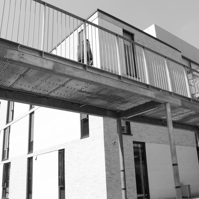
shape
Shape is a formal element that is incredibly prevalent in Hansen's work. His work often strikes me as being as geometric as is possible to create. Rule of thirds and other more nuanced symmetrical rules Hansen uses depending on the photograph to retain clean geometrical shapes as they appear to him.
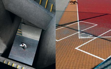
This ability to create purely or mostly geometrical images is mainly due to the backdrop of man-made, or 'unnatural' surroundings due to the nature of urban environments, constructed from purely pragmatic architecture and far less life aside from humanity and the odd plant. However, these relationships are also questioned, with Hansen's subjects not being particularly evident. For example, in the photograph on the right, is the person or the stairwell the subject? Or both? In Hansen's work, the collapsing of depth is utilised for his own means, distant shapes suddenly becoming imposed upon the closest, far different from how the scene may have looked in reality when taken. The urban environment therefore, may become alive, or the animate subjects the architecture.
Shapes in Hansen's images therefore are almost inverted versions of what the average photographer may look for in urban environments, comprising of almost unidentifiable coloured shapes, usually offset by the existence of one organic subject, such as a person, plant or animal. Hansen describes his only identifiable influence as the Bauhaus movement, which is certainly embodied in each of his images, which explore the relationship between the organic and the inorganic.
colour
Colour, in Hansen's images are incredibly vivid, similarly to Saul Leiter's use of Kodachrome film in his street photography. Hansen's images however, appear less painterly, and have a more modern, graphic feel with a more neutral atmosphere, the colours cooler rather than warmer. Even clouds in his images, which offset block coloured shapes, are captured in a way that recognises their pattern rather than form. They resonate with a view I would perceive to be of a dreamy walker, capturing each geometric image they see excitedly. There appears, perhaps due to the colour and subject matter, a sense of urban optimism, or at least appreciation for the aesthetic qualities of urban areas.
subject matter
|
|
The subject matter Hansen uses is also interesting as well as unconventional. As I have previously talked of his use of shape, it is more important when considering subject matter to consider the relationships between the diptychs he chooses to present, their similarities, and the interaction of colour in the images than simply the images themselves, creating more meaning than the images existing unconnected.
This subject matter is often not limited to objects themselves, rather subject matter may become a similar effect or impression when combined in diptychs, forming similarities in subjects such as shape, colour, shadows, or an uncanny similarity of the composition of the image, or an extreme contrast or comparison. For example, in the left diptych, the central subject is similar in its composition, central, but then bending towards the left, each touching the left third of the image in the same place. The shadows of the image working in a similar way, confusing the perception of the subject.
Within the diptych on the right, the subject matter is explored similarly, in that the lines on the left created by the architecture are comparable with that of the lines on the court in the right image. However, the walking subject matter is less harmonious in colour than is the dog on the right, who skilfully matches the colour of the court walked on. The walking subject matter sticks out like the white lines of the court on the right. In Hansen's work, one things sticks out most evidently, and this is that the images are taken in such a highly skilled and patient way, that their interaction with the childlike desire to match shapes and angles amplifies the satisfaction felt at viewing the images. I would like to explore this pure level of compositional satisfaction in the aesthetics of Hansen's work in my own work.
threshold concept
I would like to assign my exploration of the subjects into a thought process and principle that will contribute to my line of thought in my work. Of the ten different threshold concepts, the one I have quoted below I believe represents this.
"Photographs consist of formal and visual elements and have their own ‘grammar’. These formal and visual elements (such as line, shape, repetition, rhythm, balance etc.) are shared with other works of art. But photographs also have a specific grammar - flatness, frame, time, focus - that give structure to a photographer’s perceptions of the world. ‘Mistakes’ in photography are often associated with (breaking) the ‘rules’ and expectations of this grammar e.g. out of focus, subject cropped, blur etc. Some photographers reject formalist concerns in order to establish an aesthetic that represents their critical position and does not rely on conventional notions of beauty."
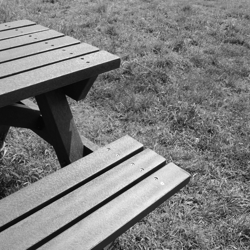
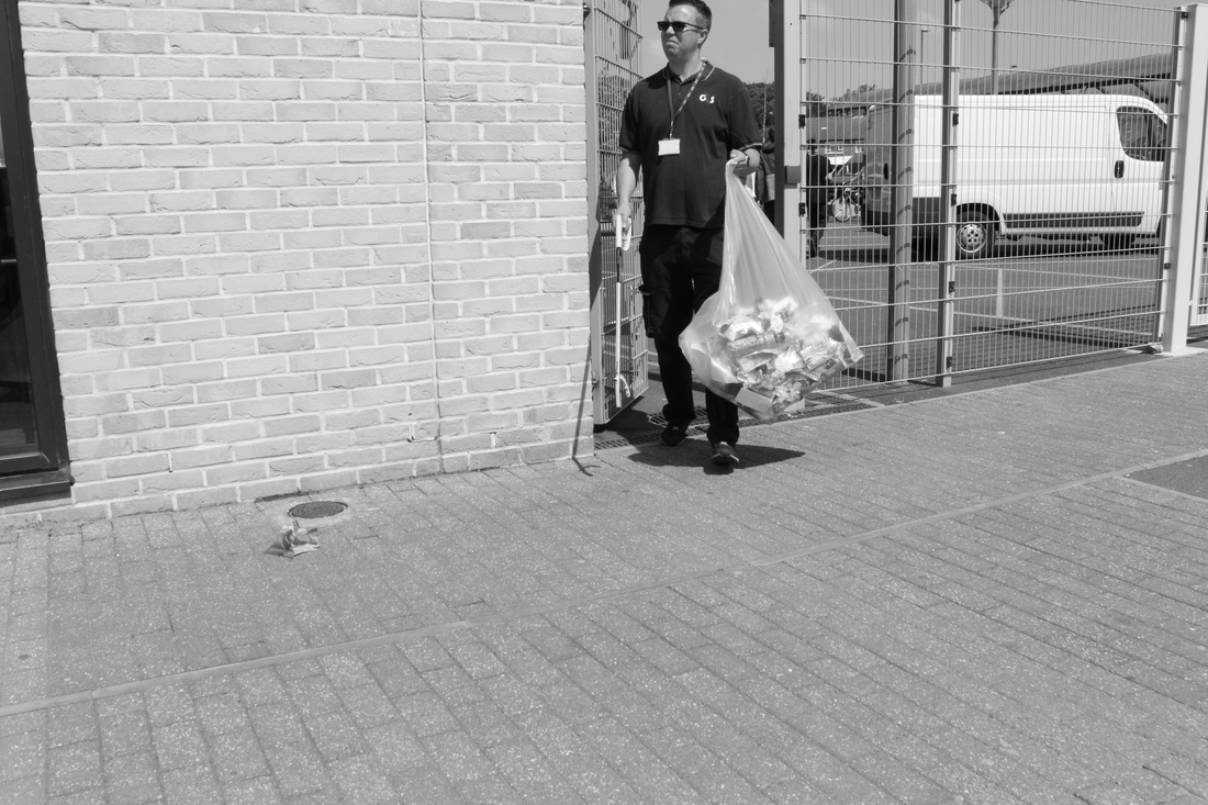
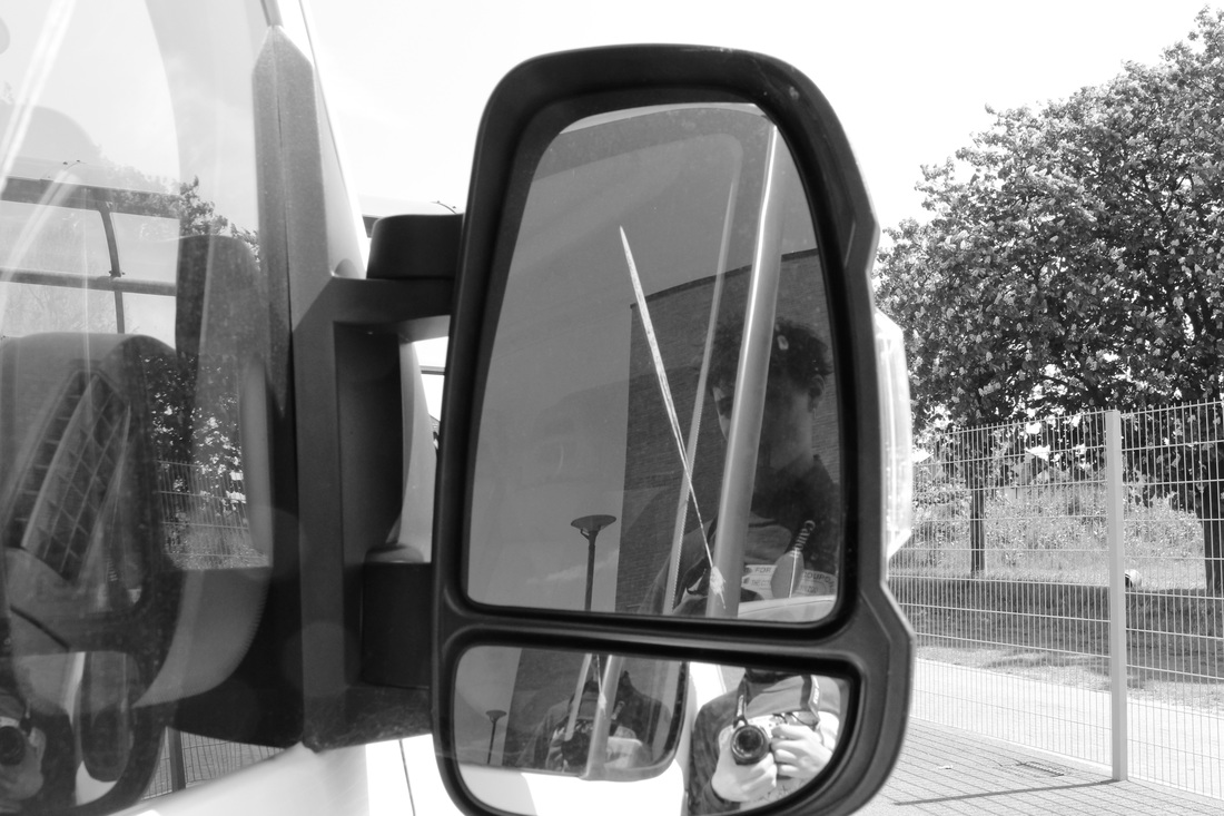
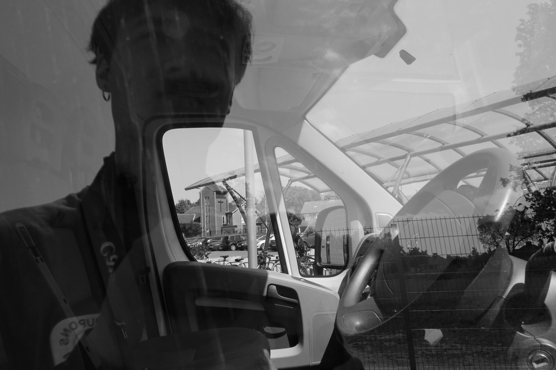
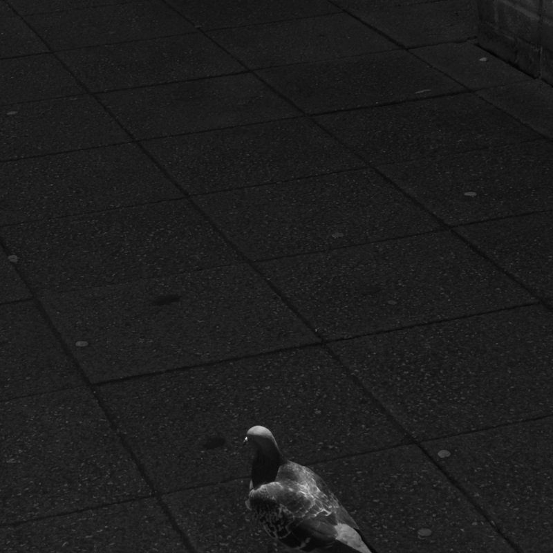
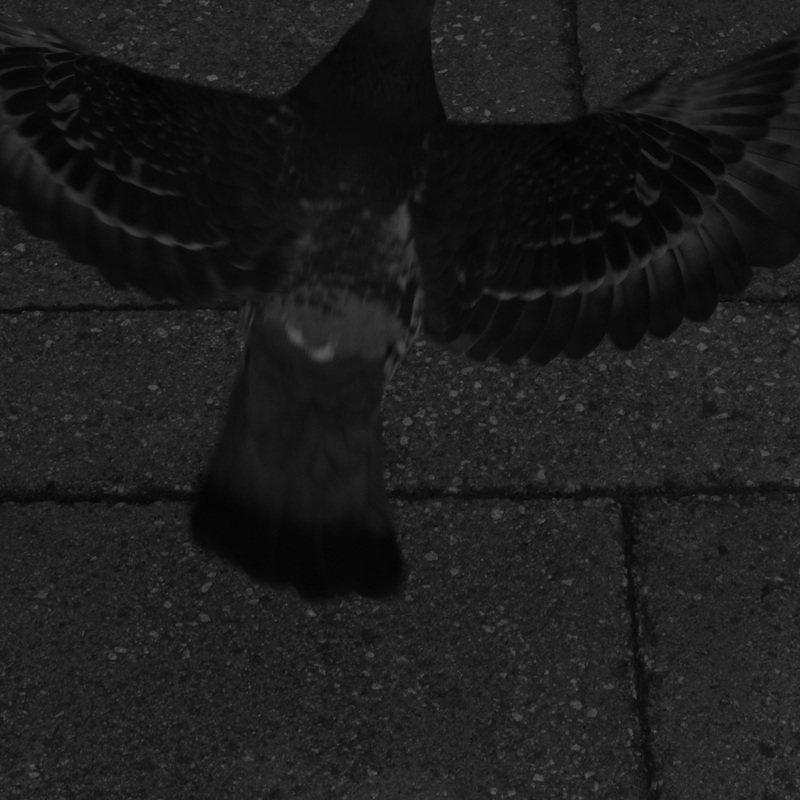
chance: an activity
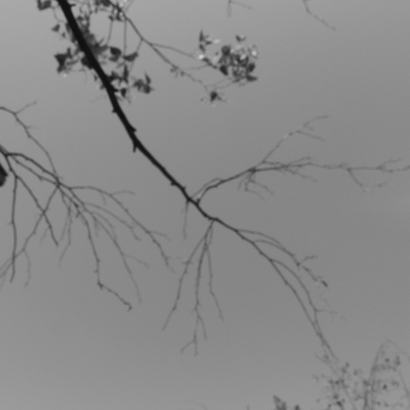
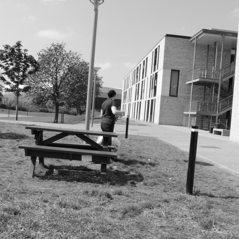
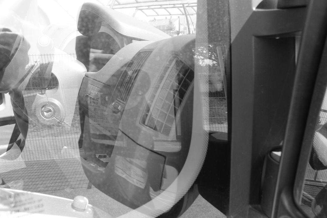
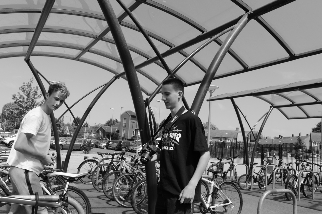
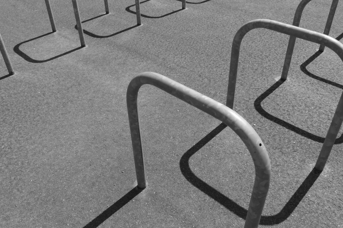
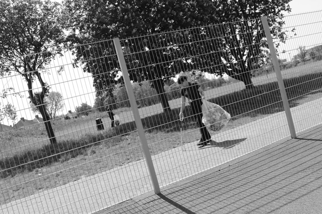
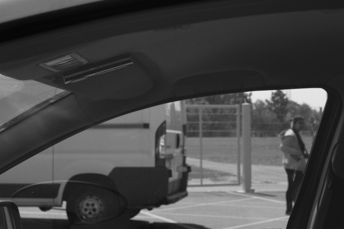
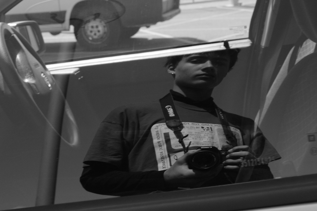
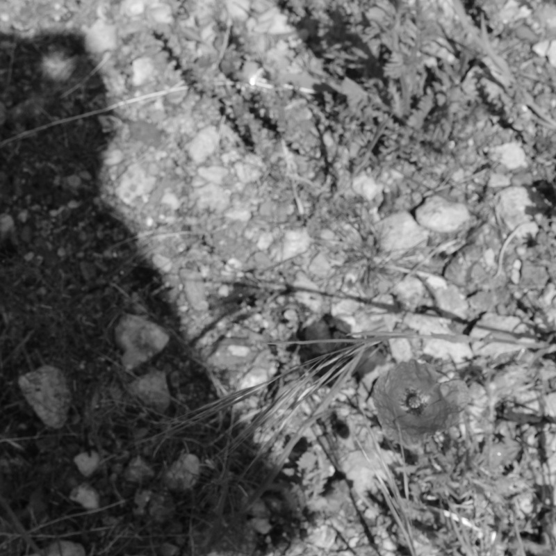
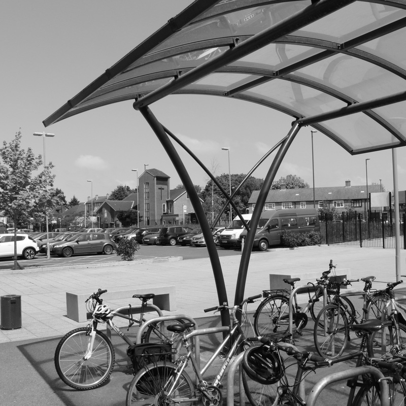
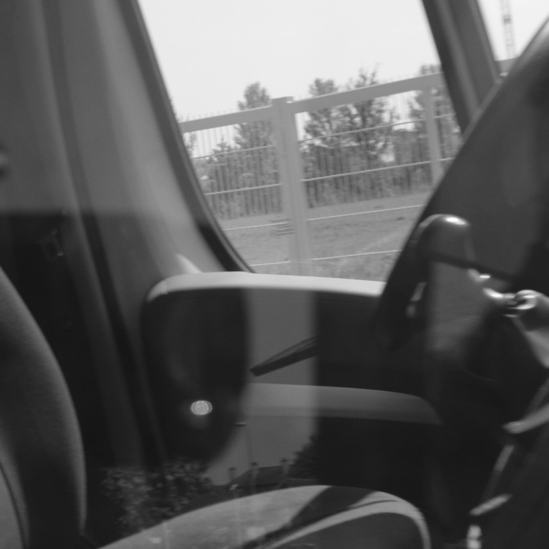
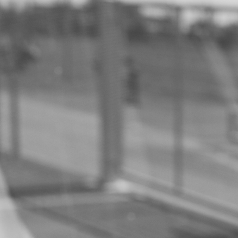


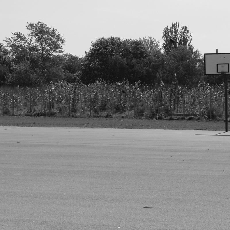
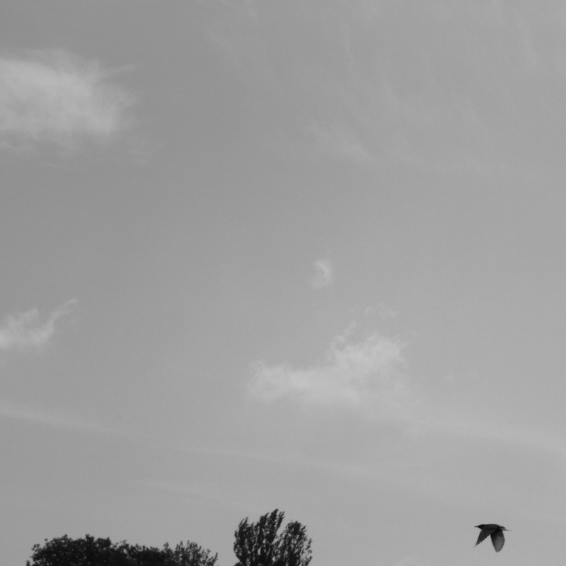


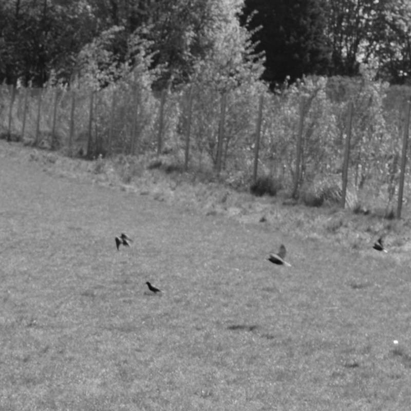
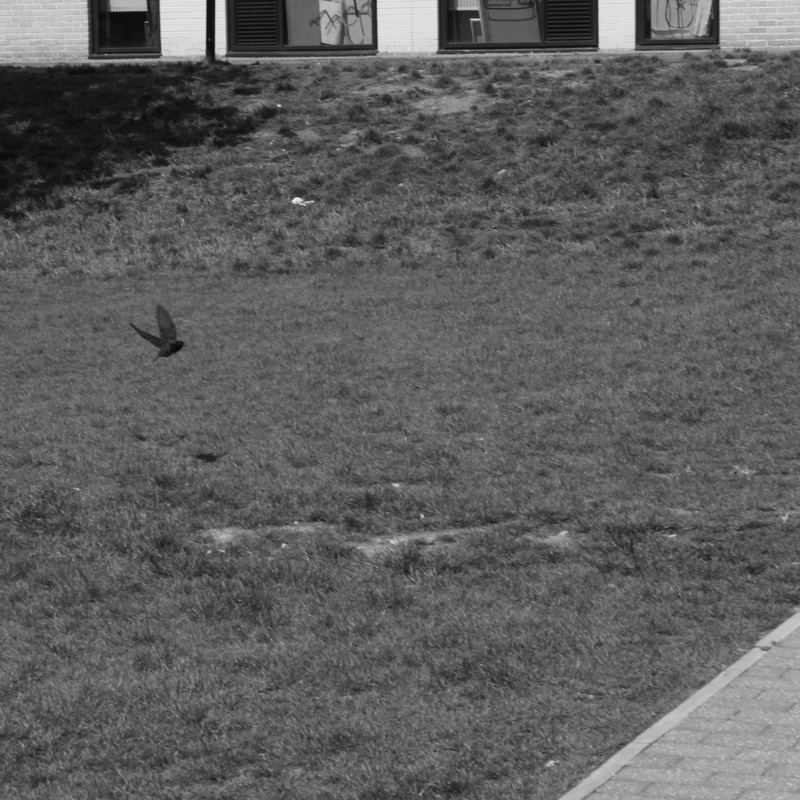
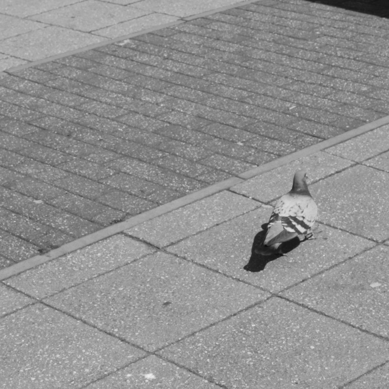

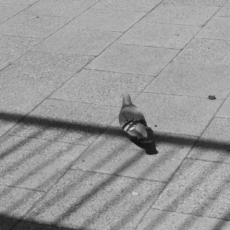
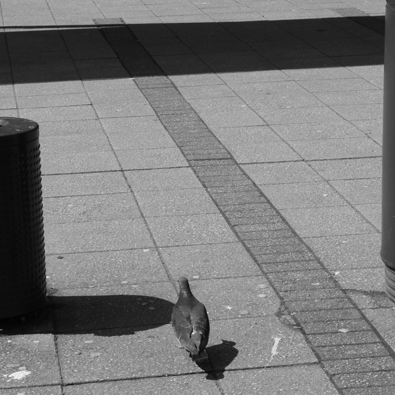
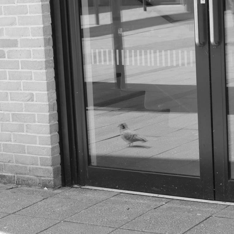
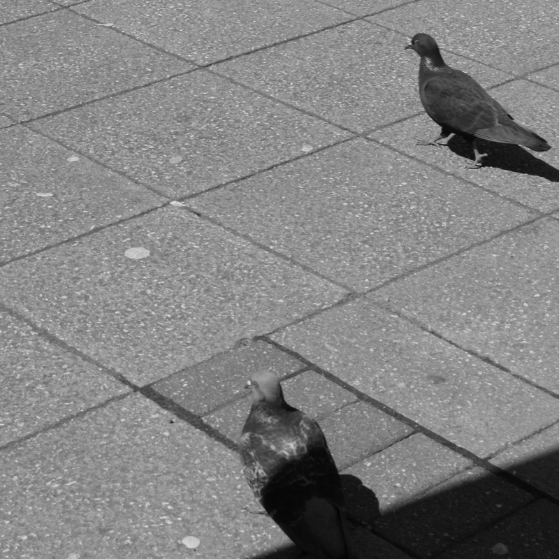
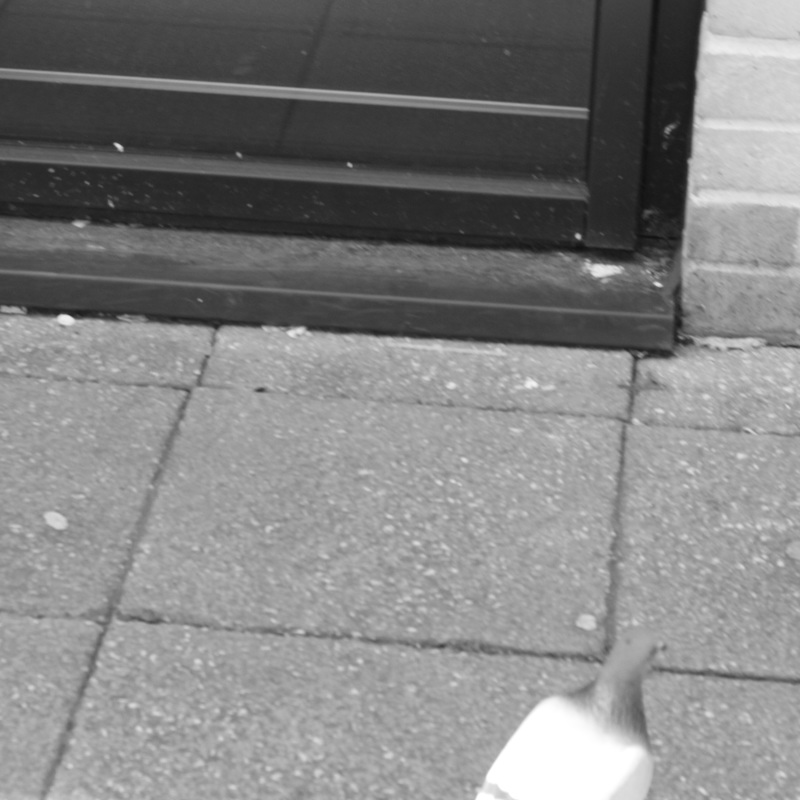


These images shown above are the result of a chosen chance-based task that I was set in class as a way of experimentally exploring photographic ideas without relevance to my overall work practice within this project while still developing ideas revealed to me through this task.
The task I chose involved not looking through the viewfinder when shooting images, using zoom and focus simply by feel, focus being able to be corrected sometimes from looking at the previous image. The camera was on automatic exposure also, as this was not the basis of the task. I shot in black and white as a means of simplifying the images to a compositional level when actively thinking while taking them, and for analysis of my photographic intuition after. Some images, which are the majority, were also changes to an aspect ratio of 1:1 rather which was my intention, to simplify symmetrical composition even more when shooting.
Unfortunately, conducting the task in school restricted me in my subject matter somewhat, but I believe the task overall was very successful. Most of the images are compositionally sound even when I was not using a viewfinder, and the subject matter usually produced an interesting enough photograph. The task in itself seems to represent the process of creating a good image and the resulting choice process. In loosening the hold on control of outcome, your own intention in photographs is realised, be it accidental or not, or partly both.
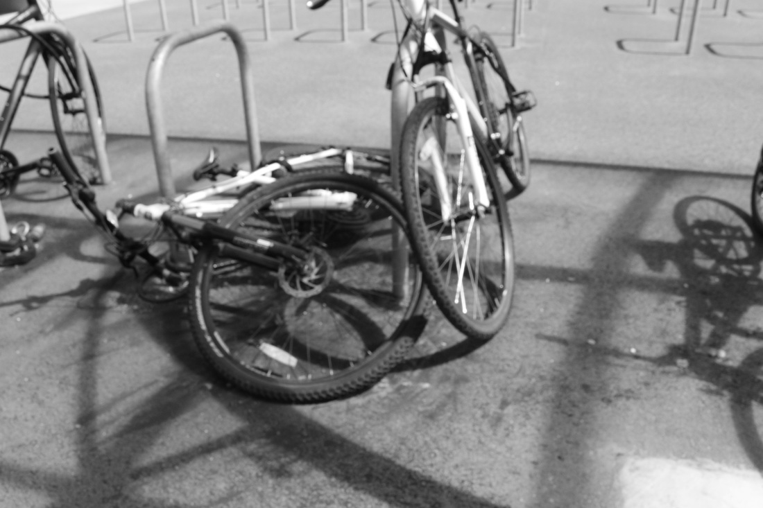
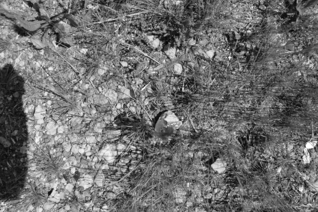
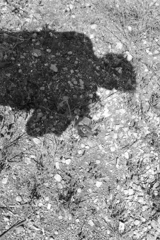
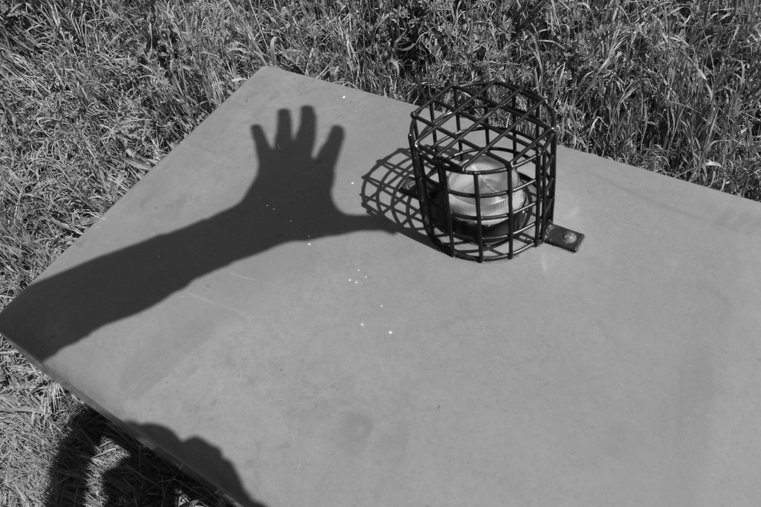
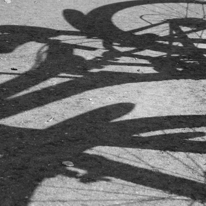
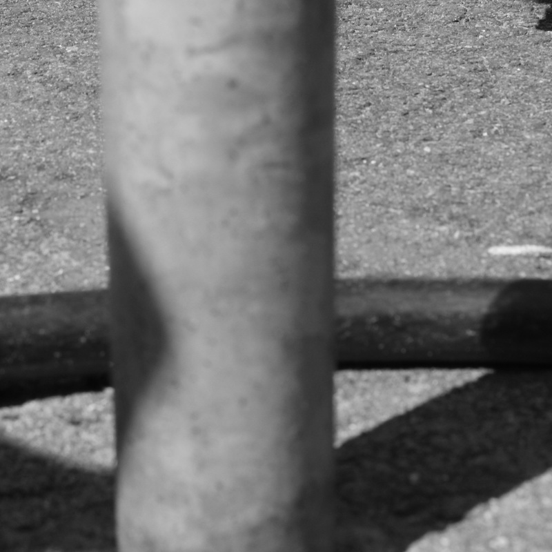
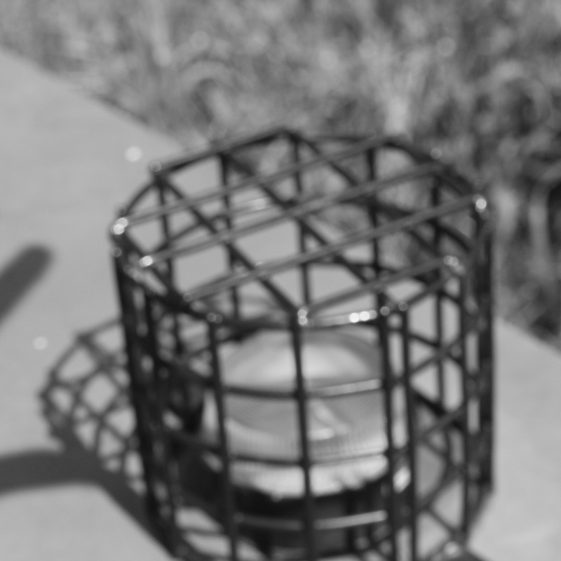
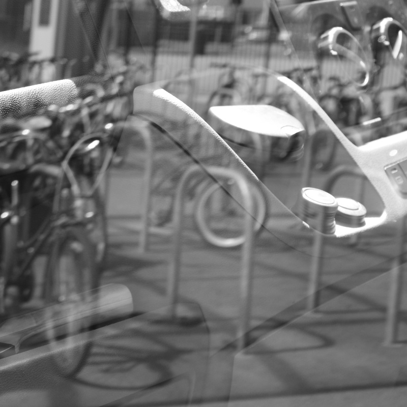
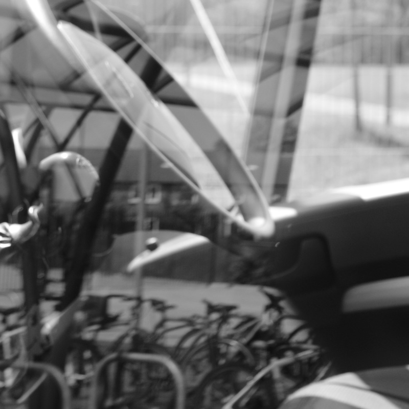
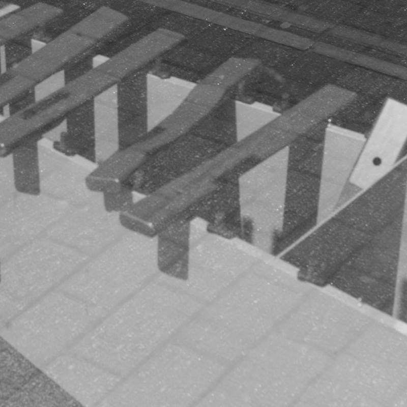
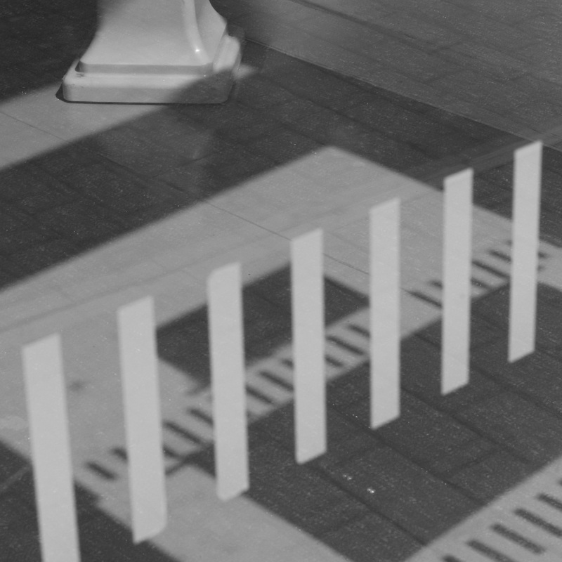
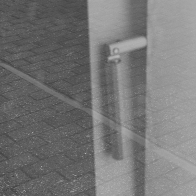
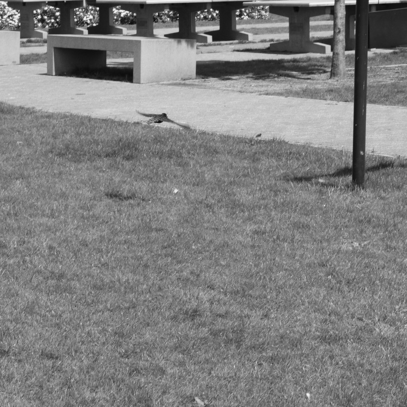
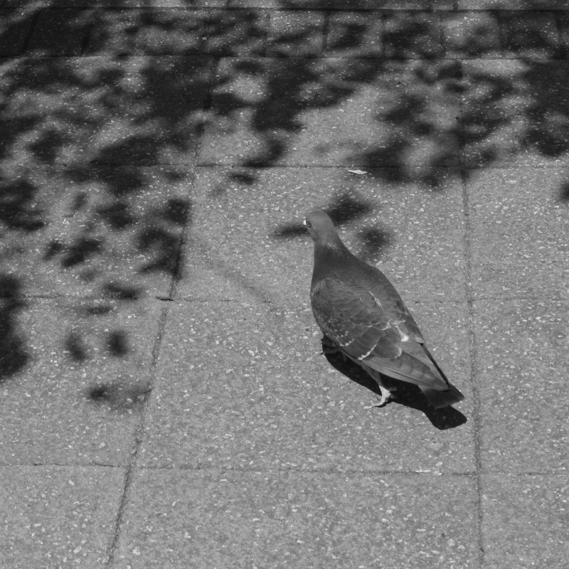
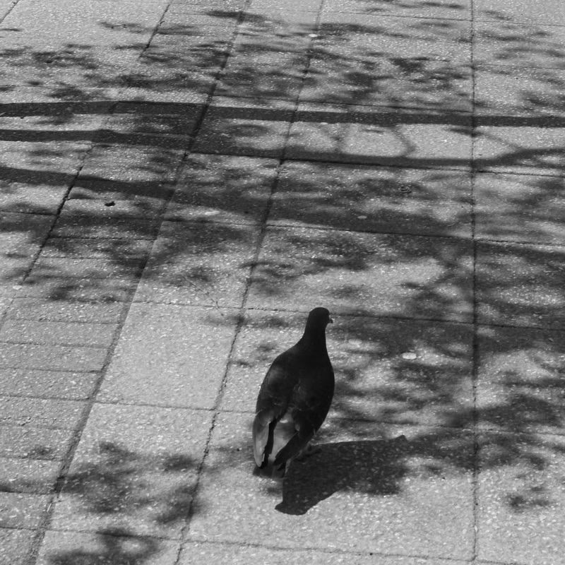
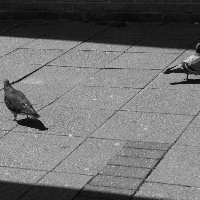
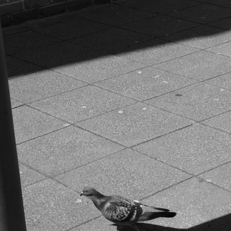
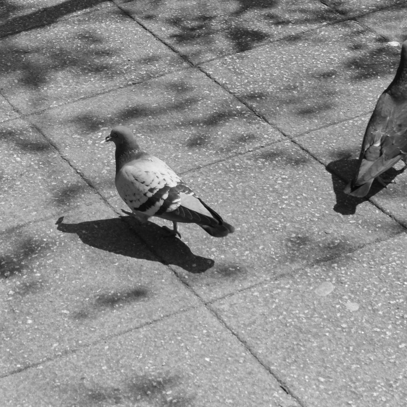
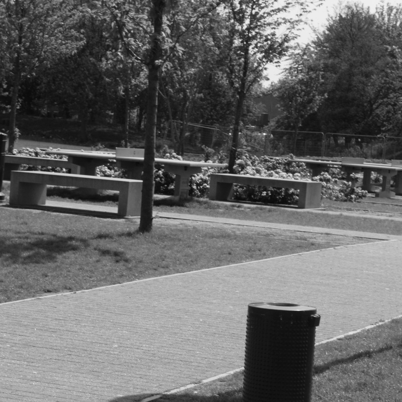
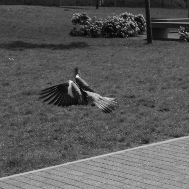
refined images


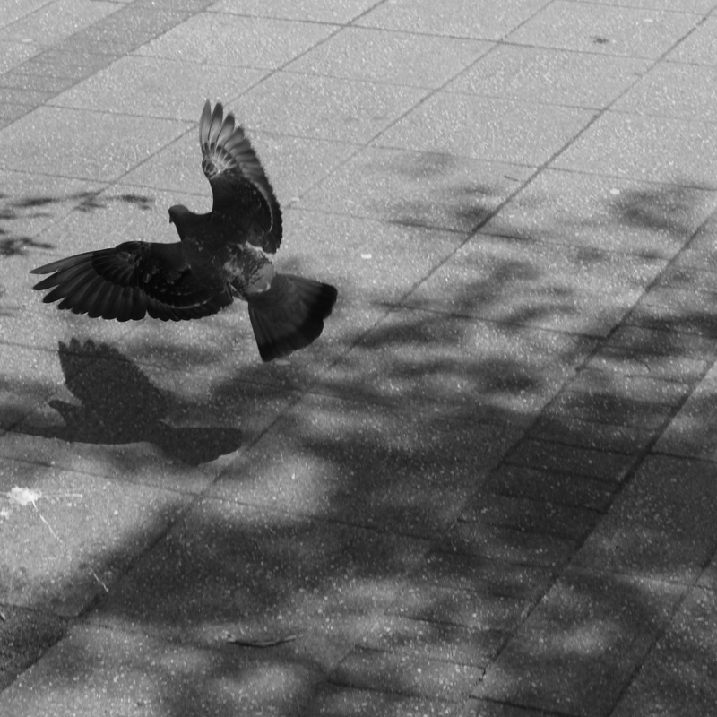


The images above are images from the task I have selected as examples of highlights in the practice proposed by the task. They are chose not through their sharpness, perfect exposure, or subject matter, but by composition regardless of other characteristics of each image.
I find in this selection of images that greater and more innovative composition occurs accidentally, and is produced in ways that are not conscious or typical of my particular viewing style, and perhaps even not in my control very much at all. In this way, and through this task, the act of taking a photograph is flipped, as it is the subject matter that the weight of importance is put, my choice therefore becoming more important than that of the composition, which is made more interesting but is not in control, whereas a normal image would be taken with much of the importance weighed on composition and this applied to the subject matter.
I find in this selection of images that greater and more innovative composition occurs accidentally, and is produced in ways that are not conscious or typical of my particular viewing style, and perhaps even not in my control very much at all. In this way, and through this task, the act of taking a photograph is flipped, as it is the subject matter that the weight of importance is put, my choice therefore becoming more important than that of the composition, which is made more interesting but is not in control, whereas a normal image would be taken with much of the importance weighed on composition and this applied to the subject matter.
inside/Out
questions on ethics
When is it not ok to take a photograph?
I am not sure I can define my own morality as to what is the correct way to photograph a subject is and what their resulting portrayal is. I believe personally the photography is a form of voyeurism and cannot be morally neutral in its use. It will almost always result in portrayals of subjects in a way they may not want, or being an invasion of privacy in the act of taking a photograph. However, I believe that the pros outweigh the cons in photography's case.
Should you seek the permission of the subject?
I believe that permission of the subject should be sought or not depending on the nature of the work attempting to be produced. It is questionable to put a limit to artistic practice beside the law perhaps.
Does a relationship with the subject change the image?
Yes, it does, as it may affect the pose, emotion and expression of the contents of the image, whether that be tenseness or apathy in regards to the context.
Can photographs hurt people?
I imagine that photographs can defame people, especially in the digital age, but I am not sure whether there exists anything that cannot hurt people, so it is not a worry of mine.
Is all photography a form of voyeurism?
Yes, but that is what makes it so interesting. If it was objective and not based on perspective, it would be boring and simply a craft rather than both a craft and an art.
How responsible is the photographer for the way in which a subject is represented?
Responsible to an extent, but I believe they can choose to do as they wish, and if that is offending people or the subject in how they depict the subject then they can do so at their own risk.
How much control can the photographer exercise over the ways in which their images are understood by viewers?
The photographer, in my opinion, exercises every way in which their images are understood, as they take them, edit them, and publish them with intention.
Can photographs tell the truth?
Photographs in my opinion, never tell the truth, and nothing can, as they are taken within a machine for capturing something in reality. However this reality cannot be replicated in a different medium to eyesight, such as a photograph, as it is simply a simulation of waves and substances interacting to produce marks on paper.
Diane Arbus - A Jewish Giant at Home with His Parents, N.Y., 1970
The formal elements in this image help to determine the way it is viewed. For example, what appears to attract the photographer is the abnormally large man or "giant", shown by the compositional lines in the ceiling meeting at this subject, and the subject being the most illuminated subject by the flash used in the image, almost blowing highlights and contrasting the subjects jet black hair with the wall behind. The vignetting of the light in the image also subconsciously hints at the mind that the brightest subject is the centre of interest in the image, as is also shown by the gradient of the shades of clothing of each of the three characters.
The relationship between the parents and the son are in a way objectified in quite a voyeuristic way, their perspective only shown plainly through composition, the boy's height accentuated by the central placement of the parent's heads in the image, the only hint of any emotion in the image being that of the mother's gaze which is almost neutralised by the compositional line in the ceiling that follows after it, almost removing this emotion and making it purely superficial. The relationship cannot really be shown to hold anything in the image, speaking more of the photographers intentions of capturing simply the external and not any thoughts or feelings of these subjects. I believe this is what attracted the photographer, which is unsettling and rather unsympathetic to the subjects, utilising just morbid curiosity in the images and not empathy.
When I look at the image, I feel almost ill in its unfeeling nature, due to the nature of both the techniques used, such as a flash on a rather decorative home, making the image feel bleak, and the portrayal of a disabled subject in a way that only acknowledges the curiosity of the photographer, rather than presenting him as having any humanity.
Nan Goldin - Nan and Brian in bed, NY, 1983
The photograph is very different to the type of photograph expected from photographers who are also considered artists, as it includes the photographer in the image. This presents many questions about the nature and use of the photograph. The photographer, as pictured, could be in a relationship with the subject, or a friend or family member. Understandably therefore the photograph would be for documenting a memory.
The relationship to the subject changes this meaning, as the question of who is taking the photograph is thus provoked, and who therefore can be considered the photographer, if the credited photographer is within the photograph? Is the photograph therefore exposed as contrived or posed? Does this actually make a difference to how it is consumed by the viewer? The value is perhaps indefinable in this way, as we have no experience of the photographers relationship to the central subject, and therefore have no way of judging this. However, if the photograph exists only as a memento, we must question why it was published at all, as it is in a sense objectifying the captured moment as an art piece.
The relationship between the photographer and the subject is very interesting in analysing the image, as the photograph and the photographer as a subject in the image both are presentations of the photographers viewpoint of the event shown in the image. The gaze of Nan on the right cuts through the two subjects, similarly to Arbus' image, and gives a feeling of physical closeness, but also distance. This distance is described by the inverted by the tones around the two images, the left subject highlighted against a dark background, and Nan on the right in a dark with a bright background, this lighting splitting the image in two and creating a type of imagined boundary in the viewers mind. The inclusion of the photographer in the photograph promotes the tiptoeing of genres and definitions that the photograph sits within.
I feel, when looking at the image, rather calm, mainly due to the composition and directional but warm and soft light. There do not appear to be many dark undertones to the image that I could plainly state, beside perhaps a melancholic and distant feeling, both of the subjects appearing as if they are on their own, or this image could be of one of them alone and have the same impact.
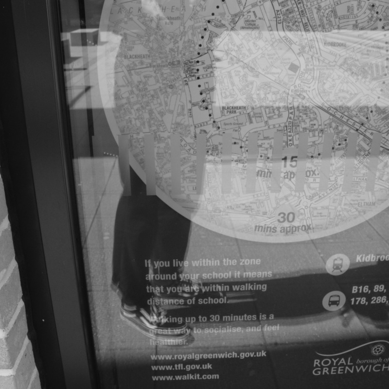
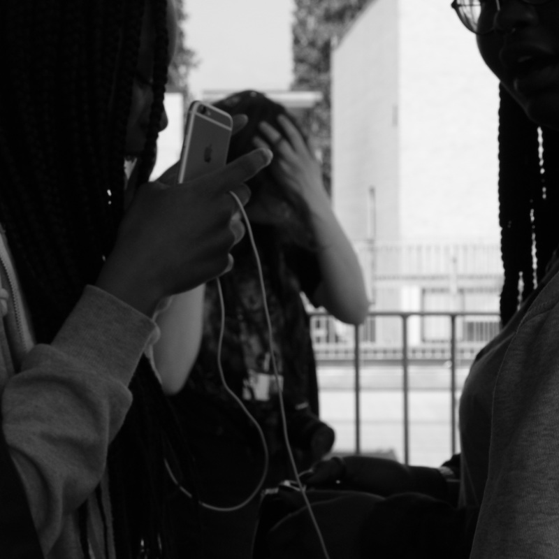
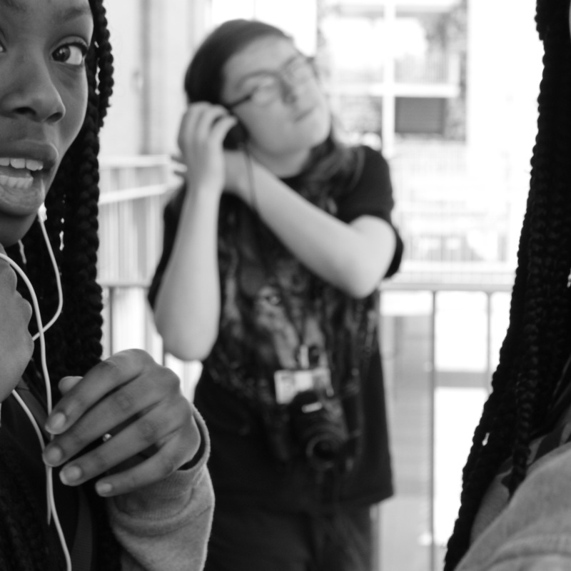
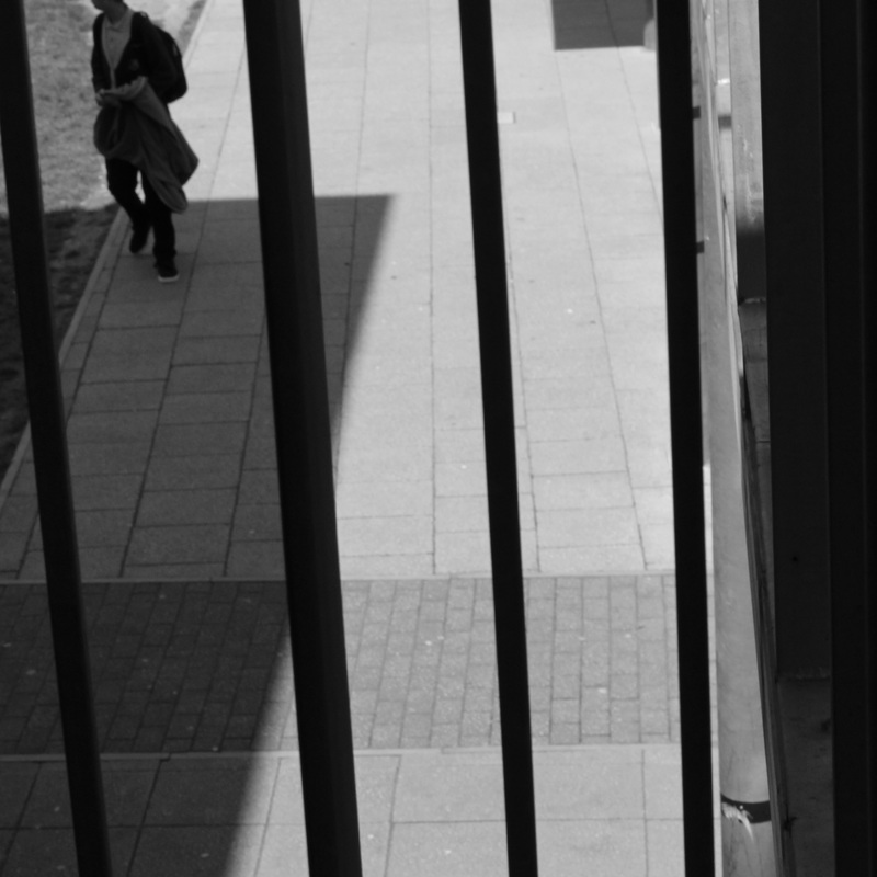
inside out activities
image selection: Am i an insider or outsider photographer?
|
|
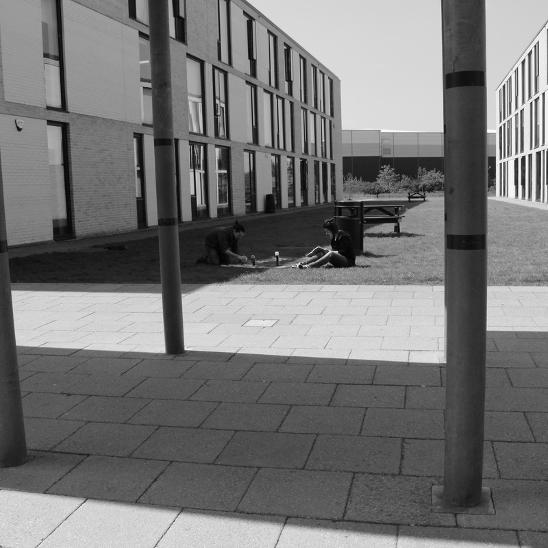
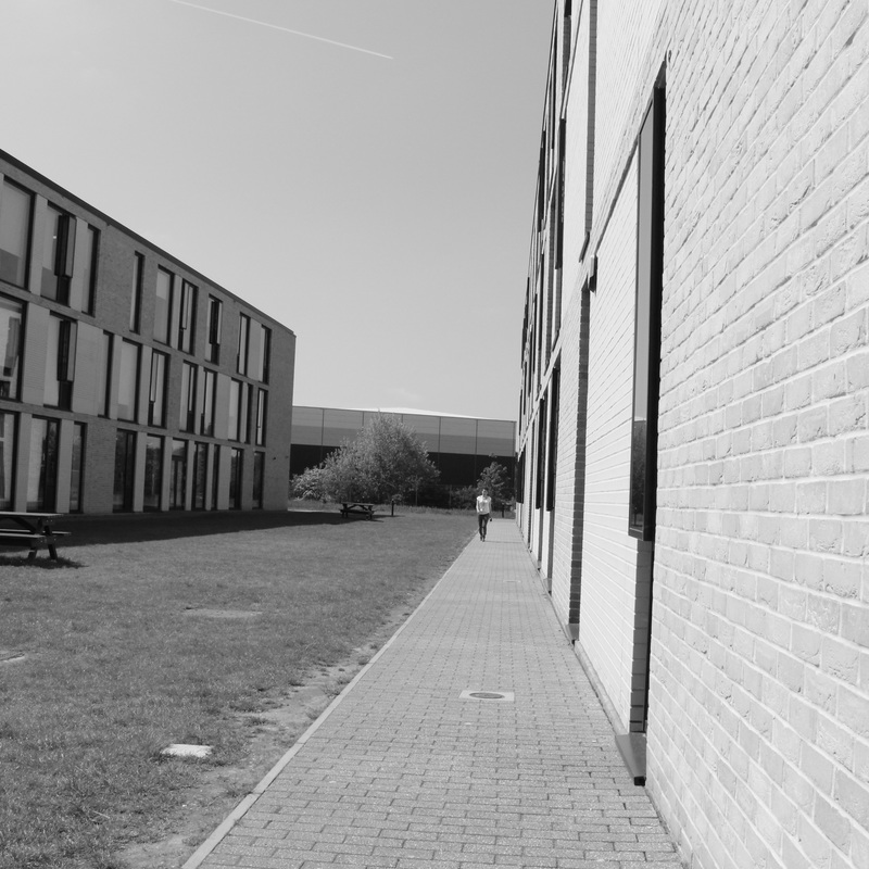
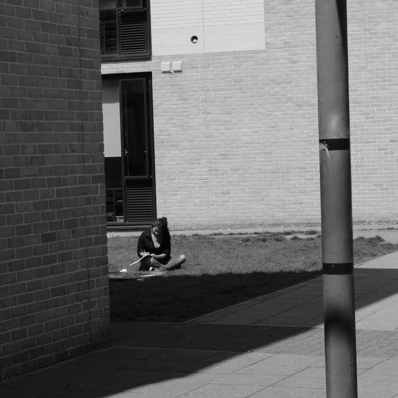
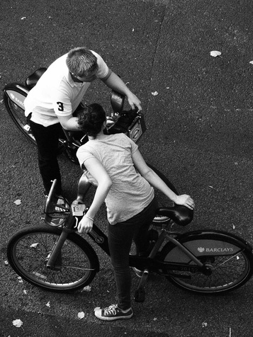
The question of whether I am an insider or outsider within photography is one that I am not fully sure of. I do know that I perceive, feeling like an outsider, not that I do not feel a connection to my subjects, rather that I simply feel a type of emotional distance from them in some ways. I seem to recognize mostly the differences between myself and others, but not negative ones. Simply intriguing ones. When photographing on the street, I try not to capture insights into the person, but rather the person's relation to the environment and their context which I believe reveals more about them and therefore about my self and my eye for photographs. I believe that the surroundings are inherently very important in a photograph, for example the image on the right above, in which the directional lines give way for many different interpretations of the photograph.
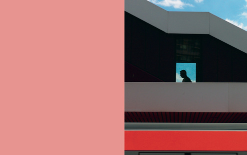
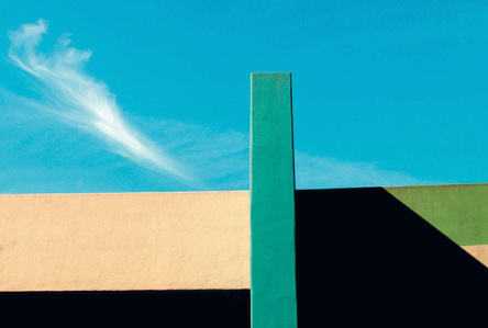
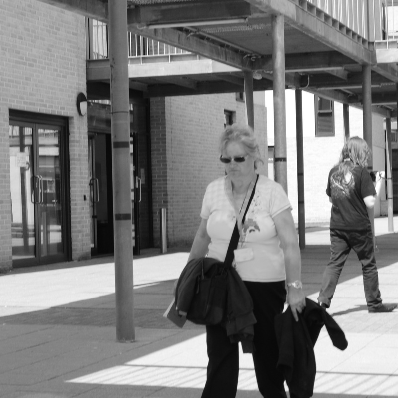
saul leiter/seigfried hansen response
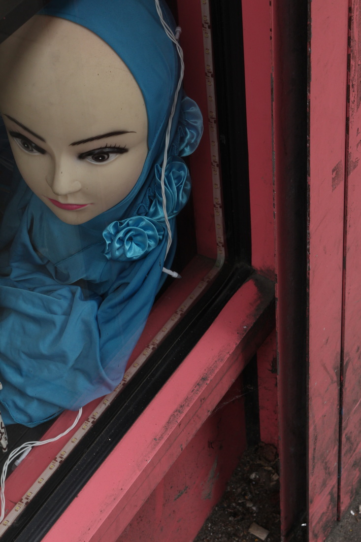
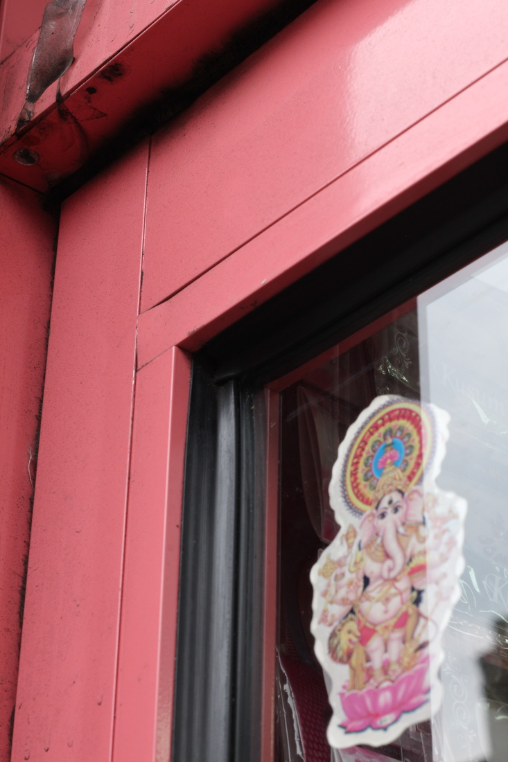
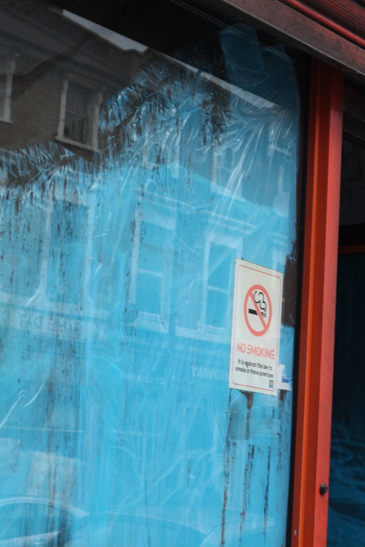
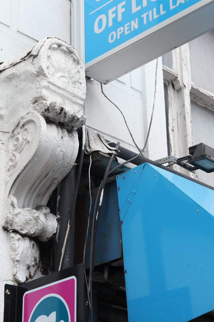
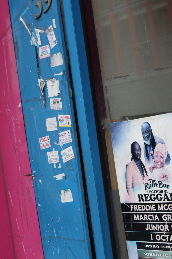
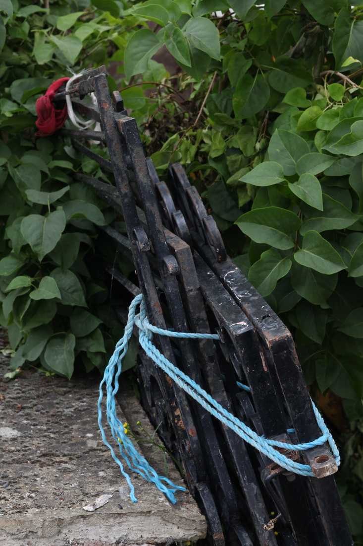
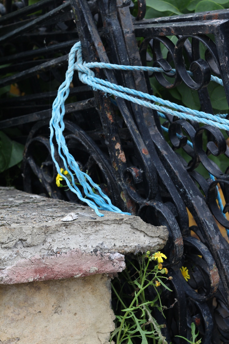
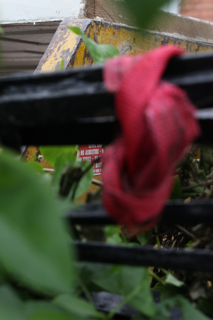
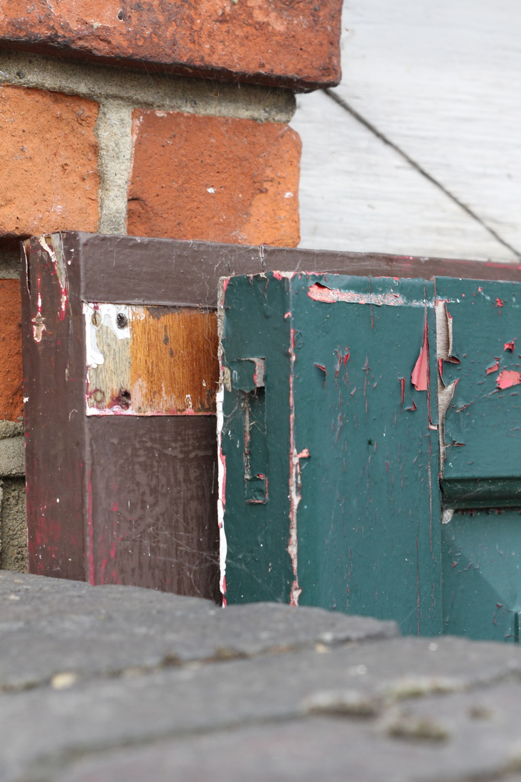
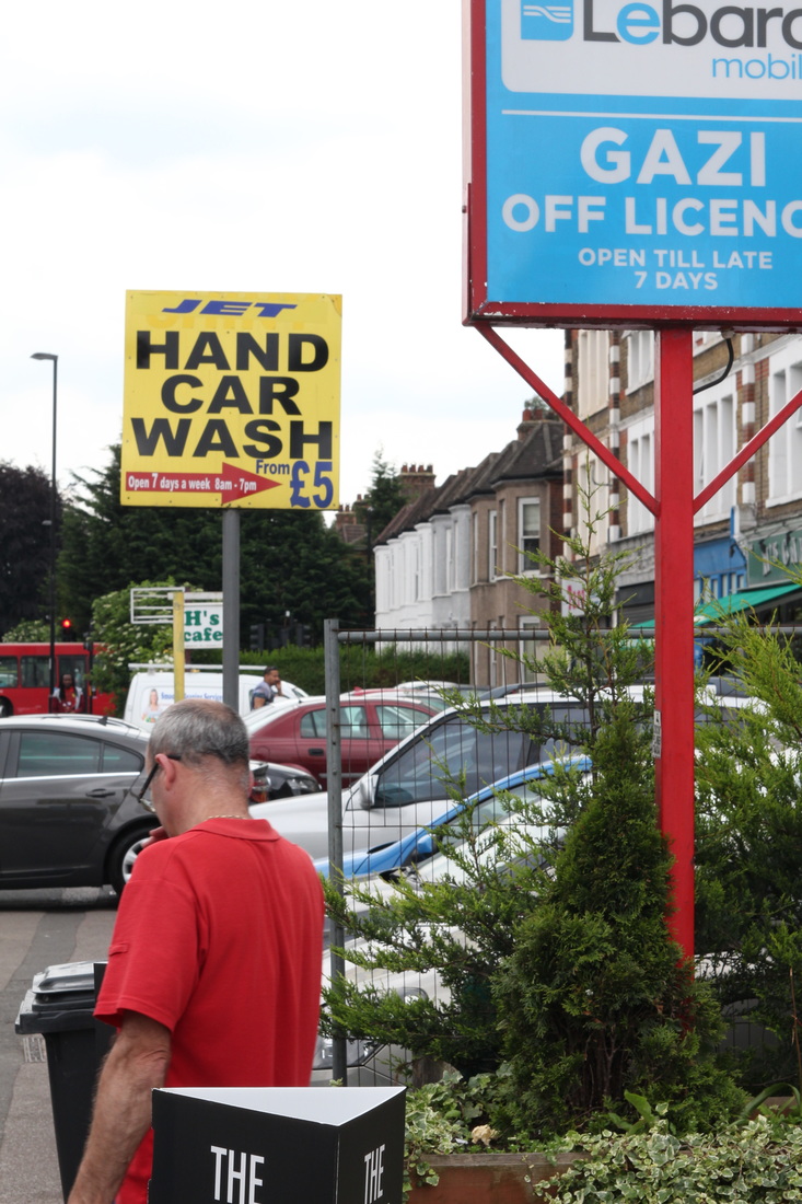

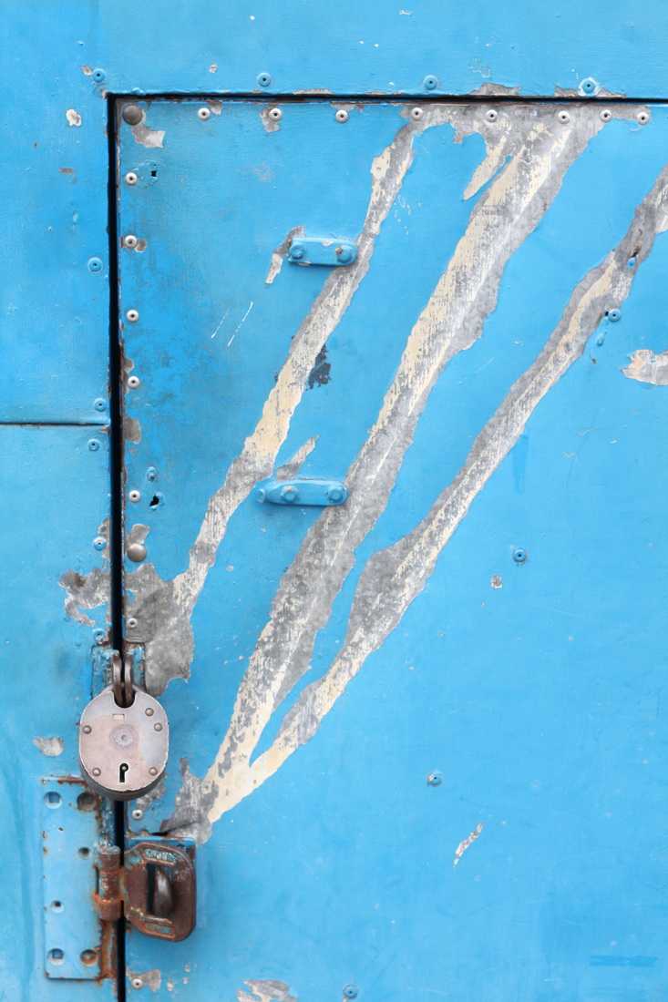
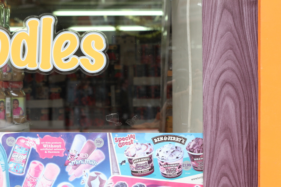
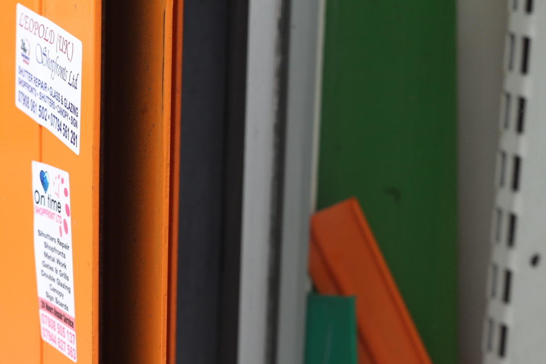
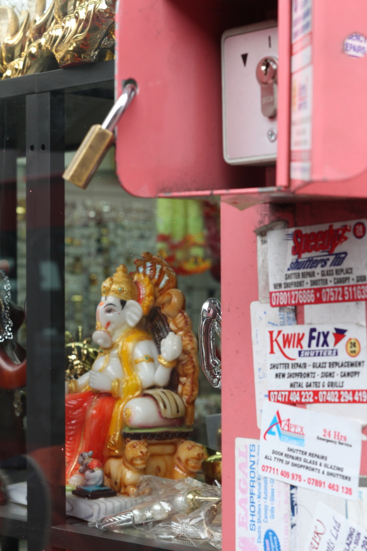
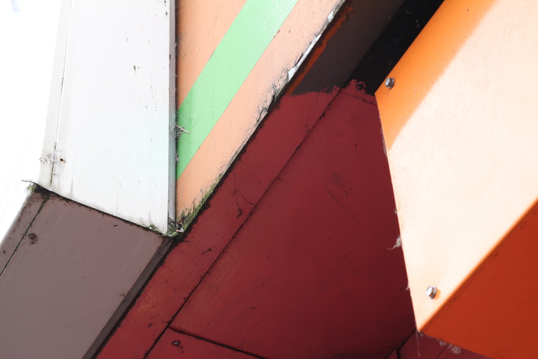
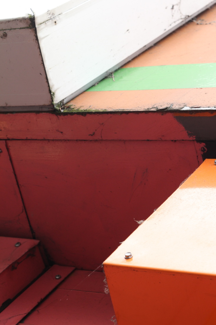
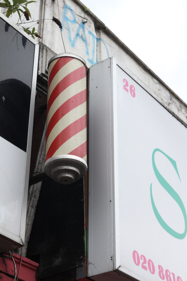
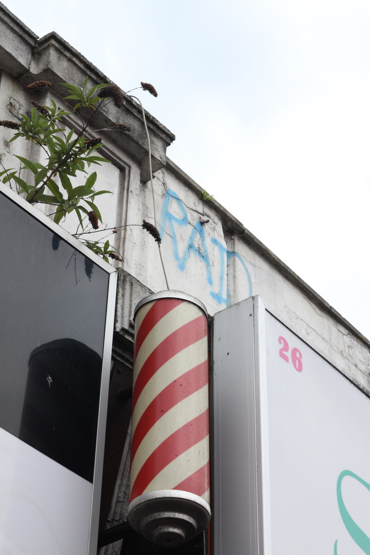
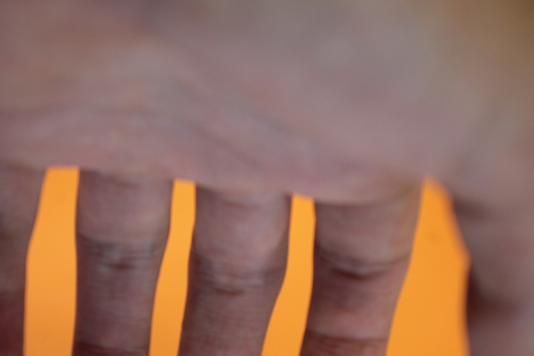
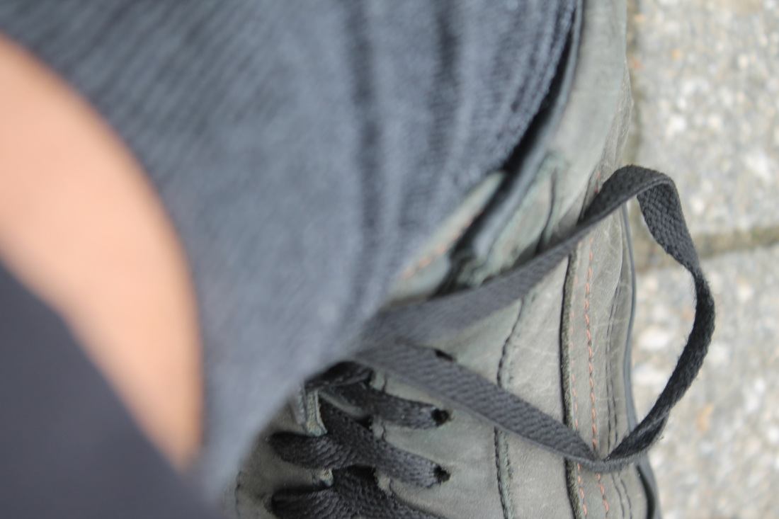
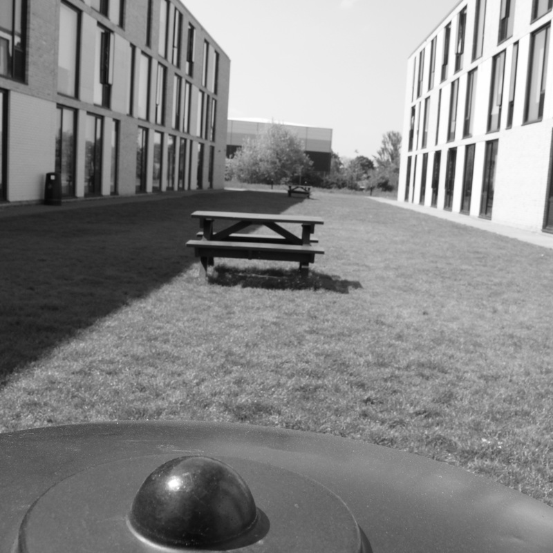
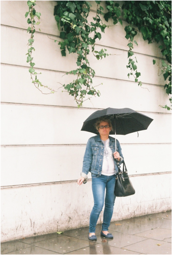
This series of images was taken in town as an experiment for the sole purpose, I now realise, to experiment with what colour and shapes I find my eyes drawn to. I did intend to edit these images, but on second thought, the subject matter I want to involve myself with I have not yet decided, thus I can use these images to analyse my own eyes. I find that when shooting around town, as is shown by these images, I am attracted to bright, unafraid colours, that clash and work well together, in essence allowing me, when I see them, to choose the emotion of the image carefully by the relationship of the colours I choose to include.
The shapes I tend to choose are also interesting. I tend to line up each image's composition in such a way that it is always parallel to the frame, which hints at a bit of am obsession with both symmetry and geometry. Geometric shapes have always been satisfying, whether that be in architecture, people or just compositional lines. I think that these two elements may weigh in heavily in this project, fitting the attitudes of the photographers I have already studied so far.
The shapes I tend to choose are also interesting. I tend to line up each image's composition in such a way that it is always parallel to the frame, which hints at a bit of am obsession with both symmetry and geometry. Geometric shapes have always been satisfying, whether that be in architecture, people or just compositional lines. I think that these two elements may weigh in heavily in this project, fitting the attitudes of the photographers I have already studied so far.
Hand-colouring
The hand-coloring, hand painting or overpainting of black and white photographs is defined and is in practice the manual addition of colour onto still black and white photographs to attempt to create realism and/or add artistic purpose. These images were popular for commercial purposes in the 19th century far before the invention of the colour photograph. Oils, watercolour and pastels were common candidates for mediums the colouring was done in, being applied to the surface of the photographically printed image using a variety of tools for different purposes, such as fingers, paintbrushes, or cotton swabs.
I believe that this is a technique and subject area that could be incredibly interesting to explore through the lens of modern photography, contrasting the digital, as this was in fact the equivalent of such a modern thing at the time. This coincides very cleanly with the aesthetics and colour theory Saul Leiter utilises in his photographic process, as I may colour as I choose, and in some sense perhaps recreate the types of colours possible to capture using Kodachrome film. Using this process could go in many different directions, such as:
- printing myself black and white images on film and colouring them as I saw them in real life
- using found prints and transforming them through the process
- experimenting with different paints, sometimes in the same image to observe effects.
- note down colours of each photograph I take and try to best describe it, then attempt to reproduce that realism using the process.
- introduce collage into the mix
- warp shapes through the colours, into either geometric abstraction or organic mixing colours between lines
- use the realistically coloured print to produce abstract block colour photographs
- choose the colours I want to use in the image, perhaps intending to produce certain emotions or links to time periods
- colour images in a way that makes no realistic sense, creating a surreal environment.
- use only two or three colours in the image and viewing the effect.
- print from found or destroyed negatives and colour them using a rule or simply intuition to create abstract pieces.
- test out using resists, and perhaps even the chemigram process in an attempt to create colour.
- black and white video could be coloured, like an animation with found imagery
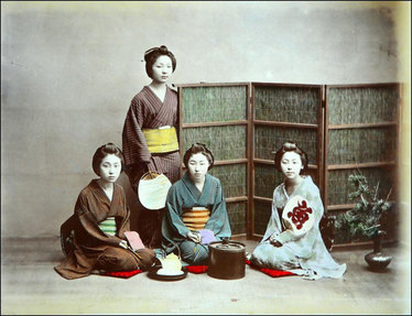
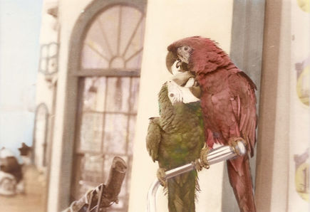
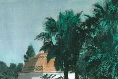
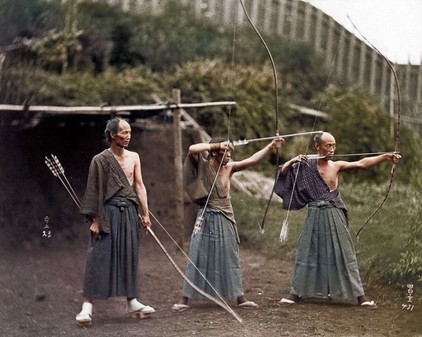
The photo above is an example of a hand coloured photo from 1886 by Adolfo Farsari. The technique was particularly popular in japan, and was used often in an attempt to form the closest images to the hyper real as was possible. In some areas, it was considered an art in itself.
This is a digitally coloured image that, regardless of not being hand coloured, demonstrates the power of the surreal effect colouring historical photographs can give, bringing them out of the abstraction and nostalgia of black and white and in some way into the present. Although, it may also serve as a reminder that photographs do not give us a window into the past and its reality, but in fact are ultimately abstractions, simply pixels on a screen, and may eventually become the communicative equivalent of what we consider the written word in describing reality in the future, which nowadays has far less communicative power than that of a photograph in describing real events. In essence, it reminds me that in some ways capturing true reality will always be futile, and in attempting to hand colour images, it highlights this fact very plainly in the context of the digital world.
This is a video of the process of hand tinting one man undertakes as one of the last professional hand-tinters, and gives an insightful view into the process itself, in technical terms. I hope to experiment with the process, using it in a hyper real way, trying to emulate the modern colour photograph to gain an understanding of it fully, and then move on to abstracting said photographs with colour, in essence changing the nature of the shapes in the image.
the photographer's gallery
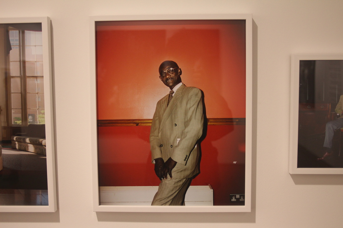
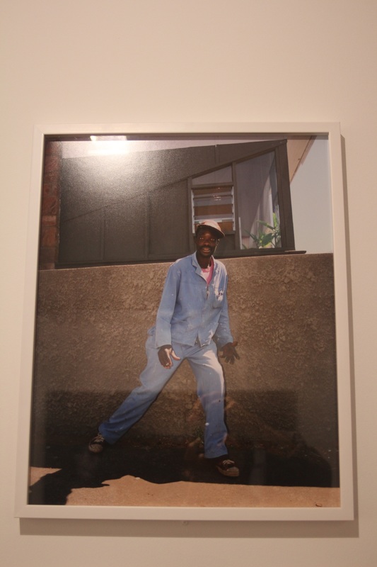
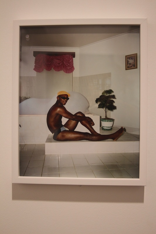
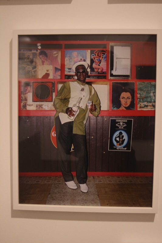
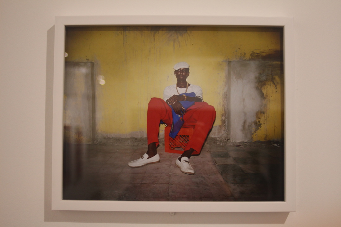
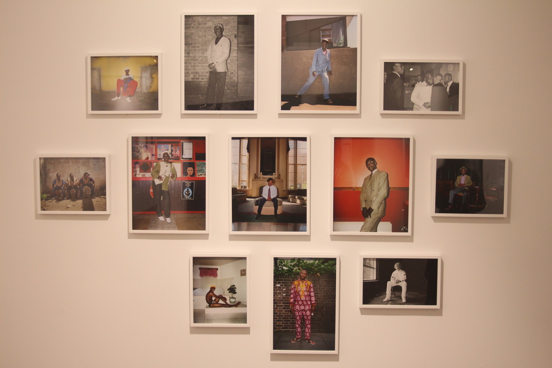
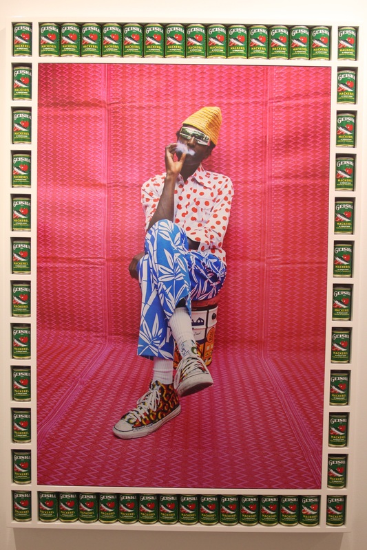
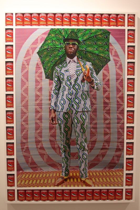
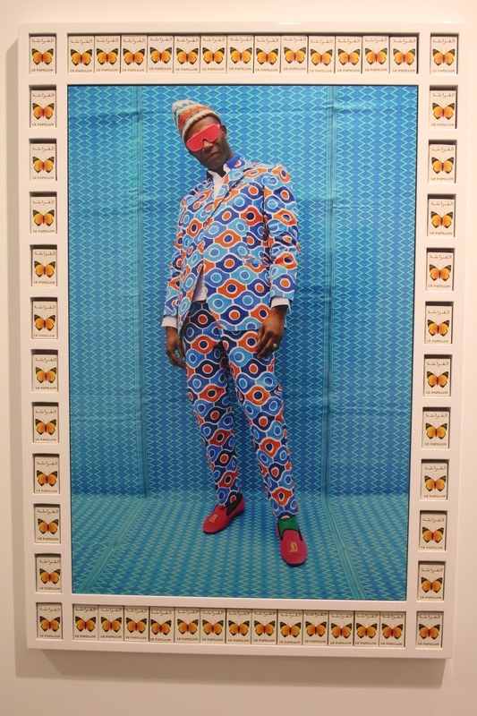
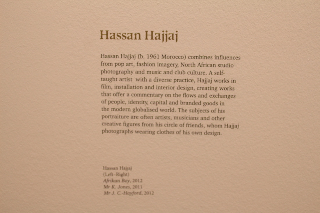
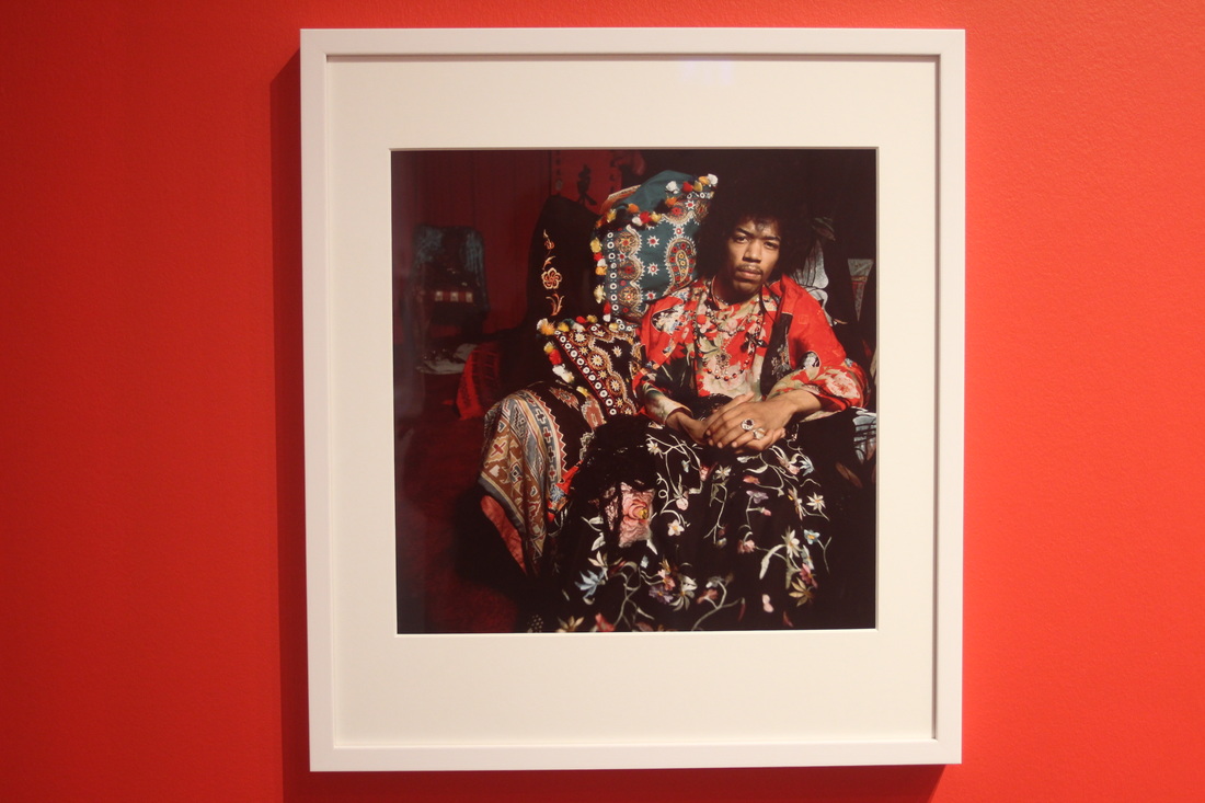
These images are from a trip to some recent exhibitions in the photographers gallery. I saw the work of a variety of different photographers in the exhibition on black masculinity, and I saw Terry Donovan's work within fashion, which I did not enjoy or feel particularly inspired by.
The exhibition on black masculinity I found to be somewhat interesting in the images of some of the photographers utilising interesting colour and patterns. However, the social commentary, although not uninteresting or unimportant, was not inspirational for me as I want to look more at the aesthetic rather than the social in this project. The curation of the show was very interesting however, such as including found objects in framing, and using collections of images as a collage framed against a wall. This visit however, does not make me wish to deviate from my current artistic intention in this project.
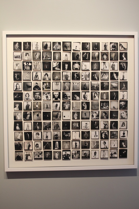
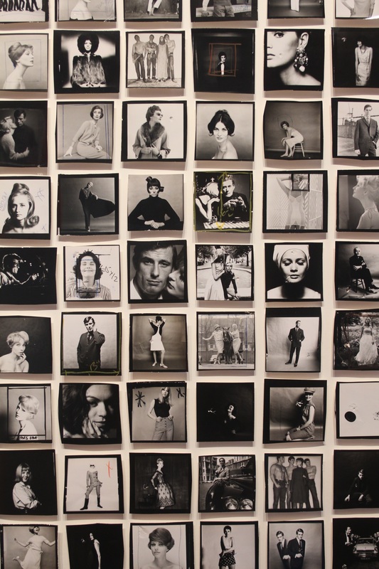
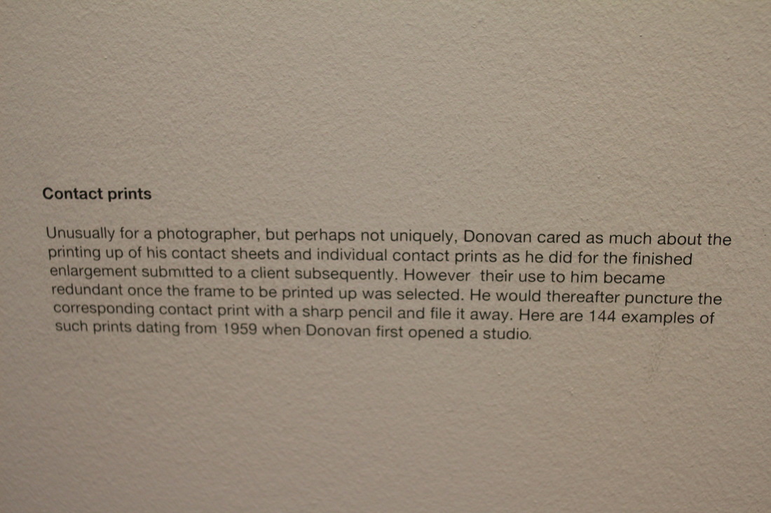
The Terry Donovan show I found very uninspiring generally, as it was largely commissioned commercial fashion photography which I do not enjoy and cannot draw much meaning from. There were things within the exhibits curation that I did find intriguing however, such as the use of contact sheets as framed artworks, and the changing of the wall colour from white to bright red.
The exhibition on black masculinity I found to be somewhat interesting in the images of some of the photographers utilising interesting colour and patterns. However, the social commentary, although not uninteresting or unimportant, was not inspirational for me as I want to look more at the aesthetic rather than the social in this project. The curation of the show was very interesting however, such as including found objects in framing, and using collections of images as a collage framed against a wall. This visit however, does not make me wish to deviate from my current artistic intention in this project.
The Terry Donovan show I found very uninspiring generally, as it was largely commissioned commercial fashion photography which I do not enjoy and cannot draw much meaning from. There were things within the exhibits curation that I did find intriguing however, such as the use of contact sheets as framed artworks, and the changing of the wall colour from white to bright red.
class curation task
These images are the result of a class in which in pairs we were asked to choose 5 images from a collection that has some sort of relation to an idea, motif or theme we could choose. We then layed these in an order. These orders were then stuck to a wall, each pair's images having to lead on to the following pair's so that a tracking film could be made from them. These are some images taken from those images on the walls, some combining two different photos into abstraction, producing interesting shapes and resulting interactions. I think that even ignoring the images themselves, the nature of the task is intriguing concerning processes in forming project ideas, such as cropping, using found imagery, curation, and the curated images' order and relation to one another. These are all things that need to be thought of within the project and are essential in many ways to its success when finished.
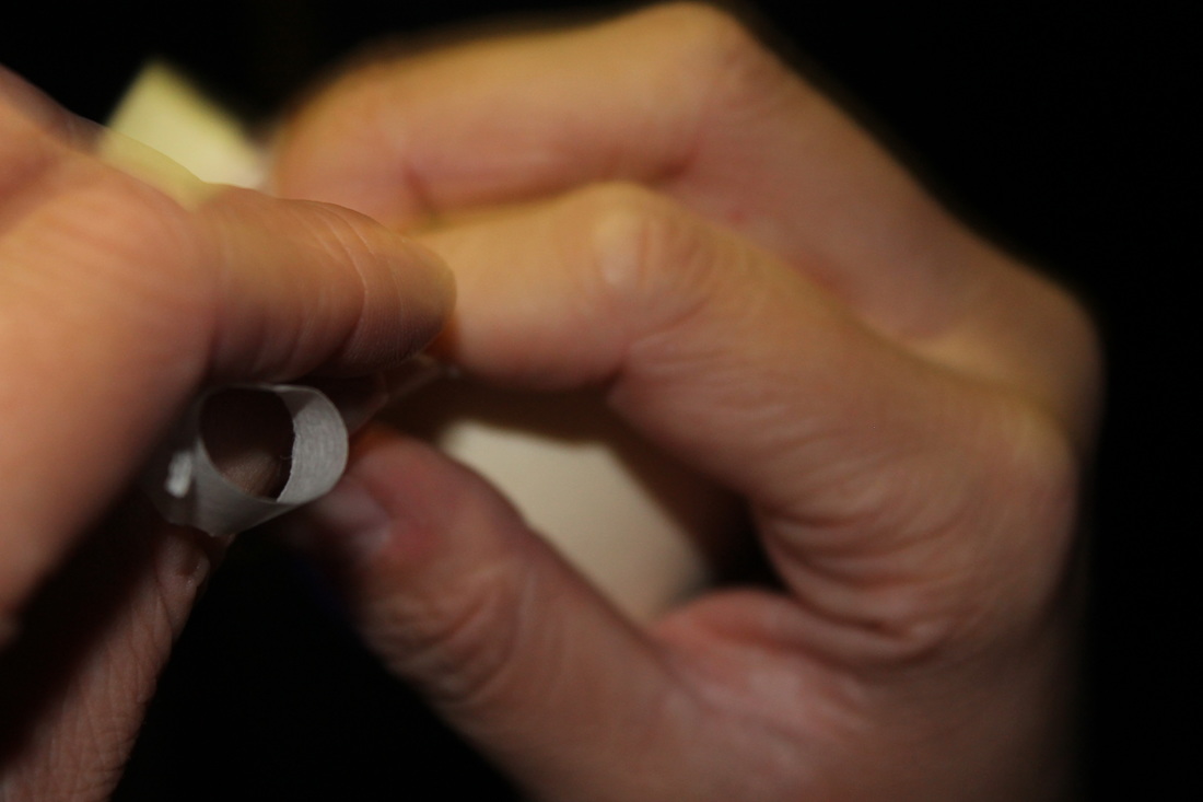
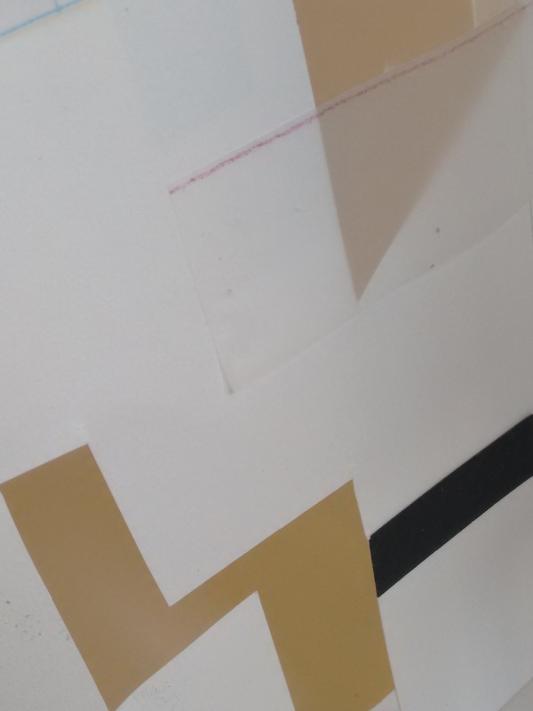
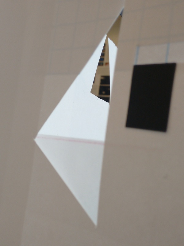
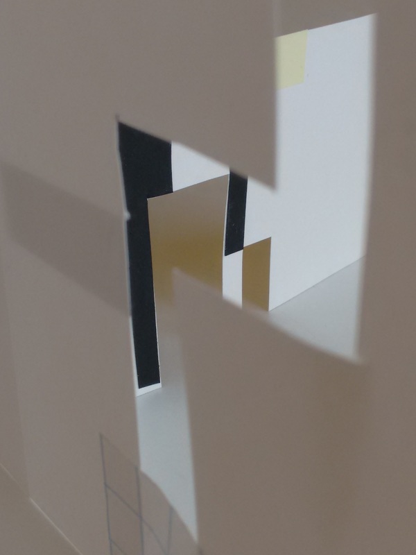
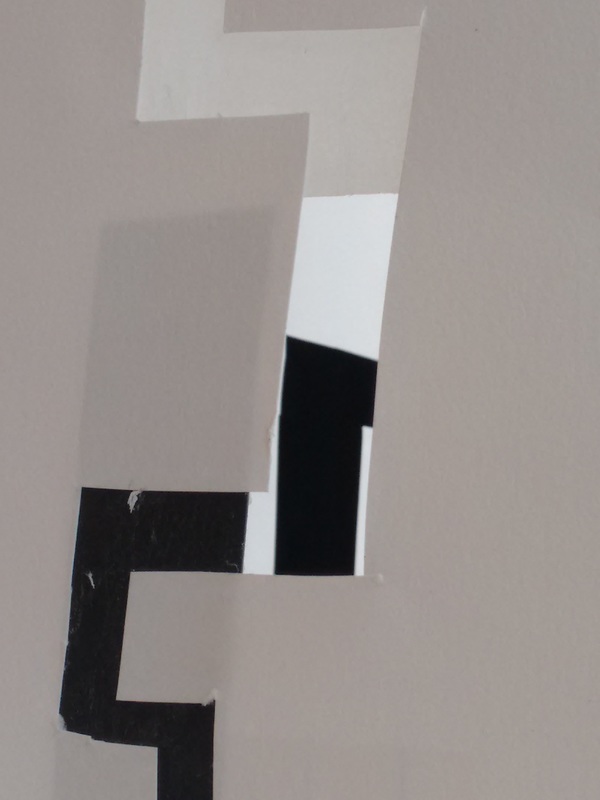
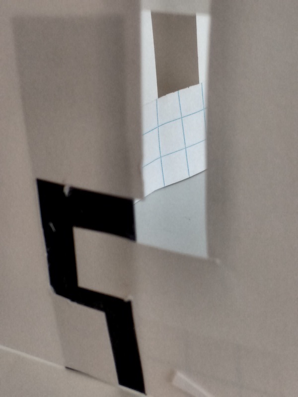
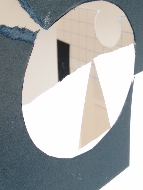
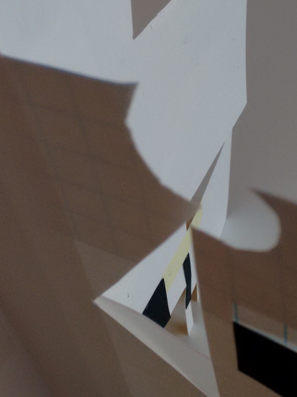
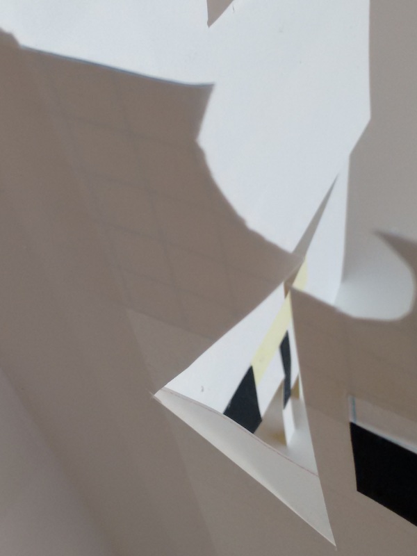
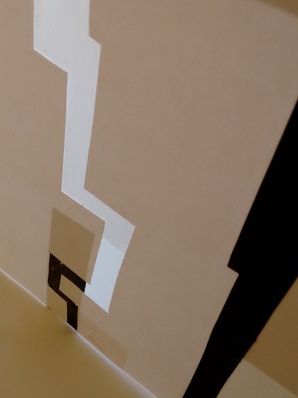
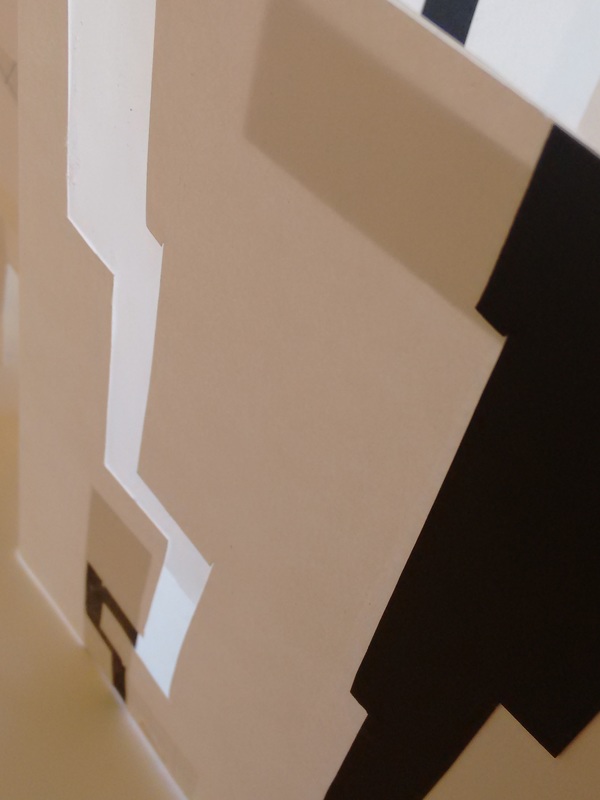
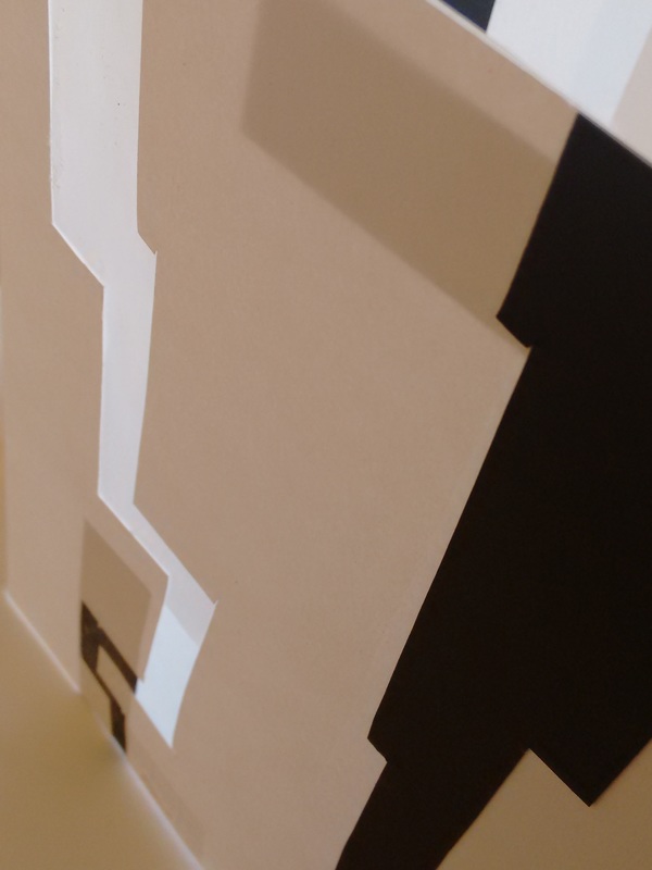
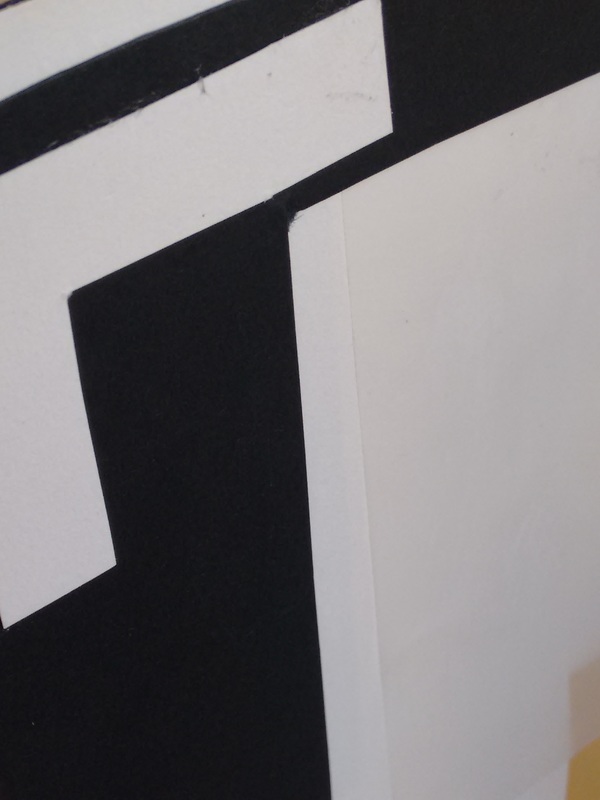
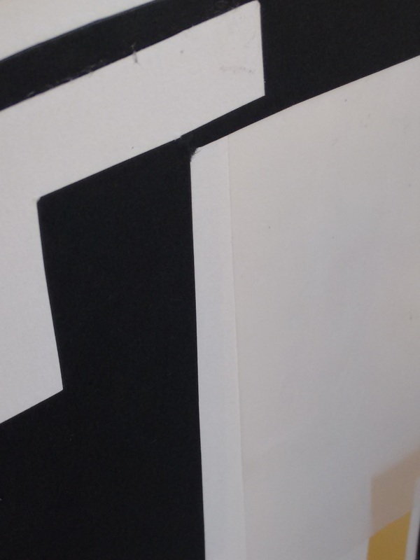
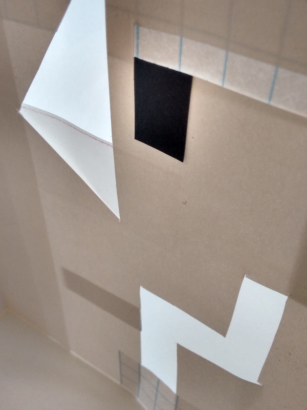
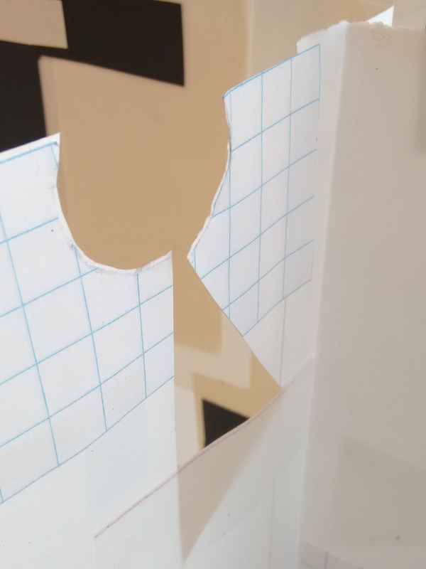
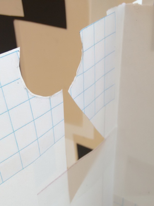
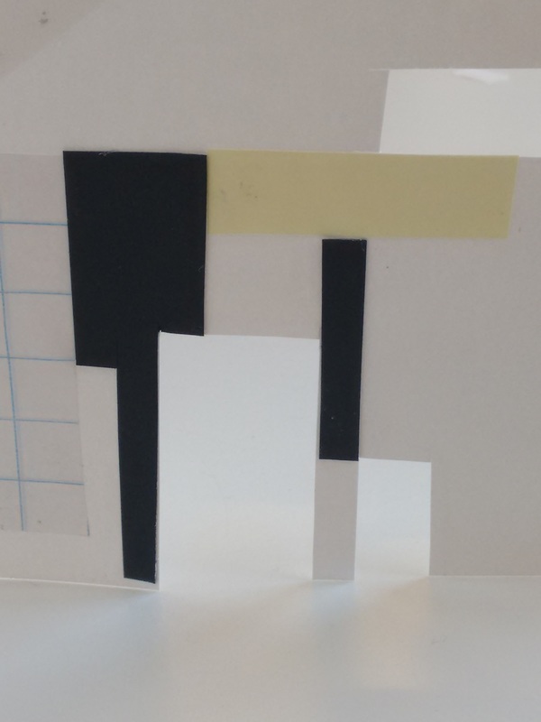
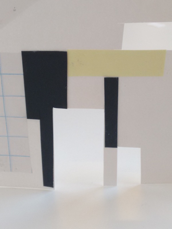
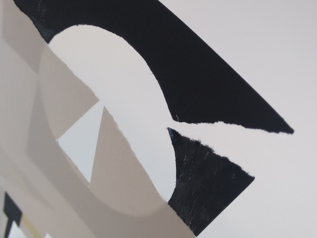
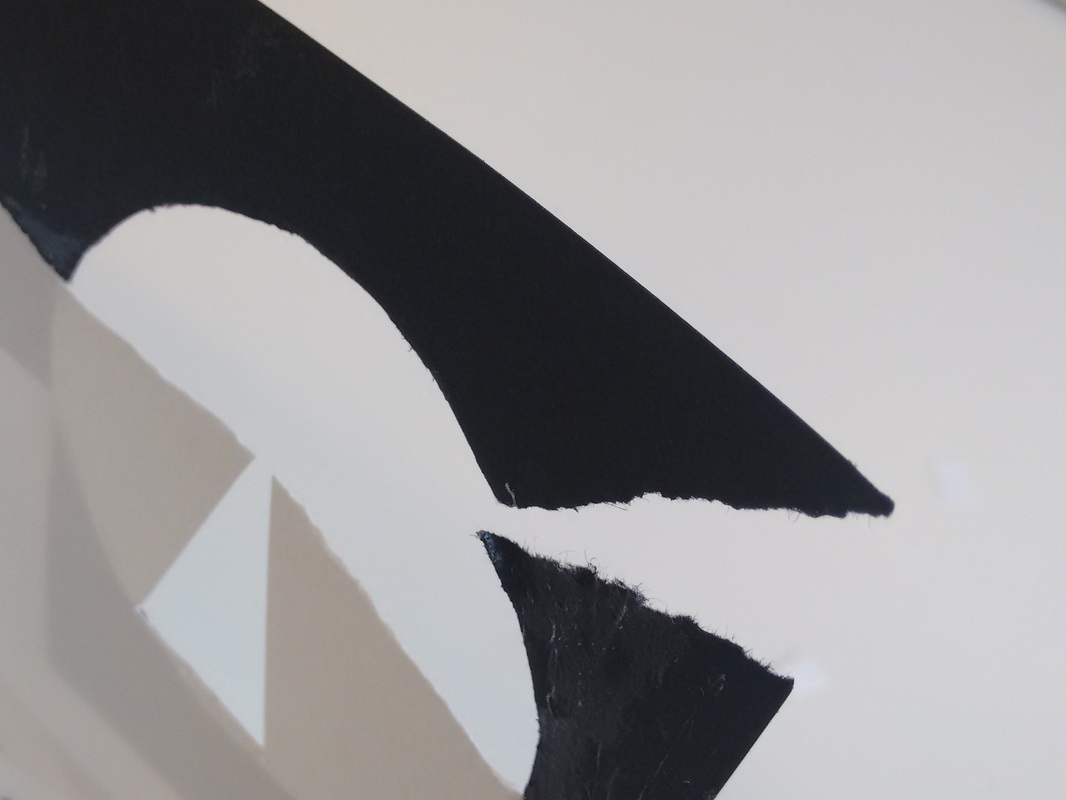
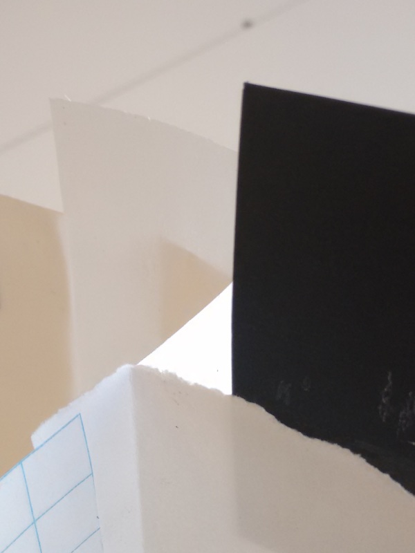
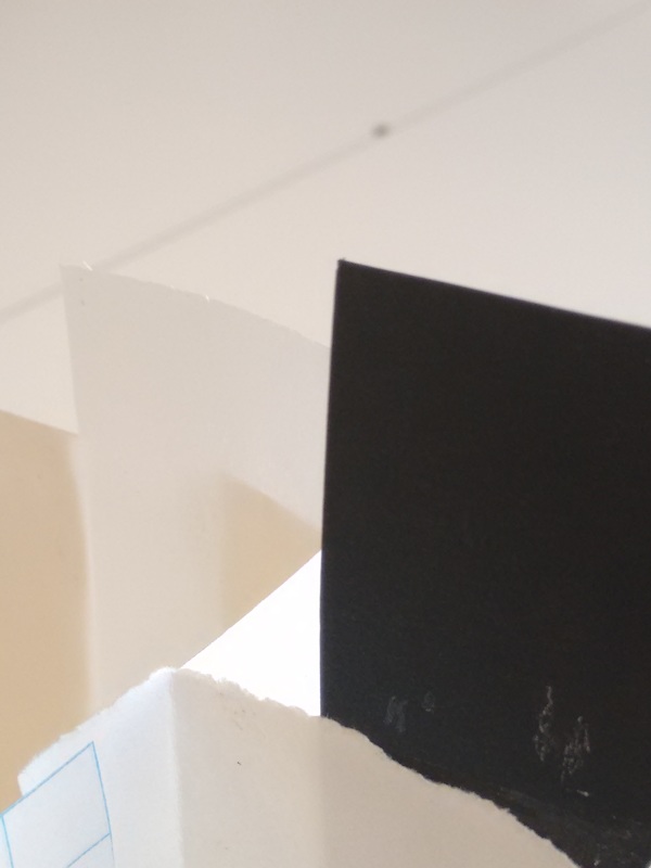
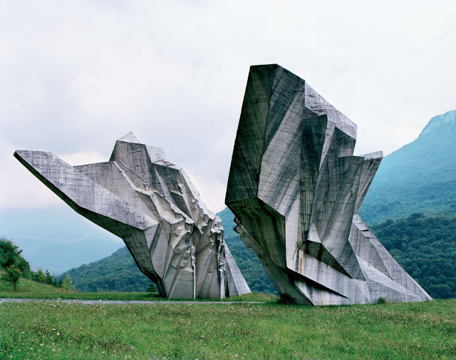
abstract paper sculpture
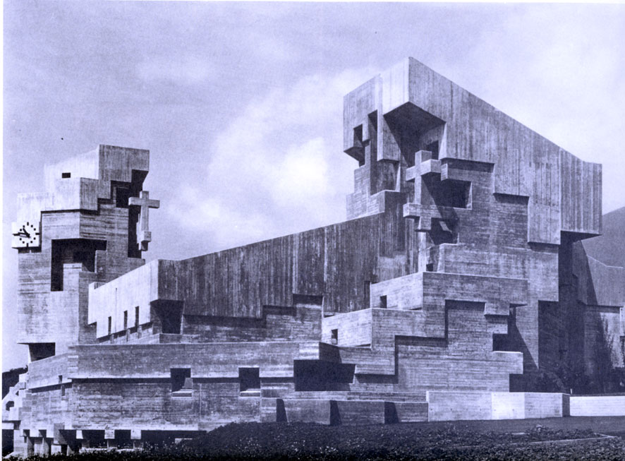
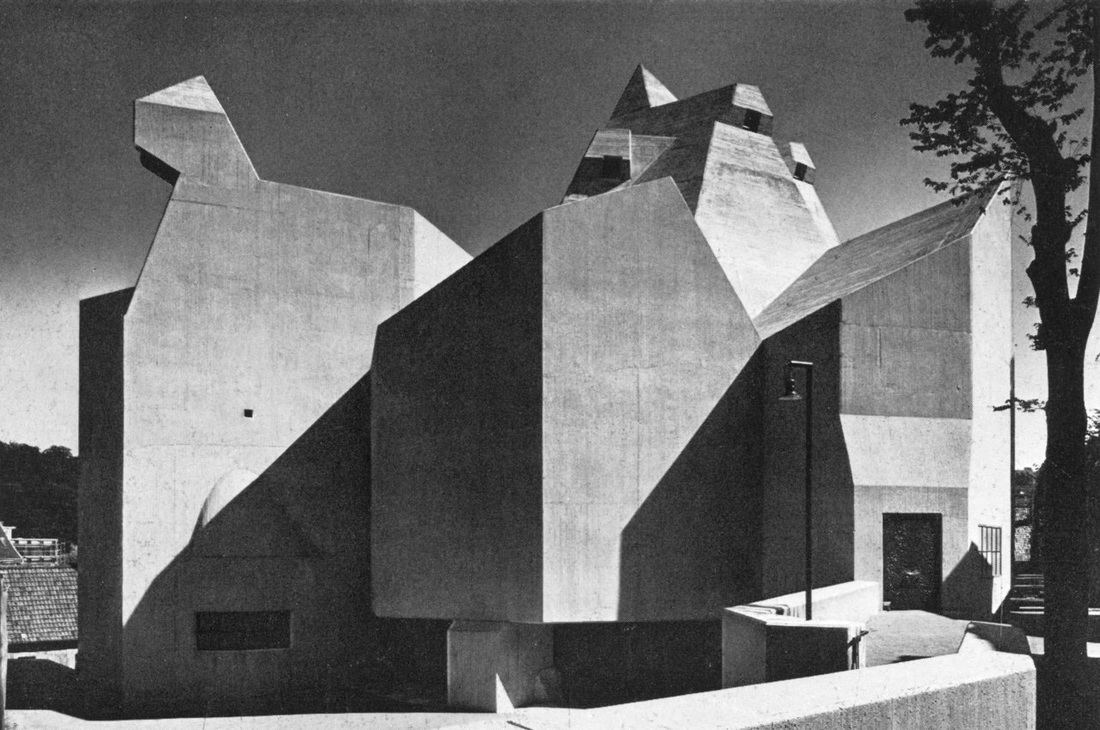
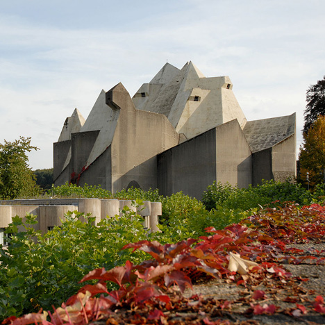
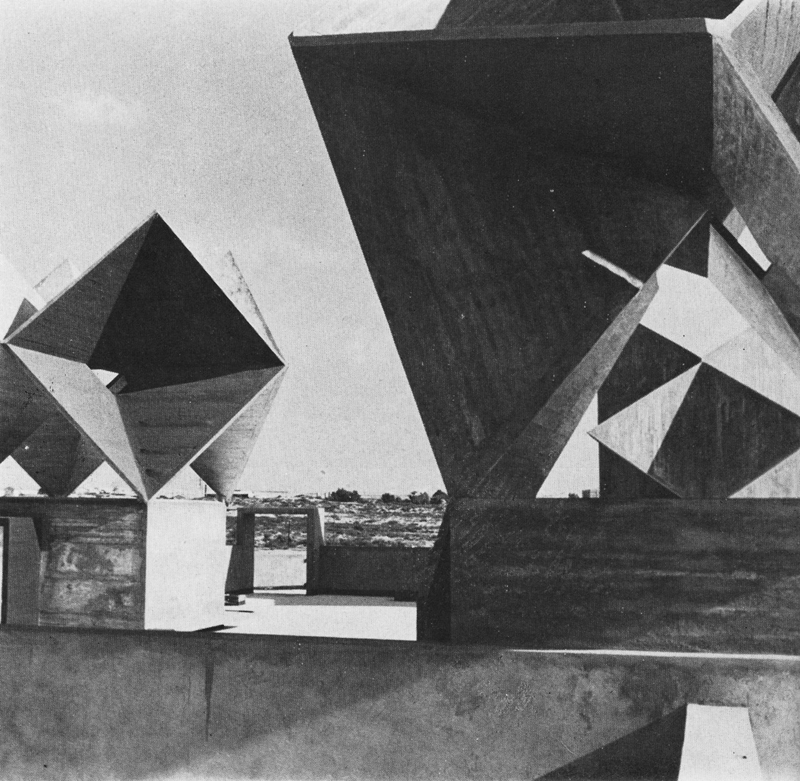
brutalism
links: http://www.dezeen.com/brutalism/
http://www.slate.com/blogs/the_eye/2015/08/13/brutalist_architecture_a_case_for_hulking_concrete_buildings_from_roman.html
http://www.cracktwo.com/2011/04/25-abandoned-soviet-monuments-that-look.html
http://davidumemoto.com/soma-cube-ix
http://www.billleslie.co.uk/Films/Index.html
http://www.slate.com/blogs/the_eye/2015/08/13/brutalist_architecture_a_case_for_hulking_concrete_buildings_from_roman.html
http://www.cracktwo.com/2011/04/25-abandoned-soviet-monuments-that-look.html
http://davidumemoto.com/soma-cube-ix
http://www.billleslie.co.uk/Films/Index.html
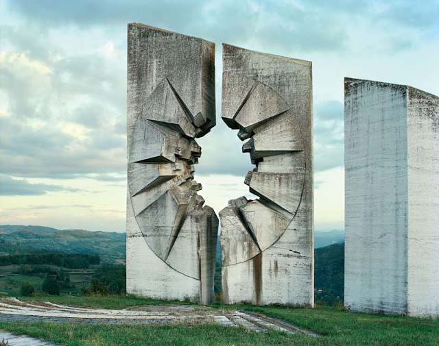
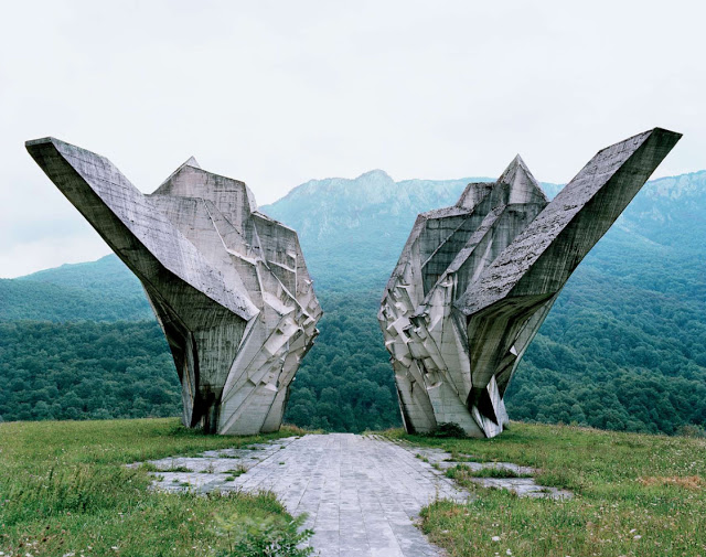
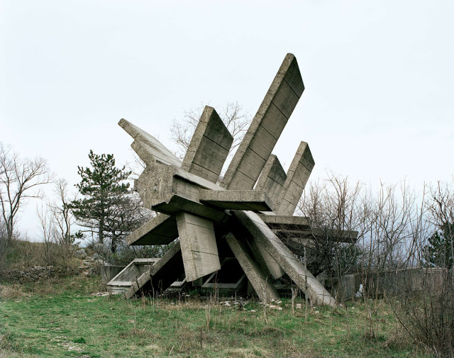
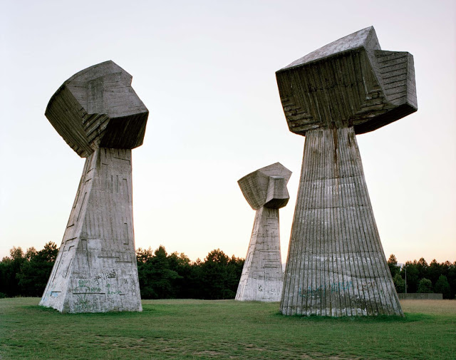
architecture
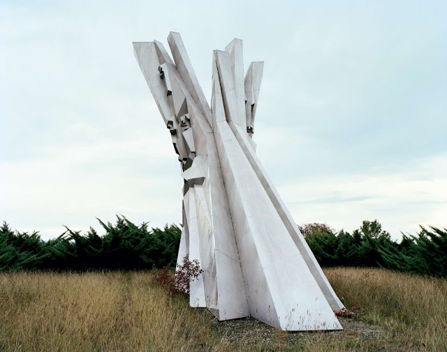
monuments
Bill leslie
david umemoto
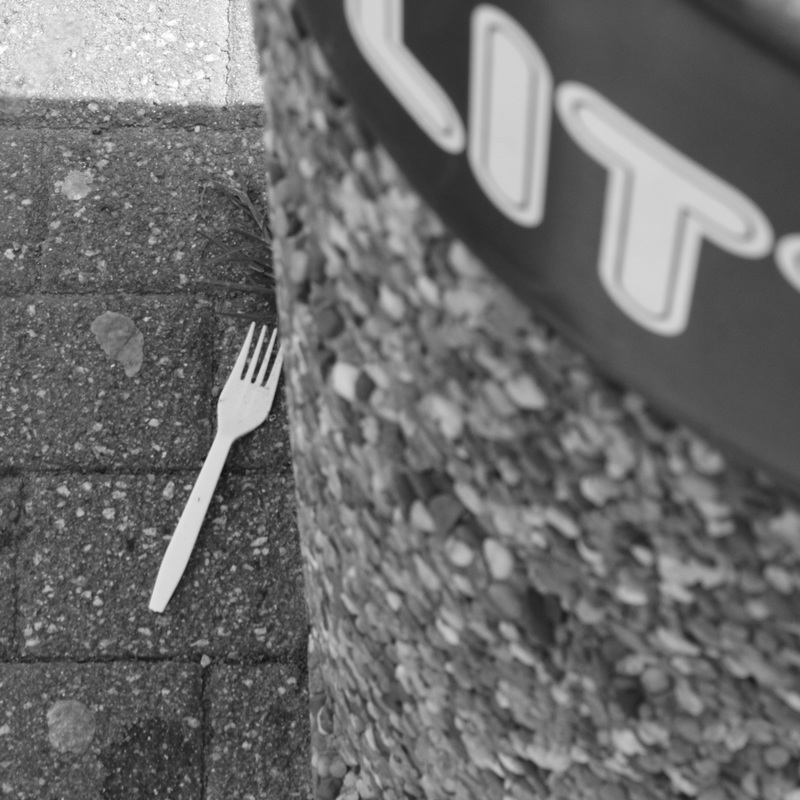
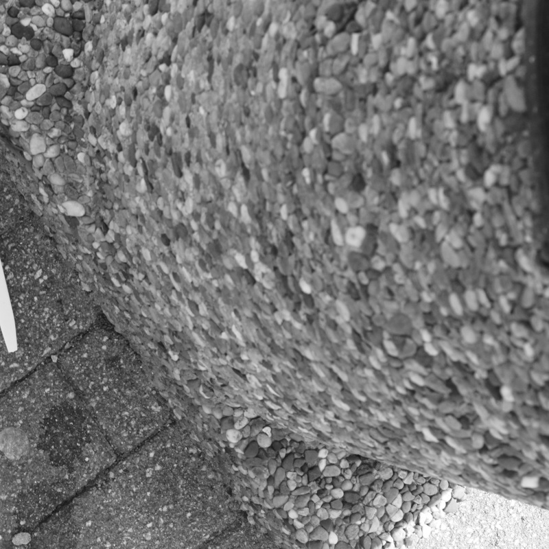
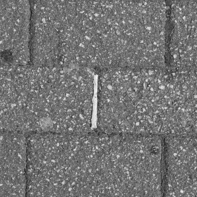
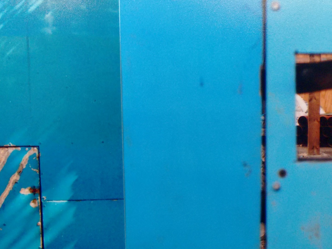
randomized tasks
a print in odd places
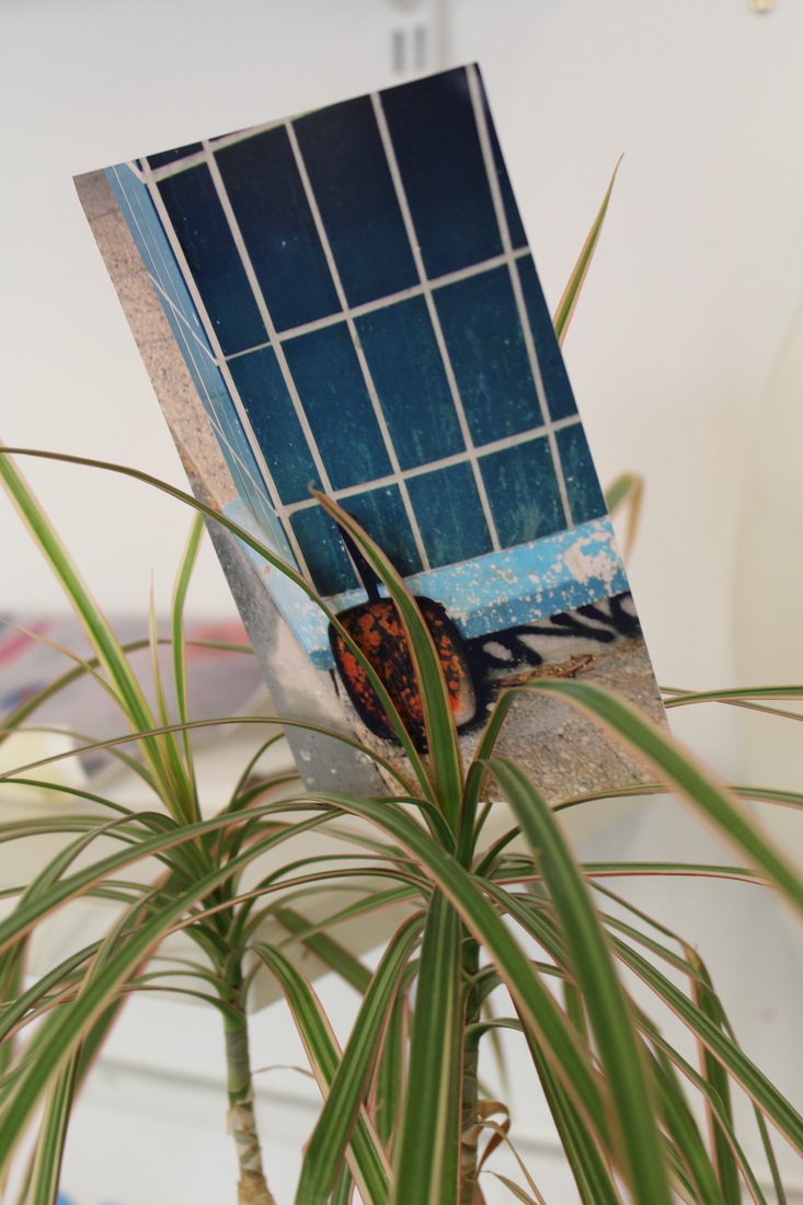
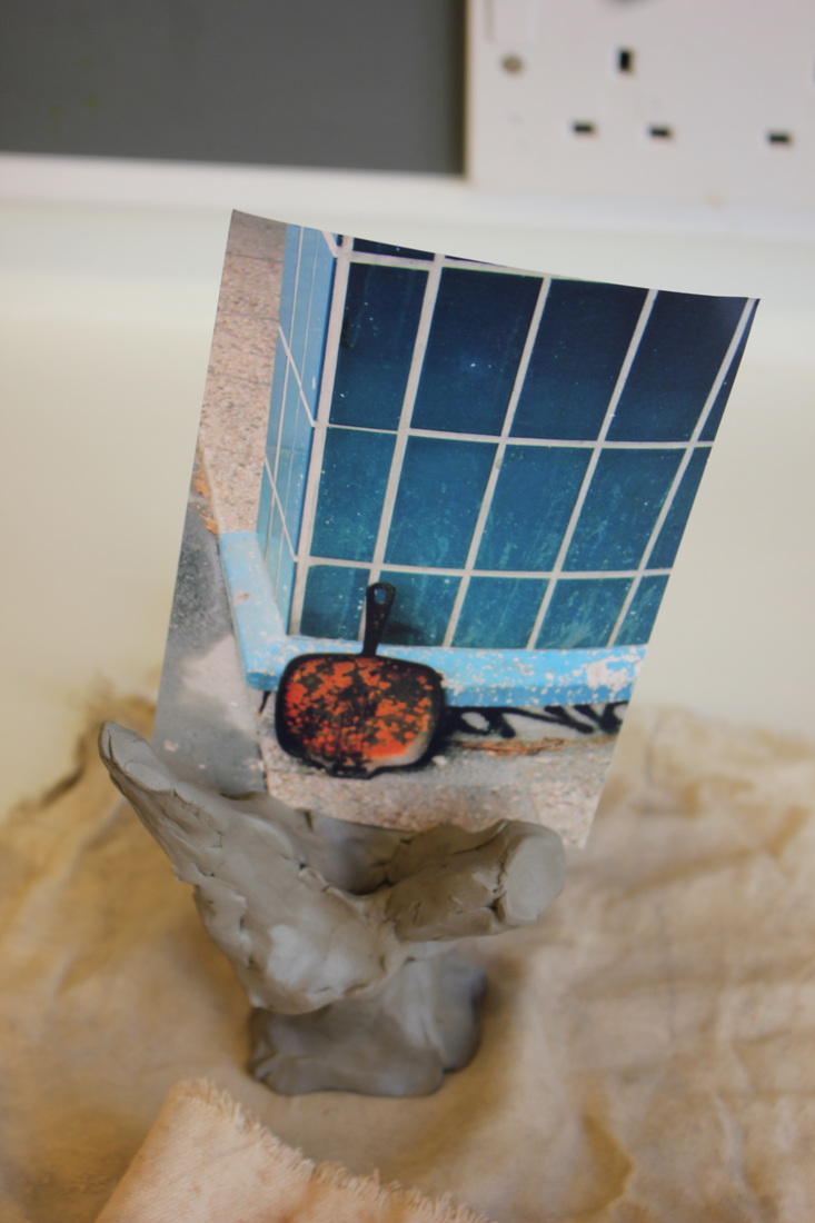
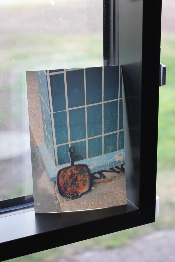
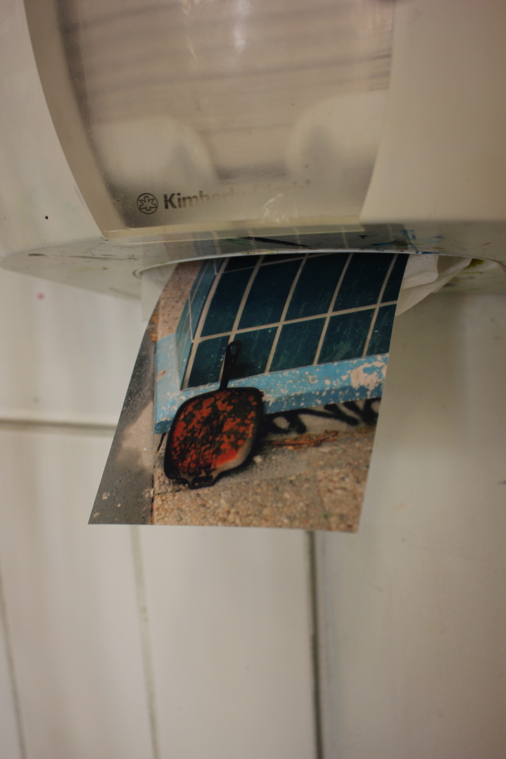
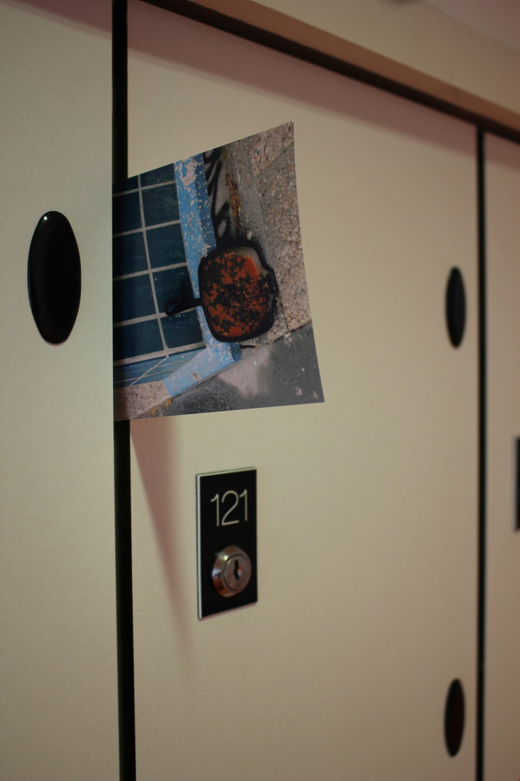
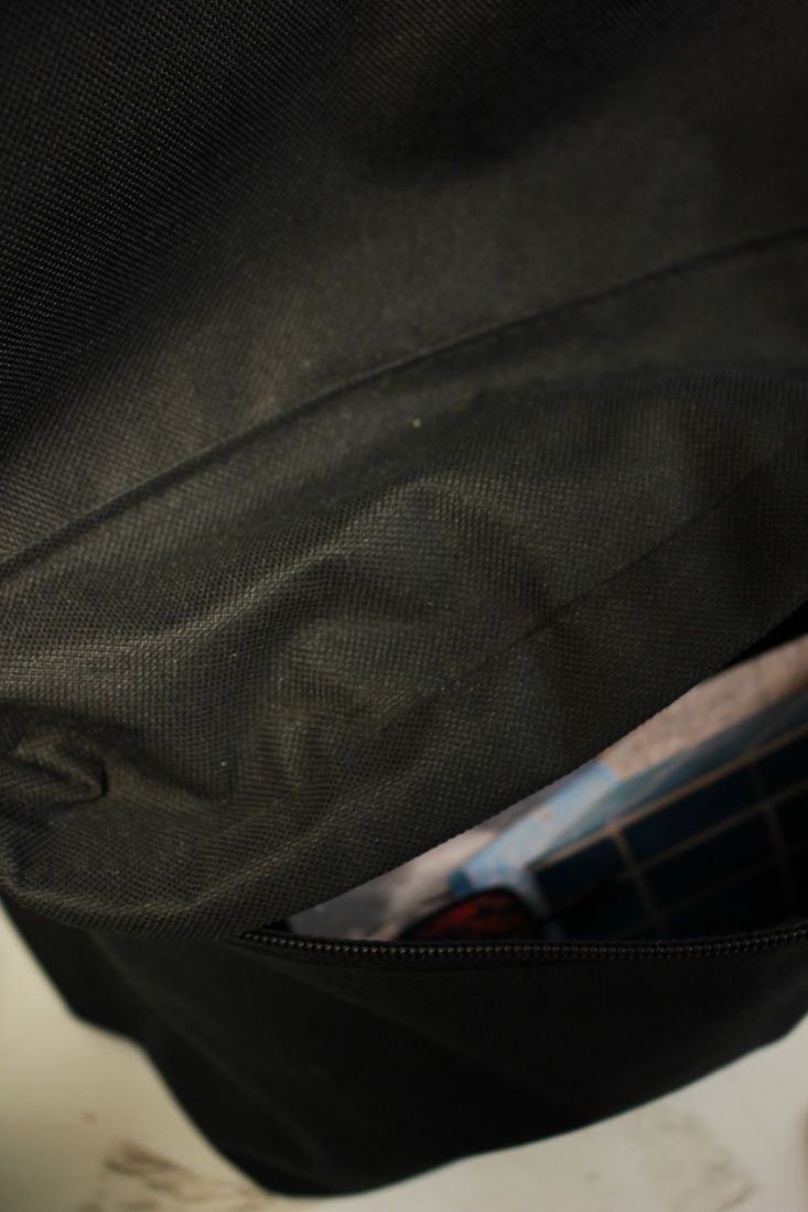
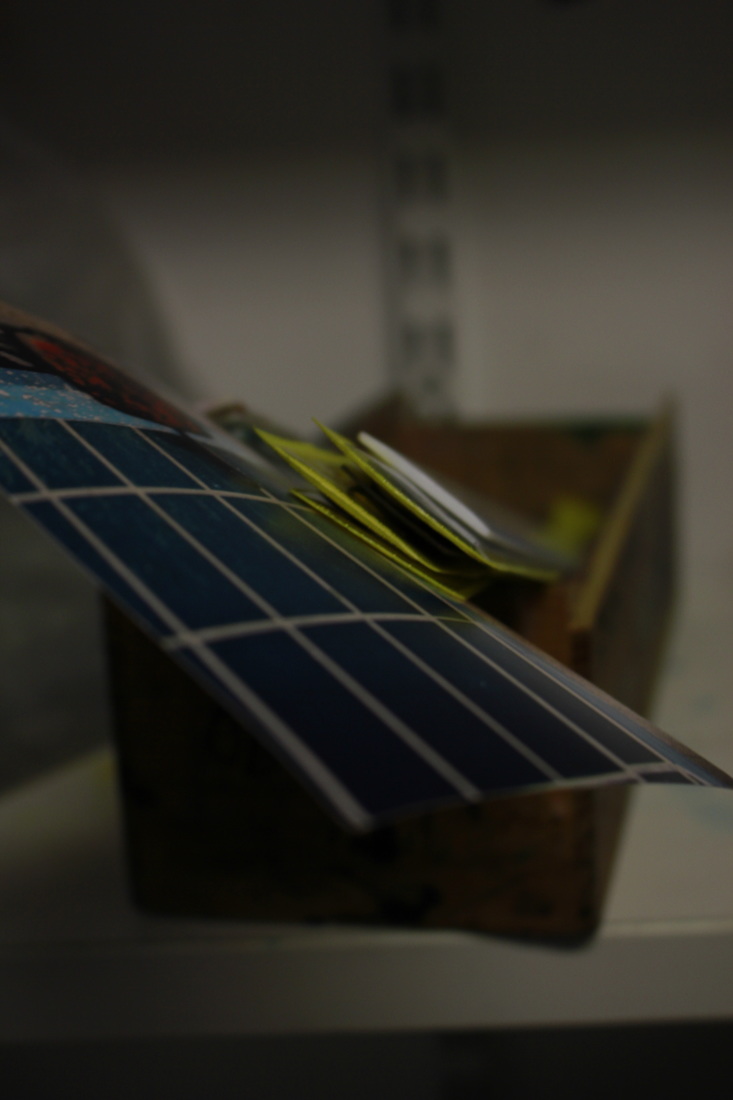
task to take photograph of photograph in odd unexpected places