Cameraless Photography
taking an image without a camera
The image I have taken is of two filing cabinets.
The light quality in the image is soft, coming from under the blinds beside them and covering around one third of the image, diffusing with soft light shadow at the top. Texture in the image is not very noticeable or prominent, the only textures being smooth painted walls and metal. The angle of view in the image is straight on but from a left angle and slightly below eye level. The angle of it is not emotive, but does draw to attention the light source and reflections in the image. Many parts around the image were not included, such as the laminated cards above the cabinets, which would have changed the texture and light in the image. The framing in the image is also used to draw your attention to the way the light falls upon it, rather than the subject itself. This photograph is in colour, however everything in the image does not contain significant amounts of colour. However I do believe it could be improved by converting it to black and white as it would draw more attention to the geometric shapes, light, tone, line and composition.
The light quality in the image is soft, coming from under the blinds beside them and covering around one third of the image, diffusing with soft light shadow at the top. Texture in the image is not very noticeable or prominent, the only textures being smooth painted walls and metal. The angle of view in the image is straight on but from a left angle and slightly below eye level. The angle of it is not emotive, but does draw to attention the light source and reflections in the image. Many parts around the image were not included, such as the laminated cards above the cabinets, which would have changed the texture and light in the image. The framing in the image is also used to draw your attention to the way the light falls upon it, rather than the subject itself. This photograph is in colour, however everything in the image does not contain significant amounts of colour. However I do believe it could be improved by converting it to black and white as it would draw more attention to the geometric shapes, light, tone, line and composition.
|
taking the imageThis the photo taken by my classmate Toby in an effort to replicate the exact image I described above. I believe that it has been replicated very accurately, almost exactly, to the point at which I find it hard to find fault with it, as the light in the image is identical to when I described it.
Although, perhaps the eye level could have been lowered slightly, and moved to the right by a small amount. |
Man ray
|
Man Ray was an American, born in Philadelphia and worked some jobs before committing to art and photography as a profession. Between the 1920's and 30's, he was one of the pioneers of new photographic techniques such as rayographs and solarisations. He was also known for his extensive use of spiral motifs within his work, and the creation of rather surreal and centered images. |
Man Ray is a perfect example of a master of the technique and skill of creating photograms. The technique of creating photograms is simply using an exposure from an enlarger in the darkroom onto photographic paper, then any object that has opacity, or changes the direction of light, when placed upon the paper beforehand, forms an image. This is then developed in the darkroom similarly to a print.
Man Ray's images are often associated with that of surrealist art and photography, as he was one of the primary movers of the concepts behind the movements of Surrealism and Dada. His photograms reflect this, often seeming collage-like and using composition and objects that common to create something purely abstract and incoherent. To respond to Ray, I would like to |
MOHOLY NAGY
|
Moholy Nagy was a Hungarian photographer, painter, and many other things, who was also a professor at the Bauhaus school of the arts. He was influenced by the idea of constructivism and was very keen on the idea of the integration of art and technology. He used photograms as a medium extensively and is known well for his body of work.
Nagy's photograms contrast Man Ray's heavily, often being more minimalistic and individually stylistic changing from photogram to photogram. He employs the use of scale, angles and common Bauhaus tropes of mechanical objects of the modern day. |
It would also be useful to note their careful use of composition, Nagy used very varied and spread compositions, while Ray used centered and collected ones, both of them however, often not having too many objects or any out of place, creating clean and visually pleasing images, which are often surreal and composite, creating something new out of separate elements exposed to light. From viewing their work and researching it, I would like to incorporate both of the great attention they payed to shadows and how it would affect the outcome of the image, due to the use of angles. |
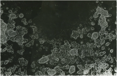
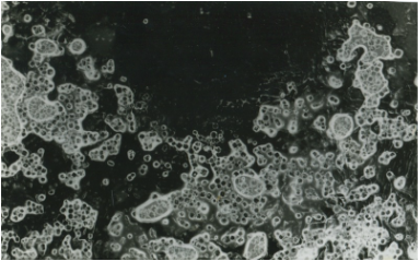
photogram tests
|
|
|
These are a series of photograms I took when learning the process. They decrease in exposure as a series. Each was taken with three seconds of exposure, the first with an aperture of 2.8 and the other two a successive stop down each. Using different variants in exposure in photograms is an altogether different dynamic to when taking photographs. It can be used strategically for effect to define and obscure different parts of the image, as shown above, rather than more than often looking wrong when using a normal camera.
chemical experiment
This was a photogram/chemigram which I created with the usual photogram process with some of the object dipped in developer before the exposure. I think it came out in an interesting way, as you can almost see the liquid around the items. However, I'm sure that I will learn and experiment with chemigrams in more depth in the future.
cylinder and pens
|
|
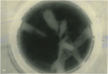
These are two other experimental photograms I created. To create this effect I used a measuring cylinder and filled it with pens and pipettes. On the first image, it did not even show as it was too underexposed and the items were all translucent. When I stopped it down, I got the second image, which turned out rather surreal.
watches
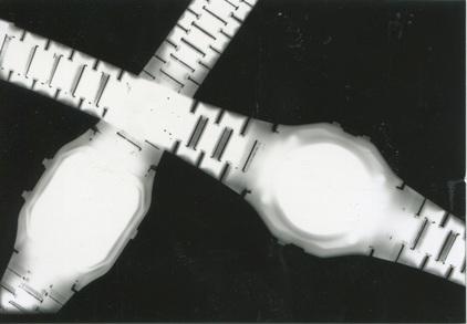
This is was my first photogram and was purely for experimentation purposes. However I believe it was very successful for a first attempt, although a little overexposed, the watches form a nice texture and shape.
man ray and moholy nagy responses
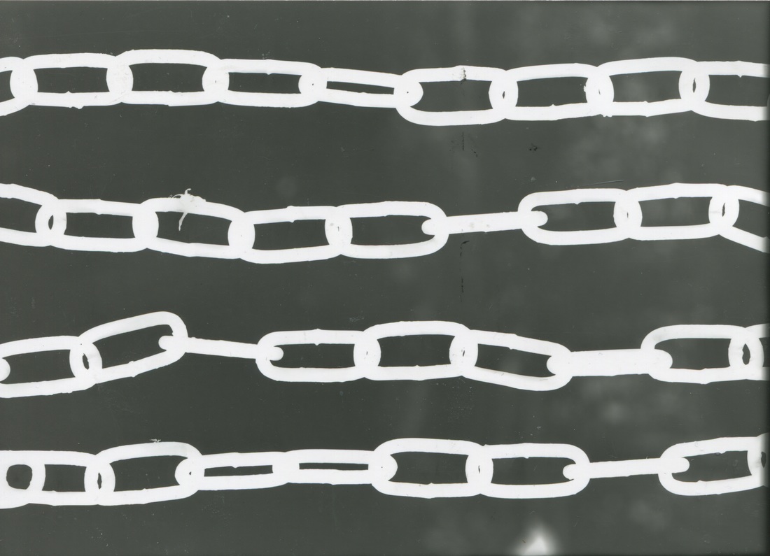
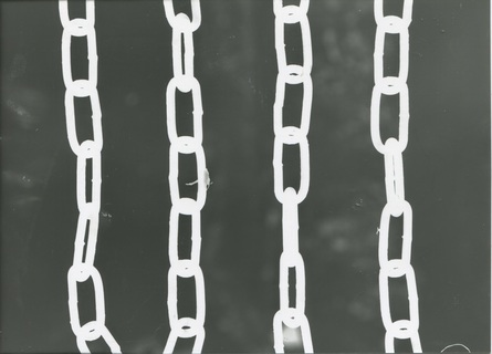
chains
|
|
These were the first photograms I created in response to the artists whilst still attempting to get to grips with the process. I attempted to create them as symmetrical and equidistant as possible, to keep them simple and to make them aesthetically pleasing.
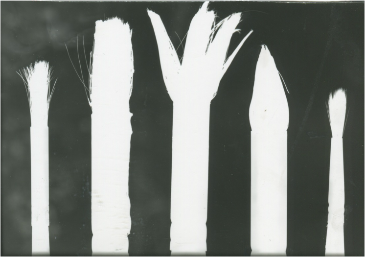
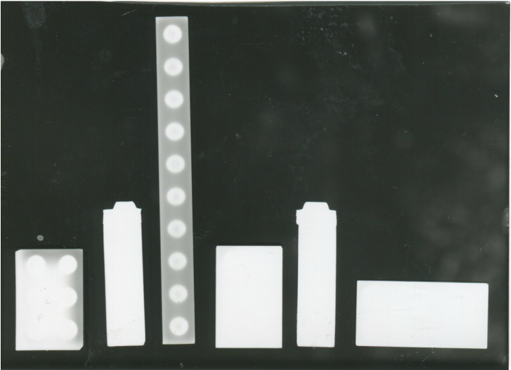
order
|
|
These were some photograms made in an attempt to organise found objects categorically. The first image is of paintbrushes found in the darkroom, and the second composed of lego found upon the darkroom floor dropped from a previous workshop. In ordering things that are often in disorder, but should be in order, they creates a feeling of satisfaction for the viewer and a simplicity that is easy to interpret and look at. The order also allows comparison between objects that are usually seen as exactly the same under their umbrella term, exposing that they are in fact very different.
I think these are successful responses as they are very clean and ordered, and beautiful in that way, as they are in almost a perfect order and are very similar in style to Moholy Nagy's Bauhaus influenced works.
I think these are successful responses as they are very clean and ordered, and beautiful in that way, as they are in almost a perfect order and are very similar in style to Moholy Nagy's Bauhaus influenced works.
cassette
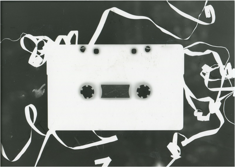
This is a photogram created using a cassette and the cassette tape coming spiraling from it. I believe this photogram responds to Man Ray and his rather surreal photograms, as the tape creates both a patterned and random effect across the image.
The reason why this image is so successful in my opinion is that the hard lines of the cassette contrast heavily with the random and very organic forms of the tape, the tape almost decorating the shape of the cassette. |
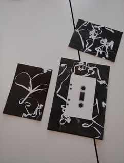
This is an image I took luckily of photograms I made to have as a triptych with the cassette photogram. I believe the two extra images complement considerably the center image by having a similar but very different form and line, perhaps being good for display.
|
paper curls
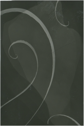
This is a series of experimental photograms I made using small curls of paper. They are in one sense tests, but also experiments for ideas. This photogram on the left was simply curls on their own and at the same height. They produce a pleasing image, as they flow along the image compositionally, resulting in nothing distasteful, but are not yet very interesting at this point.
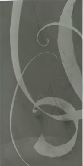
This photogram applies the same aesthetic choice of the previous, yet some parts of it are intentionally out of focus. This was done through layering them, leaning upon one another when the photogram was made, and therefore resulting in depth in the image due to the lack of focus and therefore juxtaposed clarity of the small and thin areas in focus.
This last photogram took the experimentation to an extreme. I used different shapes, more geometric and angular ones, even though they were ripped, to contrast the thin wavy lines and shapes produced by the previous style of paper curl. This produces a collage, if you like, of shapes and results in a rather abstract and experimental image which is enjoyable to attempt to decipher.
The use of these experiments is that they have given me ideas to experiment further using paper in photograms. Specifically after seeing the writing on the photogram on the left's print, that had printed through the paper and upon the photogram, I wanted to therefore experiment with images instead, to extent the possibilities of putting an already made image through another process to warp and abstract it within a new context.
The use of these experiments is that they have given me ideas to experiment further using paper in photograms. Specifically after seeing the writing on the photogram on the left's print, that had printed through the paper and upon the photogram, I wanted to therefore experiment with images instead, to extent the possibilities of putting an already made image through another process to warp and abstract it within a new context.
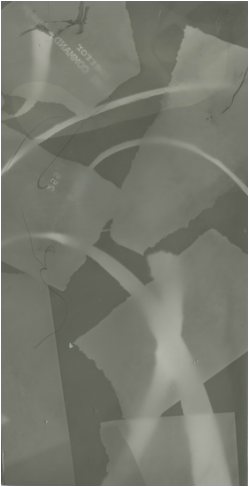
cut paper compositions
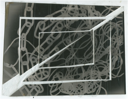
This is the scan of the composition of a cut up photogram held together by strips of tape. The composition was collaged from a photogram of a chain and string which I abandoned as it was overexposed. It has a random and chaotic pattern, thus I chose to make the composition geometric to contrast this.
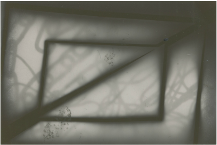
This is the first print I attempted of the composition. It was not well positioned however as the paper was smaller than the composition itself. The focus also looked as if it needed to be improved.
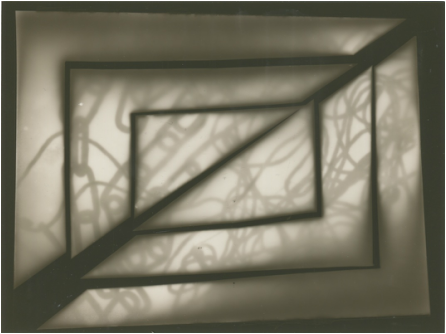
This is the final print I achieved of the composition. It came out very well in my opinion, the chains and string on the original photogram used come through strongly and appear almost in focus which is an achievement considering it was through two layers of paper. The image is odd in many ways. The majority of it is a white grey with the superimposition of the string and chain upon it, as if the photogram is some type of portal into another image separate from itself.
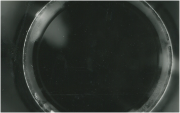
This is the scan of the second composition I created. To create it I used a rather abstract photogram, considered an accident as it was simply washed out tones. I then cut out circular shapes from the paper, as if something had sliced it in a circle, while also taking away some paper so that I could create a composition including empty space as well as the paper itself. I then arranged these circular rings how I wanted, which was rather random, making the tones and shape not transfer to the neighbouring ring and thus be contrasting.

This is the final print of the paper composition. To produce it I used the same timings and aperture as the last previous cut paper print. I think this print is very emotive, its grays give off a very distant feeling, and the allusion to space that seems to penetrate through the shapes is therefore evident. It is spacial and almost appears as if it is at a distance from you.
Floris neususs: photograms
|
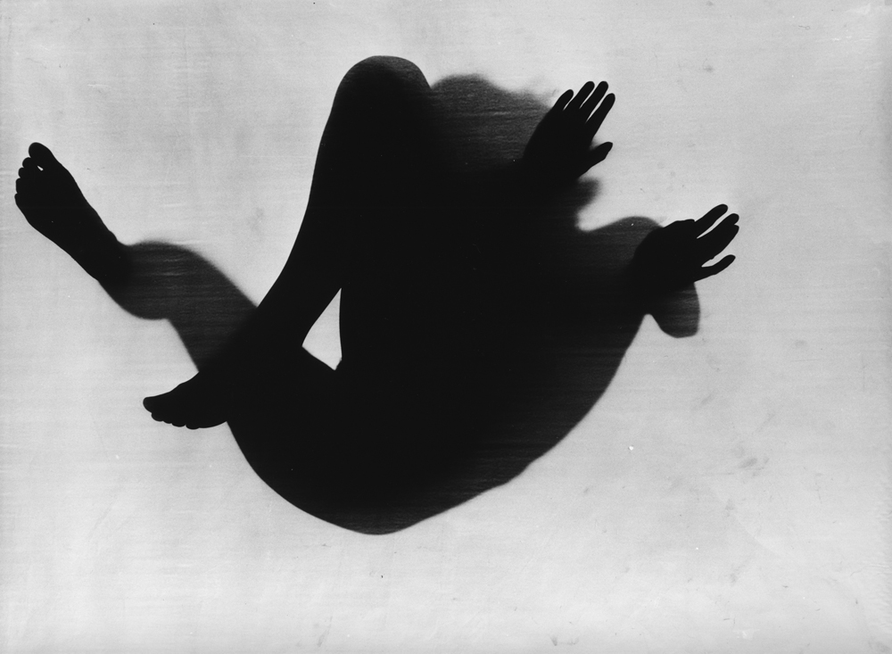
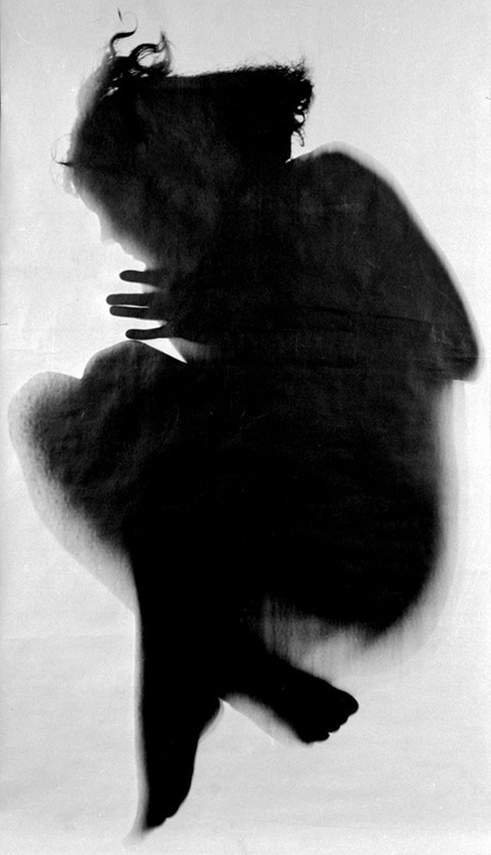
Floris Neususs is a German photographer and artist that has worked extensively with photograms to the point at which he dedicated his entire career to the process. There are numerous ways in which Neususs' works are successful and influential within the process of photograms.
Neususs' work changed the way in which people thought about the process, as he scaled up the process and used innovative visual techniques. His compositions often involve contrasts and are centered, rather than random or pattern like, and even more often involve very organic shapes, specifically people. The compositions are also often rather obscuring in the way they are arranged, such as the overlaying of limbs shown in the photograms I have chosen. Neususs plays with light by attempting to translate three dimensional form into two. An example of this is the image on the right, in which the figure has parts above the paper, allowing an abstract but also three dimensional form to be created. This also adds to Neususs' surreal, detached and isolated tone that his work carries. |
more photogram responses
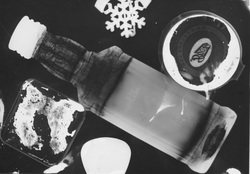
object series: transparency
I decided to explore transparency in response to the artists I have researched. It responds to Man Ray and Moholy Nagy in the way in which transparency explores depth, as they explore depth often within their bodies of work. Floriss Neususs also explores depth, but using form and organic shapes more extensively, thus I chose a portion of my objects I am using to have very interesting forms besides just geometric ones.
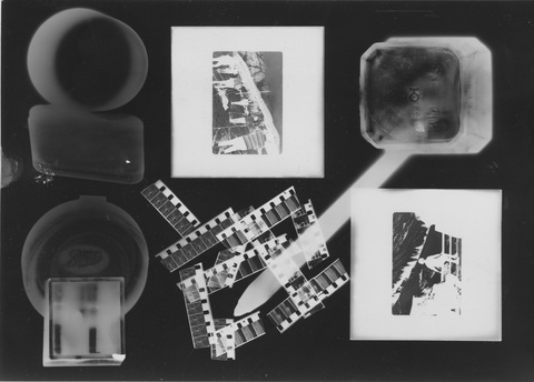
This is test for transparency using both two dimensional transparent objects, film positives and super 8 film negatives that had been cut up, and three dimensional transparent objects, such as the sharpener and SD card holder ect.
This test demonstrates the way in which these transparent objects can interact. I chose to lean some of the three dimensional objects on one another and this creates an interesting effect, combining both of the objects, essentially creating a double exposure and combining their shape while abstracting it.
The film positives and negatives also pair very well together, as they produce a similar aesthetic through their ability to form an image separate from the object they are clearly on the paper. They are also all quadrilateral and so compliment in the way in which they are both geometric.
The final element I tested was the small whiskey bottle with the pen leaning on it. This demonstrates how distance from the paper can blur the image concerning the pen, as it comes into focus closer to the surface. It also demonstrates glass' ability to distort light creating an interesting texture and also abstracting any light from objects travelling through it, such as the pen.
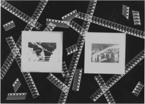
This is a result of my liking for positives and negatives and how they interact visually. I like the way in which the ordered positives interact compositionally in comparison to the randomly place negatives. This could even work as a way of curating photographs instead of printing them.
This is the first photogram combining both two dimensional with three. I placed the bottle and leaned the positives at a diagonal angle symmetrically. This produced a very interesting effect as it created distortion from the distance. Although the distortion is a very interesting effect, I don't like the image as a whole as the shapes produced don't look good in my opinion.
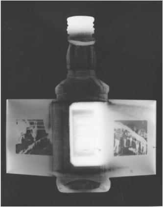
This photogram was a a test on the texture produced by glass. I laid a large glass bottle upon the paper and then added the smaller bottle upon it. This produced a very interesting effect and actually made the image of the small bottle just as in focus as when it is placed directly on the paper. The combination of the two glass objects creates intense textures which are almost marble-like.
|
|
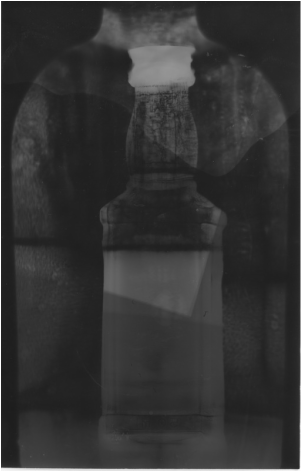
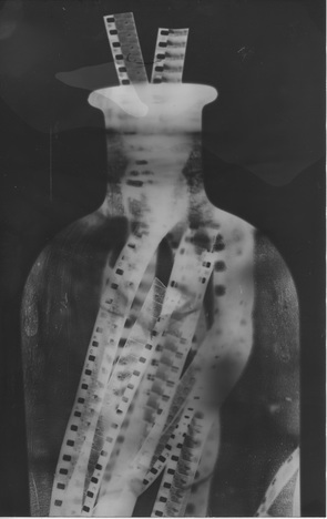
These are two images created with the same object. The object is the previously used large glass bottle, but filled in this instance with super 8 film negatives. The first image is the object side on. The cylindrical shape of the bottle forms amazing distortions in light, the negatives changing sizes and coming in and out of focus and lengthening. Besides the impressiveness of this image, I feel that if this was to be redone I would rearrange the negatives to sit more spread out within the bottle to form perhaps more interesting shapes.
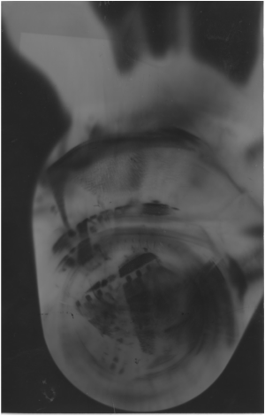
The second image is the object held at a diagonal angle to expose its three dimensional form and the way in which the light would act at that angle.
The second image is the object held at a diagonal angle to expose its three dimensional form and the way in which the light would act at that angle.
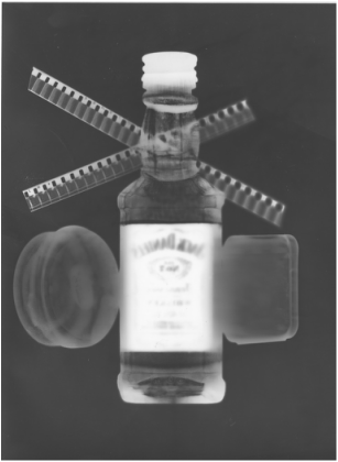
This image in one sense could be considered a small piece summarising the interesting methods, motifs and techniques I have discovered through working with transparent objects.
I incorporated the bottle, the main motif I have been using in photograms and to be used as a means of leaning the other objects upon it. It also exposed perfectly in this image as you can see the logo through the paper, showing my progression in calculating exposure.I used the negatives leaning, creating depth and therefore a change in focus. I also used two similar sized transparent containers, similar to the positives I used before but do not draw the eye as much. All these things I believe successfully make it a very visually interesting image which has easily readable beauty while also remaining difficult to decode as the transparent containers are rather ambiguous.
I incorporated the bottle, the main motif I have been using in photograms and to be used as a means of leaning the other objects upon it. It also exposed perfectly in this image as you can see the logo through the paper, showing my progression in calculating exposure.I used the negatives leaning, creating depth and therefore a change in focus. I also used two similar sized transparent containers, similar to the positives I used before but do not draw the eye as much. All these things I believe successfully make it a very visually interesting image which has easily readable beauty while also remaining difficult to decode as the transparent containers are rather ambiguous.
printing
I began here to use the positives previously shown in my photograms to enlarge and create photograms upon them. This proves very experimental and surreal. In this image I simply used the super 8 film and outlined it with them to show the figure. This significantly impacts the way in which the photograph is perceived by the viewer.
|
|
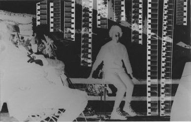
These are two images I created using long strips of the super 8 negatives as objects for photograms, I created shapes when they overlap, outlining certain figures and cutting through others upon an enlarged image being printed onto the photographic paper. These, I have realised, can be used to suggest certain things about the image or impose an opinion or commentary about the image from the photographer or person creating the photogram, showing the eye where to look and at what specifically. This allows more meaning perhaps to be derived from the photograph, almost helping the viewer.
These images can be indicative of certain things, for example, the first image in which I separate the two subjects, it could be interpreted as a type of tension or separateness, that is still however connected in some form, or it could suggest some type of relationship between the two subjects that has an obstruction. Furthermore, the cutting of the negatives through the other subjects may show that they are below those above.
The second image is identical to the first aside from the lack of one negative line, which demonstrates the difference that the intervention of the creator can have, this time perhaps suggesting very different things, such as an isolation to others, or a splitting of a group. All of these individual interpretations show the possibility for more story-like perceptions of photography, which I think is very interesting, and will perhaps carry further.
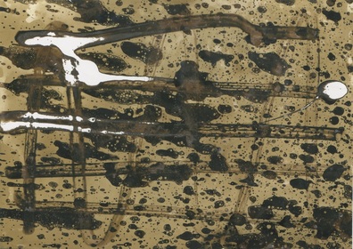
chemigrams: Pierre Cordier
Pierre Cordier was born on January the 28th 1933. He became an artist on the advice of Georges Brassans. He invented the famous process of the chemigram on November the 10th 1956 which famously combines the delicacy of painting with the complex chemistry of the photographic process.
He is now known as the founding father of the chemigram. The chemigram is a photographic process most often performed in a darkroom which treats photographic chemicals almost like watercolours, developer used on the photographic paper to create dark areas, and fixer for light. The chemigram process however, is not limited solely to these two simple chemicals. Common liquids used in the process of chemigrams can range from bleach, oil and honey to saliva, ink and varnish. The liquids or chemicals used in the process can be used in various amounts and applied in various ways and with different media.
Ultimately, the way in which one creates a chemigram is through the use of the basic chemicals needed for the process. The rest of the way in which the individual goes about creating the chemigram is entirely up to them and can contain practices within the process that have never been experimented with before, as the process is relatively new in comparison with many artistic mediums and has infinite possibilities with varying outcomes even when the exact same steps are followed in a chemigrams creation.
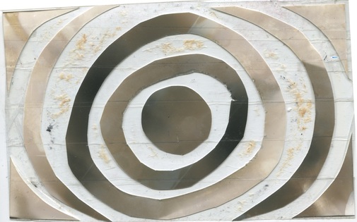
image analysis
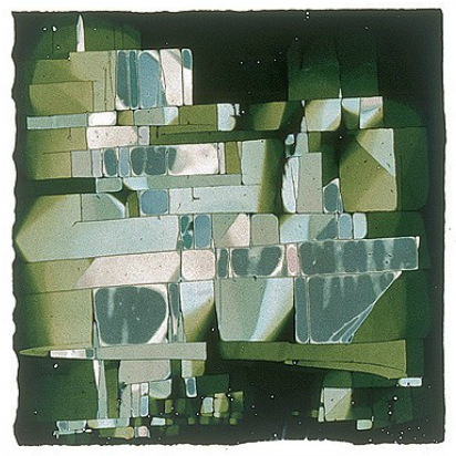
This is an example of one of Pierre Cordier's chemigrams.
This chemigram is in many ways very visually interesting and dense, the most evident formal elements being shape and pattern. The pattern in the image is both repeated and interrupted in a rather random way, however this creates an order that produces a geometric grid-like effect.
The colour in the chemigram is another of the most evident formal elements, as the image appears to almost have the same base colour of a forest green, but in the center, the colours become a tinted, metallic, dull and cool. In this way, there are only really two separable variables in colour, making the image very minimal and simple to decipher.
The line in the image is also very interesting as there are no defined lines separate from the shapes within the image, creating a grid-like image. The lines in the image are very clean and thin, not drawing your eye to them, they simply outline each colour or visual element in the image.
The texture in the image also appears to be very confusing and unclear. The central part of the image appears almost metallic and glossy, however this may be because of the highlighting within the colours. These areas and the outside areas simultaneously also appear matt however, and I believe they are, disregarding the reflective texture that the highlights give.
The tone in the image is one of the most difficult formal elements to describe. The image has a very large variety of tones, as is evident when comparing the center to the outside of the image, as the center has tones close to white whereas the outside has tones almost black.
chemigram tests and responses
These are a series of chemigrams produced in a workshop in class.
Chemicals used: oil, nail varnish and deodorant.
Developing: a few seconds in all of the chemicals in the normal order.
Light conditions: sheltered daylight.
This was my first chemigram outside of the darkroom.
This image was my first chemigram and so was more a test of how the chemicals were likely to interact with one another so as to evaluate the quantity they should be used in and how they react with one another. The way in which I applied the chemicals was also very important to how they reacted, such as my placing of nail varnish around the eyes which had been done in oil, creating a resist and also above the mouth producing colour.
Using excessive liquid can also prove interesting. This created interesting drips that add to the overall aesthetic of the curved lines in the image and are almost painterly. The drips also demonstrate to the eye the way in which the chemicals move upon the paper and show evidently the reactions. Another interesting thing I found was the way in which deodorant reacts to the oil I used. It turns the usual black into bright white while also retaining the outline of the colour, which contrasts, and can be used to the advantage of the artist, and I will hopefully be using this often in my other chemigrams.
The background colour is not to my taste however, as the chemigram was exposed in shaded daylight, it only half exposed. I think that the image could be improved by not exposing it at all or not developing it. Overall however, I believe this chemigram was very successful as a result of my prior reasons.
Chemicals used: oil, bleach spray and deodorant.
Developing: a few seconds in all of the chemicals in the normal order.
Light conditions: sheltered daylight.
To create the overall effect of this image line-wise, I used a Q-tip dipped in oil and painted it onto the paper in a zigzag in portrait and landscape. I then added bleach spray ad deodorant.
The effect of the deodorant is very interesting in this instance as it is not predictable what it will react with and it also creates very interesting shapes due to this both inherently and compositionally. The bleach spray also proved very interesting as it reacts with the paper instantly, turning it black. It is also incredible regarding texture, as the air bubbles within the spray create a rough looking texture.
Overall I think this chemigram is mediocre at best as it is overkill chemical wise and visually as there is no space for the appreciation of the effects of each chemical.
Chemicals used: bleach spray, hand butter and window cleaner.
Developing: a few seconds in all of the chemicals in the normal order.
Light conditions: sheltered daylight
This chemigram was created wiping the paper with my finger with hand butter to create a resist. I then dabbed window cleaner on with a paintbrush three times and added bleach spray from the left.
I don't particularly like this chemigram at all as the resist didn't work as I did not apply enough and thus it ruins the image compositionally. The window cleaner also was not applied in a way that was interesting, symmetrical or at least not curved and distorted as it is. The bleach spray however as usual produces a nice effect and good texture, especially in this one as the imprints of the bubbles can be seen.
bleach spray looks good
window cleaner not placed on in a very interesting or good looking way
Chemicals used: white spirit and deodorant.
Developing: a few seconds in all of the chemicals in the normal order.
Light conditions: light sun.
This chemigram is incredibly interesting as it is the first I have created that evokes certain images and emotions. Using just white spirit and deodorant, it created a very visually dramatic reaction. It also created an exposure that was perfect, forming a variety of different tones.
The images it evokes for me are space, a macro-biological world, and liquids. I think that resists are the most important element of the chemigram due to this, as they create the most different textures, lines, colours and shapes. Overall this is my favourite chemigram for the prior reasons stated.
Chemicals used: foot lotion and white spirit drops.
Developing: a few seconds in all of the chemicals in the normal order.
Light conditions: light sun.
This chemigram is one that proves most odd due to the nature of how I created it. I used the foot lotion heavily in a spiral shape with my finger as a resist and then dropped white spirit randomly upon it. This creates an abstract effect that obscures the shape of the drops. The resist also simply creates more interesting effects when applied in large quantities.
The chemigram was also exposed for a longer time and in brighter sun that many of the others, causing it to become very dark in that side of its tonal range, which is an improvement on the past almost green backgrounds on the previous chemigrams. This image as a result has a very large tonal range, making it visually interesting. This is why I believe it is one of my best.
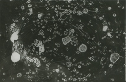
homemade slide negatives
creation
Since I have been exploring cameraless photography, I have thus far experimented with many different processes, but this is yet another. Homemade slides are in one sense simply negatives, but give an effect similar to chemigrams when printed. They are made using two pieces of acetate the size of a 35mm negative pressed together with a medium such as salt or a pigmented substance between them to produce an image when enlarged. Other processes can also be done to the acetate such as scratching, but the possibilities are ultimately endless.
results
food colouring
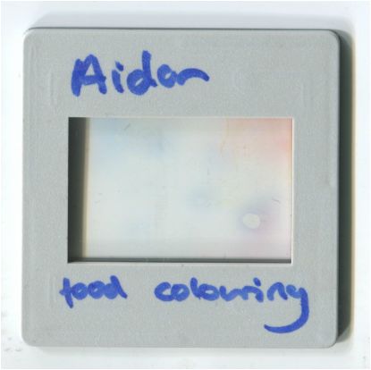
This is the first slide I made with just food colouring in red and blue, by applying two drops to each side of the acetate. The use of only two colours resulted in them blending together rather a lot. This created a purple and a few air bubbles as is unavoidable when making these. Looking back at it, I did not use enough colouring to prove effective in showing on the print. This considered, the negative was successful in its creation but is not possible to overly critique as it is far too washed out and abstract to be compared to any other of the like. However using washed out colouring with the intention for abstraction, perhaps printed with and thus over a photograph, could prove interesting.
The print for this slide unfortunately didn't come out as there was not enough colour to expose enough tone.
The print for this slide unfortunately didn't come out as there was not enough colour to expose enough tone.
food colouring + scratching
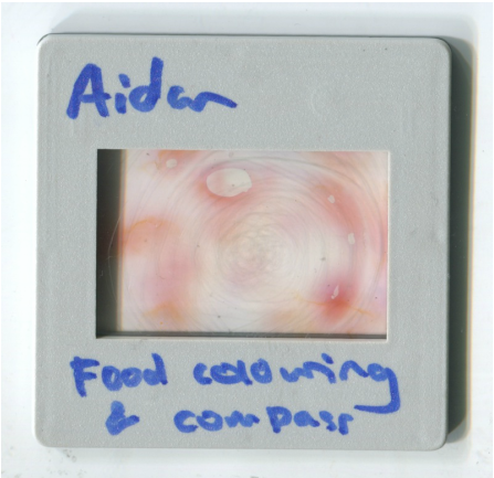
This is the second slide which I also used red and blue food colouring on. I applied it with different coloured stripes toward the center and then scratched from points on a line made with a a circular motion and made circular lines to to create a spiral effect. Unfortunately most of the colour appears to have now dissipated, although it may benefit the image, it was not the intention, thus I believe as a result of this, making these slides is more suited to abstraction to the point at which the artist refuses to attempt to take control and lets the mediums naturally act as they do.
Overall, this creates a contrasting, washed background with hard and thin lines running through within it. However, this will have to show on the print. Another positive outcome was the bubbles of air that naturally formed, giving the negative a touch of imperfection that ultimately with benefit the print in allowing more texture and overall visual stimuli to show on it.
Overall, this creates a contrasting, washed background with hard and thin lines running through within it. However, this will have to show on the print. Another positive outcome was the bubbles of air that naturally formed, giving the negative a touch of imperfection that ultimately with benefit the print in allowing more texture and overall visual stimuli to show on it.
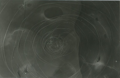
This is the darkroom print of the above slide. It certainly produced many interesting effects when printed, such as the sharpness of the scratches and the the washed liquid-like tones from the colouring. The image was enlarged at an aperture of 2.8 for 0.5 seconds as both the colour and the scratches would disappear or become far less evident if the print was to be more exposed. Overall I believe this print was successful in aiding my understanding, but the outcome is not pretty, as the scratches are both badly made and also could have been utilised to complement the colour or perhaps an addition of salt. The textural outcome of the colours however is beautiful tonally and I would also like to exploit this.
Food colouring + vaseline + salt
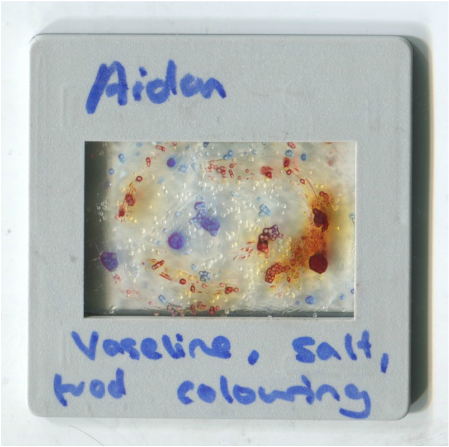
This slide is the one I am most pound of. I used vaseline on the acetate to make the salt I pressed upon it stick and then added drops of blue and red food colouring dotted around evenly.
What contributes most to the sucess of this slide is the use of the vaseline as both a medium in which the salt can stick, which will refract the light to produce interesting effects, and also as one which will show in the final print as the subsequent placing of the colouring will be directional once the slides are put together.
As can be seen, I made a circular motion with the vaseline, creating a spiral effect with the colour, mixing them and pulling them into a circle. All of these different substances together should hopefully provide some very interesting effects.
I would like to experiment with creating more slides that attempt to produce an image before the effect of the print can be analysed as I believe this will help my understanding and further development of this process. This print proved the most interesting so far. The excessive use of Vaseline proved excessively useful regarding texture, adding to the image. The direction of it application also influenced the result, creating an image reminiscent of a whirlpool, some type of cosmic system or the inside of a blood vessel on a micro-biological level. I believe it would be interesting to take that idea further to try and create compositions that respond to actual images that the process can resemble.
food colouring + vaseline + salt (2)
This slide was made with an intention rather than many of the previous, to create an intended effect. This slide in particular was meant to be very texture filled and resemble green pastures on two hills, as if it were a landscape. Colour wise, the colours shown on the scan are blended. The original colours I used were blue, green and red in that order from the top of each intended slope. Although this is a simple request of the medium, I believe considering the previous outcome, it will be difficult to create an even close to realistic effect.
This is the first print from the negative. I consider this negative to be fascinating, as it almost looks biological, as if under a microscope with living organisms upon it.
In the slide, the salt was layered very thick. This produced an effect of depth when one part of the layer was put in focus, making it seem almost as if it had a background and thus boosting texture and its similarity to my intention to create a landscape. However, the absence of space thus resulted in a lack of resemblance to my intention. It would be interesting to find a medium possible to put within the slide that fills space and is completely opaque, allowing for a more careful and easy way of making slides that conform to their original intention.
However, one problem with the print was that it was very much too dark. I have decided to therefore do another print with a shorter exposure time as this one was 1 second with an aperture of 2.8.
This is the second print from the negative. This I believe, is a large success as the perfection in exposure reveals more texture and contrasts the black background far more. There is also more of a sense of perspective due to this.
food colouring + vaseline + salt + scratching
This slide was the most complex I had done of all. My idea was to respond clearly to Pierre Cordier while also being inventive in the way in which I did so. I decided to create a geometric grid with scratching, thereby outlining space and the placements of mediums as from my past experience with this process, the colouring and salt will most definitely always shift.
I then applied vaseline and to every other square and added colour to every other last empty square. This choice was mainly sourced from my intrigue as to the different effects of the mediums when they interact, so I chose to use this to my advantage as I had the knowledge as basis for how they would, or if my intention was not realise, the test would at least be interesting.
I then applied vaseline and to every other square and added colour to every other last empty square. This choice was mainly sourced from my intrigue as to the different effects of the mediums when they interact, so I chose to use this to my advantage as I had the knowledge as basis for how they would, or if my intention was not realise, the test would at least be interesting.
This print did not come out as I would like as it is difficult to interpret the detail within it, thus I am going to reprint it.
This is in my opinion the best print of the series. At this exposure, all the detail can be seen clearly. It strongly resembles a Pierre Cordier chemigram in its neatness, obviously in comparison the previous ones as this process is naturally messy visually. I like the way in which the coloured sections of the image have beautiful gradients in tone which juxtaposes the roughness of the salt and sharp and thin lines.
I also like the way in which the neatness and mess interact visually with one another, the mediums mixing, yet the fixed lines staying constant. I would like to follow this theme of chaos against rigid structure but through another more free medium that I can use with more ease, on a larger scale, and one in which my ideas will be better realised visually.
I also like the way in which the neatness and mess interact visually with one another, the mediums mixing, yet the fixed lines staying constant. I would like to follow this theme of chaos against rigid structure but through another more free medium that I can use with more ease, on a larger scale, and one in which my ideas will be better realised visually.
marco Breuer


Marco Breuer is a German photographer, who mainly but not only uses camera less processes as well as using creates chemigrams. Breuers work explores a variety of similar themes, which are often dark and existential, such as instability, destruction, eternity and the way in which they all reflect the struggle of life and objects for the purpose of permanence in a universe against it.
The way in which he creates his chemigrams is also very fascinating. He uses many techniques that are rarely or almost never used within the genre, such as folding, applying heat, scratching, abrasion, chewing and sanding the paper. He also once fired a shotgun into a box of paper just to see what would happen as a result. He is incredibly thorough and relentless in his experimentation, and this shows in his work.
I think that his work is some of the most evocative and complex work that exists. Concerning emotions and meaning, I think that the existential and almost empty, but also utterly baffling images he creates are true reflections of the human condition. They are almost scary in their beauty and truth.
I think that his work is some of the most evocative and complex work that exists. Concerning emotions and meaning, I think that the existential and almost empty, but also utterly baffling images he creates are true reflections of the human condition. They are almost scary in their beauty and truth.
adam fuss


Adam Fuss is an english photographer, raised in rural england. He began photography by photographing nature and documenting it. This eventually led him to using techniques within photography that were camera-less, more basic chemically. Fuss is fervent in the belief that the medium of art and photography should actively reflect intention and subsequent meaning.
Fuss' imagery is often poetic and spiritual, often rather composed. He avoids detailed clarity in images, appreciating abstraction as manifestations of light and shadow interacting with one another. At points, his work leaves the abstract slightly, and shifts to representative themes, such as his famous images of snakes within clothing. The images I have displayed of Fuss' above are ones in which he uses snakes as the subject for either photograms or scans, as their odd movement produces odd effects and results in a type of surrealism.
I would like to use techniques associated in movement if I do further explore the genre of camera-less photography, either the subject movement of an involvement of it in the process, such as the paper or chemical use.
ways to further explore cameraless photography
- heat and temperature related photograms
- use of chemicals and temperature
- interacting physically with paper e.g ripping, poking holes in it, pressing upon substances
- using movement, long exposures on photograms strategically
- using movement from something living, bugs, people, animals
- scanning in things that move
- scanning in objects of transparency to experiment
