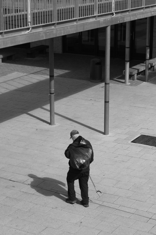
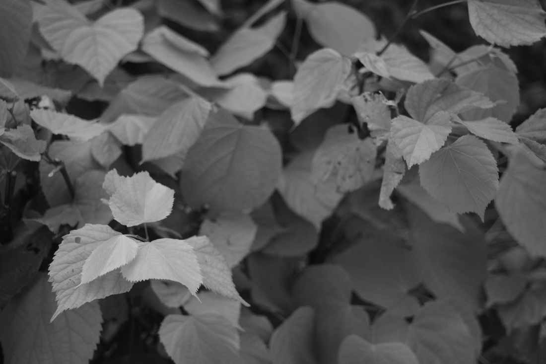
The formal elements
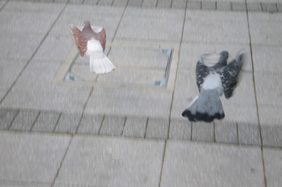
Focus: Which areas appear clearest or sharpest in the photograph? Which do not?
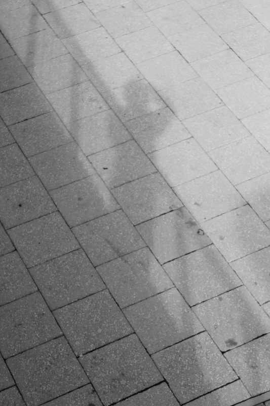
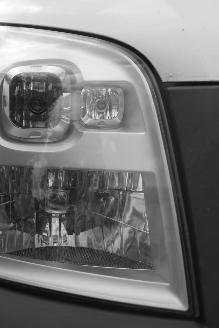
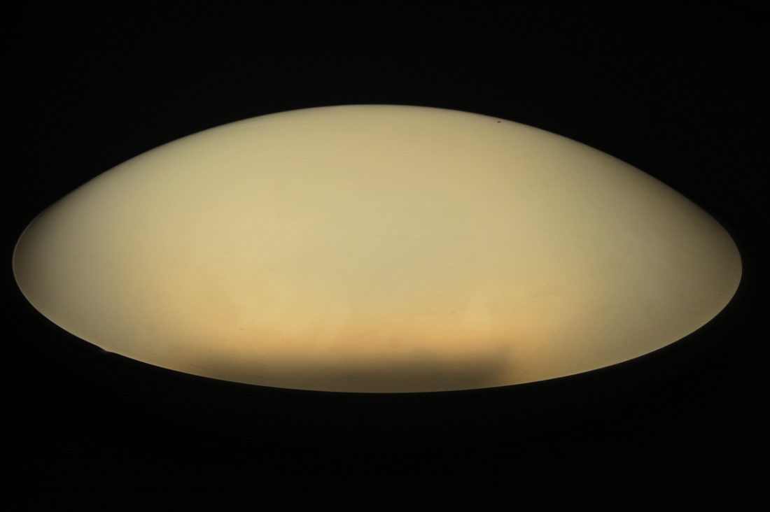
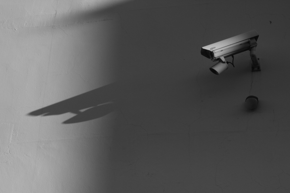
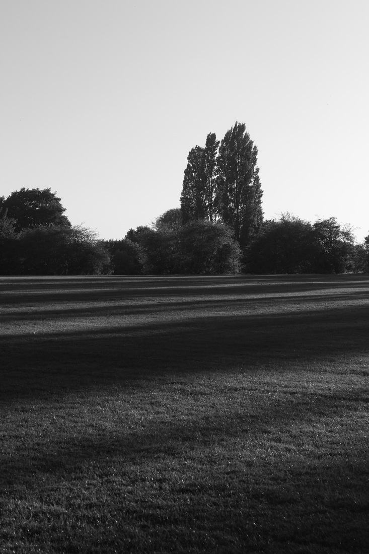
Light: Which areas of the photograph are brightest? Are there any shadows? Does the photograph allow you to guess the time of day? Is the light natural or artificial? Harsh or soft? Reflected or direct?
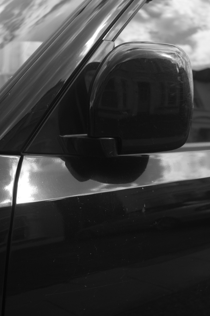
Line: Are there objects in the photograph that act as lines? Are they straight, curvy, thin, thick? Do the lines create direction in the photograph? Do they outline? Do the lines show movement or energy?
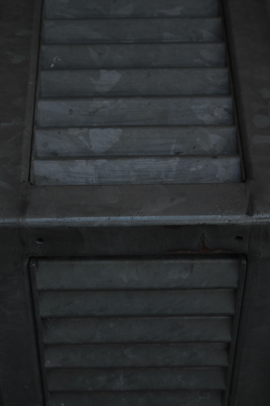
Repetition: Are there any objects, shapes or lines which repeat and create a pattern?
Shape: Do you see geometric (straight edged) or organic (curvy) shapes? Which are they?
Texture: If you could touch the surface of the photograph how would it feel? How do the objects in the picture look like they would feel?
Tone (Value): Is there a range of tones from dark to light? Where is the darkest value? Where is the lightest?
Light: Which areas of the photograph are brightest? Are there any shadows? Does the photograph allow you to guess the time of day? Is the light natural or artificial? Harsh or soft? Reflected or direct?
Line: Are there objects in the photograph that act as lines? Are they straight, curvy, thin, thick? Do the lines create direction in the photograph? Do they outline? Do the lines show movement or energy?
Repetition: Are there any objects, shapes or lines which repeat and create a pattern?
Shape: Do you see geometric (straight edged) or organic (curvy) shapes? Which are they?
Texture: If you could touch the surface of the photograph how would it feel? How do the objects in the picture look like they would feel?
Tone (Value): Is there a range of tones from dark to light? Where is the darkest value? Where is the lightest?
masters of photography: analyses
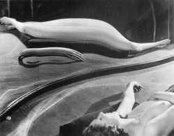
andre kertesz: montmatre (1927)
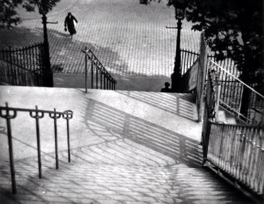
This image by Andre Kertesz is a good example of the formal elements, the most prominent being line. The lines in the image are rather thin, hard and abundant, due to the railings and their abundant shadows they produce. This creates geometric and repeated patterns all over the image, and ordered angular shapes in many different directions, in turn forming a very visually complex viewpoint with ordered and dense lines.
The composition of the image juxtaposes while also highlighting these shapes as the trees, which have a very organic shape are also included within the composition, and are thus contrasted. The composition proves rather unusual in the way in which it has many elements coming into the image from outside of the frame rather than being presented as solely within. This has the effect of inducing a spatial atmosphere that gives a sense of the unexplored and unknown.
The texture of the image is less evident. however the shadows produced in the image and the road behind could be seen as textures, in which case they produce an ordered texture through the patterns of the shadows and repeating lines in the cobbled street in the background and stairs in the foreground. However, aside from this, prominent textures seem non-existent in the image, as almost everything is composed of flat and smooth stone.
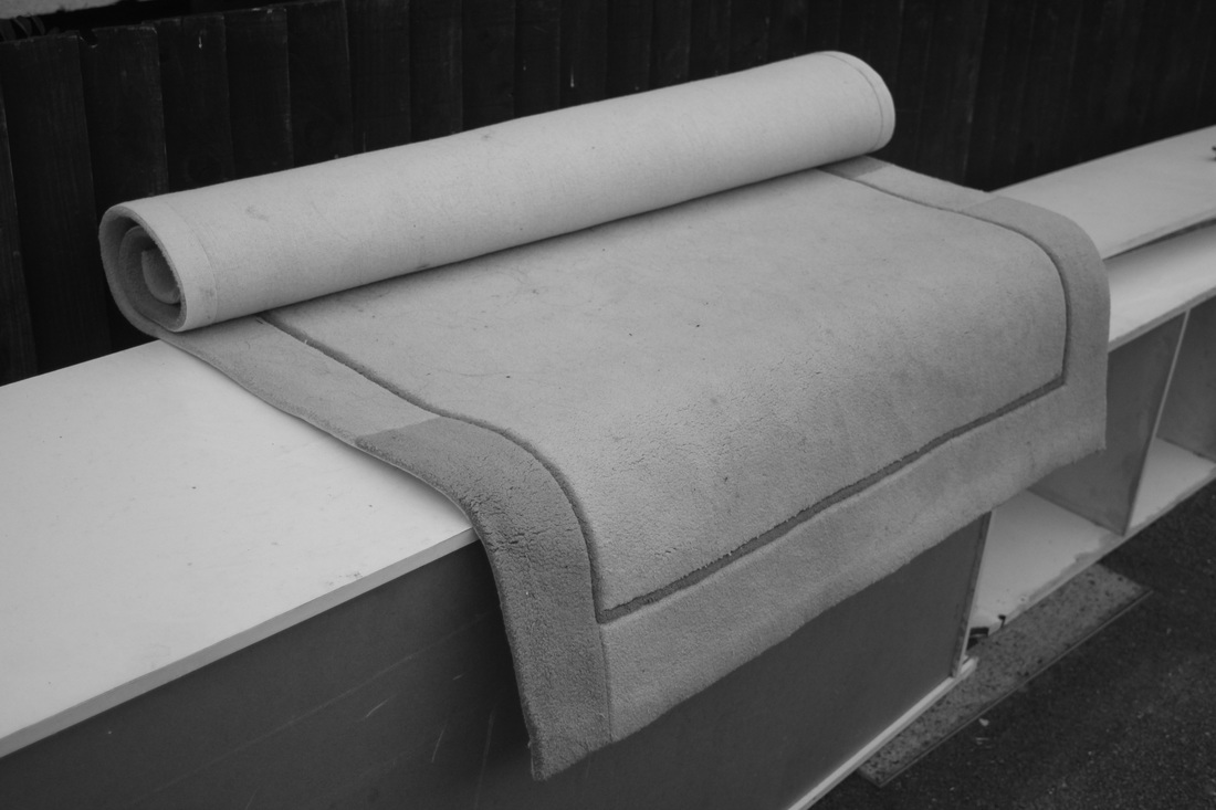
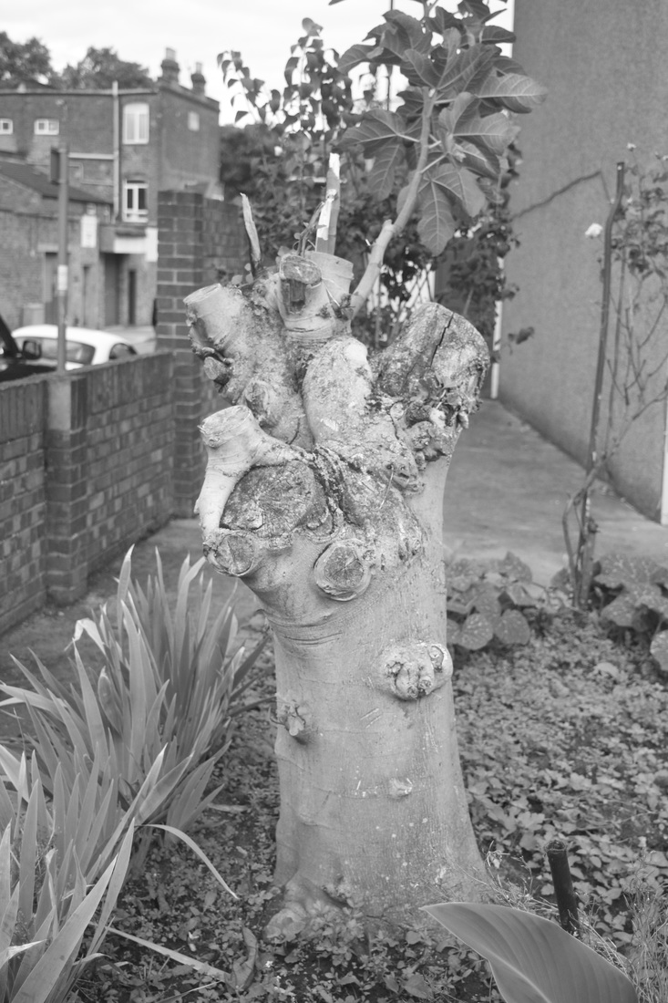
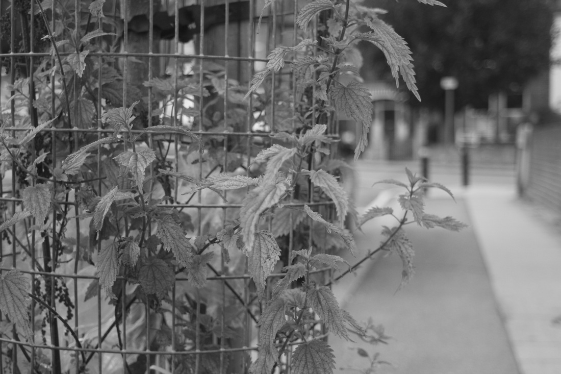
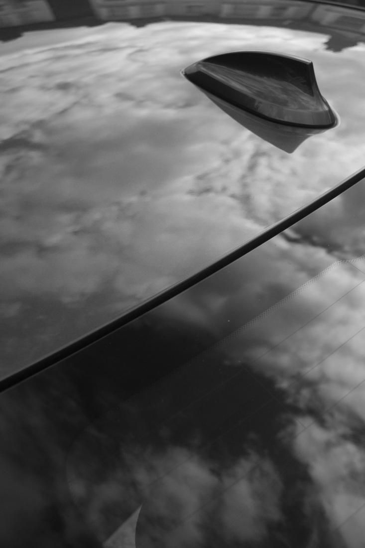
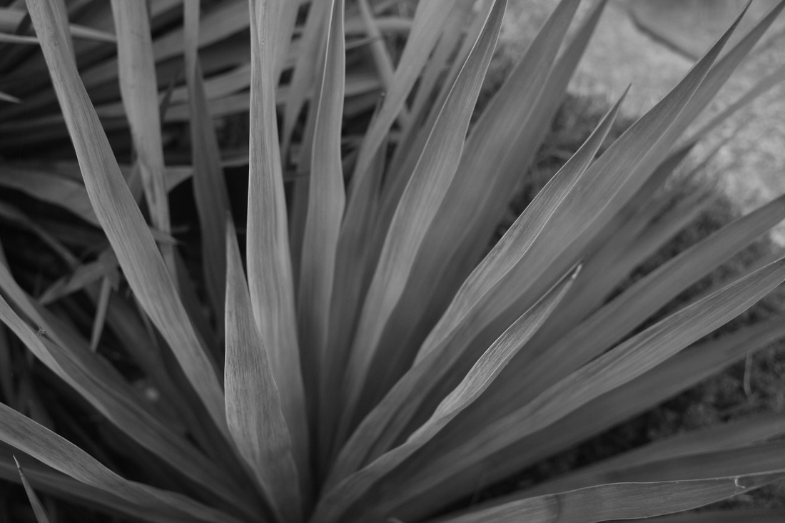
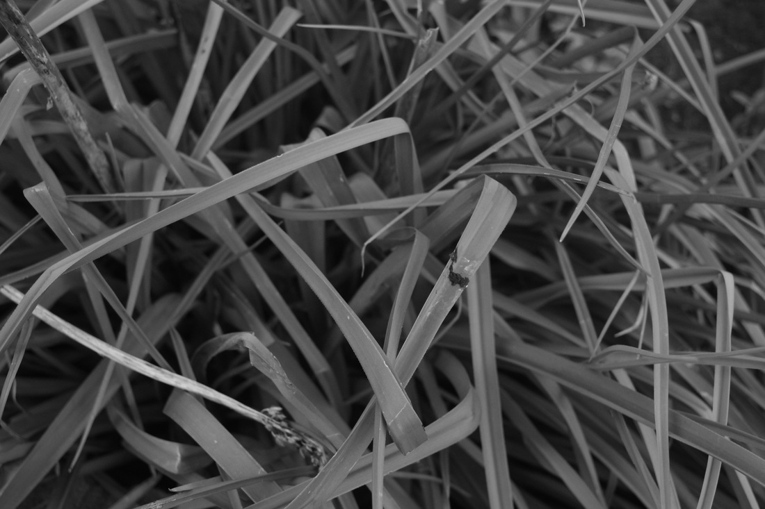
These are the first series of images I have taken in response to the two most prominent formal elements in the photograph, line and shape. I believe these images were rather successful in response to the image I evaluated of Kertesz's above, as they all reference unusual perspective in their own way, such as the shortening and lengthening of shapes due to the angle of the photograph. I attempted to make sure when shooting these images that they each would have looked either plain or just very different if the angle they were shot from had been varied in any other way.
Francesca Woodman: House #3 Rhode Island (1976)
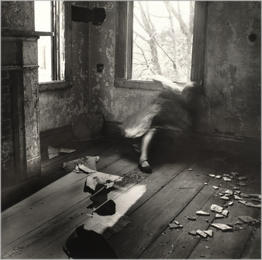
This Francesca Woodman photograph is full of many of the visual elements. The most prominent one being texture. There are many textures within the photograph such as the walls, in which the texture appears rough, almost crumbly. The subject's dress is also an interesting texture, as the blur makes its appear delicate and glossy. Furthermore, the texture of the floor contrasts all the existing textures in the photograph, by being rather matt and hard.
Shape is also prominent and contrasting, from the geometric shapes created by the interior of the building to the organic shape of the subject and the defined geometric shapes from the debris on the floor. The floorboards also create very geometric rectangular shapes, which act as leading lines allowing the eye to flow toward the subject, creating a smooth viewing from each point of interest in a curved line, from the floorboards to the point of interest, the subject, to the interest of the bright window and its contents outside.
There are many lines within the photograph also. However they are mostly quite thin and do not stand out at first glance. The lines created by the floorboards lead the eye toward the subject, Woodman. The image is also made up of mainly mid tones from the natural light, giving it an almost melancholic and shadowed feel and drawing your eye towards the most contrasted areas such as the sun on the floor and the windows. lines on paper on floor follow floorboards
JOHN GUTMANN: REACH (1938)
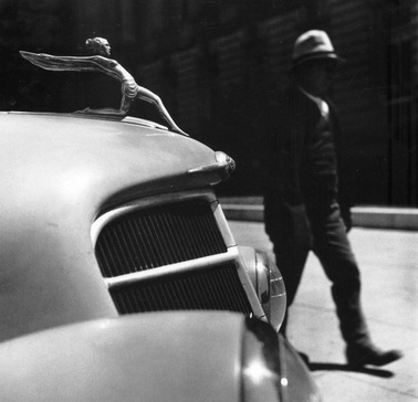
This image by John Gutmann has many examples of interesting uses of the formal elements. The most evident being tone. The metallic texture of the car means that the highlights are very prominent and the darks very dark. These highlights pair with that of the man in the background, making an interesting visual connection between them. The lighting in the image also appears to be quite hard, perhaps also being a cause for the bright highlights.
Pattern in the image is also shown in the grills of the front of the car, which have a geometric shape along with what surrounds them, contrasting the curved shapes of the car and man behind. Furthermore, the line in the image is very thin and hard as the focus is sharp, making the figure stand out and drawing your attention to the car, and causing that which is out of focus to be perceived as closer to shapes, creating a composition with rough shapes, and contrasting the clean cut shapes of the car.
Pattern in the image is also shown in the grills of the front of the car, which have a geometric shape along with what surrounds them, contrasting the curved shapes of the car and man behind. Furthermore, the line in the image is very thin and hard as the focus is sharp, making the figure stand out and drawing your attention to the car, and causing that which is out of focus to be perceived as closer to shapes, creating a composition with rough shapes, and contrasting the clean cut shapes of the car.
vivian maier: untitled (1955)
This Vivian Maier photograph is full of many of the formal elements, making it very visually interesting, the most prominent being shape. This is due to the mirror being held someone within the centre of the image. The image makes apparent the juxtaposition of geometric and organic, from the three human forms in the image, and the buildings, truck and mirror.
The texture in the image is not prominent, but is used in an interesting fashion, in which the three recognisable textures: wood, brick and fabric, all overlay and interact with one another within the center of the image. This draws more attention to the center of the image.
The composition of the image is also very abnormal, but works very well. It can be seen to be both a self-portrait, a street photograph and scene as a result. This visual complexity is further pushed by the fact that Maier decided to focus upon the man, rather than herself, posing questions as to her intention to do so. Her smile within the photograph also indicates a happy and relaxed atmosphere.
The line in the image is incredibly prominent in the image, as the sides of the mirror cut the image cleanly, the reflection and background being a different tone, highlighting the mirror, and also making evident the diagonal angle of the mirror, which contrasts many of the lines in the image which are parallel to the framing.
The image also has very soft highlights of rather diffused light, which the vast majority of is in the foreground, in areas that are in focus, which produce very organic lines, further contrasting with the geometric background.
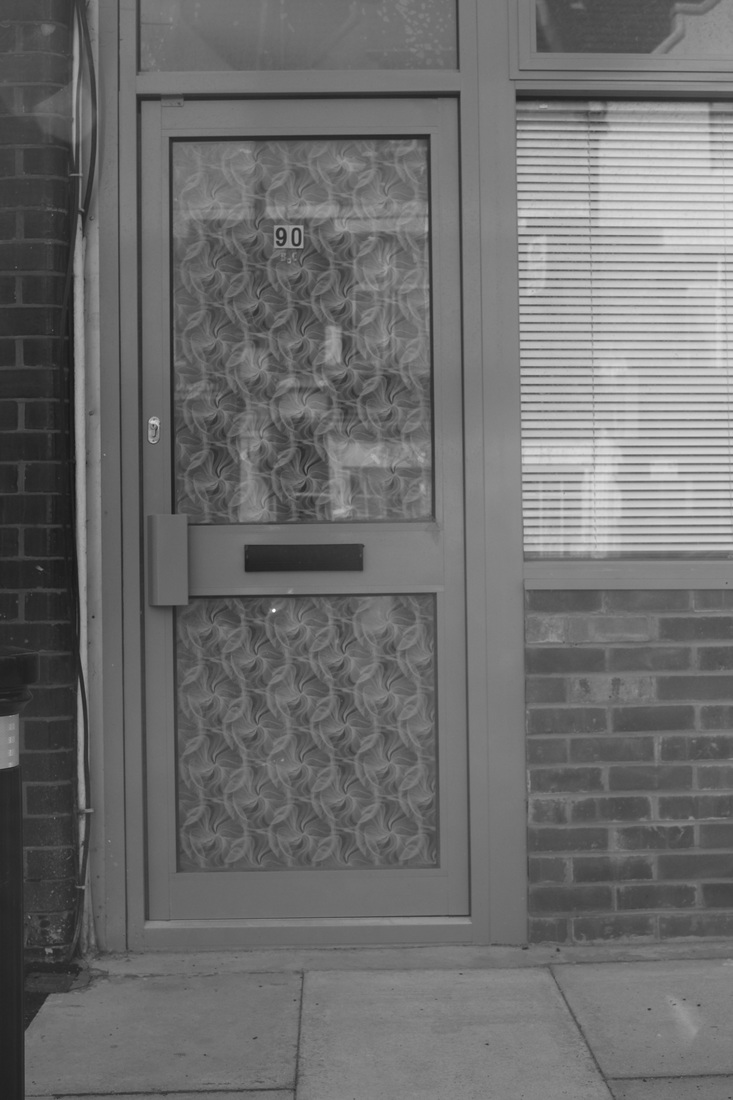
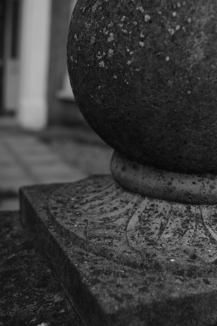
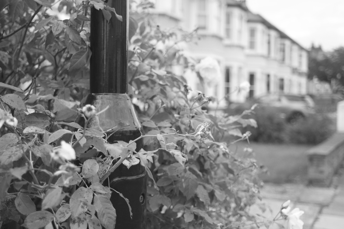
2 FORMAL ELEMENTS: LIGHT AND SHAPE
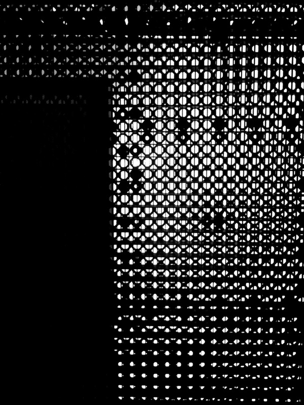
I believe that these images were successful when responding to the formal elements, shape and light. I feel that each image demonstrates this well. For example: the fifth image, which I edited to have high levels of contrast, produces a variety of shapes around my reflection which are very distinct. However, I do wish to use a more advanced camera than what these were shot on (an ipod touch), to give me the ability to play with the variable of focus, and how it affects the viewing of light and shape.
This is the first set of images in response to the formal elements which I have changed to black and white. This I believe improves the images greatly and also makes more prominent the formal elements which are being focused upon, aside from of course colour.
This is the first set of images in response to the formal elements which I have changed to black and white. This I believe improves the images greatly and also makes more prominent the formal elements which are being focused upon, aside from of course colour.
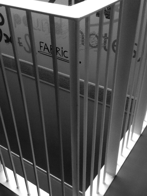
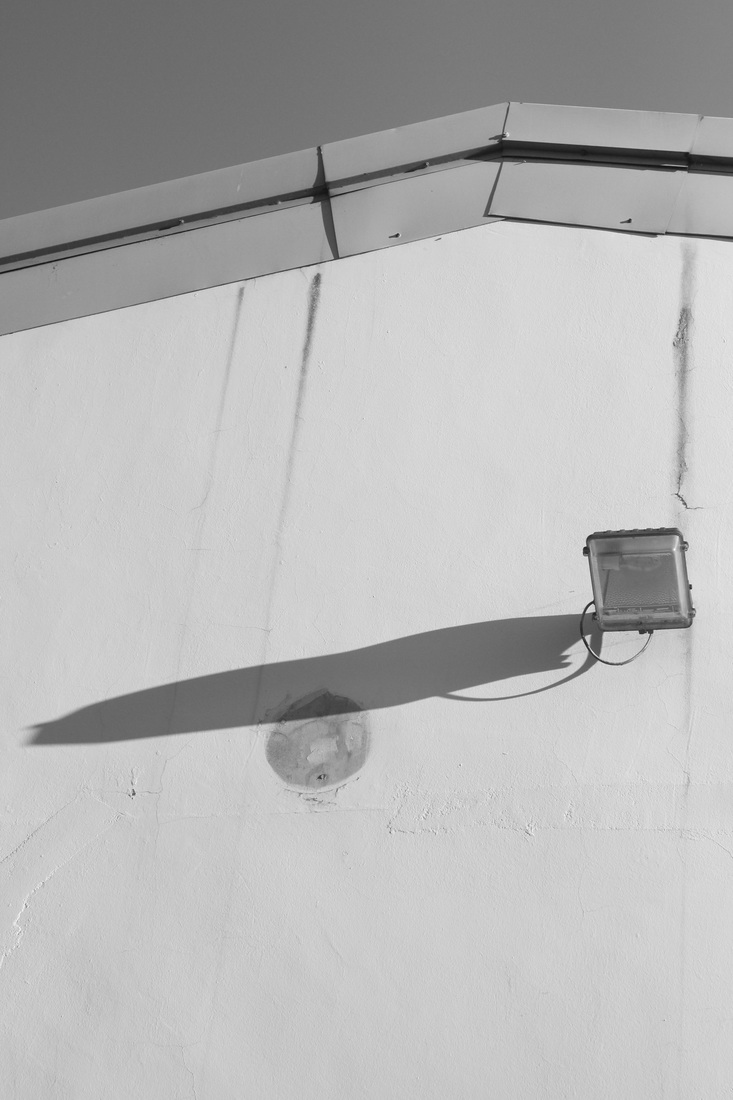
2 FORMAL ELEMENTS: LIGHT AND SHAPE (REDONE)
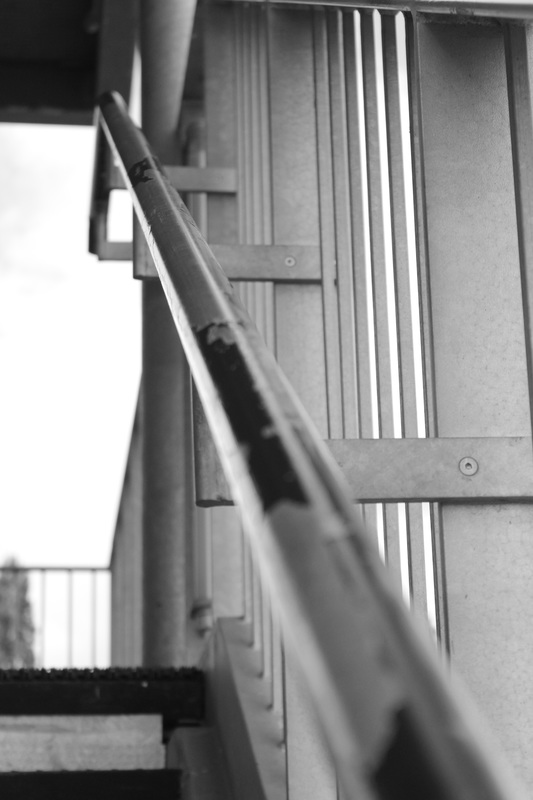
These images were taken in an attempt to refine the previous response on a canon 550D, which is of higher quality than the previous camera used. I feel these images demonstrate an improvement in both my ability as a photographer and my responses to light and shape. I believe the first image and sixth image are examples of strong responses to the criteria.
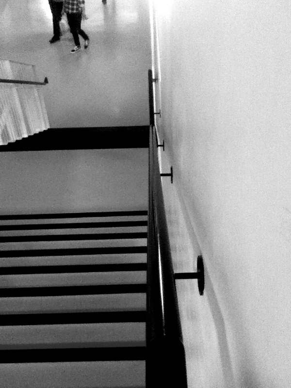
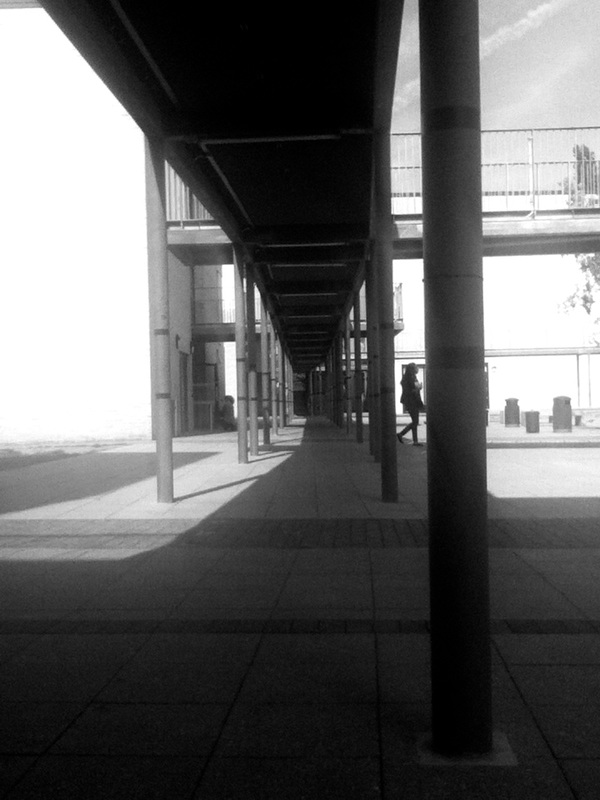
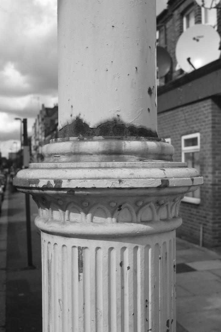
The first image was intended to play with a wider aperture to the advantage of the task. I focused in the middle of the image in the widest open aperture in an attempt to draw to attention the diminishing shape of the railing, further complementing the context of the task and experimenting with it.
The first image was intended to play with a wider aperture to the advantage of the task. I focused in the middle of the image in the widest open aperture in an attempt to draw to attention the diminishing shape of the railing, further complementing the context of the task and experimenting with it.
masters of photography: further analysis and response
JOHN GUTMANN - BICYCLE OF A MEXICAN BARBER (1937): PHOTO ANALYSIS AND RESPONSE
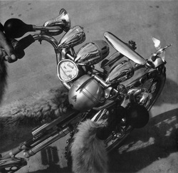
The most evident visual element in this photograph is texture. The bike has a very glossy, reflective texture which draws your eye toward it. This texture also contrasts that of the fur on the bike which has a rather soft matt look. The lines in the image are also very curvy and hard, sharply defining most of the image. The tone in the image is also very varied, from very highlighted areas, such as the handlebars, to the darkest, such as the horn. The shape in the image is also prominent, with many rounded shapes standing out and very little straight lines.
TWO EDITED RESPONSES
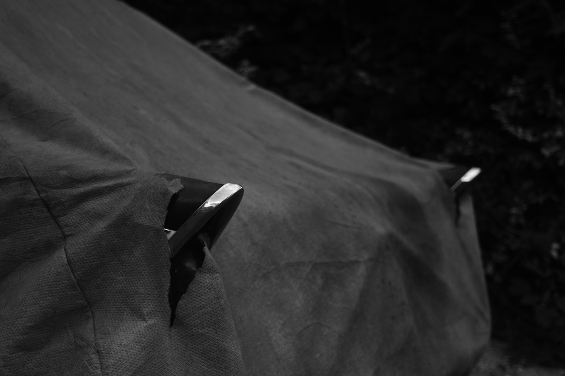
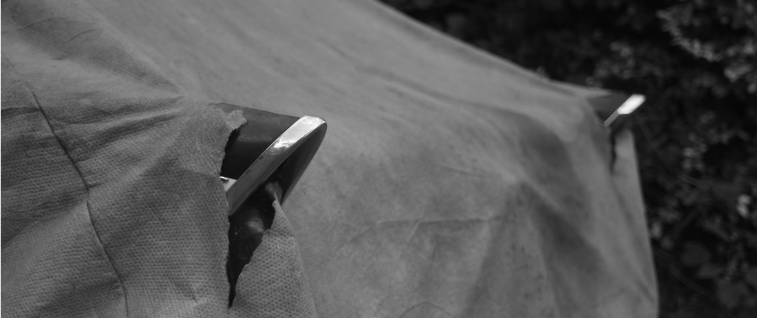
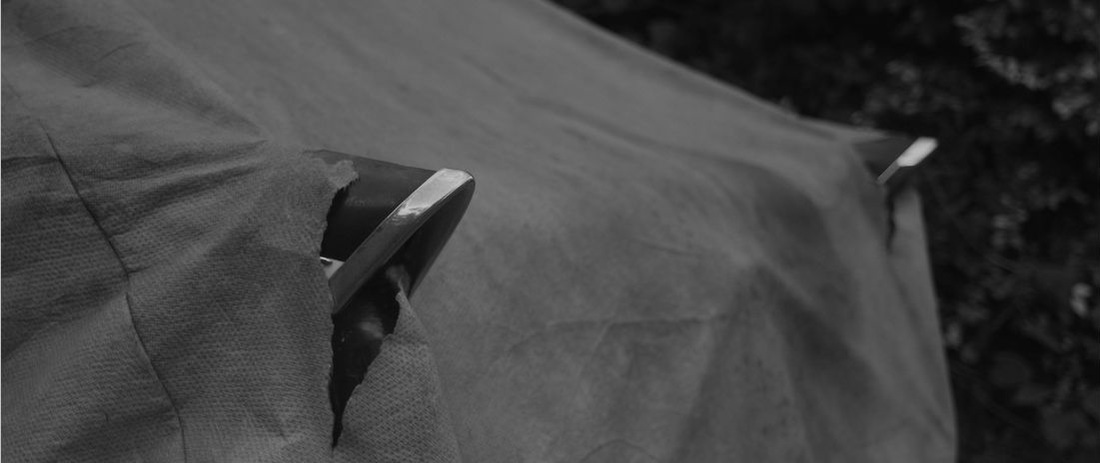

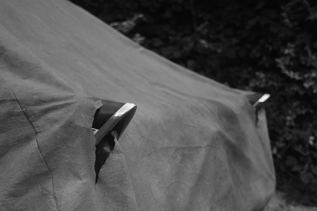
In the first image I decided to crop, so that the texture was more prominent, then I lowered the contrast so that the textures of the car and sheet blended, making it more interesting visually.
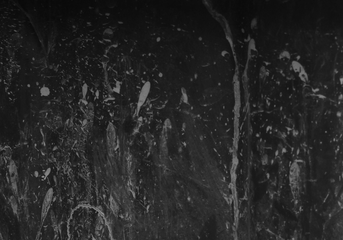
In the second image I cropped to just the paint splattered parts of it in attempt to note the close detail, almost making it into a painting of sorts. I then upped the contrast to show this.
In the second image I cropped to just the paint splattered parts of it in attempt to note the close detail, almost making it into a painting of sorts. I then upped the contrast to show this.
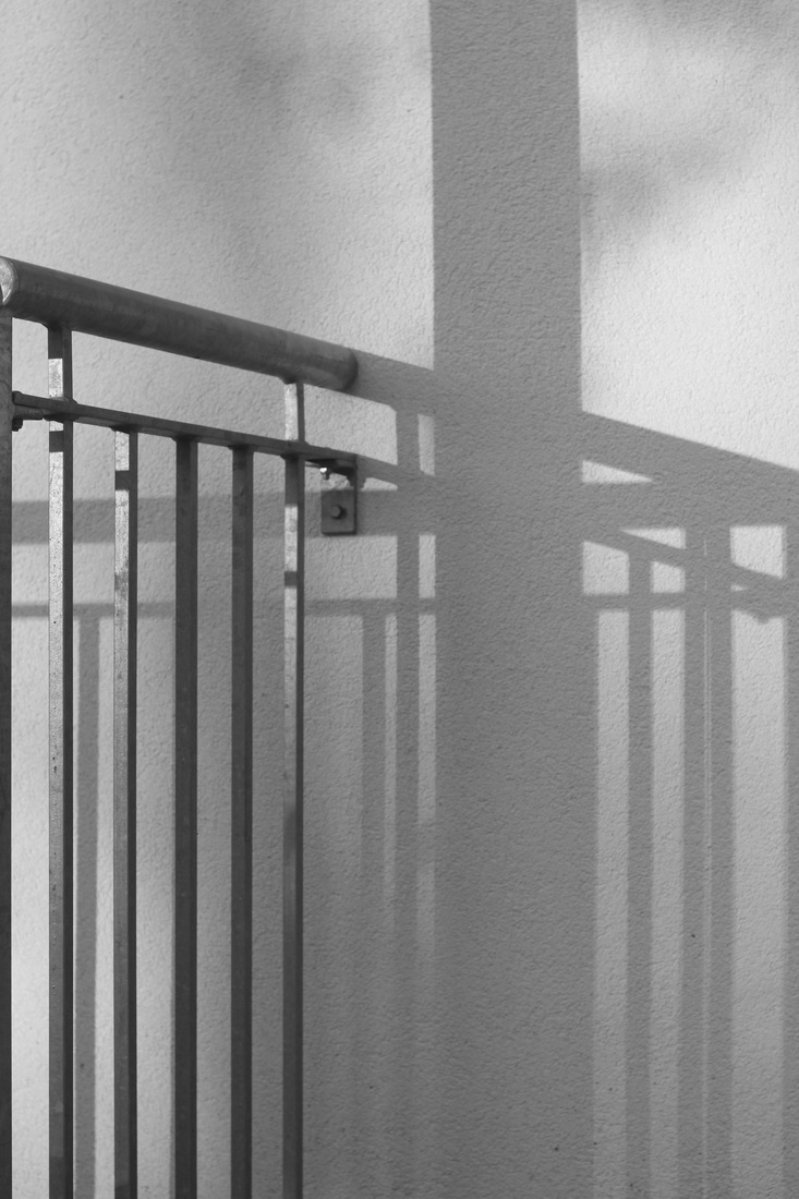
ALEXANDER RODCHENKO - BALCONIES (1925): PHOTO ANALYSIS AND RESPONSE
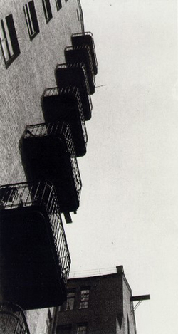
One of the most prominent formal elements in this image is shape, which is defined and geometric. There are almost no organic lines in the image. There is also a very evident repeated pattern of balconies running across the image diagonally. The line in the image is also very evident, which forms a zig zag through the middle of the image. The tones in the image are mid and dark, making the image slightly gloomy. This is probably due to the lighting, which is diffused in the image, as can be seen by the sky sharing the same tone throughout.
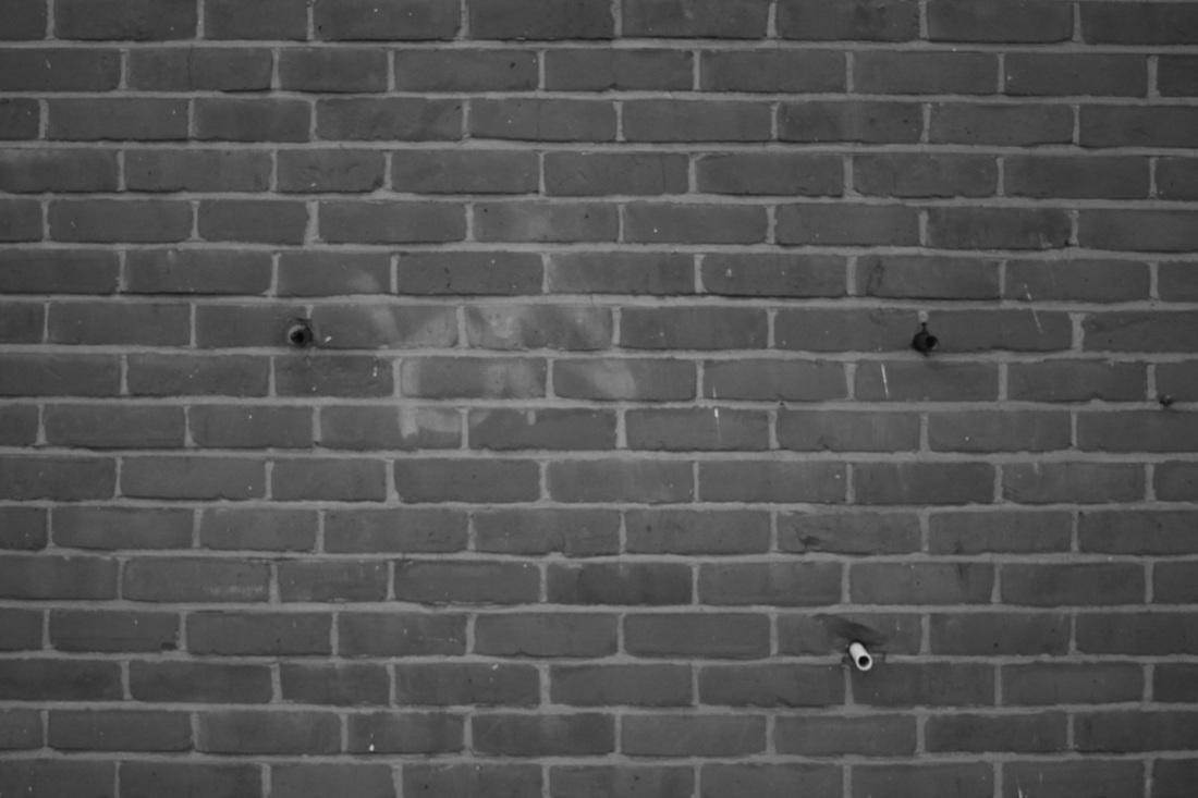
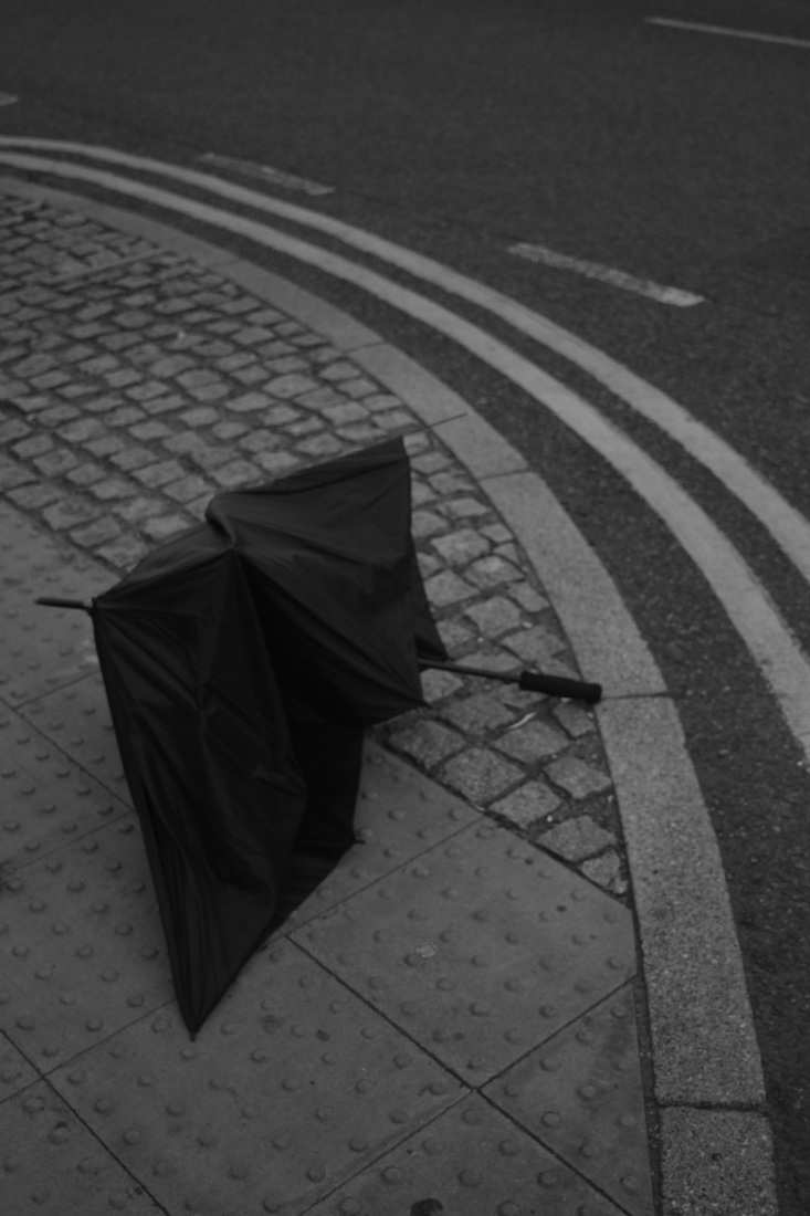
I took these images in response to the formal element, shape. I believe they were successful. However, some of the images I think, are lacking in their ability to catch your interest, such as the fourth image, which barely even has any subject aside from the small pipes coming out of the wall. Although, some were very successful, like the last image which I believe responds very well to Rodchenko's as it uses a similar pattern and structural motifs.
two edited responses

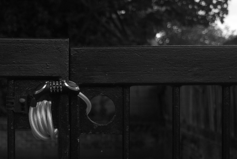
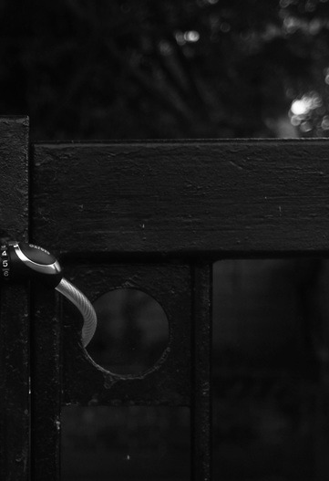

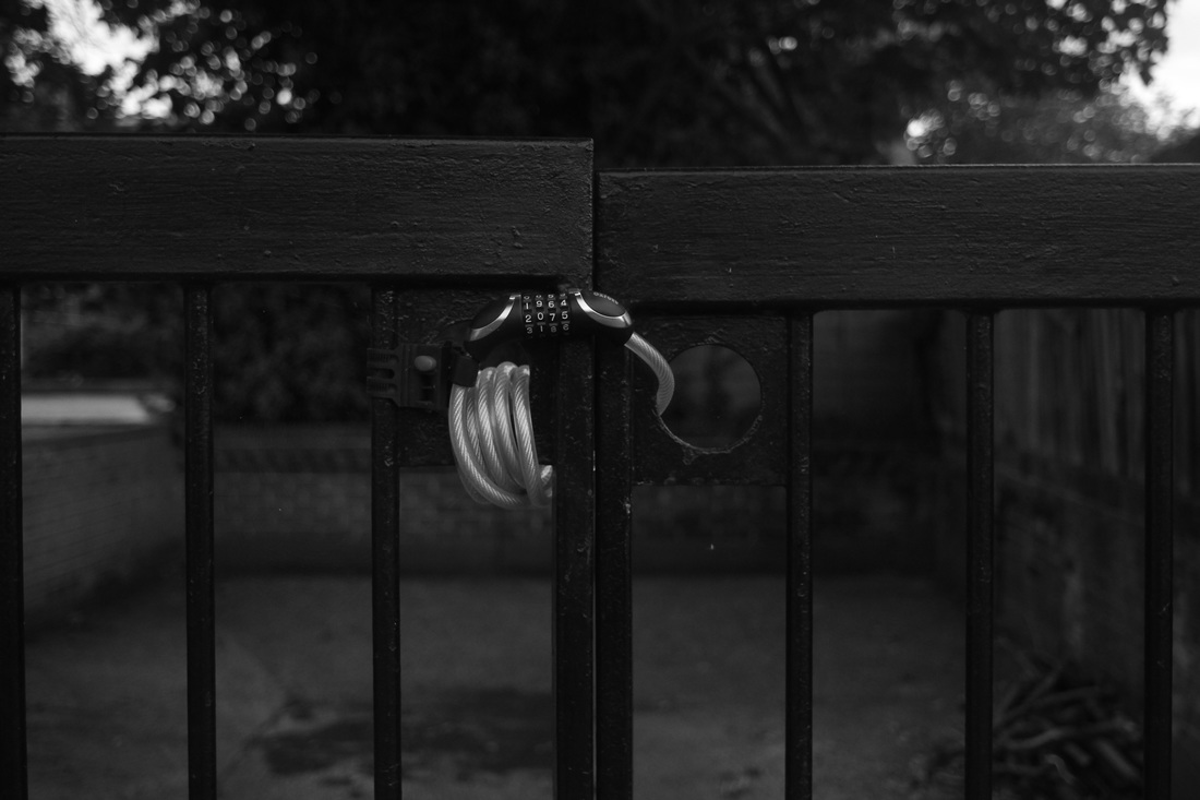
In the first set, I decided to crop multiple times in an effort to change the subject of the photograph, shape wise, from the lock to the gate and then to the bars themselves. I also tweaked the contrast to make the lock more prominent.
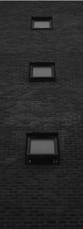
The second image was cropped simply to make the building appear taller to the eye, and to make viewing it a movement from the bottom upwards. The third image was just a correction to make the shapes of the windows stick out more in comparison to the walls.
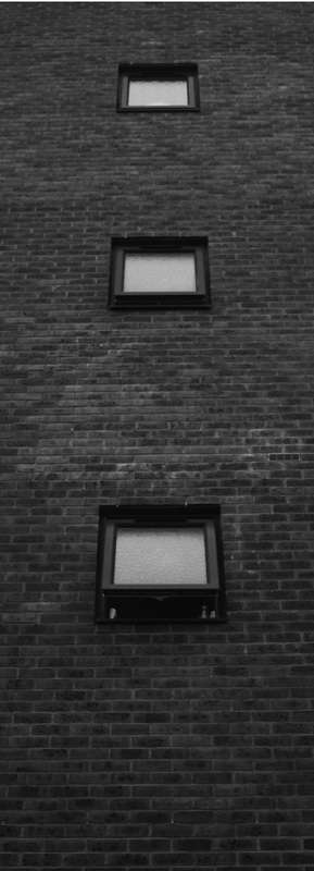
The second image was cropped simply to make the building appear taller to the eye, and to make viewing it a movement from the bottom upwards. The third image was just a correction to make the shapes of the windows stick out more in comparison to the walls.
ANDRE KERTESZ - DISTORTION (1933): PHOTO ANALYSIS AND RESPONSE
The element of this image that sticks out the most at first glance is the line. Within the image there are almost no straight lines to speak of as they are all from the woman or her distorted reflection. The shape is organic and rounded, making it a soft image to view.
TWO EDITED RESPONSES


In editing these images I attempted to change them within the context of the formal elements they were shot in response to. The first set I cropped to draw more attention to the curved line of the reflection of the sky and houses and to abstract the aerial part into a shape. The last contrast change was for the same reason. It was to bring out the reflection of the houses as i find that part of the photograph most interesting.
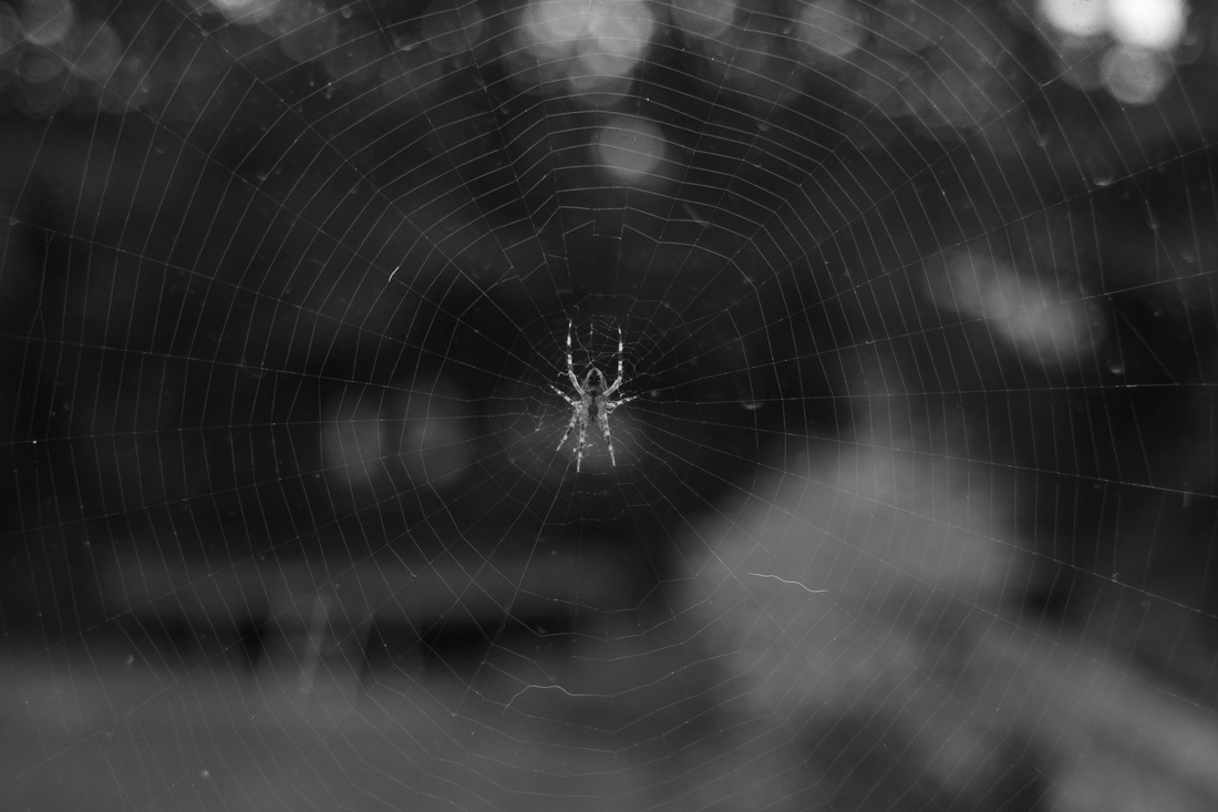
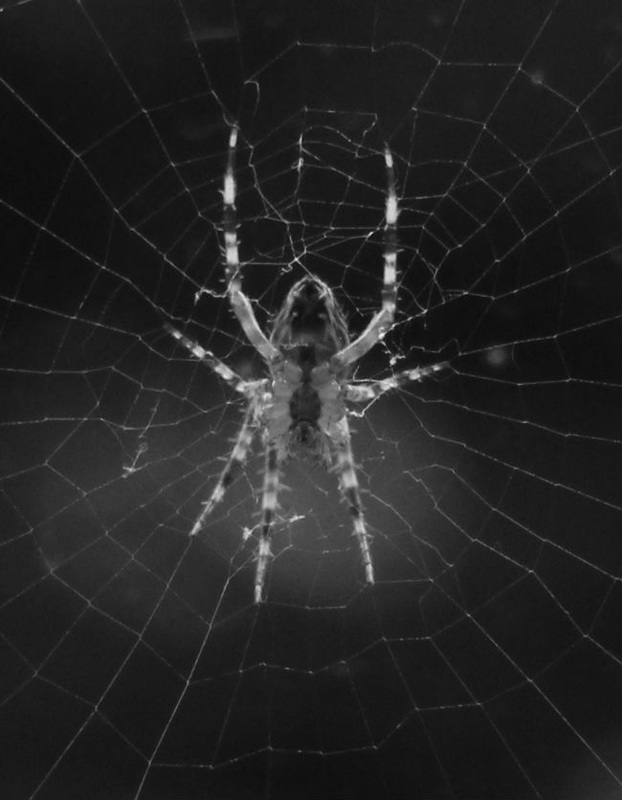
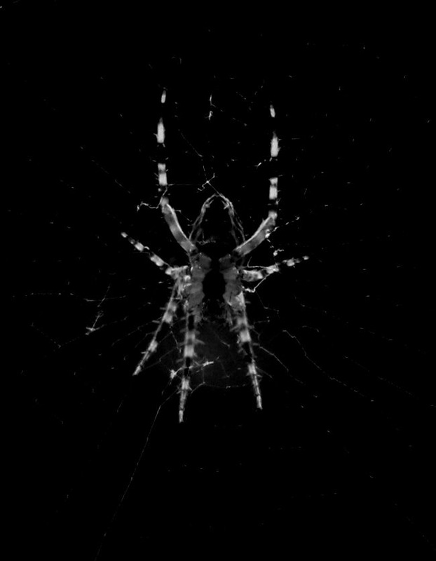
The second set was cropped so as to make evident the detail of the spider up close and make it more evidently the subject of the photograph. I then darkened it and added contrast with the intention of obscuring its lines partially, making the image eerie.
The second set was cropped so as to make evident the detail of the spider up close and make it more evidently the subject of the photograph. I then darkened it and added contrast with the intention of obscuring its lines partially, making the image eerie.
Refined formal elements responses
I believe the most successful image in the series is the first, taken from next to a staircase. It is interesting due to the nature of the light coming from the bottom of the image, as it is man made and reflects in only specific areas, due to the geometric shapes made by the corners. The light is also very diffused, making the image look soft. The lines are also prominent in the image, with two parallel lines running across the top and bottom of the image, and other lines forming a large shape in the middle of the image.
I believe this set of images were successful in response to the formal elements light and light, even considering that within my school there is not much to photograph that the vast majority would consider typically interesting.
I believe this set of images were successful in response to the formal elements light and light, even considering that within my school there is not much to photograph that the vast majority would consider typically interesting.
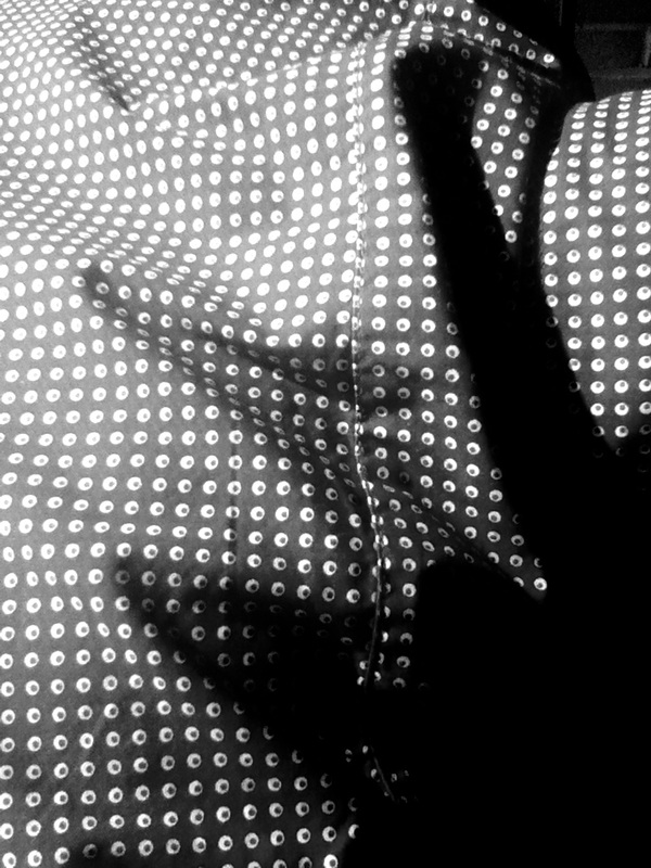
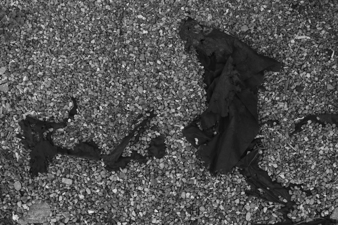
Further refined formal elements responses
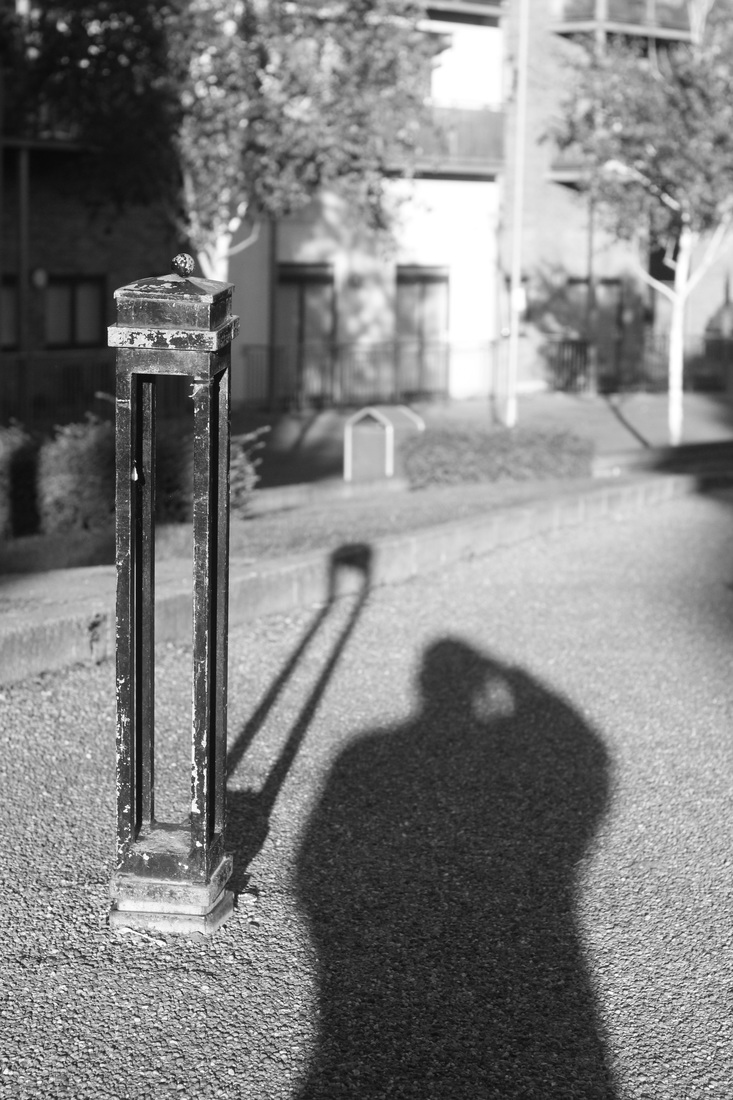
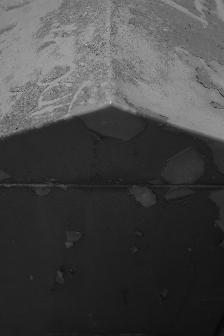
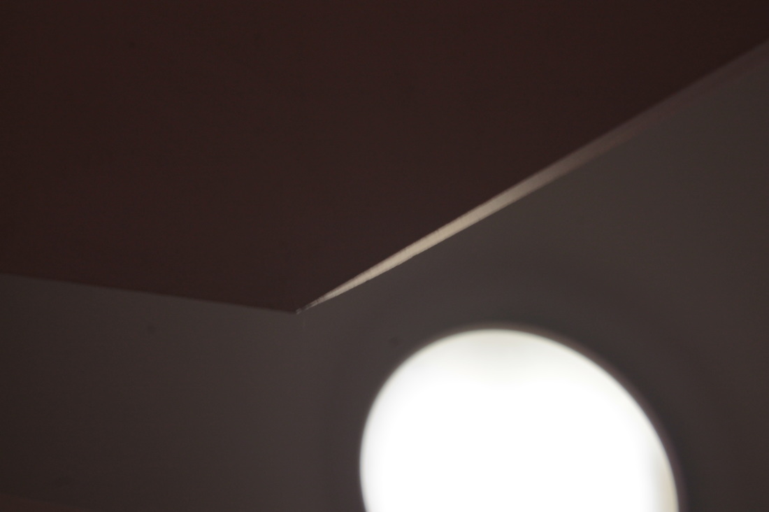
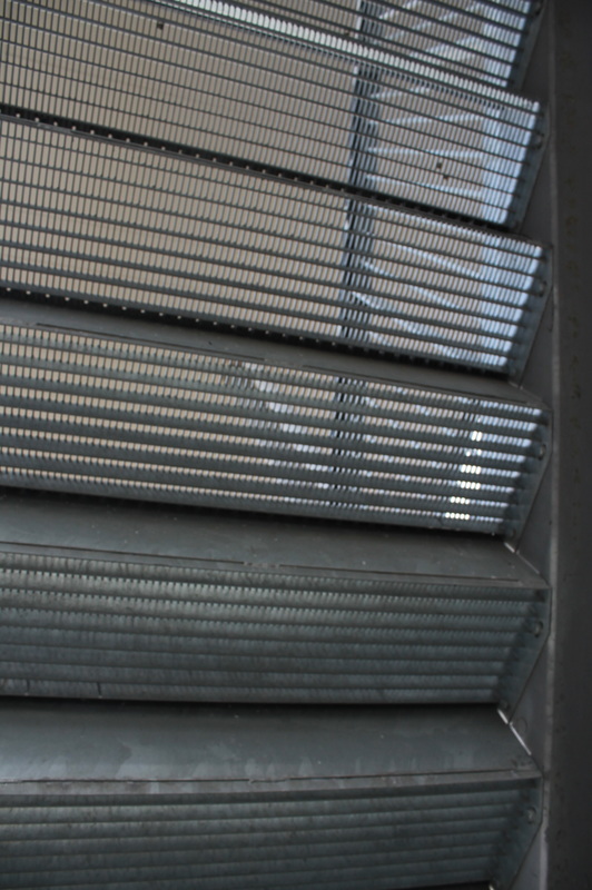
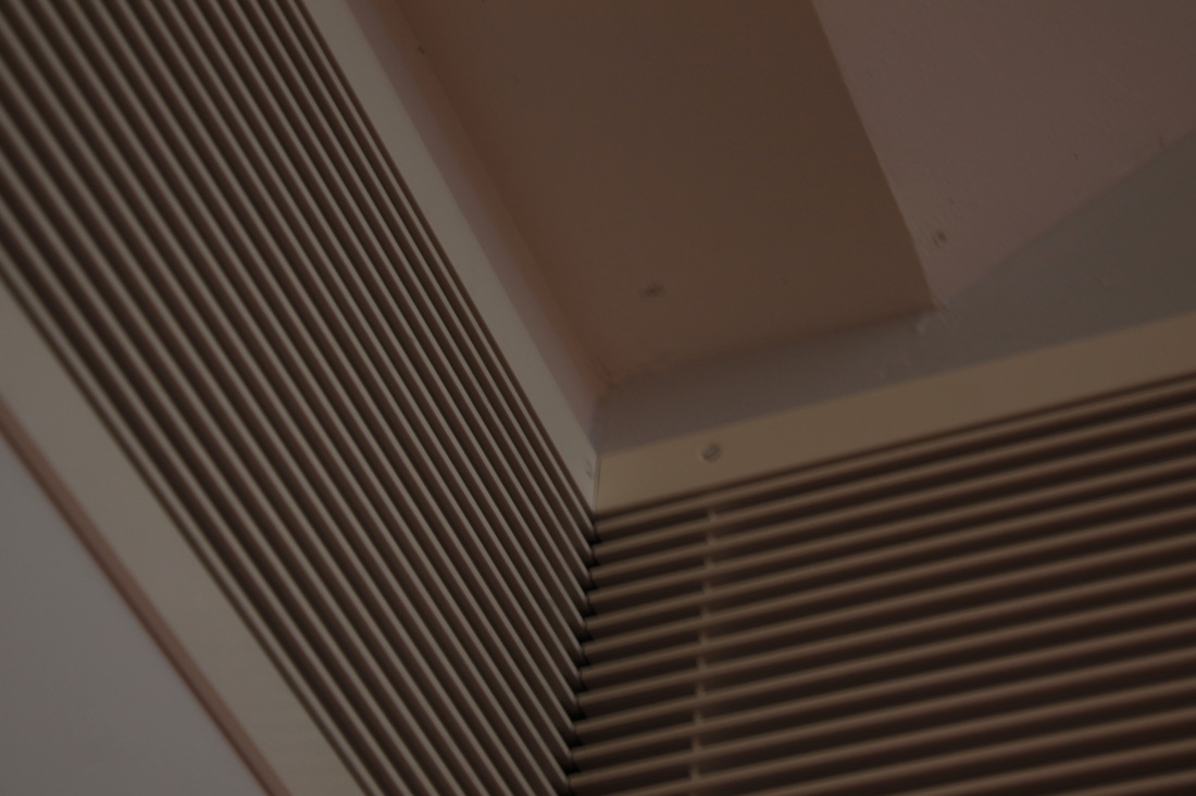
These refined images were taken in response to the the formal elements light and line, taking special note of the corners of the images. I believe these images are the most refined within the context of the formal elements.
Each image displays some type of unusual play on light which causes them as a collective to fit the criteria for the response to light and shape beautifully, for example, the fourth image which captures light hitting the fence at an angle at which the shadow continues onward at the same angle, and the sixth image, which captures the light at a dramatic diagonal angle, and with equal width between the lines, something not often seen. I also chose to convert the images to black and white to express these ideas more clearly, as it makes each formal element more prominent.
Each image displays some type of unusual play on light which causes them as a collective to fit the criteria for the response to light and shape beautifully, for example, the fourth image which captures light hitting the fence at an angle at which the shadow continues onward at the same angle, and the sixth image, which captures the light at a dramatic diagonal angle, and with equal width between the lines, something not often seen. I also chose to convert the images to black and white to express these ideas more clearly, as it makes each formal element more prominent.
darkroom printing
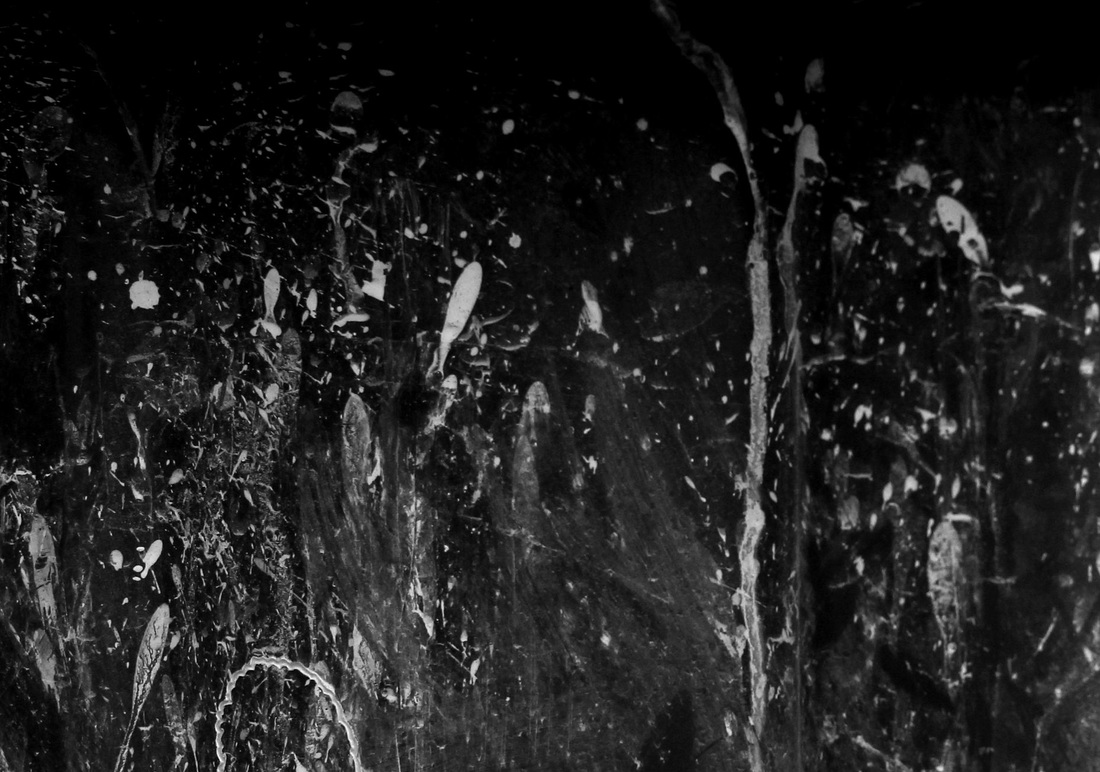
This is the first print I did within the darkroom. To do so I used a black and white ilford HP5 negative that I had shot and developed to use as simply a means to print, as the picture has no relevance to the task. I also chose this picture specifically as it has a vast range of tones while also being shot with a large wide open aperture, meaning that the focusing of the image will become more difficult.
This print was a success as it worked at a suitable exposure the first time at an aperture of 2.8 at 3 seconds of exposure. This however, I felt personally was overexposed but only to a small degree.
This print was a success as it worked at a suitable exposure the first time at an aperture of 2.8 at 3 seconds of exposure. This however, I felt personally was overexposed but only to a small degree.
This is the second print which was done with the same process and conditions but with 2.5 seconds of exposure rather than 3. This achieved the exposure I wanted successfully, but resulted in an even more washed out and similarly toned image. There is therefore very little to take from this image aside from this fact.
This was the third image printed with the negative in an effort to improve my technique. Note that I mistakenly put the negative into the holder backward, although this slight misdemeanor can be looked past as it doesn't largely affect my ability to evaluate the image.
To even further improve upon the previous two images, I felt that the large amount of middle greys were reducing the viewers ability to both enjoy and appreciate the image, thus, I used a pink filter with a strength of 3.5 to create a high contrast to then compare to the previous prints. I much prefer this version of the print as it really brings out each element in the image far more clearly, specifically the main subject, the hand, which contrasts with the dark tone of the background far greater, making it more prominent.
I am happy with this outcome of the print, however I still believe there is much room for improvement n focus and choice of filters to affect the image.
Contact sheets
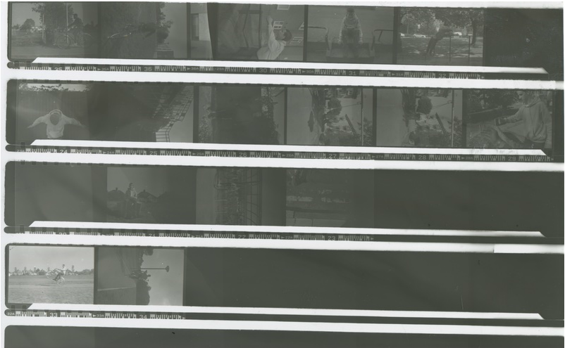
These contact sheets are from a series shot within and near my school building. They respond intentionally to Francesca Woodman's style of placing yourself as the subject. The images were a photographic collaboration between me and a classmate, taking turns to photograph one another posing imitating the environment or blending in within it.
This first contact sheet is an exposure test. When in the darkroom and enlarging, I split the sheet into five areas of exposure, the first getting 2 seconds while the others are covered, then the second and first for 2 seconds and so on. This creates a range of exposure from 2 to 10 seconds.
This first contact sheet is an exposure test. When in the darkroom and enlarging, I split the sheet into five areas of exposure, the first getting 2 seconds while the others are covered, then the second and first for 2 seconds and so on. This creates a range of exposure from 2 to 10 seconds.
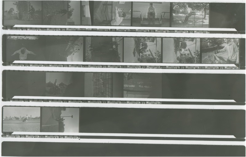
This sheet is one exposed correctly, at around 10 seconds, showing each of the images clearly. I can now, if needed, use the contact sheet to select the images I would wish to print.
