The world is beautiful
ALBERT REGNER-PATZSCH
Albert Regner-Patzsch was a unique and innovative photographer in many respects. He actively rejected many common notions of photography such as pictorialism, an attempt to imitate paintings, and general sensationalism within the genre.
Patzsch was part of the New Objectivity movement, a movement birthed in Wiemar Germany, attempting to combine the uses of both art and technology in an effort to almost create an almost utopian society in the face of the previous world war.
Patzsch's work is a great example of the combination of art and use, both as a result of the movement and his early pursuit of science. Within his style he would often photograph still life subjects, which is shown in his photobook "The World is Beautiful" which contained images of both nature and industry, contrasting one another.
I like Patzsch's work due to evidently strong and unique aesthetic which is very much formed from a set of rules he has set for himself, and hopefully I should achieve to do this similarly in my response. His style also has a very scientific feel to it, with intentions seeming deeply rooted in being useful and objective, while also bringing out beauty in that objectivity.
gallery


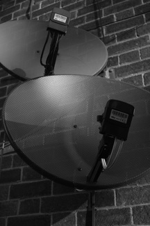
Here I have chosen some of my favourite images by Patzsch which demonstrate his attitude to photographic work to aid myself in response.
analysis
|
|
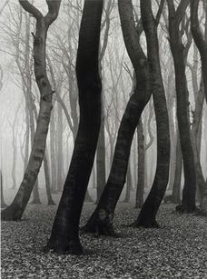
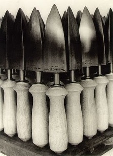
These two images taken by Patzsch are rather interesting as they have many similarities and differences, the most evident being the dissimilar subjects of the photographs. However this may be seen, as these images are paired, as irrelevant as they are arranged and can be seen to form similar patterns and also have a similar tonal range, although this is inverted for each of them, meaning that they both have a complementary aesthetic.
However, there are some elements of the images that are vastly different, such as their depth, in which the forest appears to span, relative to the scale, for a further distance, and shape, in which the organic shapes juxtapose the geometric. Both photos also have contrasting textures, from the hard matt texture of the trees to the glossy and crisp texture of the objects on the right.
The line in the image is also very different between the images, although they do both contain many
photographic response


I believe these images were very successful as a response to Patzsch's work. To respond, I chose to look at texture and shape, as these formal elements seem to be the most evident within Patzsch's work. I attempted to simplify the images when taking them, trying to keep only he subject within the photograph, which results in images very close, similar to Patzsch's. This draws attention to both the texture, which filled the images, and the shape, as the subject is the only object within the image.
assessment no. 1: 100 photographs in response


evaluation
Ultimately, I aimed to have my response both explore and experiment with the type of images Patzsch created. The Bauhaus style, within photography, is interesting as it aims to simplify what is often taken in a complex way. It also presents an idea of pure objectivity in the world, creating simultaneously utopian and dystopian images, as the nihilism that is paired often with pure objectivity can be unnerving. There are rules that I made for myself when taking these images, in a need to conform to the stylistic properties of Patzsch’s work. I aimed to do five things things:
1: To include both organic and geometric shapes, shapes that flow in some form, but not the in between.
2: To watch the corners of the image, to assure simplicity and no visual excess.
3: To keep as few subjects as possible within the image to further aid simplicity.
4: To make sure that the compositions were most often symmetrical as well as following the rule of thirds, furthermore the images being mostly centred within the image, rather than cut off at the sides.
5: To most often keep the subjects not being human, rather, to take photographs of objects as often they have more variation in texture, shape, form and tone which produces better images for Bauhaus inspired work.
I believe that my one hundred images have been very successful in following these rules. Looking over them now, geometry seems to play a clear part in the images, which is fitting, as often I shoot in urban areas. However, some of the images, mainly those of plants and nature, followed the style less, as it is difficult to capture clear and simple photographs of something very often scattered. In this way, I believe they let down the collection. Although some are successful in following the rules, such as the images I took of tropical plants, which follow very distinct patterns, which is perfect within the context of the task.
I also believe I was successful in choosing subjects appropriate overall for the task, such as mostly technologically linked and urban subjects, although I did attempt to photograph animated subjects, such as the pigeons and some figurative ones. I have also found through this task that the way in which metal is textured and reflects is complementary to the Bauhaus style, thus I included it in many of my images.
Many of the photographs I took were on different days in batches, on various cameras, settings and aspect ratios, as I attempted to experiment within the style as much as was possible, resulting in varied images. When looking chronologically through them, it is apparent that I attempted to experiment within the style as much as was possible, and in some varied ways that have not been shown in Patzsch's work, such as taking a photograph out of focus to enlarge the basic shapes and make the less apparent ones disappear.
I used colour at the beginning but then switched to black and white due to the fact that many images simply look better in black and white within the context of a Patzsch response, as his photographs were only shot on black and white film, and because the use of black and white naturally follows the task, as it makes shape, texture, line and composition more apparent.
To conclude: I believe I have completed this task well, although there is area for improvement. To refine the style, I would attempt to whittle down the images to those that conform the most, yet still attempt to explore other compositional and subject areas not shown in Patzsch's work.
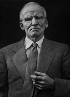
my favourite images
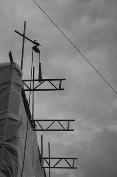
I like this image very much as it is incredibly simple as it is only comprised of a few shapes, all geometric around the center of the organic shapes, thus is kind to the eye.
|
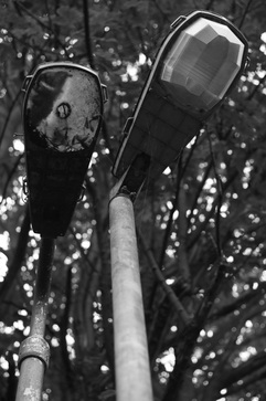
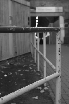
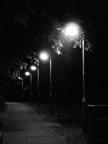
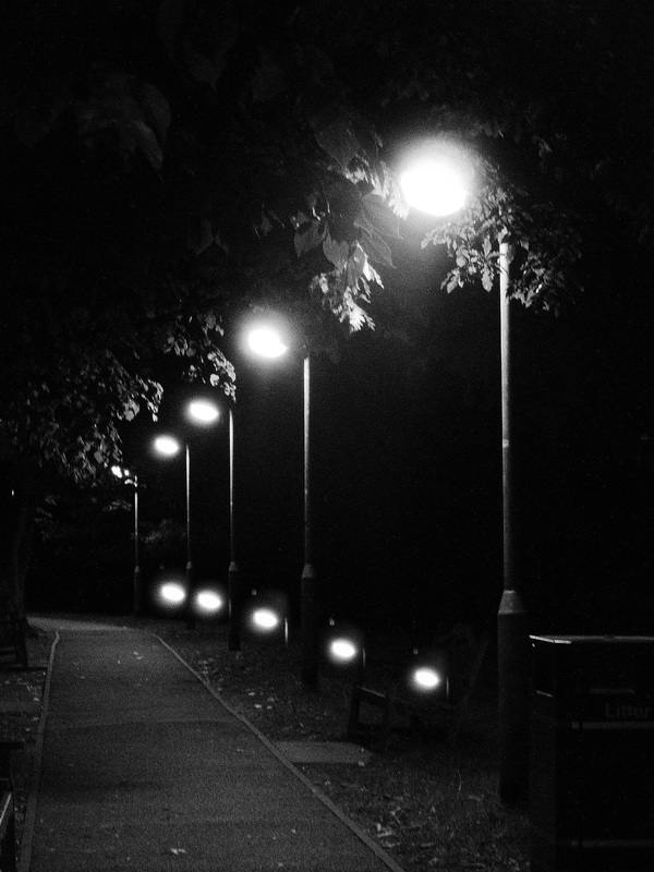
This is my favourite image of the entire collection as it, in my opinion, is the greatest example of the juxtaposition of geometric and organic as the matt textured lamp posts which have very faded light, look almost opposite to the random and out of focus background.
|

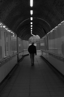
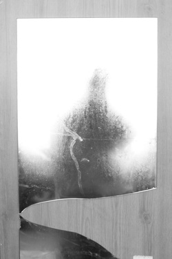
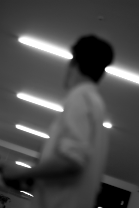
This image is one of my favourites for the same reason as the first image, in that it is very simple, and almost all the lines in the image appear to move toward the man walking in the center.
|
curating
I have decided to group my images taken for the task in an attempt to curate photosets that share similarities or differences in the way they respond. I am beginning by sorting them by each of the most prominent formal elements.
light
|

|
|
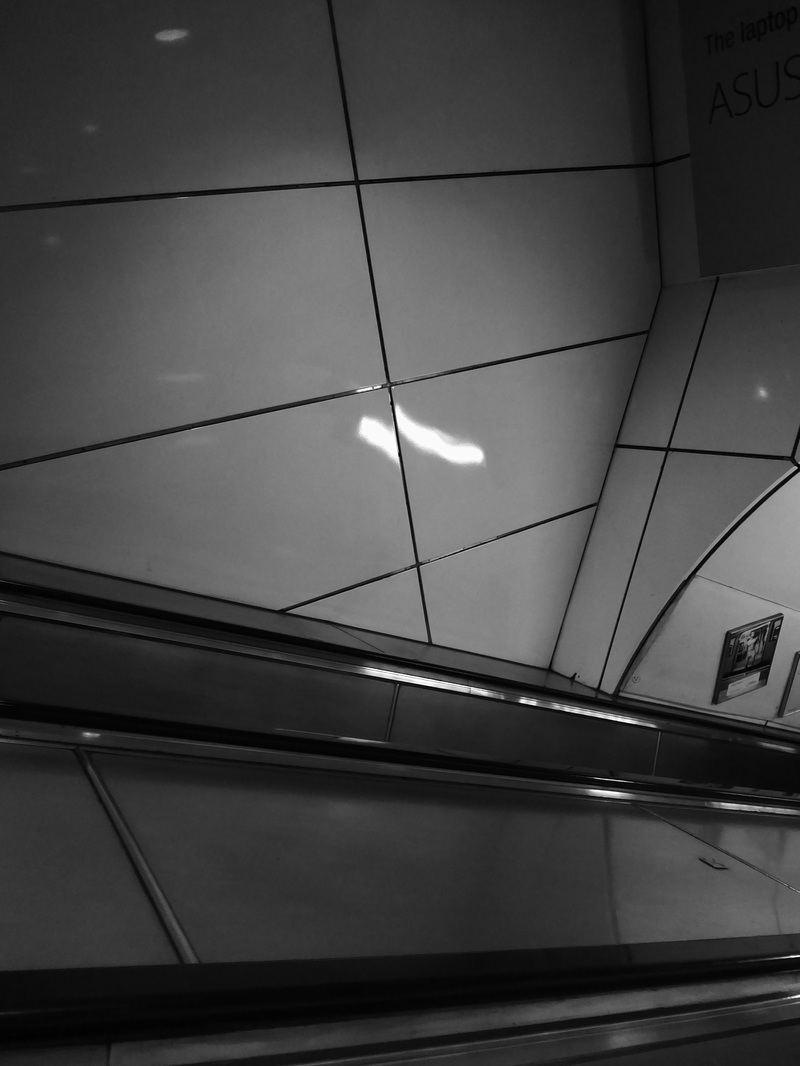
focus

|
|
|
line
|
|
other photo sets
atmosphere
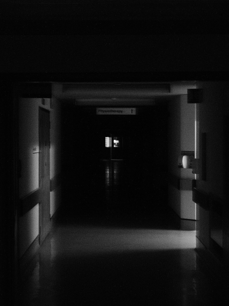
|
|
|
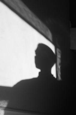
SILHOUETTE
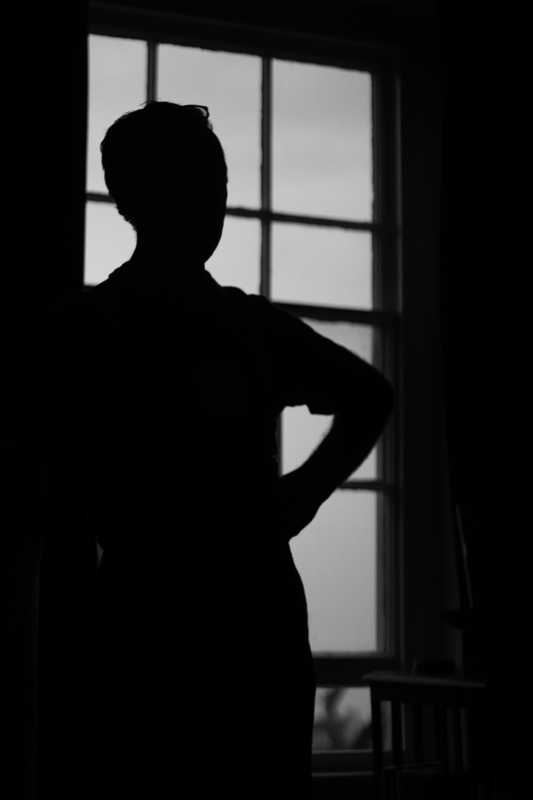
|

|
|
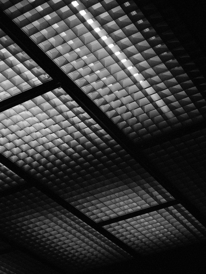
bauhaus
|
|
|
clone stamp

|
The clone stamp is a tool that can be used in many photo-editing software. In essence, the clone stamp uses one chosen part of the image and duplicates it in another area. This allows the user to duplicate and place visual motifs and elements into other parts of the photograph, or remove them respectively. This allows many different possibilities within the editing of the photograph.
|
editing practice
|
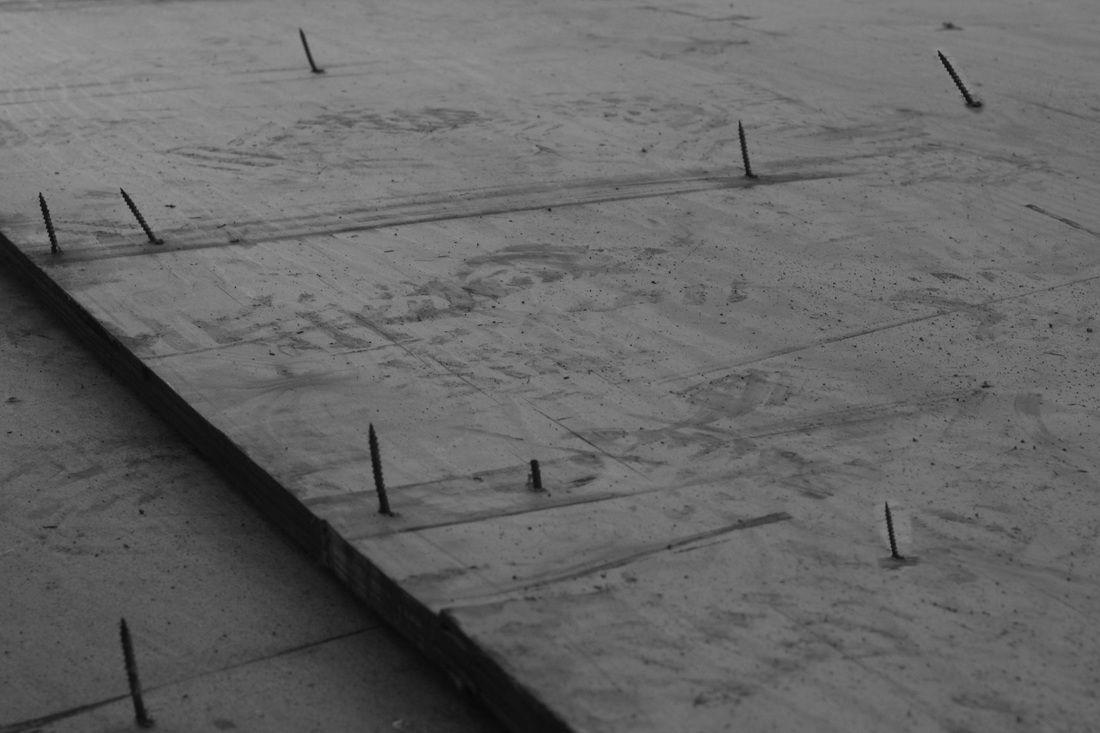
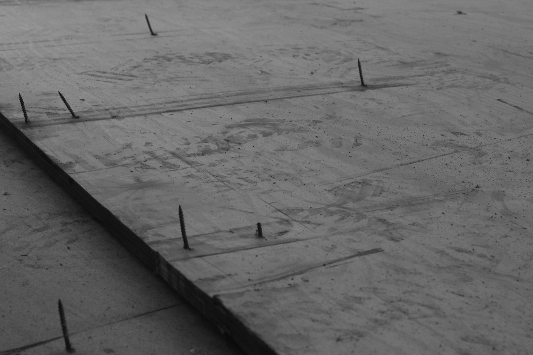
|
In this image I decided to simply repeat two nails. This creates the effect of almost seeing a pattern of randomness, however it was mainly to test the use of the clone stamp tool.

|
|
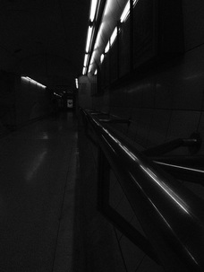
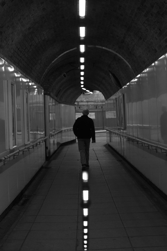
In this image I repeated the lights from the ceiling of the tunnel mirrored in the same place composition-wise. This accentuates the line of the lights and all the general compositional elements which flow toward the center of the image, as well as making the basic shapes in the image all symmetrical.
|
|
In this image I decided to use one motif to, similarly to the last edit, accentuate the lines showing perspective, almost indicating more clearly the point at which they would meet if they were to continue.
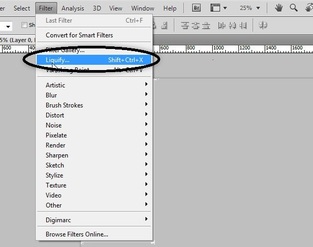
liquify tool
|
The liquify tool is essentially a tool which drags certain areas of the photograph, extending the dragged area and making smaller the area of the image dragged over. This allows the user to create very surreal images. It also allows the possibility of enlarging areas of the image, making it able to enlarge eyes on a portrait for example.
|
editing practice

|
|
|
|
|
|
|
|
editing to move onward
chosen photograph
|
|
