photobooks
"A photobook is a book – with or without text – where the work’s primary message is carried by photographs. It is a book authored by a photographer or by someone editing and sequencing the work of a photographer, or even a number of photographers. It has a specific character, distinct from the photographic print..."
the history of photobooks
The history of the beginning of photobooks is rather hazy. This is due to them becoming a very recent recognised art form in only the last sixty years or so. Therefore disputes occur in what can be considered a photobook, as for example, victorian books made by doctors of photographs of organs for example that some see to have artistic merit, photo albums created for personal use utilising relational composition, beautiful astronomical images of the moon, or political manifestos made primarily with well taken photographs may all be considered photobooks, but none may have had any artistic intention however. Photobooks may therefore perhaps have to have their invention date derived from the interval of time they arisen into popular culture or when the need for them became apparent, in an age of images with cheap camera technology such as the 1950s onwards, when many had access to taking photographs. This could be seen to be when photobooks gained both political, social and artistic recognition, through the small revolutions undertaken by photographers using the medium like for example American photographers such as Walker Evans, William Klein and Robert Frank, or Japanese photographers perhaps in the Provoke movement in the late 1960s. Some argue, although it will never be universally agreed upon, that 'Photographs of British Algae: Cyanotype Impressions' by Anna Atkins made in 1843-53, however this was eons before the time period of a universal agreement of their existence, and is also a scientific artefact, but is interesting when considered the first, as it is indicative of the liminal nature of photography between documentation, science and art.
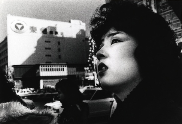
The World Through My Eyes - Daido moriayama
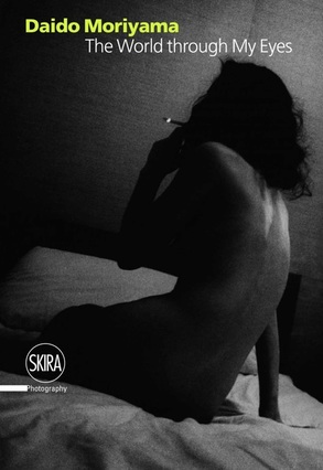
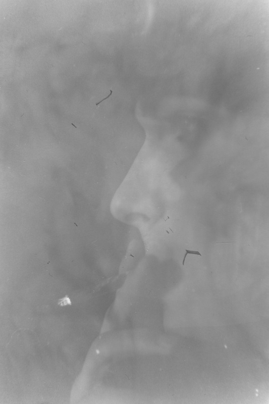
For my photo book study I have chosen a book by Daido Moriyma called 'The World Through My Eyes' which is essentially a compilation of his travels throughout Japan through many years, with a unique visual aesthetic formed from abstracted, high contrast, atmospheric snapshots of life as if bled from the human subconscious, out of focus and blurry shots only emphasising the emotions that are communicated through his work.
subject matter
His work and this resulting book can be summarised by the subject matter of journeying and images that relate to the human condition, rather than still life art images that are to be interpreted by us, Moriyama's images simply describe what we already know in an unknown way.
cover design
The cover image for this book is intriguing, and is overly demonstrative to the potential buyer of Moriyama's approach to photography, showing his ambiguous and emotional images, along with his unique aesthetic. however, I do not think the title of the book is well made, simply the choice of the photograph. It could easily be improved by lacking colour in the text, and having the name and title snapped to the left side in a minimalist font to allow the photograph to speak for itself.
strength of the photography
The photographs in this book stand out in so many ways, from the odd approach to common subjects, to the heavily emotive aesthetic, which transcends photography as the capturing of objective form to a perspective rather,perhaps Moriyama's. The book does not in many ways communicate an intention, as is shown previously it is more an amalgamation of experience than a planned and intended work, meaning that a singular or definable artistic vision is almost impossible to derive from it. Considering the subject matter, the camera technique and subject matter neither fit nor do not, rather Moriyama works through subjects that cannot be approached in one way that could be conceived to be correct. What is fascinating about Moriyama's work is that if one photo was selected from one of his books, some could be conceived to be amateurish, yet as a collective his work holds an incredibly strong aesthetic vision that is inherently professional.
page layouts
The placement of many of the images in the book are haphazard in many ways, as they contain no specific sequence to them. Yet this is a conscious decision not to care, as in many ways Moriyama's work is like a dream, it is subconscious. Therefore his books being chronological is not at all important. There also therefore is no visible logic to the placement of the images on the spreads and presentation of the images, and in many ways this is fitting. It allows the reader to absorb each image rather than attempt to connect them, so they see the work as a body of individual images that are connected by the photographer rather than by subject or sequence. The layout of the images transcends time, as it is printed full bleed without text, leaving the composition to the photographs themselves rather than how they relate to the space in the page, which results in a book which is almost pure and not stylised, aside from the photos themselves.
editing and sequencing
As Daido Moriyama claims himself, his sequencing is not apparently important to him in the slightest, it is the photographs themselves as they are what show his photographic vision and thus his books contain no intrinsic chronology or journey/story, even though many of his photographs were taken while travelling. This in many ways allows the viewer to create their own interpretation freely or just rather see the photographs as a body of individual works that are together impact-full rather than flowing through a timeline.
overall impact
In my own opinion, the impact of this book is deep and moving, and it sticks with you after viewing it. This may be due solely to Moriyama's utterly unique perspective on the world and what is contained within it that is worth photographing, contrasting as a whole more western and objective styles of photography. This book has a power that lasts and that is return worthy, especially considering the way in which the lack of sequencing allows the viewer to open it at any point, making it more casual to view, rather than requiring dedication.
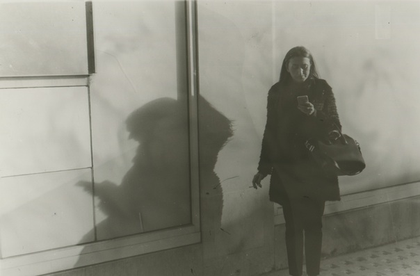
response photobook


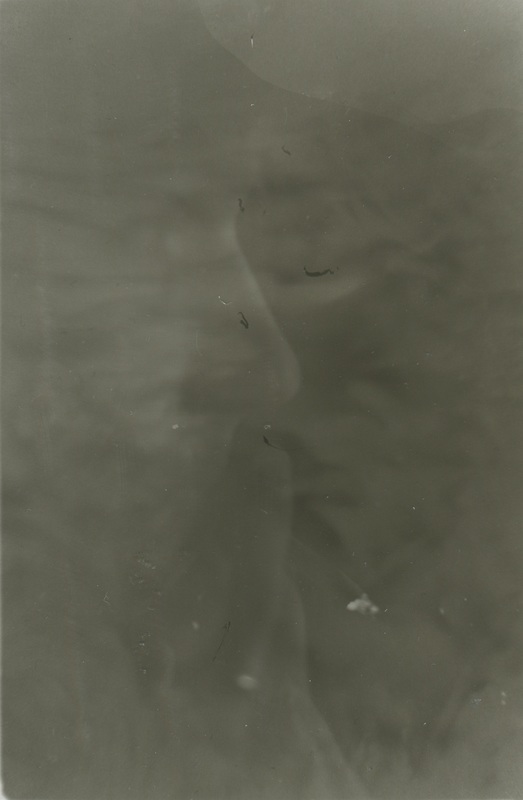
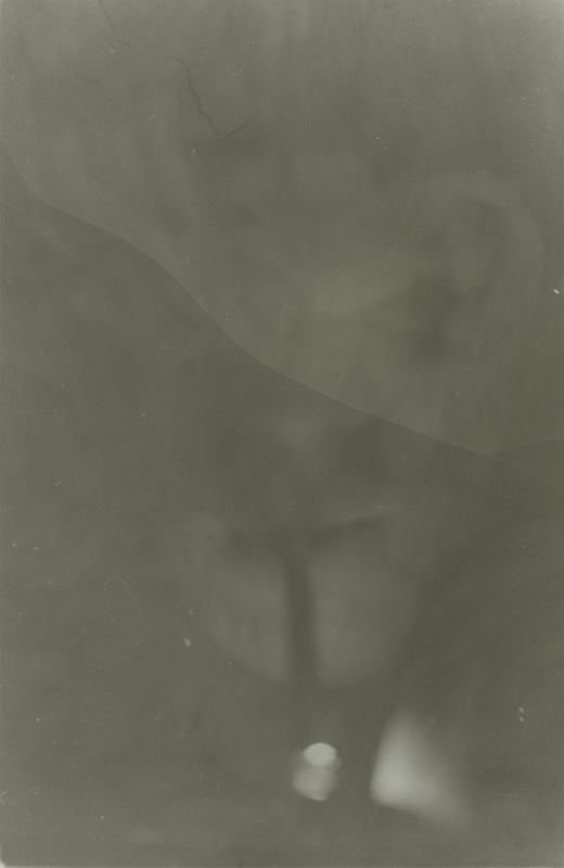
This is a series of unrelated images taken in class, in response to Daido Moriyama with the tools I had at my disposal, a tiny Olympus digital camera and, when it ran out a Canon 1100D, posing quite a restriction stylistically. We were only allowed half an hour to photograph also, posing another large restriction on the series. I find I prefer the images from the Olympus, creating not sharp, but more creative images due to the restriction in technological advancement, and the bright flash, illuminating texture, and creating more visually stimulating images even indoors.
This activity allowed me to realise that to simply photograph what is most intriguing to me within the genre I choose, as to force myself to shoot was is not interesting almost always makes me produce less visually interesting images. I have decided that I am to later pair these images in diptychs as photo book practice, explaining them compositionally and evaluating.
This activity allowed me to realise that to simply photograph what is most intriguing to me within the genre I choose, as to force myself to shoot was is not interesting almost always makes me produce less visually interesting images. I have decided that I am to later pair these images in diptychs as photo book practice, explaining them compositionally and evaluating.
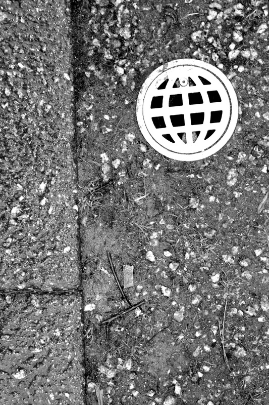
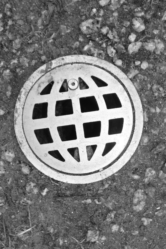
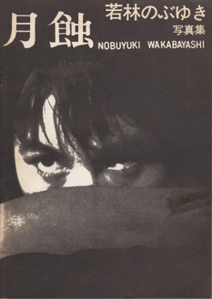
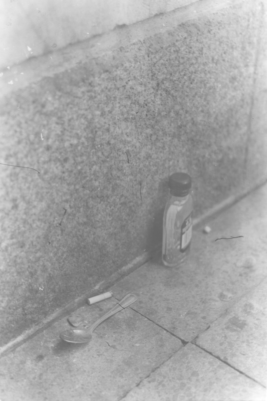
NOBUYUKI WAKABAYASHI - GESSHOKU - LUNAR ECLIPSE (若林のぶゆき 月蝕)
|
Pages: 64
Place: Tokyo Year: 1972 Publisher: PhotoJapan Size: 18 x 26 cm Softcover 55 monochrome photographs, many printed in blue. |
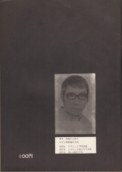
Wakabayashi was born in 1939 in Okayama City and became a member of the Japan Professional Photographers Association, holding his first exhibition in 1962. This book presents the best images from that exhibition, of prostitutes in poor Tokyo neighbourhoods between 1955 and 1961. His solarized image style are used to great effect within this publication.
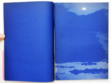
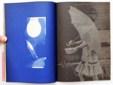
Wakabayashi's 'Lunar Eclipse' is an odd photo book, following grainy, high contrast, blurred and out of focus images of prostitutes in Tokyo neighbourhoods between 1955 and 1961. In short, a unique approach, using blue printed pages in full bleed, and using composition and a style not ever often seen in a book that is rooted in the genre of photo-journalism. The cover design is also rather interesting, simply giving an image in his style. Its not particularly shocking, but still retains interest. I will however cut it some slack as it was sold as a cheap zine and therefore the cover is not key to the success of the book.
The collection of photographs stand out in many varied ways. As a body of work, they communicate emotion and draw in the viewer without knowledge of the subject matter. The low contrast, messy images along with blue printed solarized images is, as many may agree, completely unique to the book and gives it a special touch, fitting with the aesthetic is also matt paper and full bleed spreads, photographs that are printed over both pages, as well as composed sets of multiple images in the spreads. I can't be sure exactly what the artists intention was, yet the book is incredibly provocative and evokes a melancholic atmosphere as well as a sense of loss, perhaps due to the blurred faces. The book is incredibly aesthetically sophisticated in my opinion, as it is so very original due to the odd processes used in its creation. The photographic subjects also fit this, each image appearing not similar, but out of the same world of the subconscious.
The placement of the images in layout seems very sophisticated and thought out. Yet in many ways it doesn't appear calculated for effect, rather more due to the photographer's own feeling as to how the images will fit within the space given, and the resulting effect that occurs is one that is demonstrative of the photographer's feeling and there is therefore a subsequent communication of these ideas, of his rationale in his photographs. The choice is not necessarily conscious, but emotion flows from the unconscious choice behind it, even if there may not be a visible logic to it. The layout, as I have said about Moriyama, is not dated, as much of it is full bleed, which was used since these types of photo books were produced up until the present day. In many ways the book sits on the line between a narrative and not, as it does not tell an objective account and is not chronological in any evident way, but does provoke the atmosphere of the place, in a way telling its story.
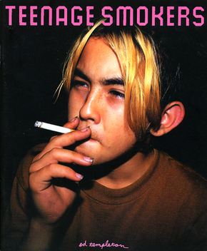
ed templeton - teenage smokers
Pages: 96
Publisher: Super Labo 2015
Format: Hardback
Publisher: Super Labo 2015
Format: Hardback
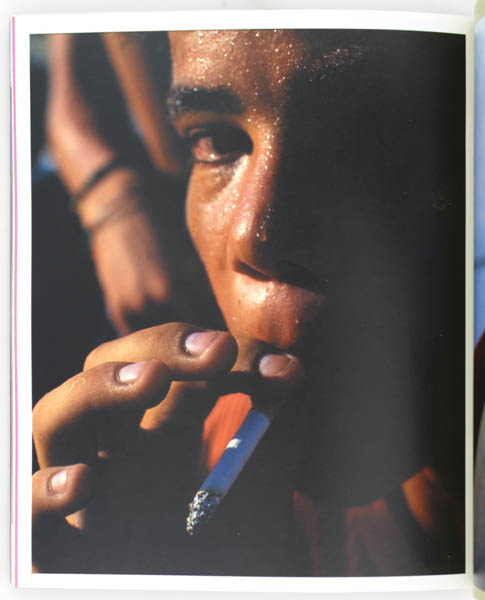
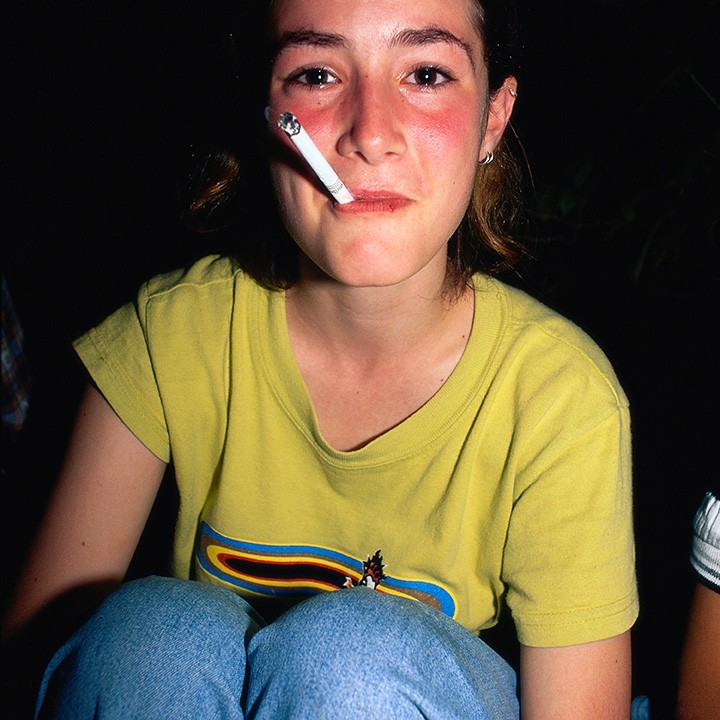
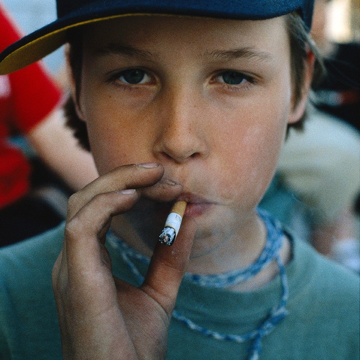
Ed Templeton is an American photographer and artist. He was heavily involved in the skate scene through the transition in the nineties from freestyle and vert ramp skating tricks into a hybrid of the two, modern street skating. The book and its concept began when Templeton would reside in skate parks while kids were there hanging out and smoking. He once bought a Polaroid and began photographing them while smoking on film and polaroids. The idea coincided with his inability to comprehend the length people will go to, considering the harshness of it on the lungs, thus he marvelled at them as they did so. Smoking is also a logical fallacy yet the people had managed to overcome this due to their desire for respect. The book presents a typological photographic study of an action, specifically one to be thought about from many angles, and has a choice of subjects that relates to the action and its cultural influence and is therefor very meaningful and thus very interesting to me.
The cover in one sense simply is descriptive of the contents of the book as it presents the average content of the book and therefore is evidence of the subject matter within. The image was a good choice, as it has elements that make it stand out, such as the unusual long bright hair, long nails and bright white cigarette. The placement of the title contrasts this, in purple, an opposite colour, and is very regular in comparison to the perceived messiness of the boy.
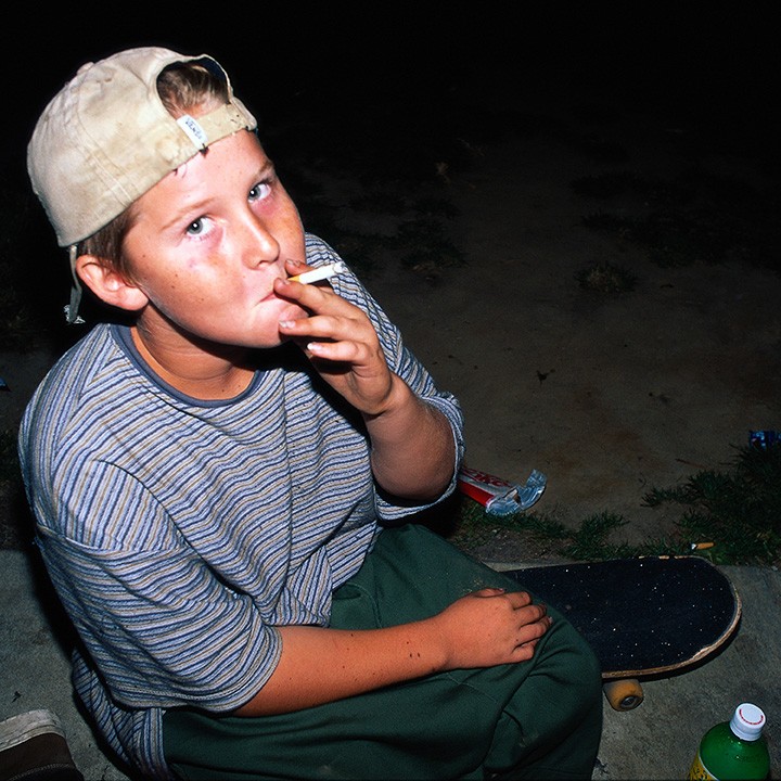
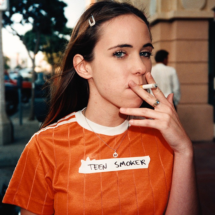
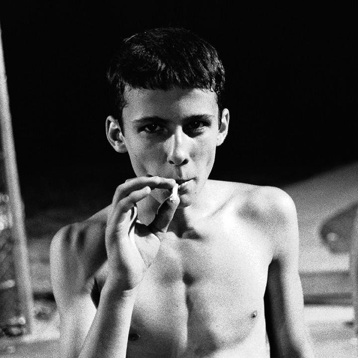
The photographs overall stand out as a collection due to their typological and documentary aspect, as well as their small variations dependent on the context and event of the photograph. They are descriptive of a specific time period and are in that way a study. The collection do in a way present an artistic intention, perhaps for the viewers to contrast their disgust with the aesthetic of smoking. The camera style is also extremely fitting, as intimate methods of using a polaroid and close 35mm film capture something small and blow it up large, exposing the action. Templeton also adds drawing and writing in an urban nineties style, mostly describing, and talking of the subject and action, as if it were a diary. However all of this is left ambiguous so in some ways the book tiptoes on the line between meaning and description.
The layout of the book, in the last four images of the gallery, is very interesting as the layouts often incorporate colour as well as diptychs within time frames. Each page describes in its own way, fitting with the image, and thus making the book full of interesting changes and differences. It is the constant variation that produces the feel of the book, therefore a type of logic exists within it, although not a measurable one. I feel that this approach is certainly different within a zine to the full-fledged, upright and romantic view that street photographers may usually take to making incredibly expensive books of their work and therefore not choosing intuitively through emotion but rather through what looks most sophisticated. Templeton was not worried about looking amateurish and therefore succeeds in describing the subjects.
The editing and sequencing of the book is unusual to speak of, as I cannot view the book physically, yet it does appear that the photographs are shot and therefore appear stylistically in the same way, or at least a similar way each time. Therefore most of the images fit into the loose bracket of the subject matter, which in a way makes it more interesting as the book becomes a typological study upon one thing, and the variation becomes what is important, rather than each image's relation to the subject, as the relation is already very evident. I like the way in which Templeton does not give clues within each encounter, rather they are presented as fleeting experiences or meetings, rather than a story. Nothing links each individual subject aside from their action. They are simply alone in the photographs but feel as if they're together.
The cover in one sense simply is descriptive of the contents of the book as it presents the average content of the book and therefore is evidence of the subject matter within. The image was a good choice, as it has elements that make it stand out, such as the unusual long bright hair, long nails and bright white cigarette. The placement of the title contrasts this, in purple, an opposite colour, and is very regular in comparison to the perceived messiness of the boy.
The photographs overall stand out as a collection due to their typological and documentary aspect, as well as their small variations dependent on the context and event of the photograph. They are descriptive of a specific time period and are in that way a study. The collection do in a way present an artistic intention, perhaps for the viewers to contrast their disgust with the aesthetic of smoking. The camera style is also extremely fitting, as intimate methods of using a polaroid and close 35mm film capture something small and blow it up large, exposing the action. Templeton also adds drawing and writing in an urban nineties style, mostly describing, and talking of the subject and action, as if it were a diary. However all of this is left ambiguous so in some ways the book tiptoes on the line between meaning and description.
The layout of the book, in the last four images of the gallery, is very interesting as the layouts often incorporate colour as well as diptychs within time frames. Each page describes in its own way, fitting with the image, and thus making the book full of interesting changes and differences. It is the constant variation that produces the feel of the book, therefore a type of logic exists within it, although not a measurable one. I feel that this approach is certainly different within a zine to the full-fledged, upright and romantic view that street photographers may usually take to making incredibly expensive books of their work and therefore not choosing intuitively through emotion but rather through what looks most sophisticated. Templeton was not worried about looking amateurish and therefore succeeds in describing the subjects.
The editing and sequencing of the book is unusual to speak of, as I cannot view the book physically, yet it does appear that the photographs are shot and therefore appear stylistically in the same way, or at least a similar way each time. Therefore most of the images fit into the loose bracket of the subject matter, which in a way makes it more interesting as the book becomes a typological study upon one thing, and the variation becomes what is important, rather than each image's relation to the subject, as the relation is already very evident. I like the way in which Templeton does not give clues within each encounter, rather they are presented as fleeting experiences or meetings, rather than a story. Nothing links each individual subject aside from their action. They are simply alone in the photographs but feel as if they're together.
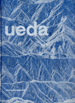
Shōji Ueda - shōji ueda
Pages: 188
Place: France
Year: 2015
Publisher: Chose Commune
Size: 23 x 30 cm
Hardcover
Place: France
Year: 2015
Publisher: Chose Commune
Size: 23 x 30 cm
Hardcover
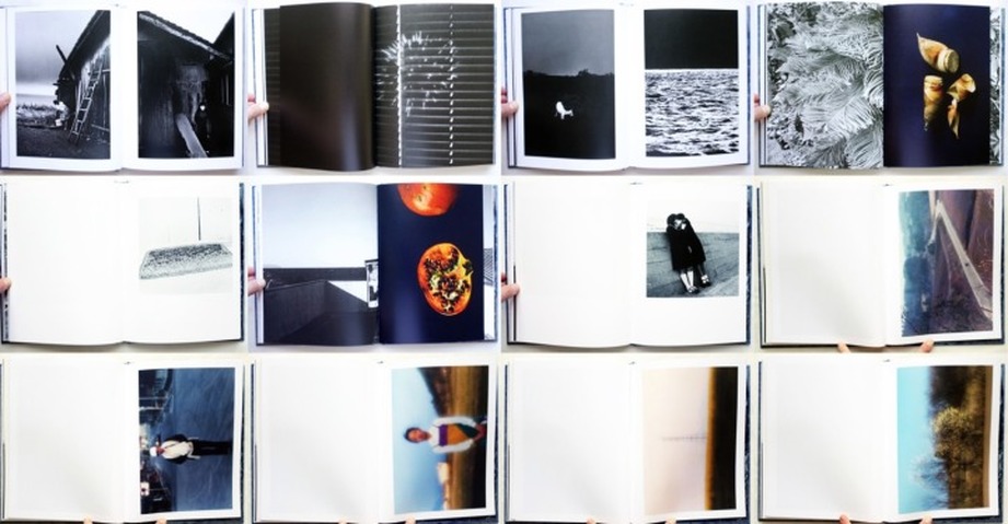
Shōji Ueda was born in 1913 and died in 2000. The book is about Shoji himself, an intimate view of his personal experience spanning a lifetime. This highly personal collection is, similarly to Daido Moriyama, not bound by restriction within a genre or idea for the book, but rather defined by the eye of the photographer and a pure intuition. He most often photographed that which he found previous around him: a beautiful landscape or human, and often composed still lives of fruit and objects when not wandering. The book is is essentially the travels of Ueda, shown through the intricate details of life surrounding him throughout his life in Tottori (his birthplace), on the Sea of Japan.
The cover is very interesting as it is just as much part of the book as the images, as it depicts snow covered rocks/mountains which in many ways may have dominated his view while living in Tottori may have dominated his vision.
The photographs stand out in the way in which they both clash, through years of using different cameras/film and shooting in different styles, and have an air of purity and composure, as if his land is sacred in some way. The photographic style and camera technique are odd, as they almost appear to be from different photographers, yet they all retain a centered subject and rather clean composition, in many ways suiting the intention, romanticizing and creating nostalgic imagery.
The page layouts also do not follow any specific rules aside from the needs of the photograph, the composed, more photojournalism-esque items with human subjects are left with space, whereas images with more attention to texture and shape are printed full bleed, as if the human elements hold nostalgia but the object images are seen more as studies. The choice of the image layout on the pages seem intrinsically linked to the camera and resulting aspect ratio as a result of its use, the medium format cameras left with space and the SLR photographs full bleed or left with little space, each fitting comfortably into the page. There appears to be a visible logic to the image sequencing that again is very nostalgic and personal, although these seem to span only shortly before being changed to some other subject. The layout appears modern, but is not pinpoint able due to the simple nature of the spreads, It could easily be from 1960 only, or last year. It fits within its time as a contemporary photography book, but does not hold to any specific date.
Font in the book does not appear to play a huge part, but the title and combined face of the book are almost numinous and grand, making the book appear very calming and relaxing, the font fitting, but not taking away from the beauty of the book. In a way, effortlessly blending in to an imageless book.
The editing in the book appears highly intuitive in image selection, similar to Moriyama in that way, yet retains something that he does not, which is a very romantic, rather than the William Klein-like atmosphere Moriyama introduces. Ueda's images appear more refined, and therefore have a more ethereal beauty attached to them.
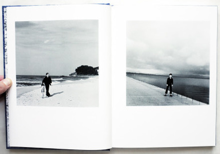
This is a page from Shōji's book that I wanted to use to demonstrate my intention. Each photograph of their separate page interacts with the other, the first by appearing to look at the other subject, the other subject appearing therefore to ignore. Leading lines also are similar, as well as the rest of the composition especially the placement of the subject, therefore they both become heavily interlinked. This separation however also produces emotional response, appearing desolate, yet in contrast also nostalgic and of another time meanwhile. It is this difficult combination and complication of emotions and meaning I would like to achieve in my own book. I want to intentionally leave ambiguity for the reader, but through evident signals.
Photobook Comparison
These three photobooks collectively span from the sixties up until the present day. They are all incredibly different collectively in regard to their subjects and presentation methods, yet as they are all Japanese, they share a similar vision, one that rejects the norm of photography and arguably raise it to a high art form with their methods and technique due to the huge lack of well composed romantic images with a level of visual contrast similar to real life. These books are exactly the opposite, even when containing colour, they still retain a surreal element.
In the way in which they are different however, the books are only varied slightly and this does cause a difference in their emotive quality, but only through the subtleties in the differences of their printing, and the colours and contrast levels used. They all retain that melancholic nostalgia. This influence I believe should be present in my book. I want to borrow the grainy, accidental importance, yet retain a composure in the photographs that will subvert expectation, treading an ambiguous line between refined and messy photographic artistic process.
In the way in which they are different however, the books are only varied slightly and this does cause a difference in their emotive quality, but only through the subtleties in the differences of their printing, and the colours and contrast levels used. They all retain that melancholic nostalgia. This influence I believe should be present in my book. I want to borrow the grainy, accidental importance, yet retain a composure in the photographs that will subvert expectation, treading an ambiguous line between refined and messy photographic artistic process.
Diptychs
A diptych (/ˈdɪptɪk/; from the Greek δίπτυχον, di "two" + ptychē "fold") is any object with two flat plates attached at a hinge.
In short, a diptych is a method of presentation using a pair of the objects in question so as to present them in an interaction, creating new meaning and amplifying the formal elements that conflict with one another and in instances of harmony. I am going to now brainstorm possible ideas that I would not have thought of otherwise when creating a book.
ideA BRAINSTORM
Folding connected flat hand held book.
seperate sheets
conceptually connected?
if the artist tells you that there is a connection, there is
two attached and folded covers or images protects the contents from the elements.
Scroll
old fashioned
invited to handle in a certain way
we associate it with certain things
suggests importance.
Stood upright book
far more like a sculpture than book
invitation to pick up piece
historical expectations of format make us behave in a certain way
you can walk around it to view the presentation from all angles
open it and close it
Connected
there is a shown link between the sequencing of the images
does the presentation matter?
Flat object without binding
has to be opened
the images were together and are being seperated
changes the relationship between the images
could erode the significance
Other formats
cropping to only needed sections for presentation
printing onto textiles - cyanotypes?
making a book from the textile prints
joined by being connected to a solid object or simply the same object
physically interacting images
moving image / static image
The video above was made in response to a task set to create a minute piece of work, without much effort, which experimented with the effects of time and movement on perceiving images. I chose to explore this idea by using tension and release as a tool for creating a more complex appreciation of an action or image. I chose to repeat, through editing software, the beginning of myself about to kick an orange (the action) for an entire minute until the tension is released and I finally kick the orange (release). This tension being released causes an evidently different sensation to that of the normal video without editing. The effect is something I'd enjoy using in a photo book, in some way or another, which could be done in many different ways, such as black and white being released by bursts of colour, or perhaps subject matter that builds up into action and then reverts back to calm. Even if I do not use these ideas, they are certainly interesting to think about, and be influenced by.
Luke Fowler - two frame films
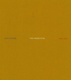
Two Frame Films is a photo book by Luke Fowler, the images made using a camera that takes two photos on the usual space of one 35mm photograph, only winding and taking half an image as a full image, allowing the photographer to double their exposures and also allowing the artistic results and meanings from diptychs.
The act of using diptychs in this was forces the viewer to concentrate of the purely editorial and sequencing aspect of the book and images. They promote a different way of interpreting the images, subverting the usual one image view of photographs.
The act of using diptychs in this was forces the viewer to concentrate of the purely editorial and sequencing aspect of the book and images. They promote a different way of interpreting the images, subverting the usual one image view of photographs.
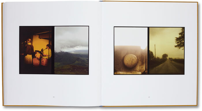
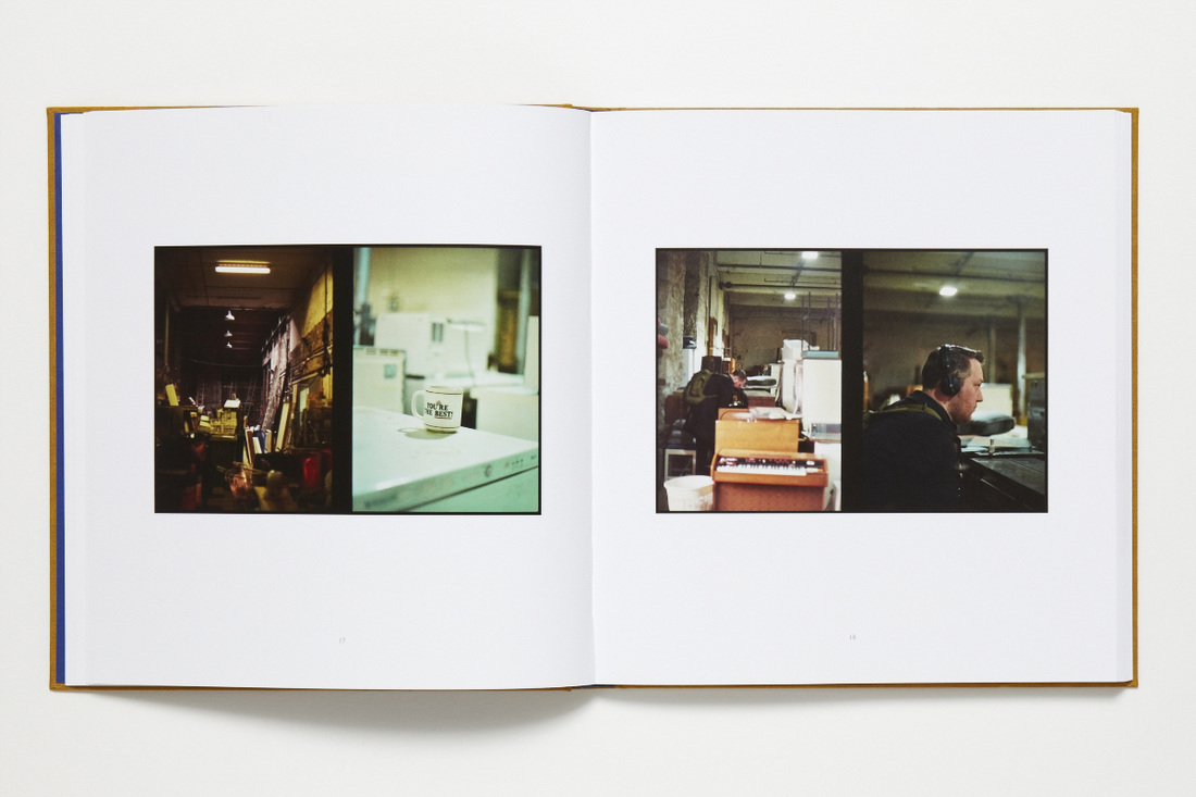
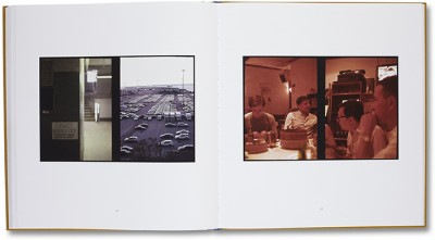
The book appears, in my opinion, to be about the camera itself, which is a rather odd perspective to take regarding the creation of a photo book. It is in a sense an experiment, on the road to discover the use and power of the camera and what it does, apparently compositionally by the look of the photographs. Images flow together, in a continuous stream, however they are not always simply after one another in succession in time, rather they can have long periods of time between them, making the viewer question the time period between them as well as the setting of the photograph.
Fowler's photographs are often highly autobiographical. They force us to interpret his preferences, his interests, and his visual language without any context. We are forced to create relationships and form believed stories from the narrative, becoming part of the creation of meaning and wholly therefore, a participant. The spreads become interactive, amplifying subjectivity within the eye of the observer. They transcend beautiful photographs in themselves, and become a language of imagery, suggesting and presenting explicitly at the same time.
All of the formal elements are heightened through this process, as comparison becomes intrinsic. Shapes, lines, textures, tones and especially colours have their power increased due to their relations and contradictions. The book is a way, in fact, to double the power of the usual two page spread Diptych of the average photo book, forming a narrative that is difficult to reach through compositional and editorial choice, as these choices are forced upon the photographer in the moment, and are therefore more raw, accidental and creative. This narrative however, often doesn't cross over between pages, and exists only within the diptych itself, which can be perceived as a strength or weakness within the book. I find it fascinating either way, as the entire book can be seen as a compilation of small experiences or stories, such as Templeton's work.
osma harvilahti
Osma Harvilahti is a Finnish photographer who took the diptychs shown here in a trip to Africa. I am simply using the images presented here as examples of possibilities regarding diptychs. He uses a variety of methods to create these diptychs, yet I have specifically chosen his colour matching work.
The image on the left is very interesting. What I find interesting about it is the seeming absurdity of the connection between the two subjects, yet the colour matching, which is not necessarily identical, but is close as all three purples in the image exist in a gradient, makes the image appear incredibly aesthetically pleasing.
The image on the left is very interesting. What I find interesting about it is the seeming absurdity of the connection between the two subjects, yet the colour matching, which is not necessarily identical, but is close as all three purples in the image exist in a gradient, makes the image appear incredibly aesthetically pleasing.
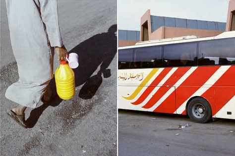
The image on the right is identical in its contents. Each image has seemingly no relation but are connected inherently by their perfect match of colour, even if each composition has no relation to one another. These matched images are incredibly satisfying to view and therefore deserve appreciation regardless of whether they connect situationally. I find this style of matching interesting as the arbitrary connection of colour allows new meaning to be created.
I would like to therefore experiment with colour as a test to discover whether colour matching may be useful to the project.
I would like to therefore experiment with colour as a test to discover whether colour matching may be useful to the project.
Mike terry
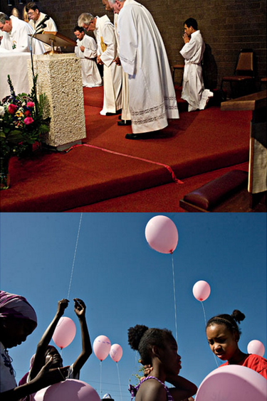
Mike Terry is a photographer who creates Diptychs with varying strategies. Some connected by the quality of light, others by juxtaposed and contrasted viewpoints, colour matching and contrasting subjects and moods.
The diptych on the left is an example of this matching and contesting within the images. The absurdity of the combined situation exaggerating both events. The images contrast in so many ways that I think it is important first to break it down into each simple element. Firstly, the viewpoints in the images are different, one facing almost completely upward, into the sky, and the other facing forward in a well lit room, perhaps within a church. The quality of light is also contrasted, the above even and well lit, below however is sharp directional light, revealing only sections of faces and bodies to the light.
The subjects are evidently very different, white priests and black women and girls are an incredibly contrasted subject, one that provokes many a political inference or allusion. The contrasting subjects are linked evidently to the colour of the images, the below's brown, blue and pink creating a mesmerising and calming tone to the image, the above however, even in its holy scene, appears more aggressive due to the bright red. These moods are highly influenced by colour, changing the way in which meaning is conveyed.
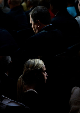
This is a diptych born of similarity. It presents two people in exactly the same fashion, the light falling on their face identically, the colours and area exactly similar, proposing the two images to be very much more linked together than the previous diptych. There is less contrast to the images and far more similarity, as if they are almost the same image.
eisenstein's theory of montage
Diptychs also however, exist not only in photo books, but in film, especially when theory is considered. Much of image theory actually derives from cinema. One famous pioneer of this theory was Sergei Mikhailovich Eisenstein, who created a theory regarding the use of Diptychs. He was a Soviet film director and film theorist, a pioneer in the theory and practice of montage.
His theory is not compressible, and encompasses many different viewpoints and concepts concerning film theory. Essentially, it grounds the basis for the meaning of the diptych, yet not in its evolved and slightly variant modern way. Eisenstein's theory takes advantage of the arousal of emotions intrinsic to humanity and to enforce ideological consciousness of the image or scene. The flicking between separate images in a sequence essentially doubles its meaning, forcing us to look back toward something we have seen and therefore produce a conclusion from the new variable and its effects. This effect is a common old-time common film trope, of flicking back and forth in an emotional or violent scene, so as to present the scene and the reaction we empathise with, increasing the tension due to the stress caused by the scene itself.
His theory is not compressible, and encompasses many different viewpoints and concepts concerning film theory. Essentially, it grounds the basis for the meaning of the diptych, yet not in its evolved and slightly variant modern way. Eisenstein's theory takes advantage of the arousal of emotions intrinsic to humanity and to enforce ideological consciousness of the image or scene. The flicking between separate images in a sequence essentially doubles its meaning, forcing us to look back toward something we have seen and therefore produce a conclusion from the new variable and its effects. This effect is a common old-time common film trope, of flicking back and forth in an emotional or violent scene, so as to present the scene and the reaction we empathise with, increasing the tension due to the stress caused by the scene itself.
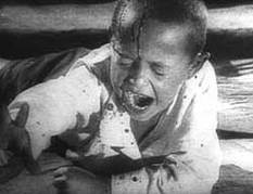
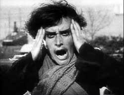
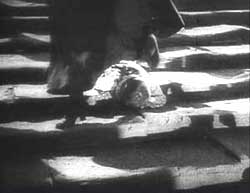
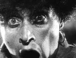
Stills from a sequence in one of Eistenstein's films, demonstrative of the emotional impact that two separate but linked images can have, affecting interpretation and understanding.
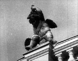
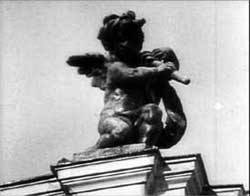
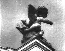
Three cherubs are shown in quick succession, suggesting movement, specifically as if the last cherub is punching the air in a violent action. The montage is demonstrative of an ability to contrast something typically opposite, such as a violent punch, with something innocent, like the cherubs. The power of the diptych and therefore context of the sequence are powerful influence in regard to the meaning that is formed by the viewer.
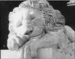
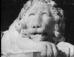
The three separate stone lions, shown in rapid succession, create an image of rising, and almost aggressive immediacy. Montage can be used in this way to show movement, at any speed, a story. In essence this is the basis of any animation or film sequence creating movement. This can be applied to photography whether chronologically or not. The emotions and rationale of the photographer in the the photo book are followed by the viewer, flowing through and from each image through the book, creating the narrative.
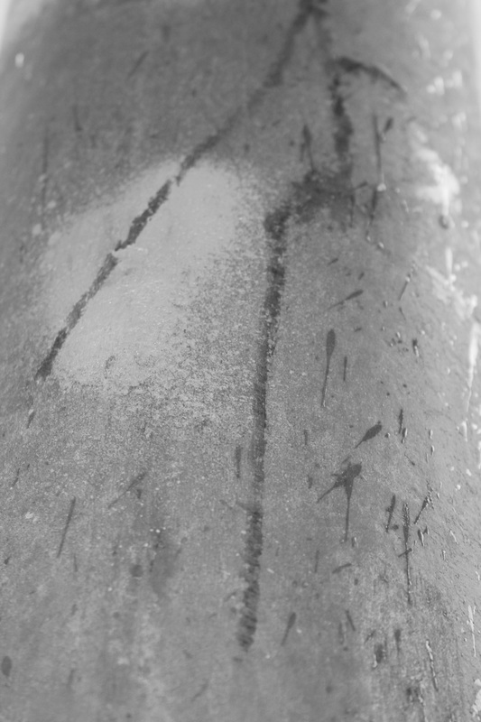
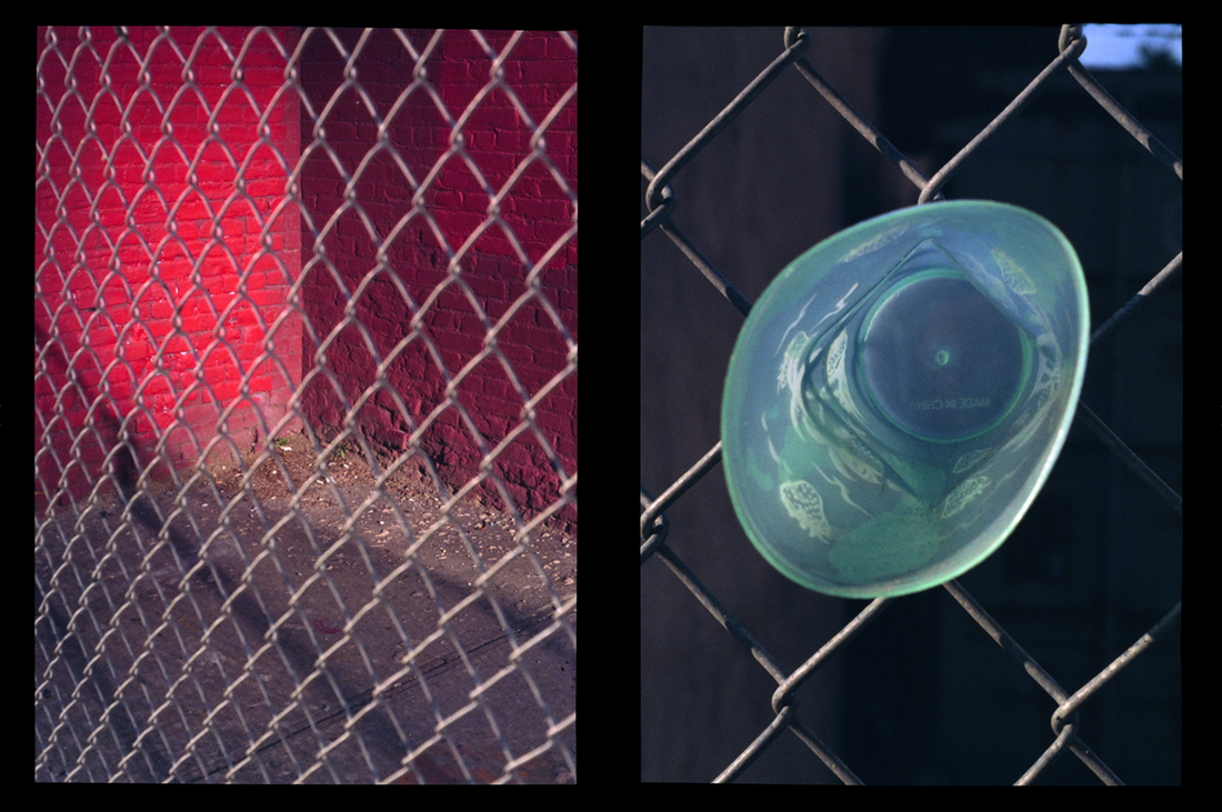
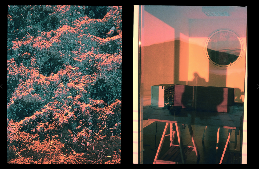
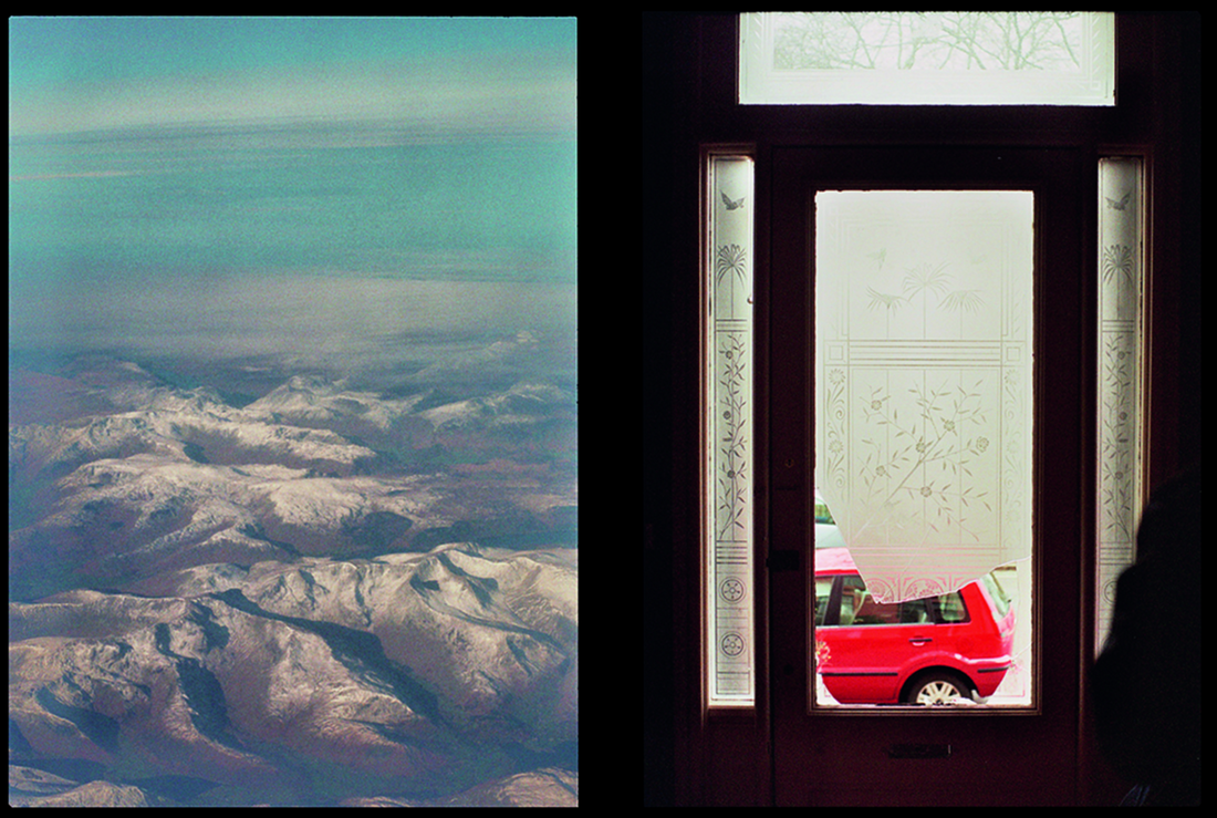
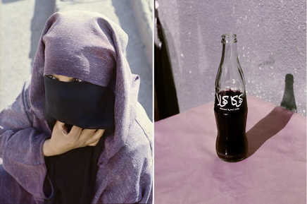
diptych practice
These are sets of diptychs I have paired from my best images from my Daido Moriyama response. To begin pairing diptychs, I first wanted to begin with what was easy to combines, my most abstract images. These allow me to pair using the formal elements cleanly and evidently, before I move on to my subject area and resulting pairs of more complexly related images.
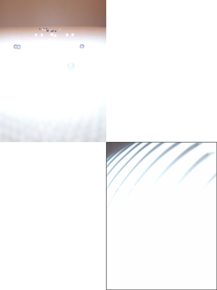
These two images above were paired through tone and composition. Each were taken incredibly close to the subject and therefore the flash produced incredibly bright white areas, forcing into abstraction. These two images have a similar composition, their subject at the top third of the image. I also changed the layout of the diptych, placing one at a diagonal, thus resulting, as was intended, in the below image not seeming as if it could be any size, but an image the same size as the one above it, allowing the compositional similarity to be amplified. However this is already done by these black lines, which are produced by the camera I was using, and were accidental and unintended, yet they work in bordering images that would otherwise blend into the background.
These two images above were paired through tone and composition. Each were taken incredibly close to the subject and therefore the flash produced incredibly bright white areas, forcing into abstraction. These two images have a similar composition, their subject at the top third of the image. I also changed the layout of the diptych, placing one at a diagonal, thus resulting, as was intended, in the below image not seeming as if it could be any size, but an image the same size as the one above it, allowing the compositional similarity to be amplified. However this is already done by these black lines, which are produced by the camera I was using, and were accidental and unintended, yet they work in bordering images that would otherwise blend into the background.
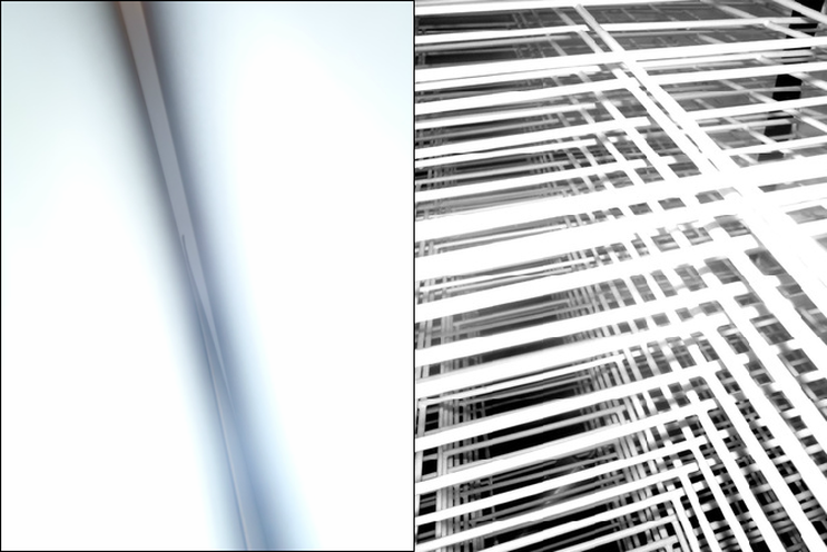
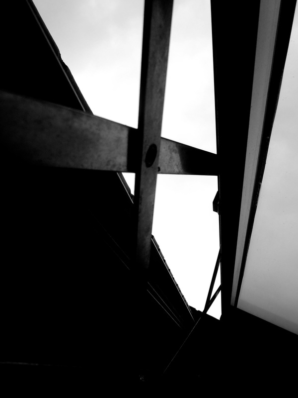
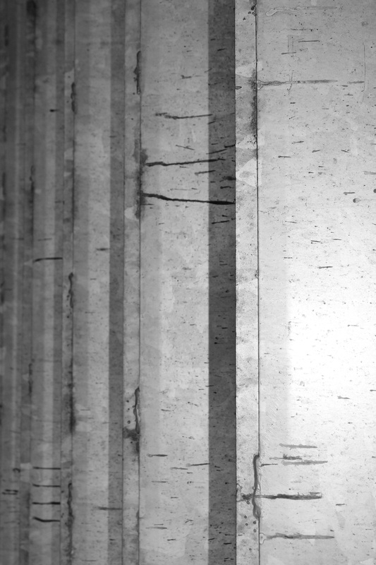
This diptych was paired through line and composition. As is evident by their close pairing, both images follow the same angle of the central line leaning, the first a space between a wall and a cabinet, and the second a drying rack, yet the second does it in a contrasted way, through many criss-crossing lines and therefore are satisfying to view. Both images also contrast in the way in which they are almost inverted versions of one another, one having a dark leaning line with white surrounding, the other having white leaning lines and black surrounding and in between.
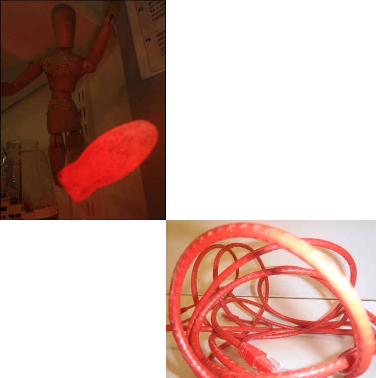
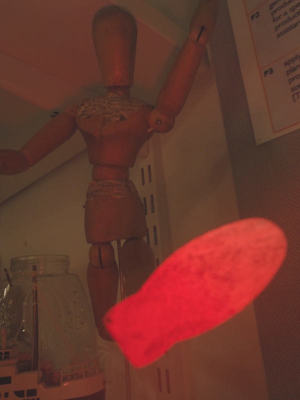
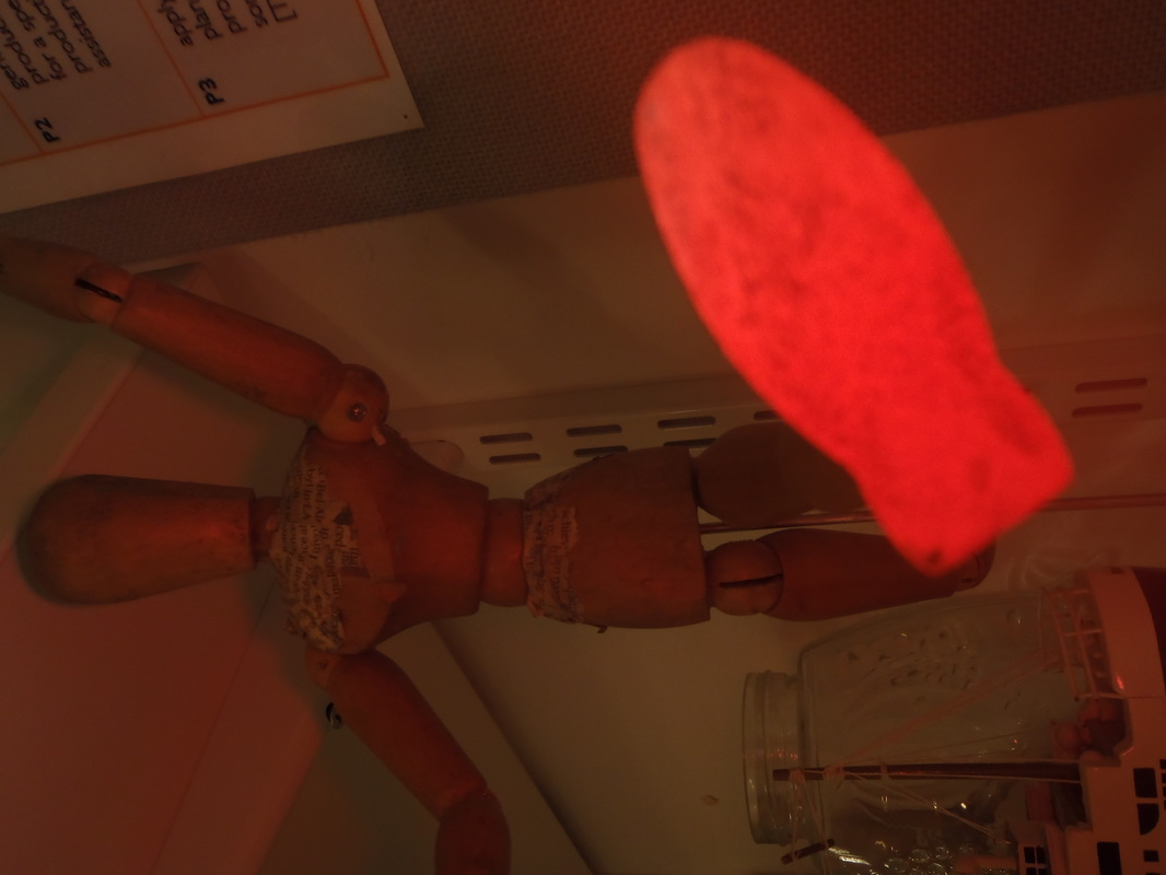
These two images, when taken were intended to be placed together. The pairing of these images is solely by the colour red. Yet they were taken in different ways. The wire was already red. For the image of the wooden drawing maniken, I had taken off the automatic flash by placing my finger over it, only leaving the red light that is used by the camera to focus, lighting the corner bright red. These two ways to produce red contrast the images, and is evident. They result in a difference in tone, the top dark and bottom bright, juxtaposing them as well. Each of the subjects in the images are also contrasting. I also used this specific composition to display the diptychs so as to separate them compositionally, and therefore draw out differences. While both are classroom objects, this is not blatantly evident, and so the viewer has to work to form links between them using background information, or simply create their own narrative.
These two images were paired tonally, regardless of their vast difference in texture and line, and in focus. The first image a black bag, the second a small section of a speaker. Each however, still retain the reflection that is universal in plastic and metal, forming highlights from the flash and therefore having similar tonal values. I used this compositional method of diagonals to enhance difference between the images, yet also allow some leading lines in the first image to appear to flow over and below into the second's clean curved lines.
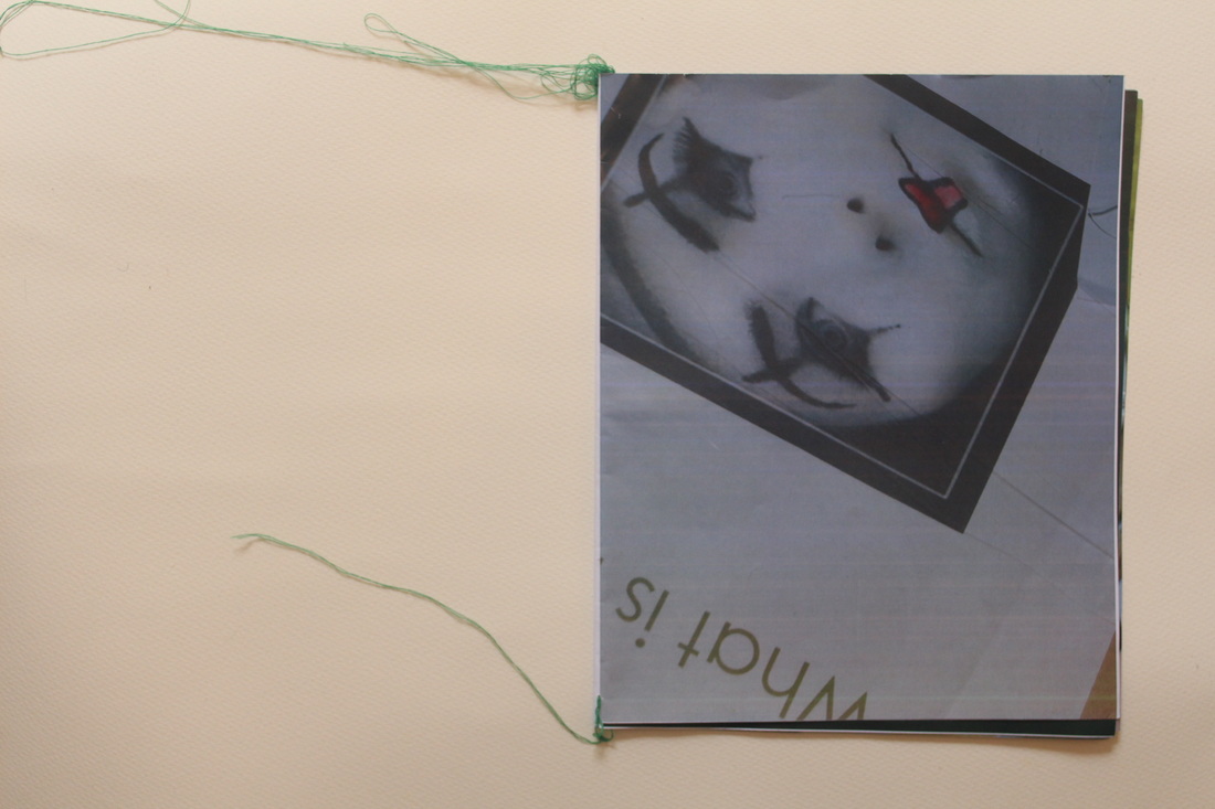
mock 2 hour photobook
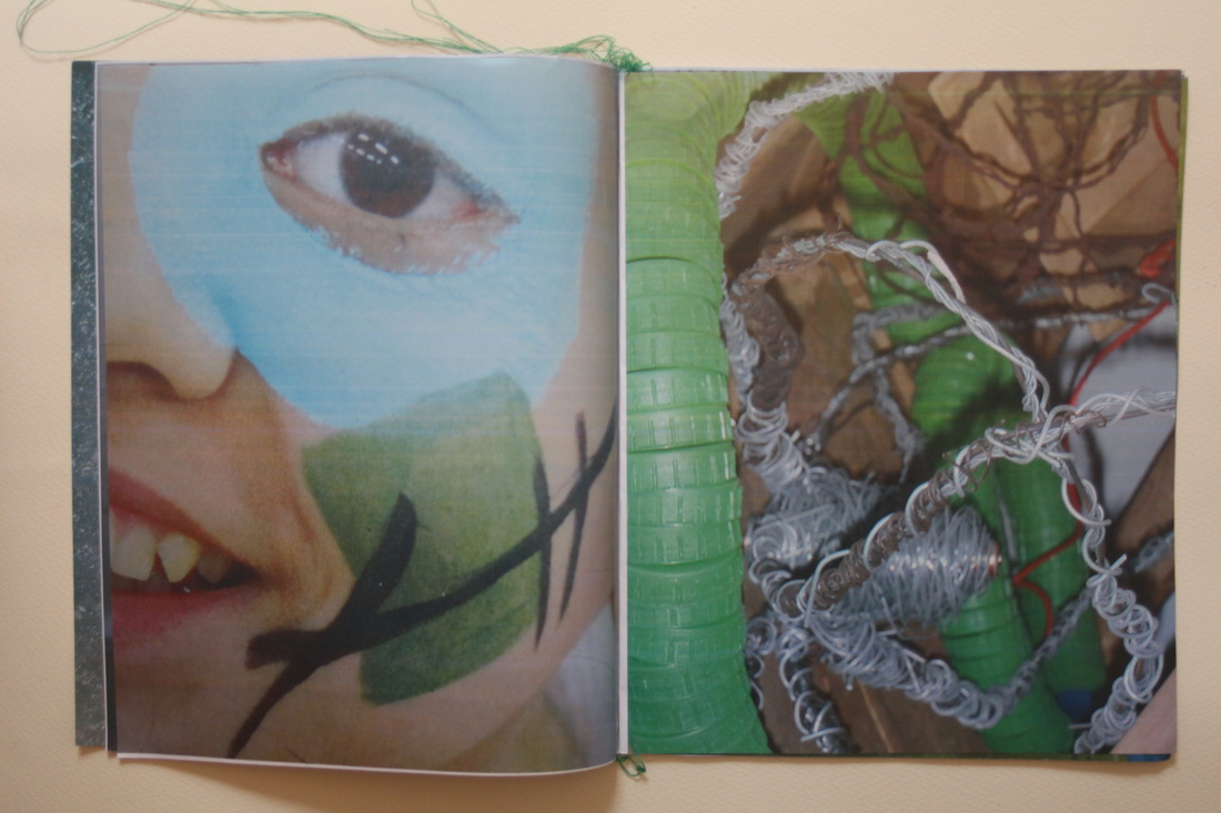
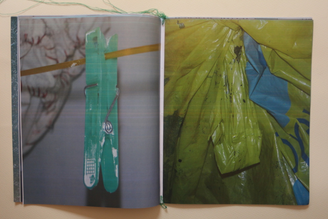
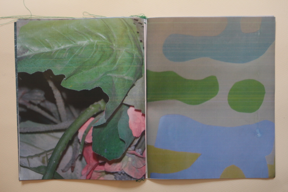
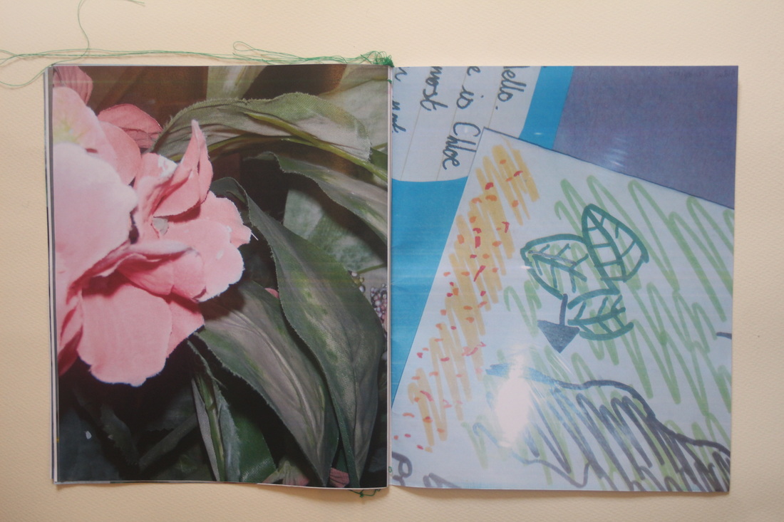
This photo book was created in two hours, the time used for both shooting, printing and assembling the images as well as binding the book. I began with a tiny olympus point and shoot camera which had incredibly low quality images and the flash couldn't be turned off. I chose a theme intuitively, which was the colour green, as when shooting in school, subject matter is limited and so to choose a theme by subject matter would cause me a problem if there was not enough of it. I shot, I would say close to the style of Daido Moriyama, but in colour. However I felt it still contained my rather signature composition.
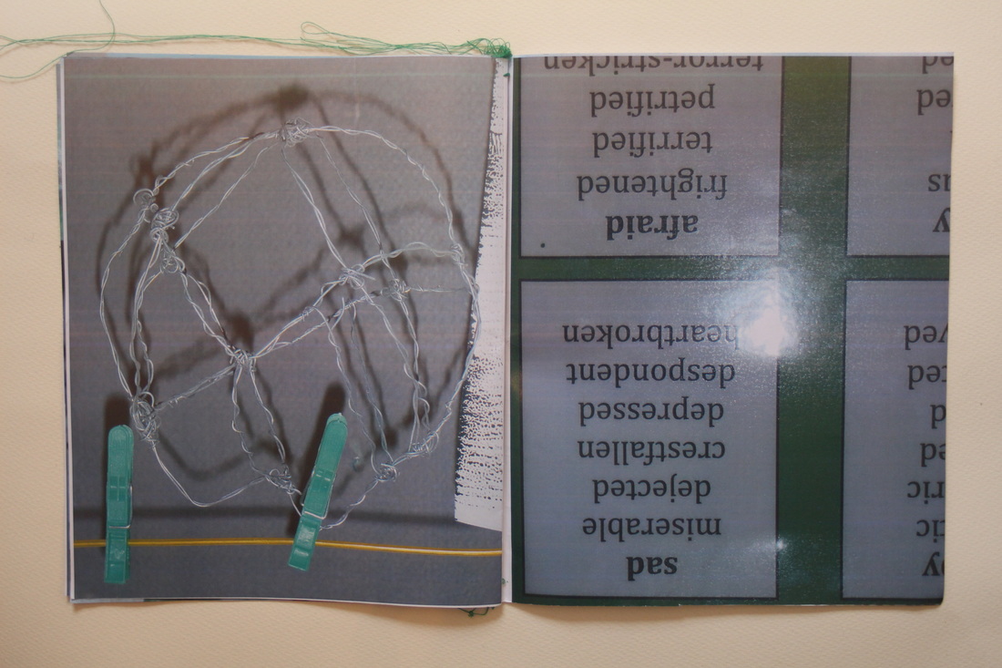
In printing I did not have much choice or access to a way of choosing the size of the images, so I chose to print them all full bleed on A3, with two images per sheet, each sheet being double sided, so that I could bind them easily into a full photo book by simply folding them and slotting them into one another. This however had a cost, which was that I only had a certain amount of ability to choose the outcome of the sequence of the images. It also caused a few of the images to come out upside down, which caused an interesting effect, and also created a cover out of one of the images as one side had a blank space. To finish, I bound the book at each corner with green thread put through itself many times until it knotted firmly and created a tangle that held. I would have done a few more of these along the spine of the book had I had time, but what I did do I believe represented the book quite well in outward appearance; quite messy, but with a firm hold in representing the subject matter well.
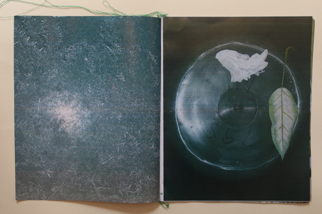
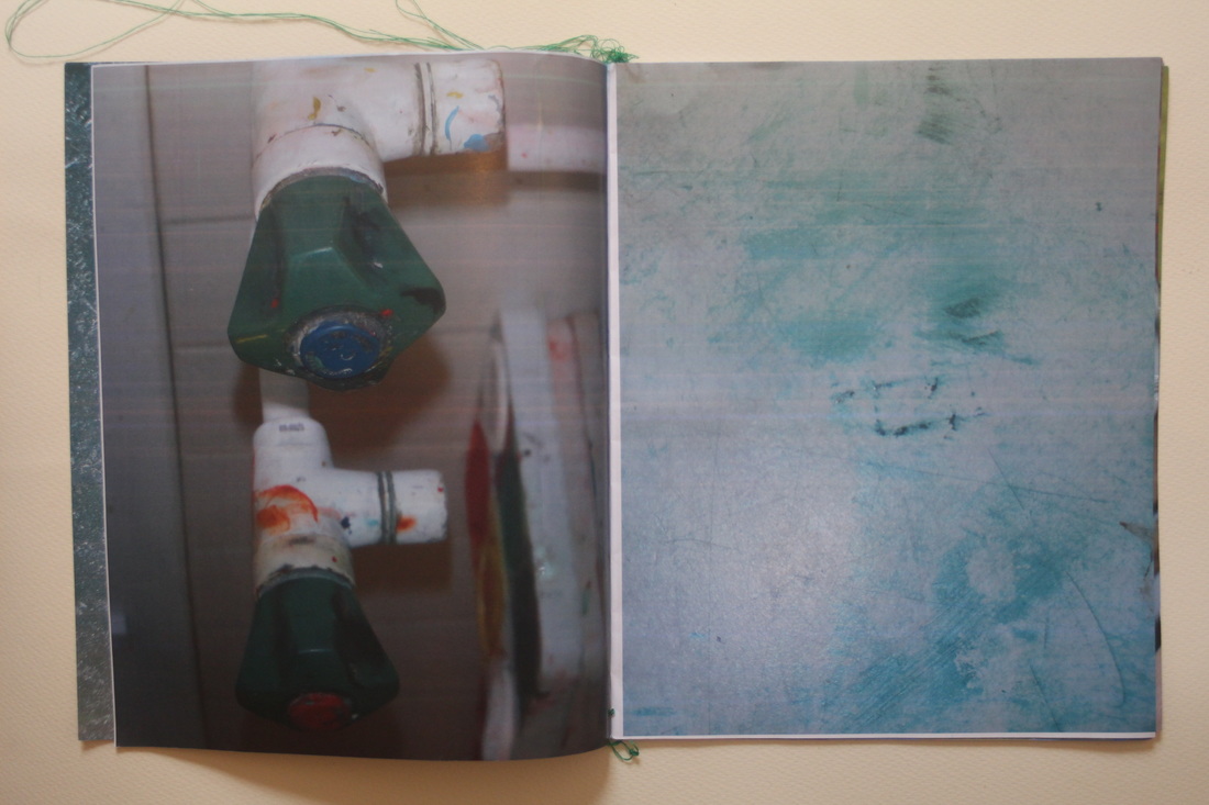
I think the photo book was very successful, as it succeeded in realising the type of intention present in the last timed exercise I did above in this project, The images together in diptychs and their relationships to one another become very interesting therefore, some being visually satisfying in colour matching, such as the first spread, similar compositionally like in the third spread, juxtaposed visual punning, like the last spread, or simply unrelated, causing the viewer to search for connection more thoroughly like the second to last spread. All these methods of creating diptychs are successful in producing interesting spreads and thus should be utilised in my final photo book. I also really like using full page spreads, as when they are used with human subject matter or a subject matter usually small to us, they can be incredibly impactful when changed in scale. They are something I would like to use at least once in my book.
In printing I did not have much choice or access to a way of choosing the size of the images, so I chose to print them all full bleed on A3, with two images per sheet, each sheet being double sided, so that I could bind them easily into a full photo book by simply folding them and slotting them into one another. This however had a cost, which was that I only had a certain amount of ability to choose the outcome of the sequence of the images. It also caused a few of the images to come out upside down, which caused an interesting effect, and also created a cover out of one of the images as one side had a blank space. To finish, I bound the book at each corner with green thread put through itself many times until it knotted firmly and created a tangle that held. I would have done a few more of these along the spine of the book had I had time, but what I did do I believe represented the book quite well in outward appearance; quite messy, but with a firm hold in representing the subject matter well.
I think the photo book was very successful, as it succeeded in realising the type of intention present in the last timed exercise I did above in this project, The images together in diptychs and their relationships to one another become very interesting therefore, some being visually satisfying in colour matching, such as the first spread, similar compositionally like in the third spread, juxtaposed visual punning, like the last spread, or simply unrelated, causing the viewer to search for connection more thoroughly like the second to last spread. All these methods of creating diptychs are successful in producing interesting spreads and thus should be utilised in my final photo book. I also really like using full page spreads, as when they are used with human subject matter or a subject matter usually small to us, they can be incredibly impactful when changed in scale. They are something I would like to use at least once in my book.
how i would display a diptych montage (regardless of resource)
This is a brainstorm concerning how I would display diptychs if I had unlimited resources to make my ideas reality.
I could...
If I were to choose the ideal display strategy of all fifteen of the possible strategies I have thought up above, I would use the idea of projectors, projecting along the street, so people would have to view them. I also think that the interaction of the light from the projector and street would be rather interesting as an experiment, as it would affect the look of the projection.
I could...
- Print on fabric. it could move in wind if hung outside, be blown by a fan, or be hung like two curtains indoors.
- Print them on bill boards on the motorway, a diptych of two portrait images taking up each one.
- Create cyanotypes of my photographs and hang them in the street. This could be done with other images
- Create posters, pinning them up inside bus stops so as to create a small gallery.
- Having two slideshows, showing random shuffled images, each diptych becoming unique.
- Print images on clothes that are given out in the street.
- Split the photograph by tone into separate transparent frames that when put together become the photograph, but the entire sculpture is three dimensional.
- Hand out photos or small photo books to the public, as if a leaflet.
- Print photograph on glass, could be placed in building window, bus stop shelter or door. The opposite bus stop could have an opposing image.
- Print them on a wall in the underground.
- Print them on two walls in a four sided gallery room, aside from the sides with doors.
- Create small glass sculpture/trophy on which the photograph is printed which works as a display instead of a frame.
- Have projectors project my images upon the street from above at night.
- A screen or projector that flashes two images against one another fast, showing the viewer both images in the same place at the same time.
- Present the two images in public as a test to guess the link between them.
If I were to choose the ideal display strategy of all fifteen of the possible strategies I have thought up above, I would use the idea of projectors, projecting along the street, so people would have to view them. I also think that the interaction of the light from the projector and street would be rather interesting as an experiment, as it would affect the look of the projection.
ideas brainstorm
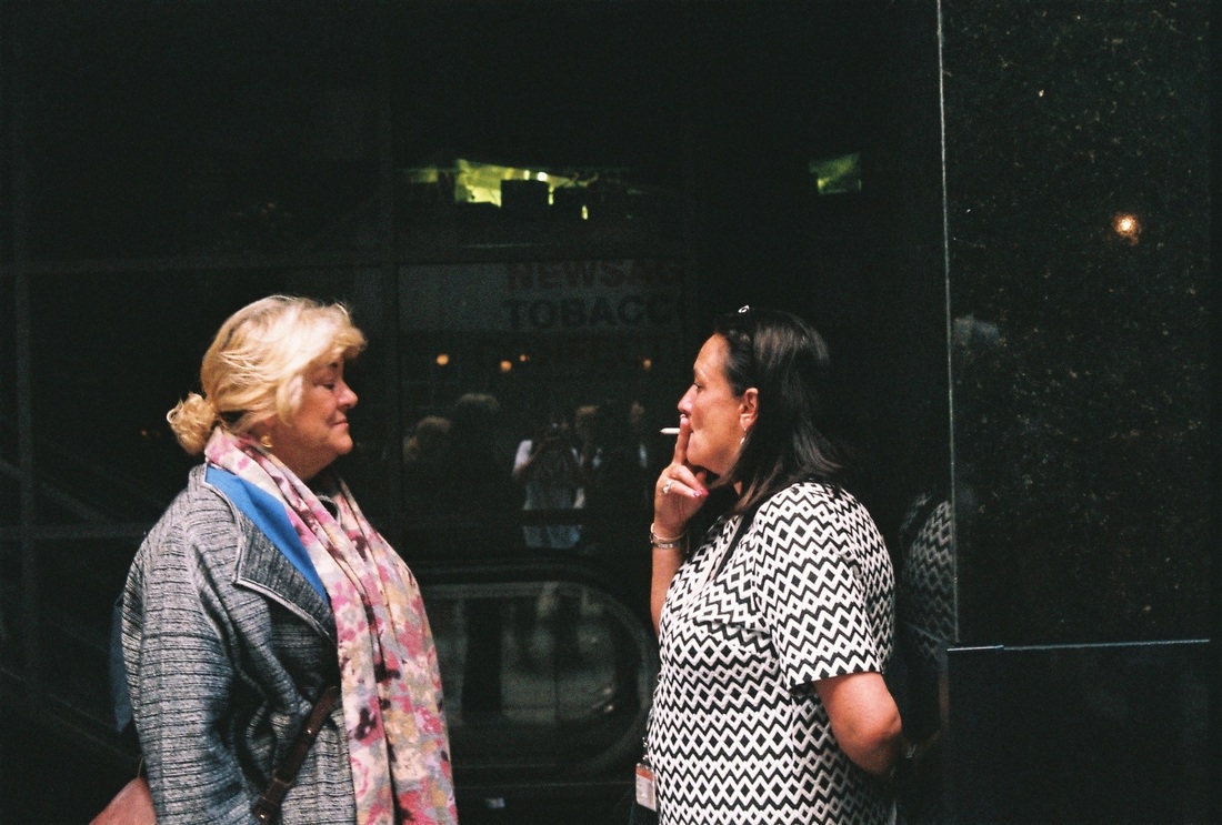
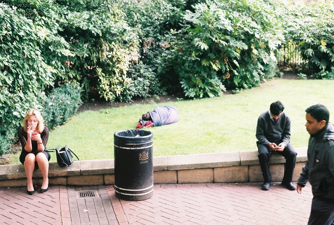
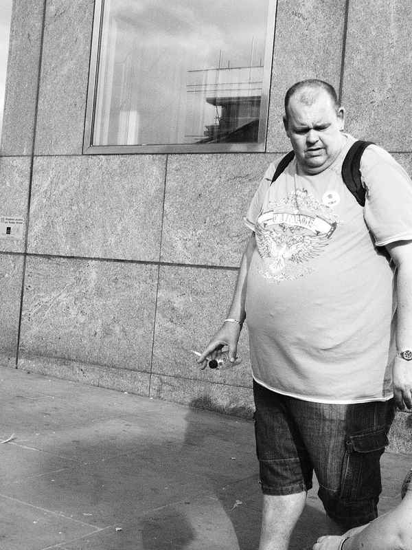
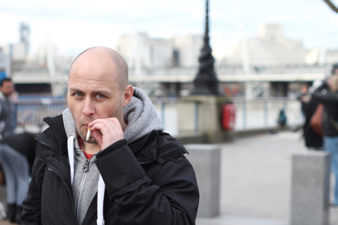
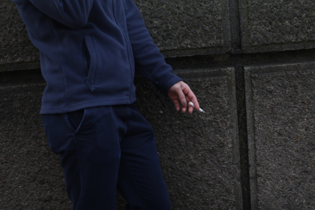
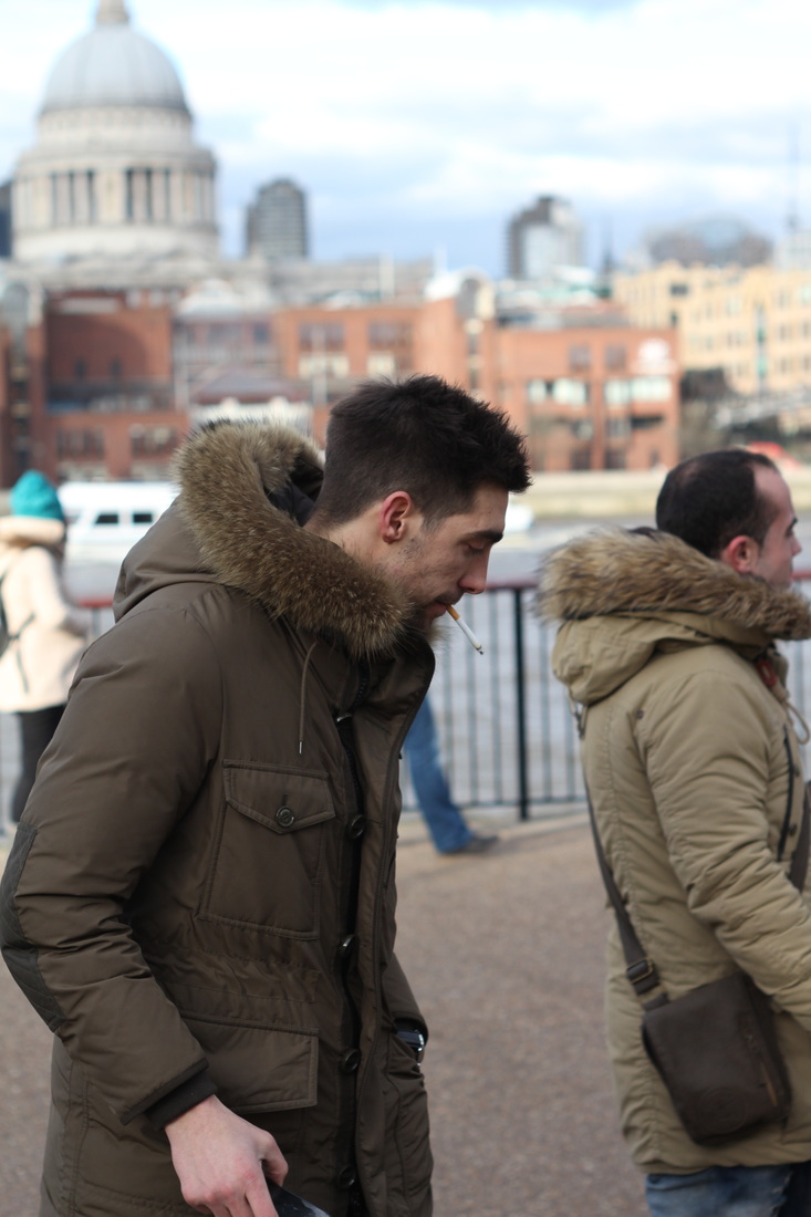
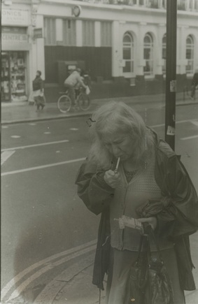
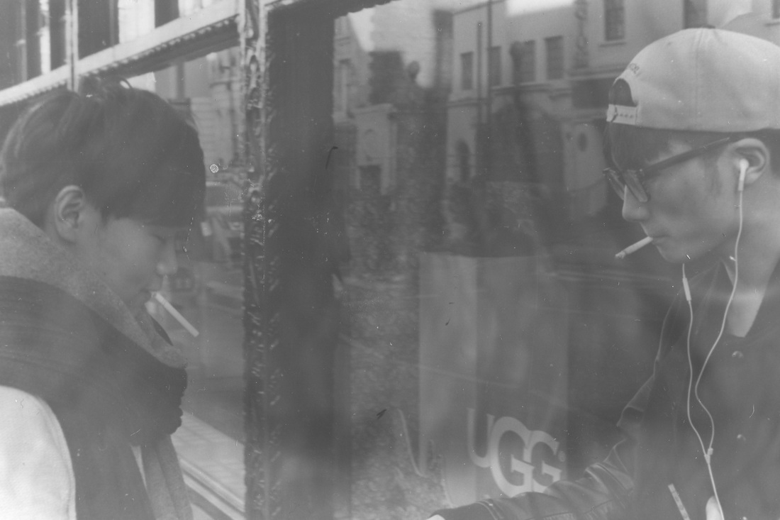
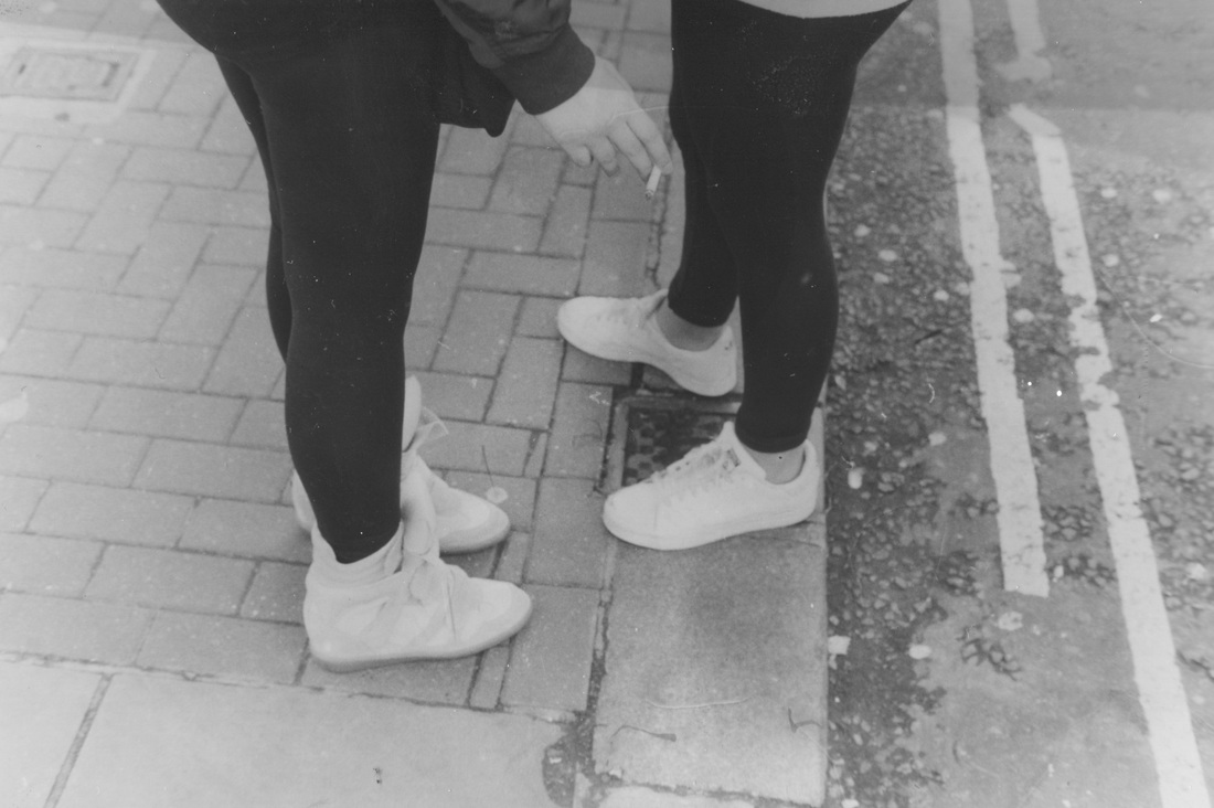
Smokers
I like what Ed Templeton has done with such a simple and considerably known thing, that most agree is negative. Yet, I believe I could combine street photography with this to explore more widely the act of smoking. It could be very interesting looking at it from an anthropological but also creative perspective in public and in private.
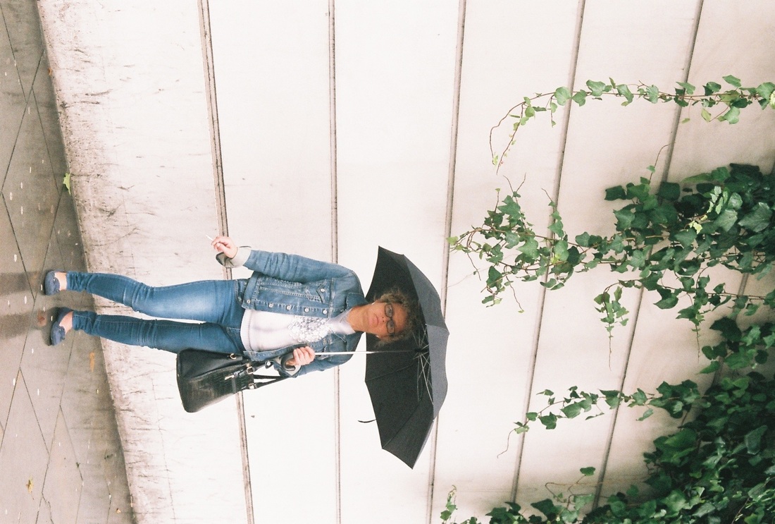
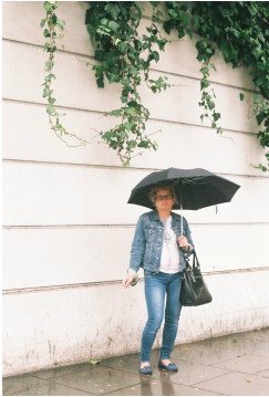
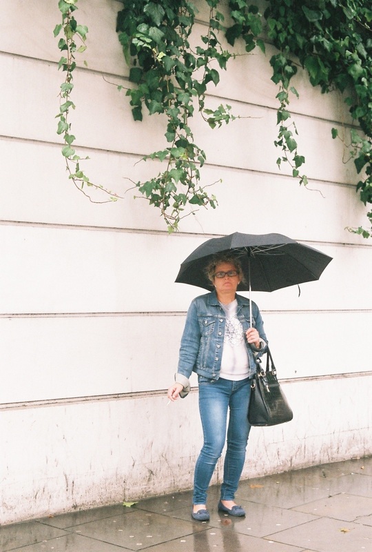
Umbrellas
Umbrellas are a motif I often find myself photographing, yet I cannot come up with any meaning or comment that photographing them may produce. I may simply photograph them for their aesthetic qualities rather than the idea itself.
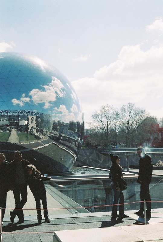
Street photography
I believe I have some strength within the genre of street photography as a whole, but I wish to expand my way of working for this book, thus I believe if I do use street photography, some type of documentation of something more personal and intimate is required, as street photography can often be impersonal, using humans simply as organic forms rather than as meaningful beings.
Studies
I think that using different processes to describe a subject matter may be very interesting, even if it is simply down to the type of camera I am using to photograph with. There could be a photo journalistic element to the book using the documentation of the same person/subject matter in different places/events.
Subconscious imagery
Through the inspiration of Moriyama's work, I could form a book like 'The World Through My Eyes' that is a simple capturing of what I find draws me to specific things photographically. This however, doesn't involve much restriction/pushing myself, and thus I wish not to do this for my book as it may not push my photographic skill and/or meaning of the book very far.
I like what Ed Templeton has done with such a simple and considerably known thing, that most agree is negative. Yet, I believe I could combine street photography with this to explore more widely the act of smoking. It could be very interesting looking at it from an anthropological but also creative perspective in public and in private.
Umbrellas
Umbrellas are a motif I often find myself photographing, yet I cannot come up with any meaning or comment that photographing them may produce. I may simply photograph them for their aesthetic qualities rather than the idea itself.
Street photography
I believe I have some strength within the genre of street photography as a whole, but I wish to expand my way of working for this book, thus I believe if I do use street photography, some type of documentation of something more personal and intimate is required, as street photography can often be impersonal, using humans simply as organic forms rather than as meaningful beings.
Studies
I think that using different processes to describe a subject matter may be very interesting, even if it is simply down to the type of camera I am using to photograph with. There could be a photo journalistic element to the book using the documentation of the same person/subject matter in different places/events.
Subconscious imagery
Through the inspiration of Moriyama's work, I could form a book like 'The World Through My Eyes' that is a simple capturing of what I find draws me to specific things photographically. This however, doesn't involve much restriction/pushing myself, and thus I wish not to do this for my book as it may not push my photographic skill and/or meaning of the book very far.
Medium/camera brainstorm
- 35mm colour
- 35mm black &white
- medium format
- using dark room process- to achieve effect
- digital low quality
- digital edited like moriyama
- dslr digital - high quality
- lomography
- chemigrams
- photograms
- cyanotypes
I feel also that the bulk of my book could be made using 35mm black and white prints, as I enjoy using the darkroom, and I can guide the aesthetic qualities of the prints doing so, so as to respond to Wakabayashi's book as the processes will not be perfect, but the imperfections will contribute to the success, if done correctly, to the book.
layout brainstorm
- thoroughly composed
- small images against white
- change in background colour
- each page different colour
- against black
- full bleed- moriyama
- mixture of different ideas
- small against white
- large but with space against white
There are a variety of ways in which I would like to layout the book, and I am therefore unwilling to restrict myself through the format. I wish to experiment fully with many ways of laying out the books images, from full bleed to layouts similar to contact sheets and I also think that a mixture of images, in all styles, gritty and high quality could be quite an interesting take on a subject matter, neither romanticizing nor criticizing, but simply studying.
There are a variety of ways in which I would like to layout the book, and I am therefore unwilling to restrict myself through the format. I wish to experiment fully with many ways of laying out the books images, from full bleed to layouts similar to contact sheets.
book design brainstorm
- cover
- hardback?
- softback?
- zine?
cover
The cover could be made:
- in black paper
- in some harder material: cardboard, wood, metal, recycled material
- to have a darkroom print on it
- to have embossed lettering of the title
- to have a polaroid in the center
- to have an image printed full bleed upon it
- to have a cyanotype or photogram on it.
- to be laminated
pages
the pages of the book could be:
- made of the images themselves
- made of card with the images stuck to them
- made from darkroom prints and their paper they were printed upon (as it is quite thick)
- made from a thick material e.g cardboard
binding
The binding could be:
- a hole punched loose binding with each page with string through the side
- string binding, woven through the paper, there are many different styles of this sort
- normal book binding on a book sent off to a book printing company
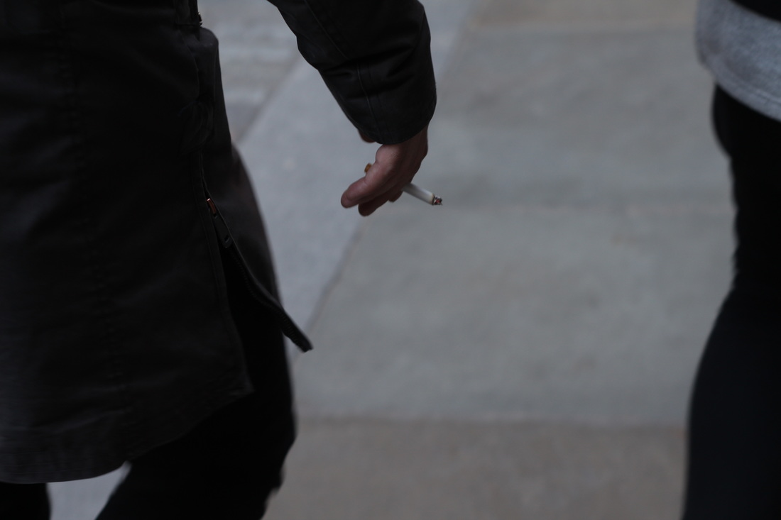
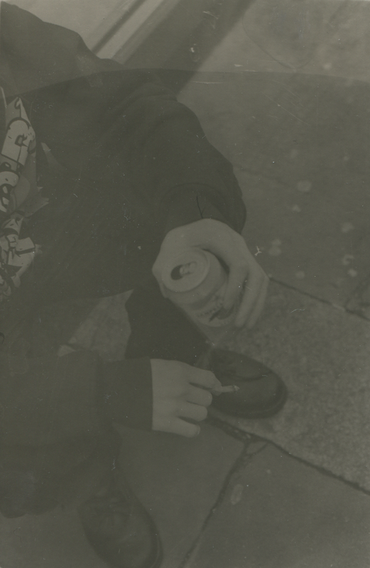
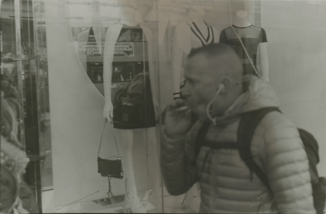
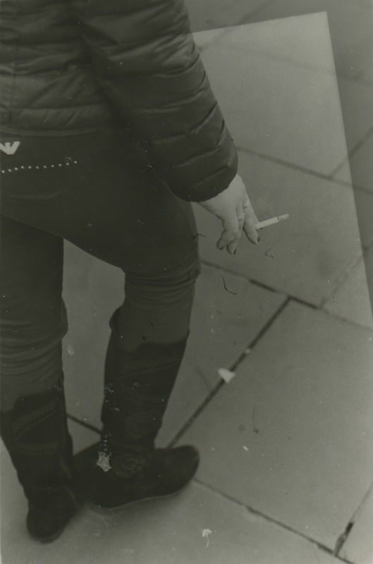
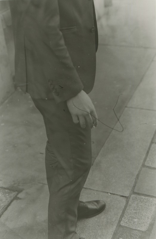
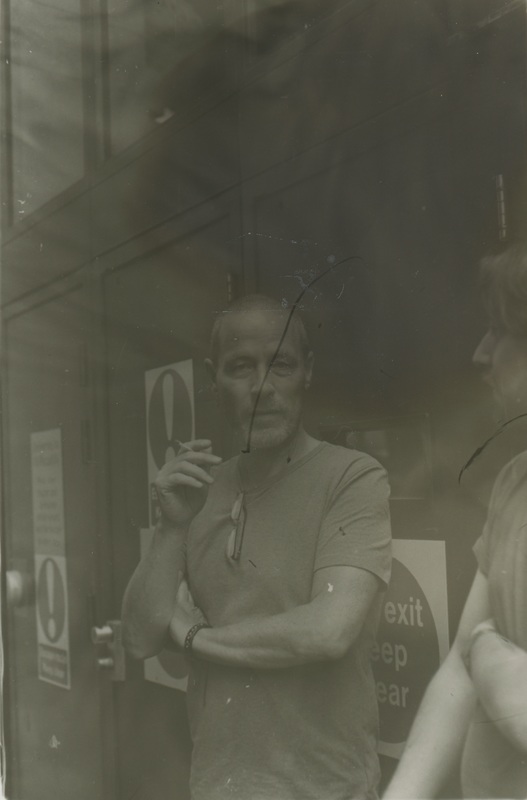
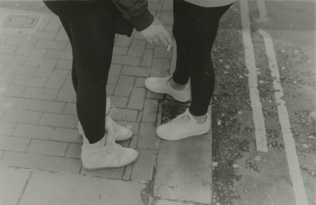
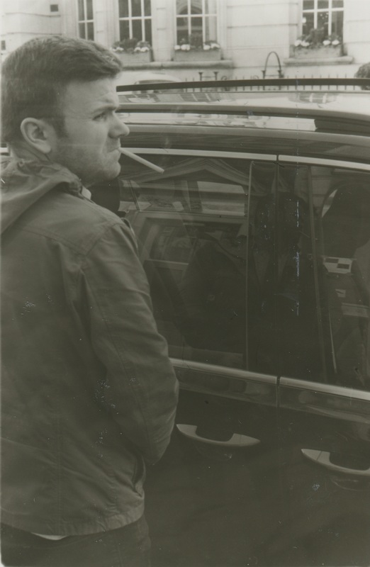
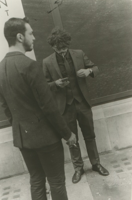
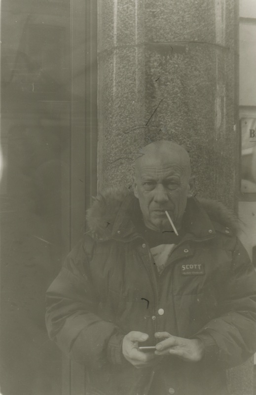
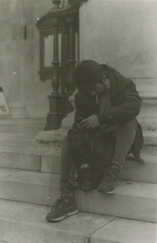
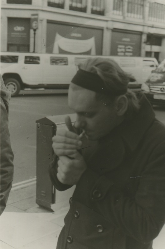
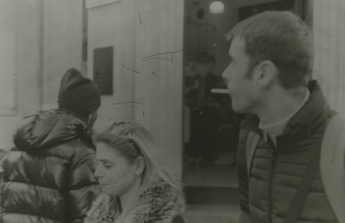
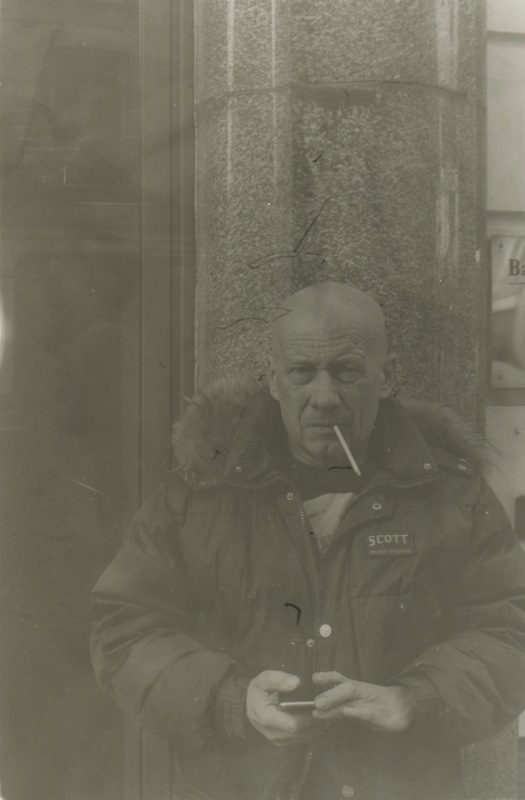
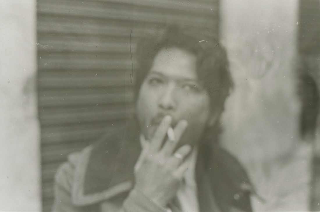
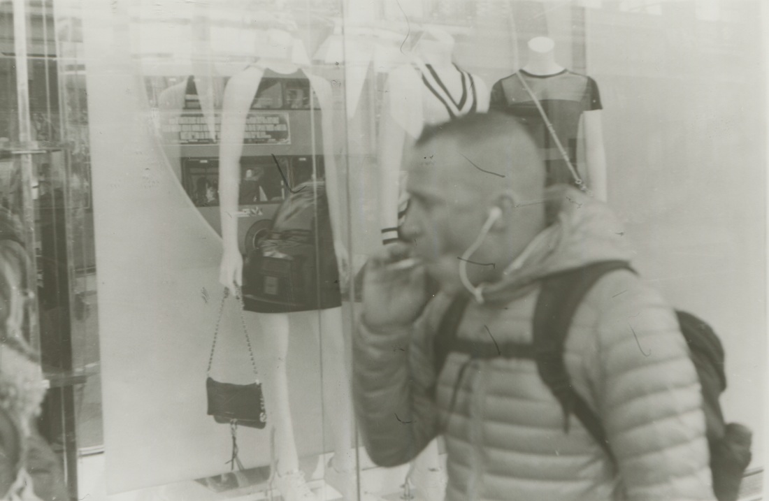
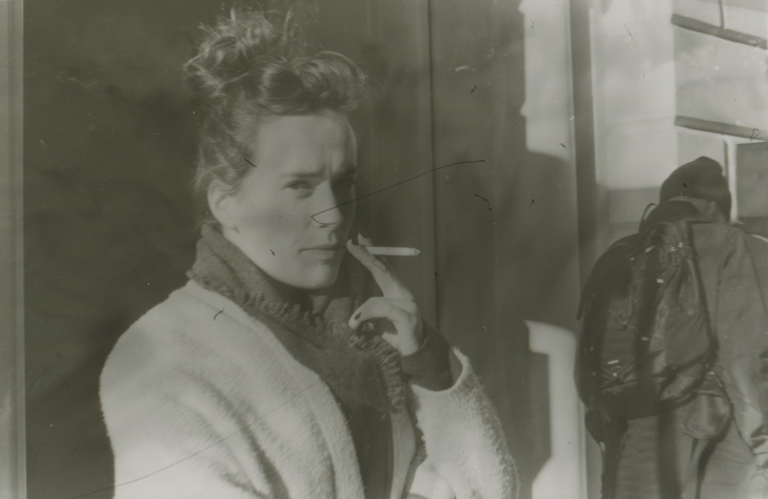
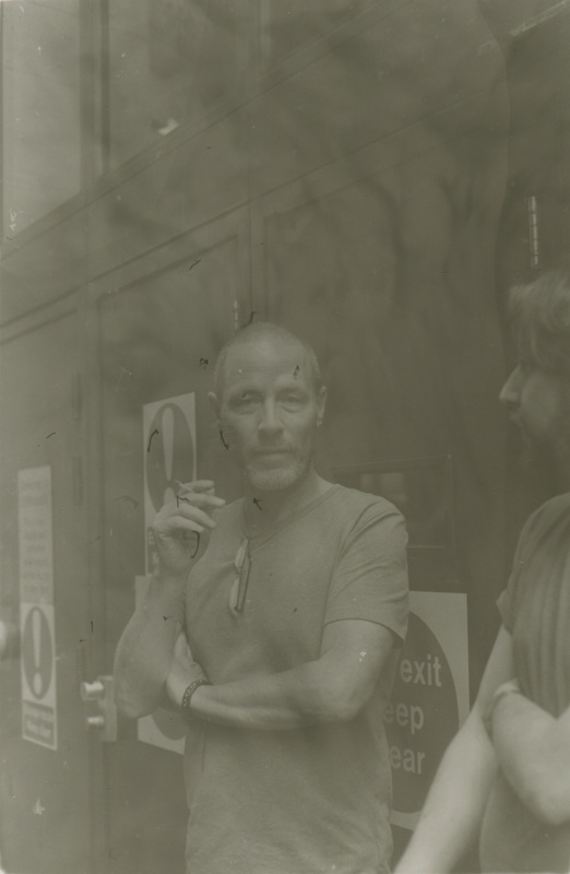
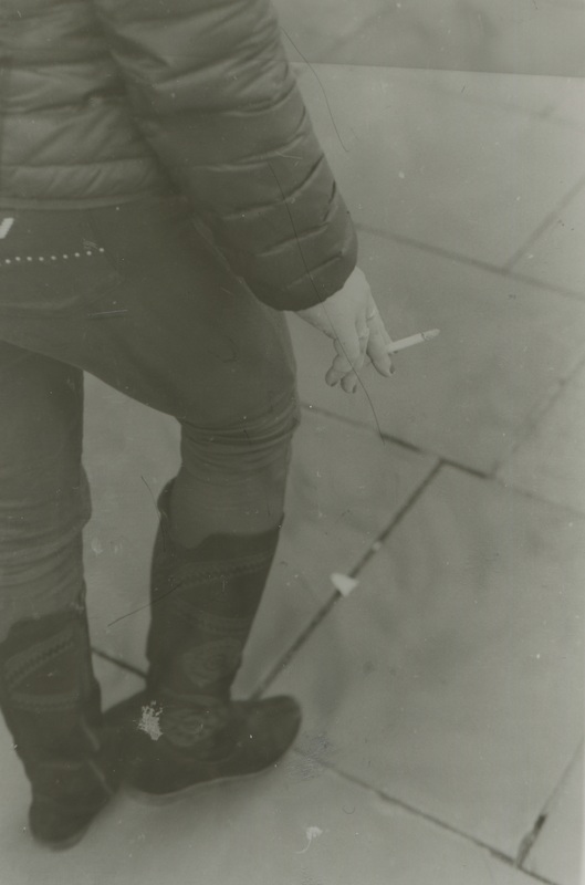
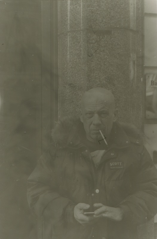
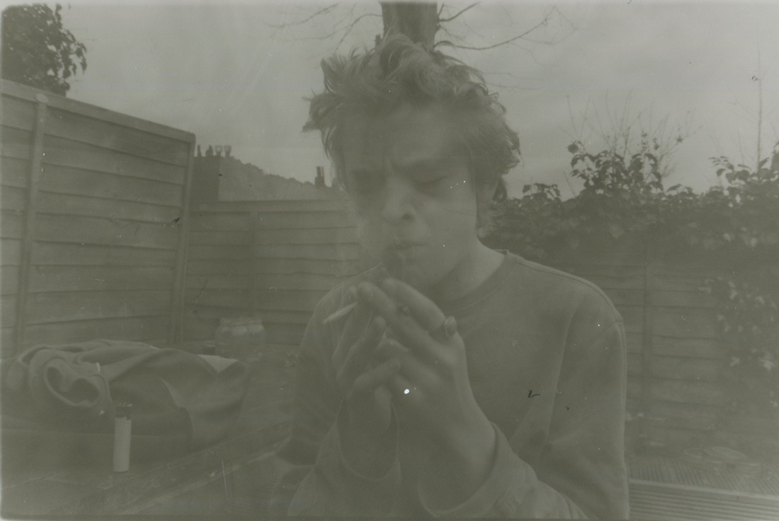
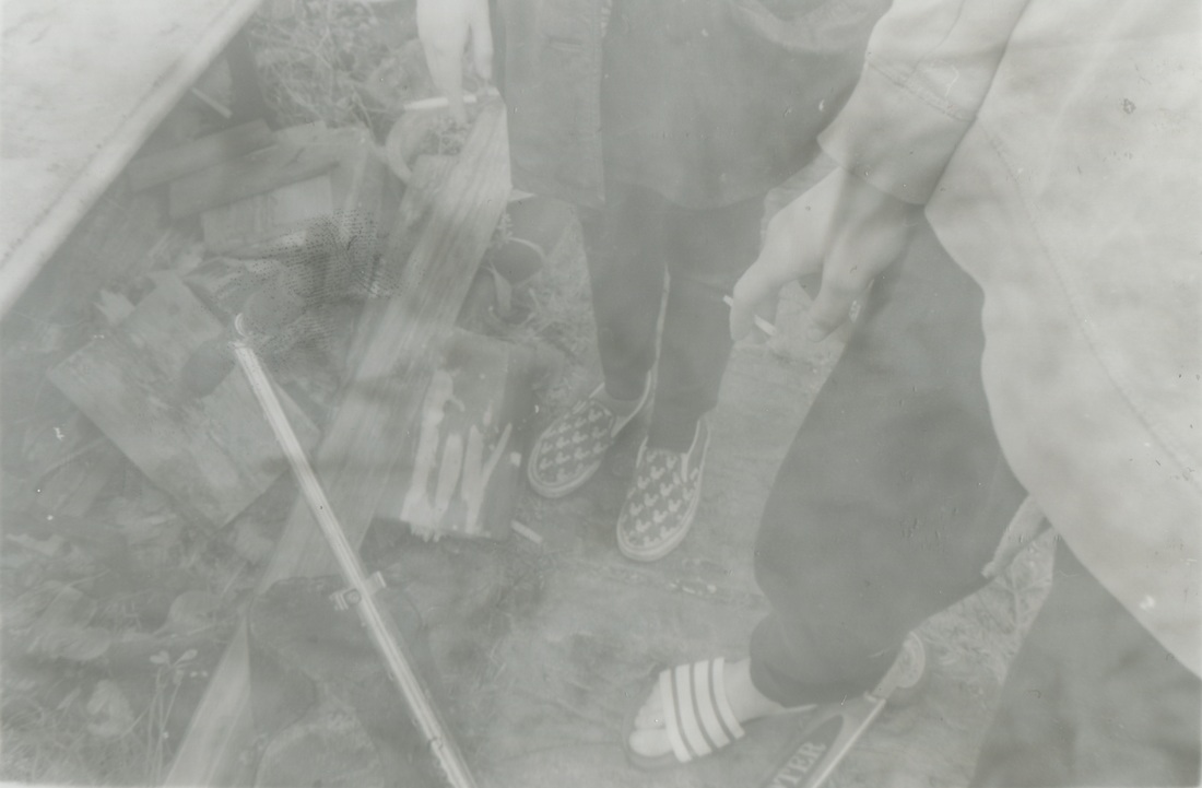
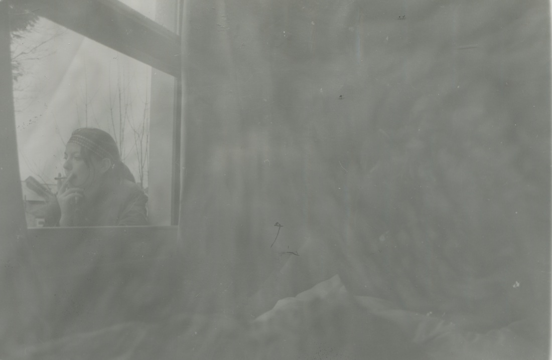
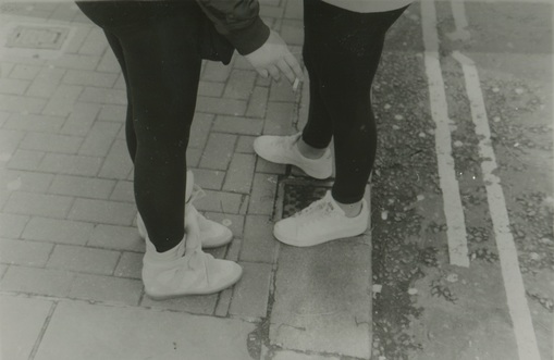
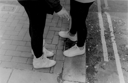
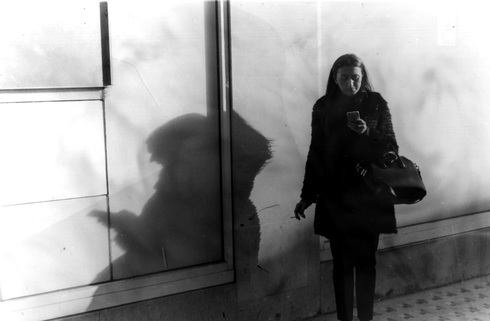
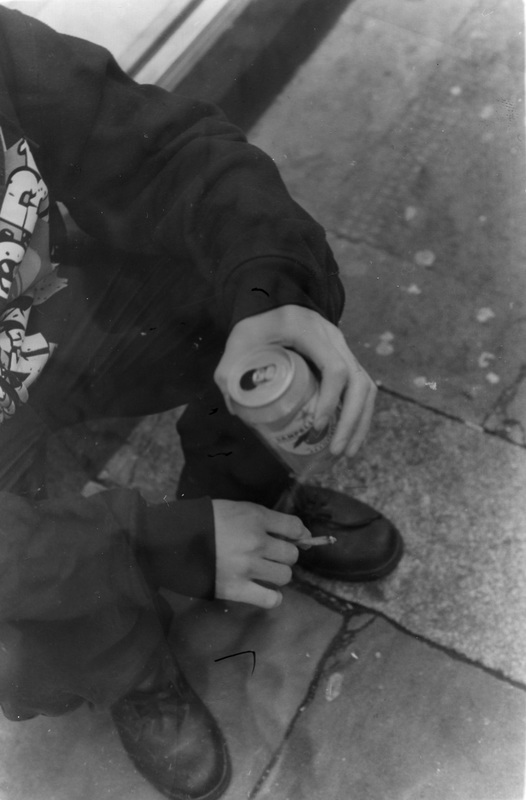
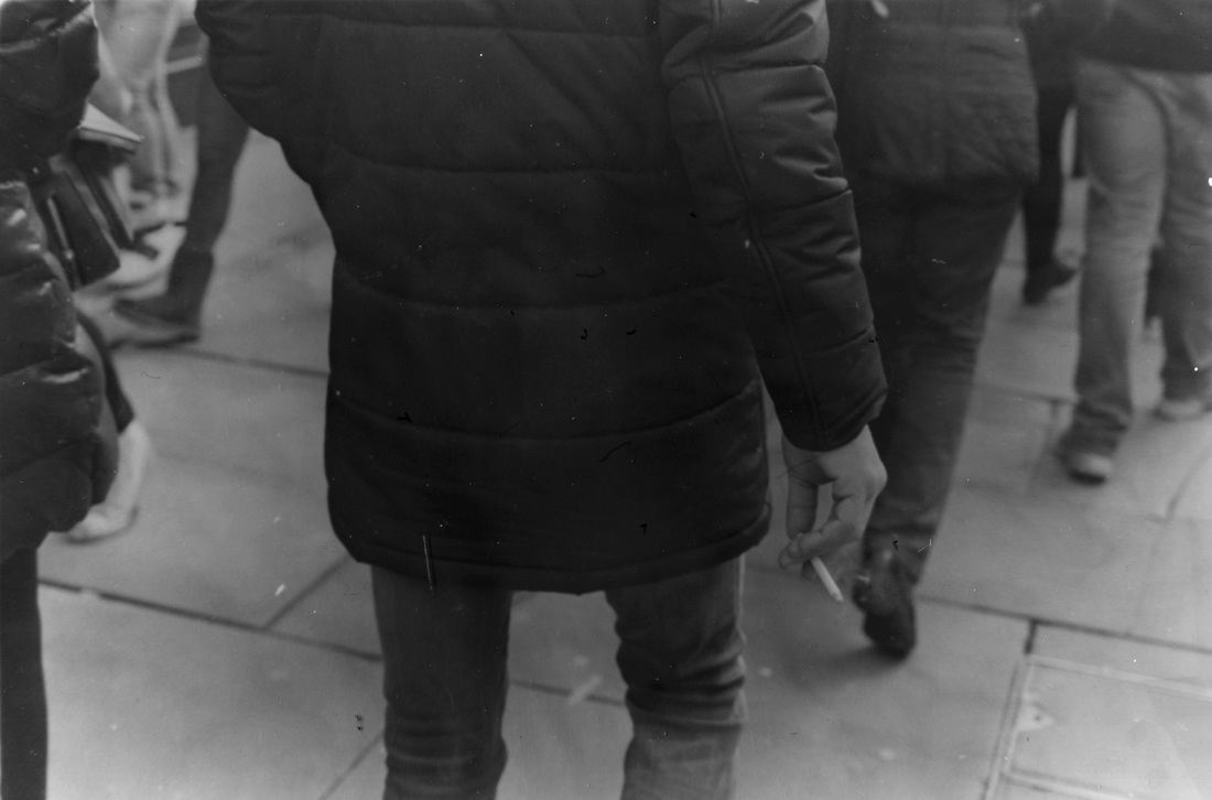
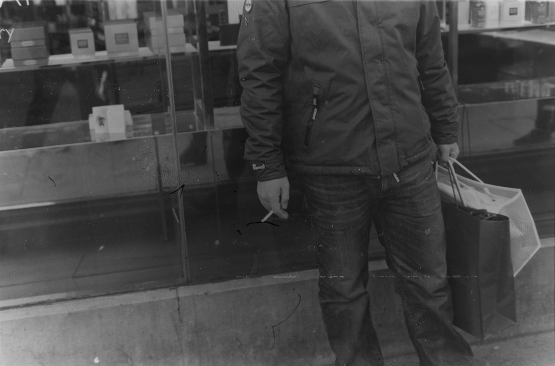
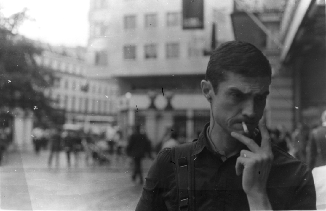
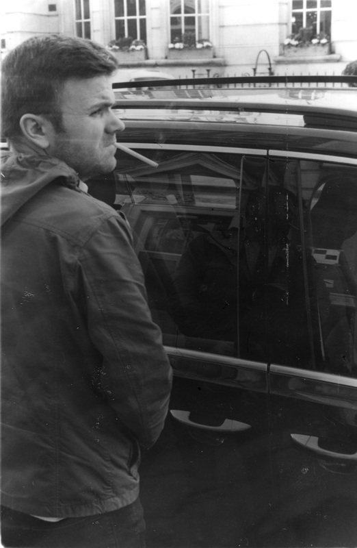
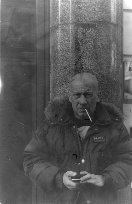
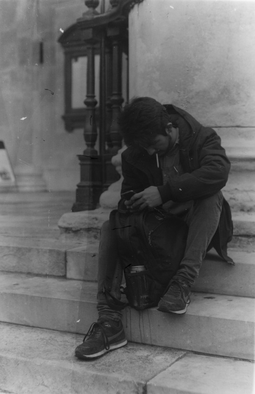
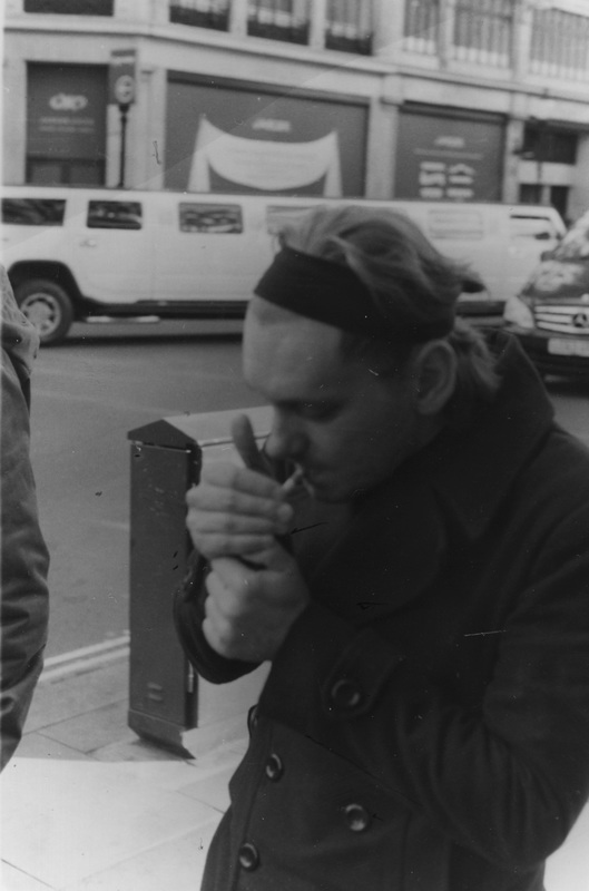
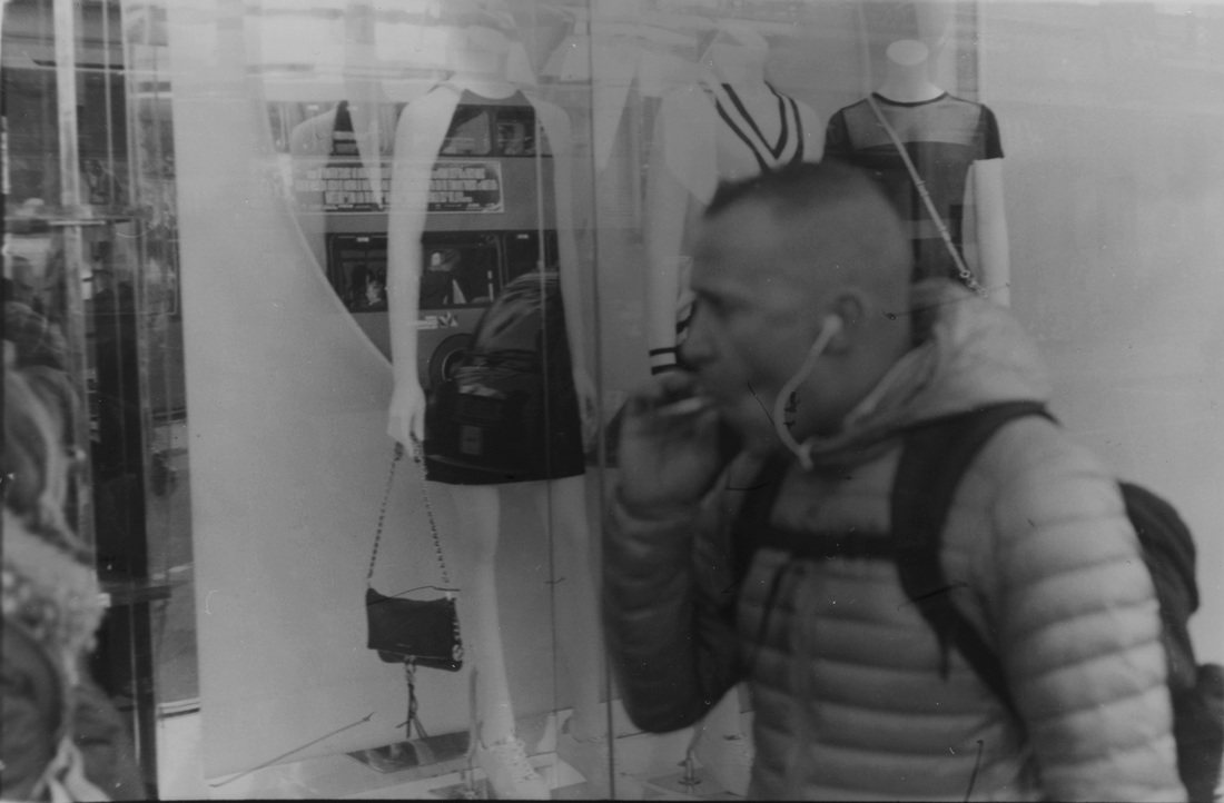
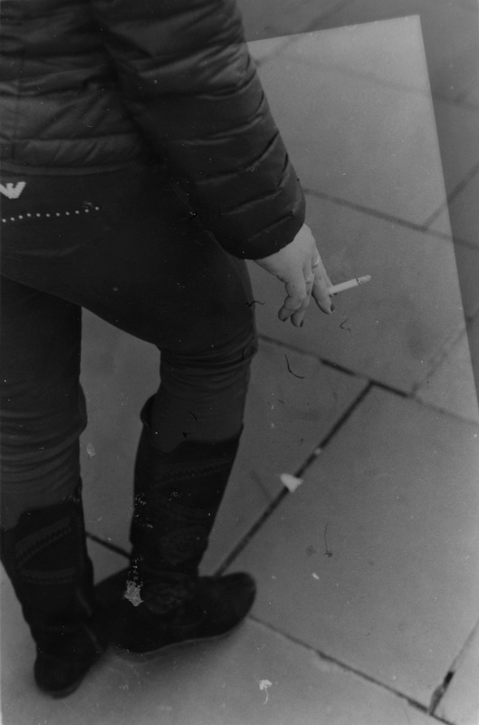
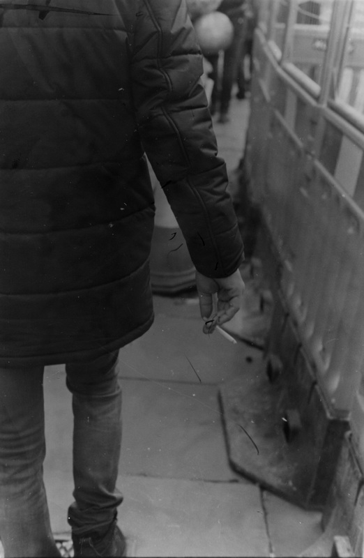
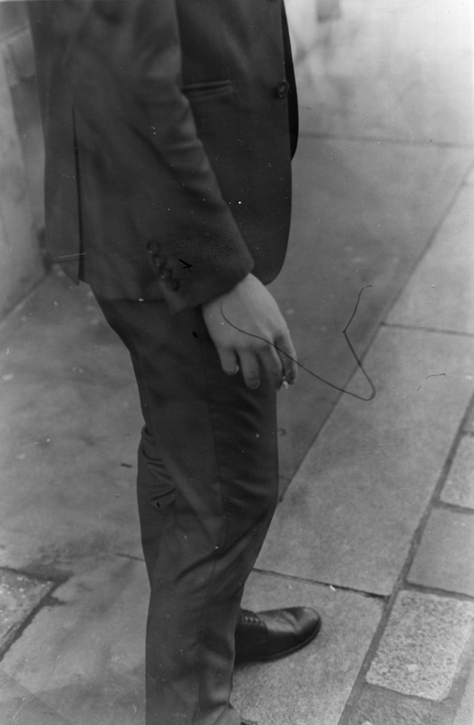
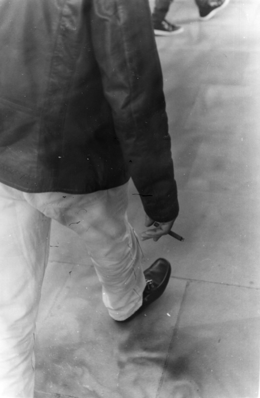
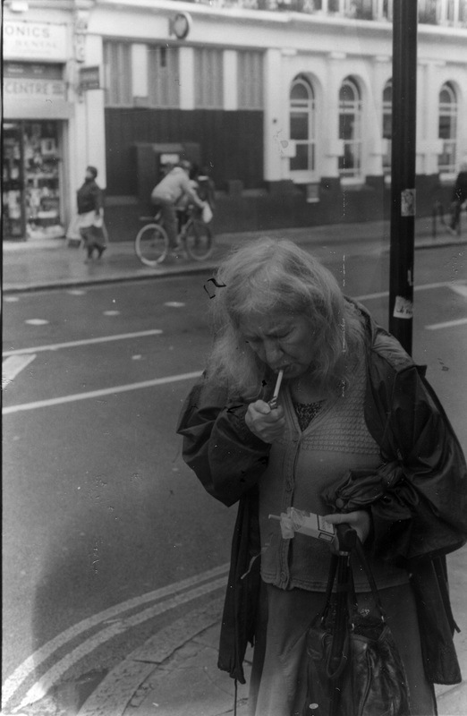
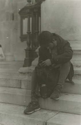
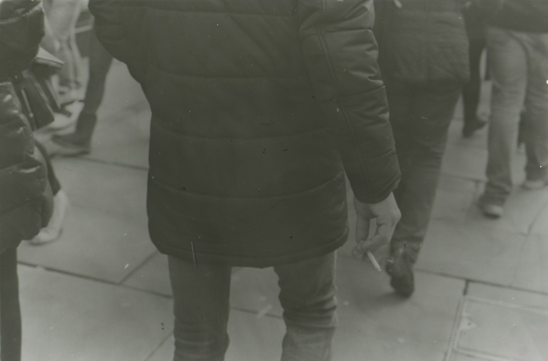
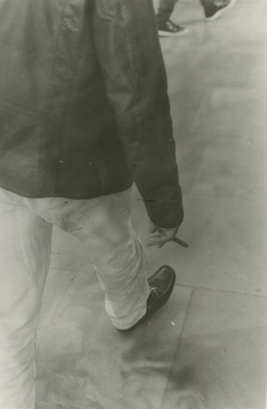
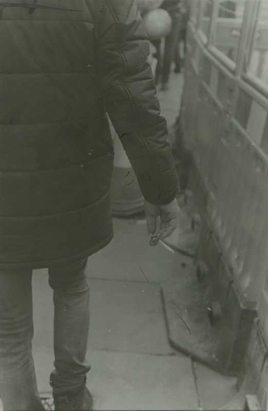
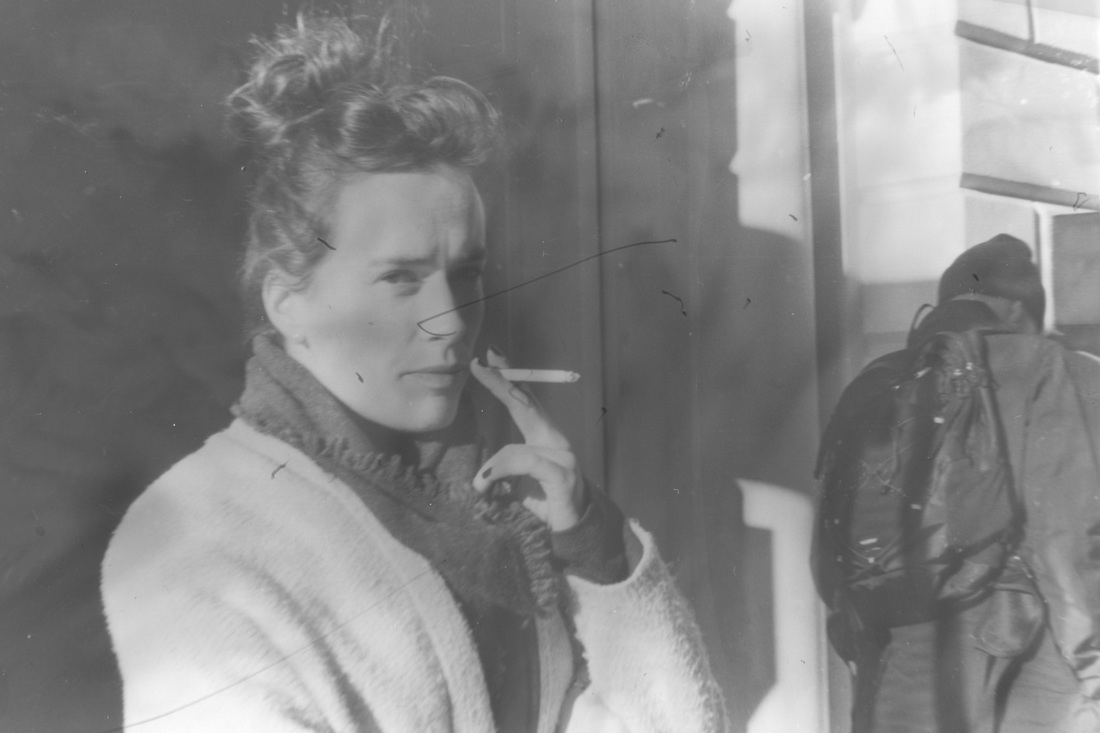
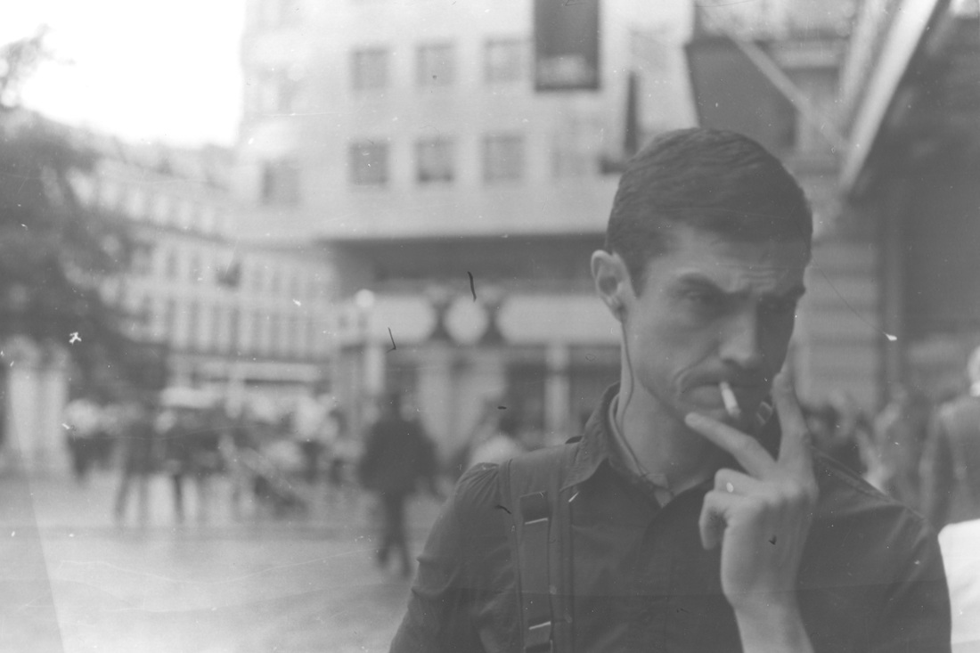
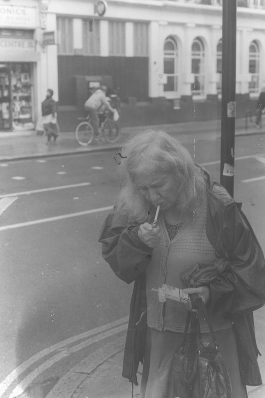
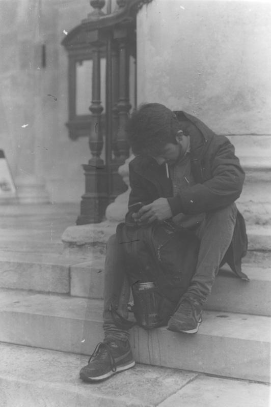
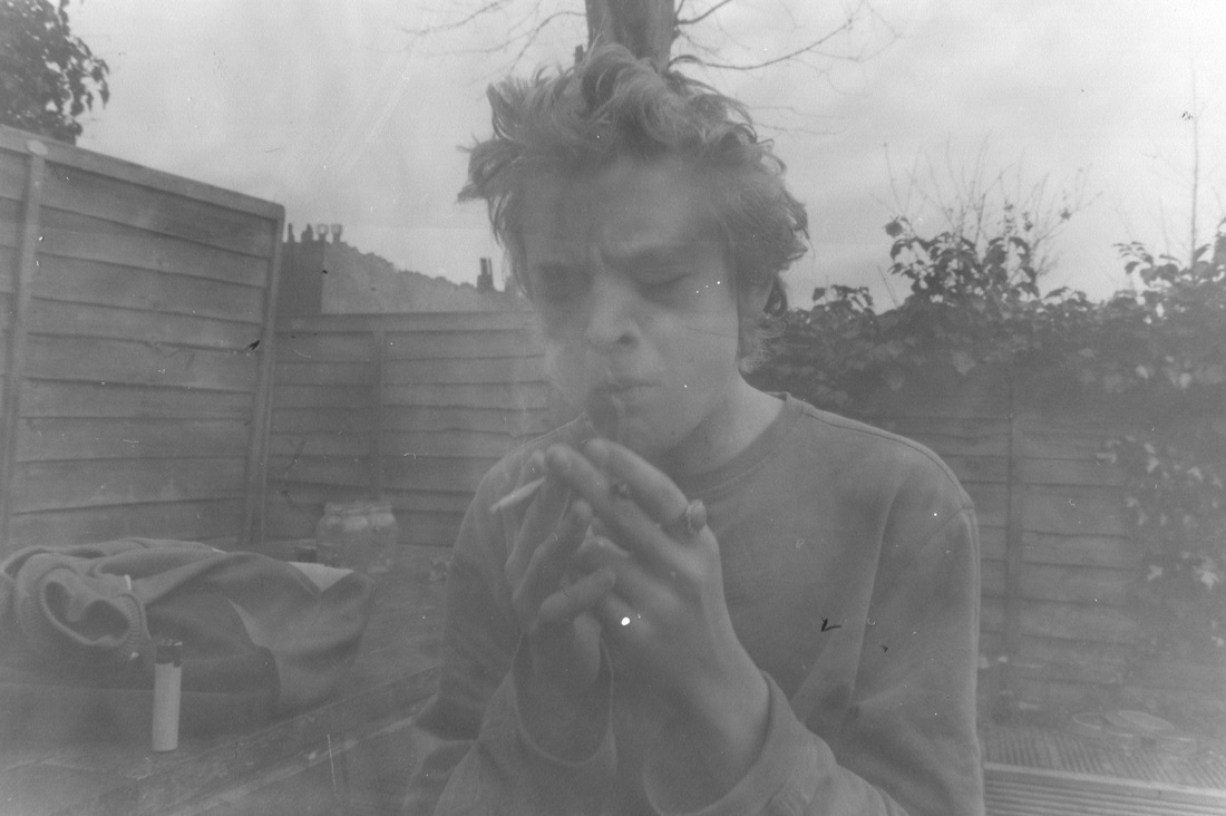
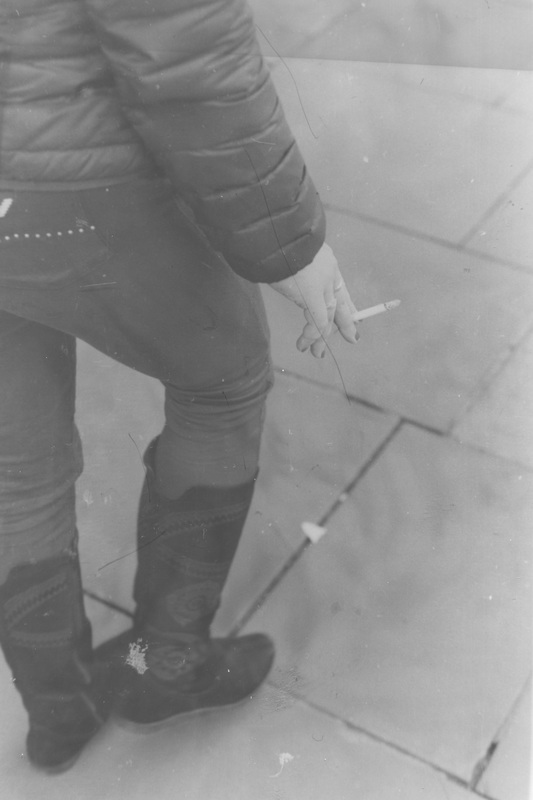
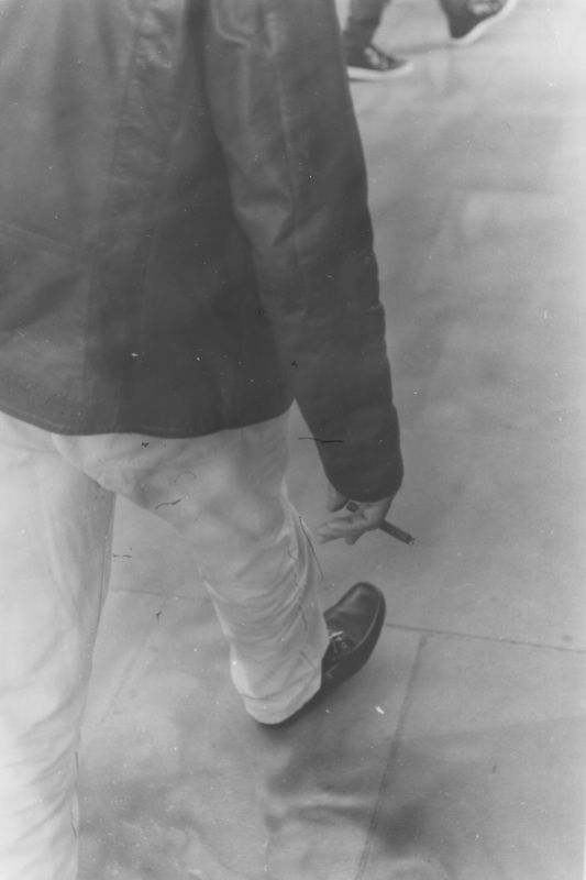
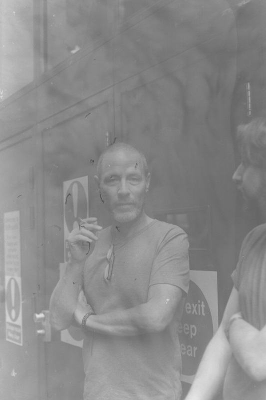
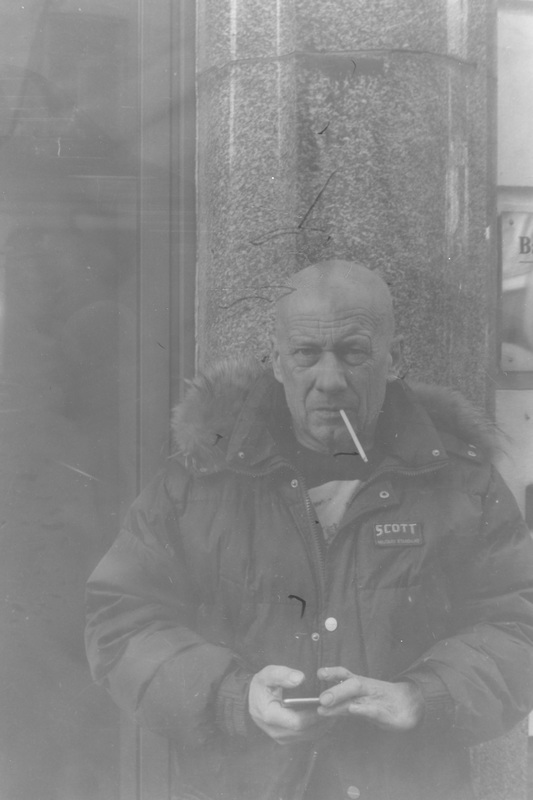
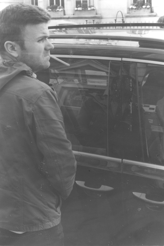
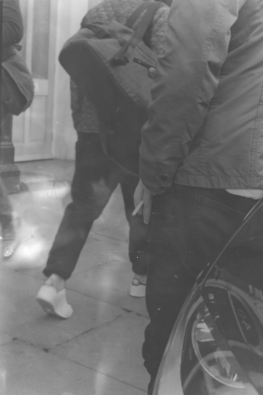
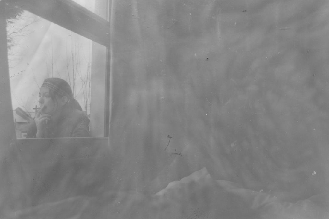
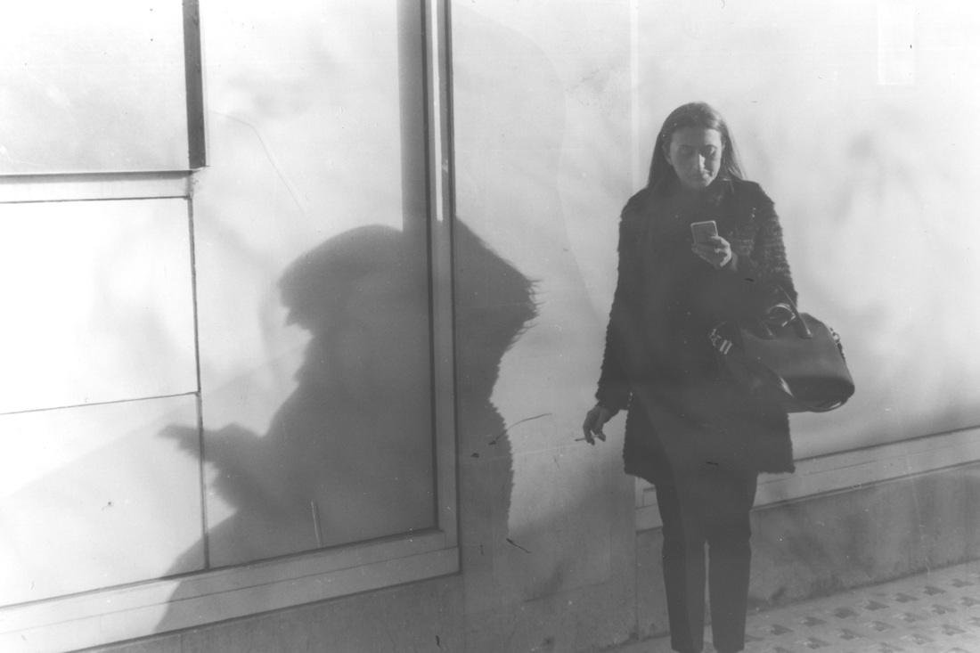
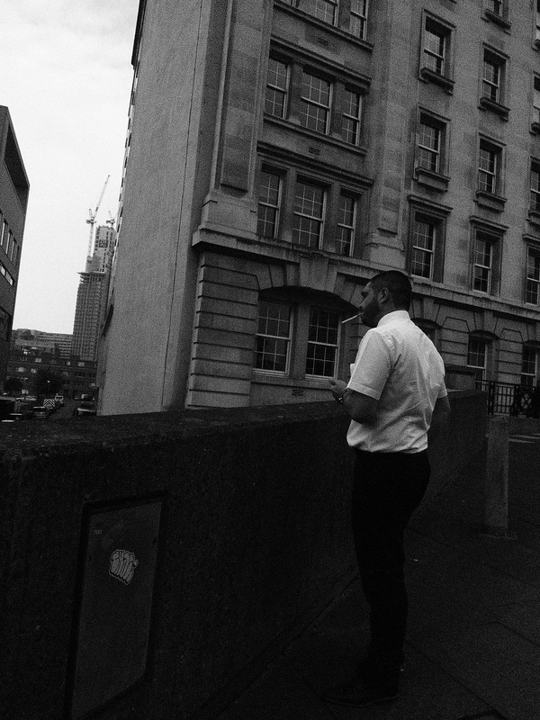
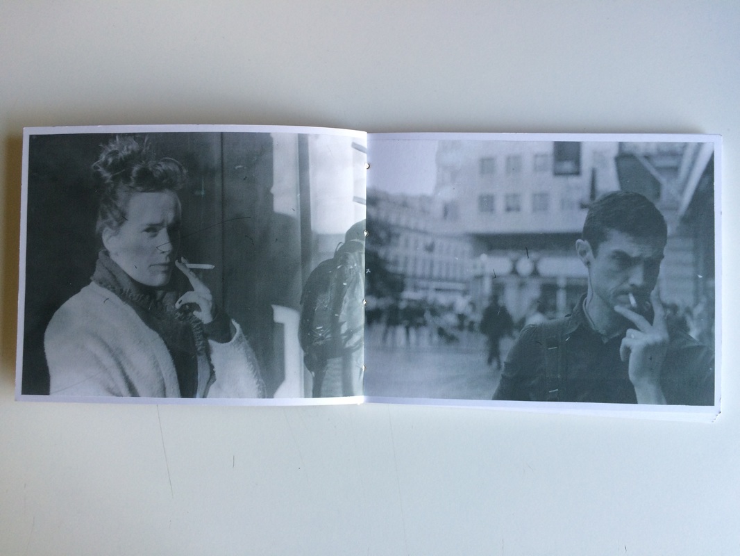
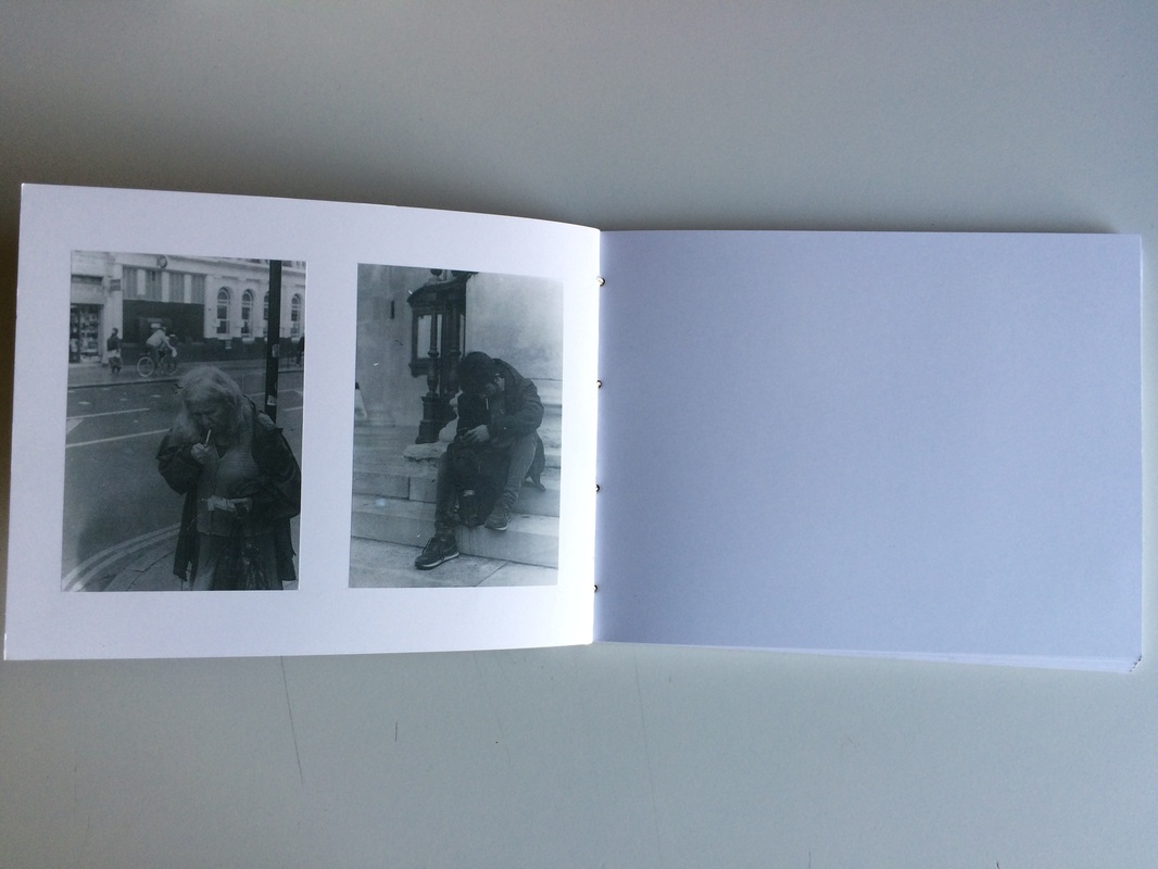
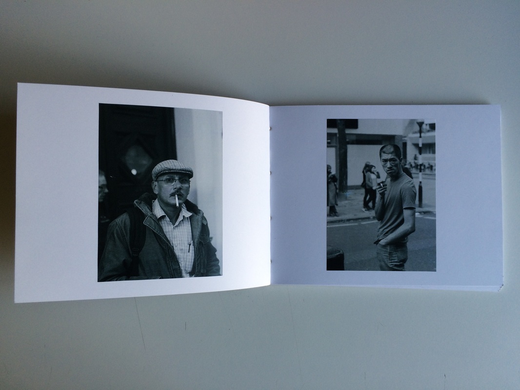
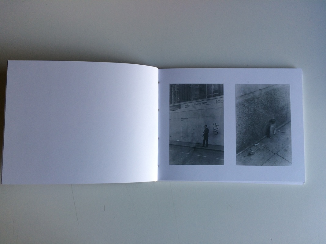
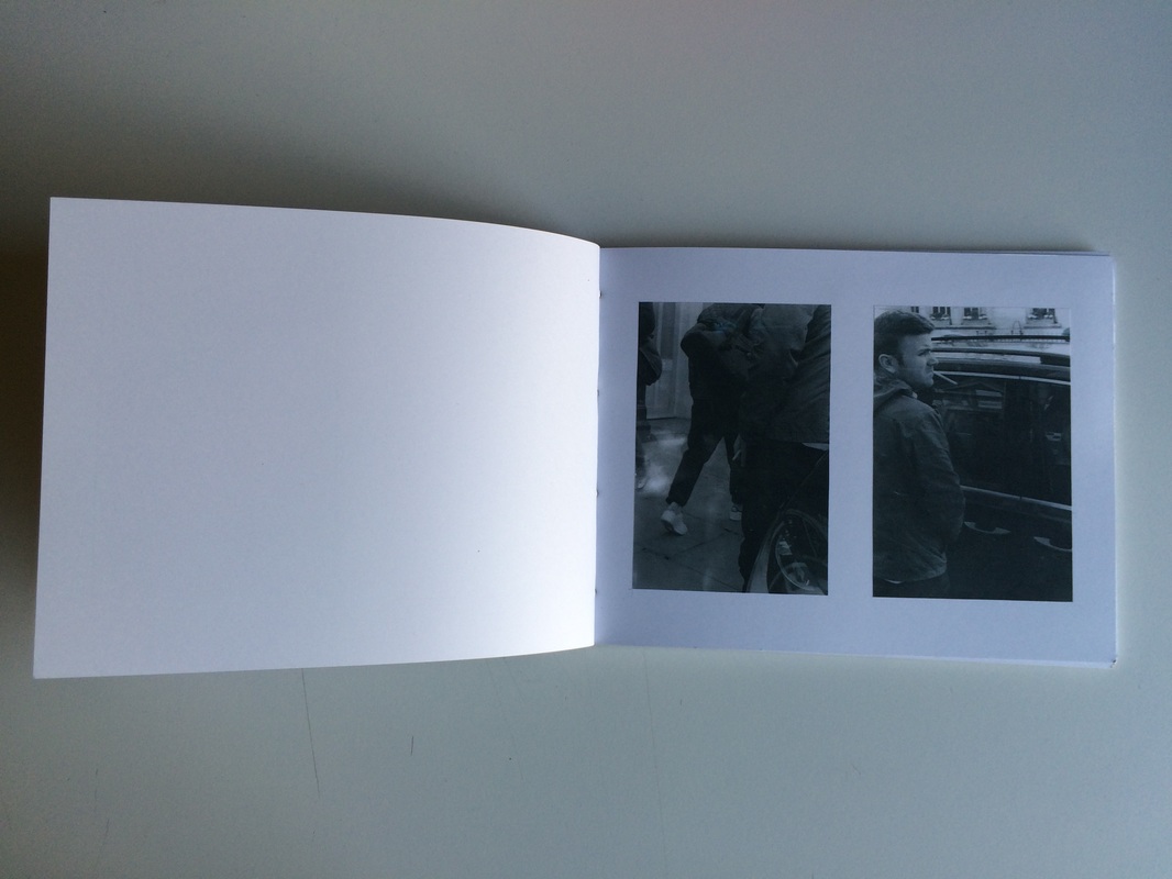
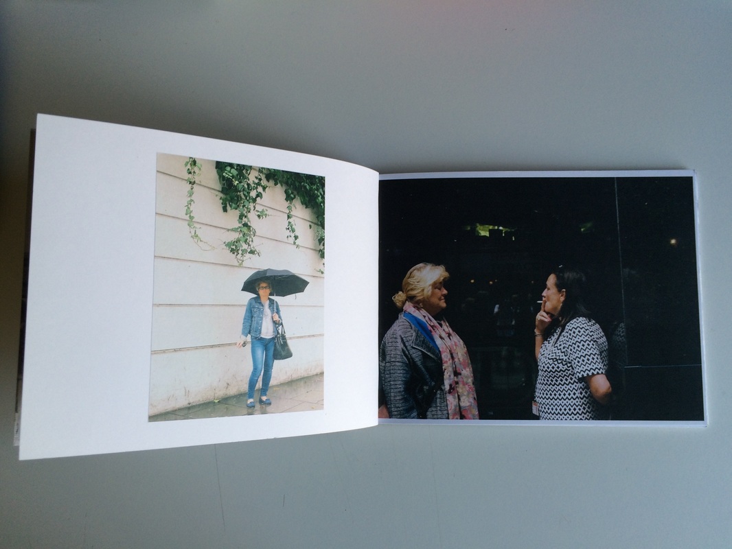
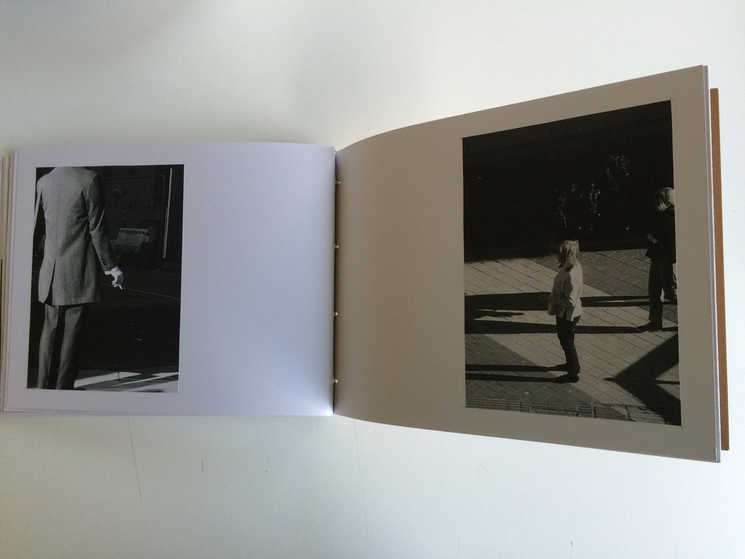
smokers: previously


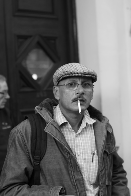


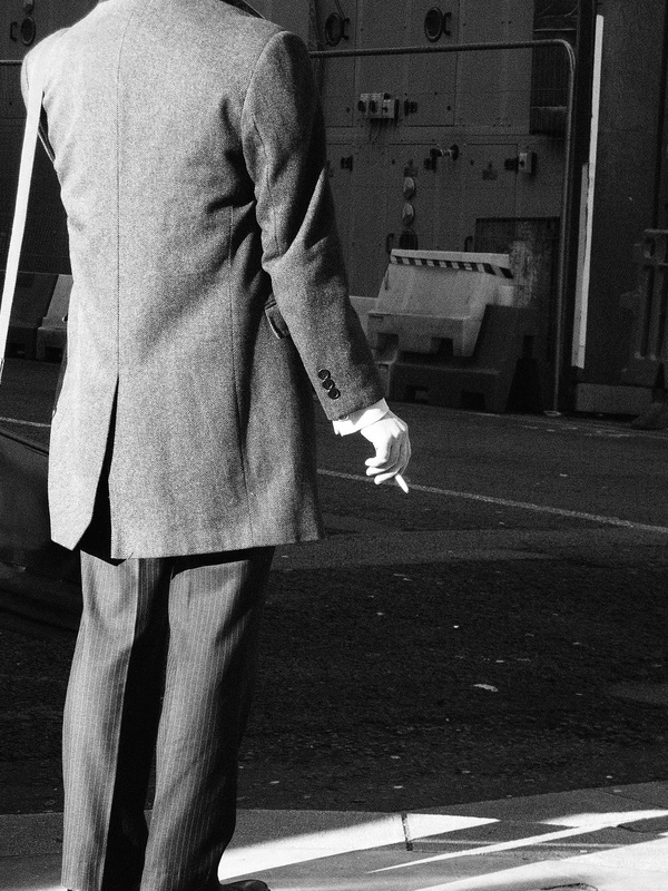

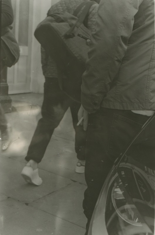
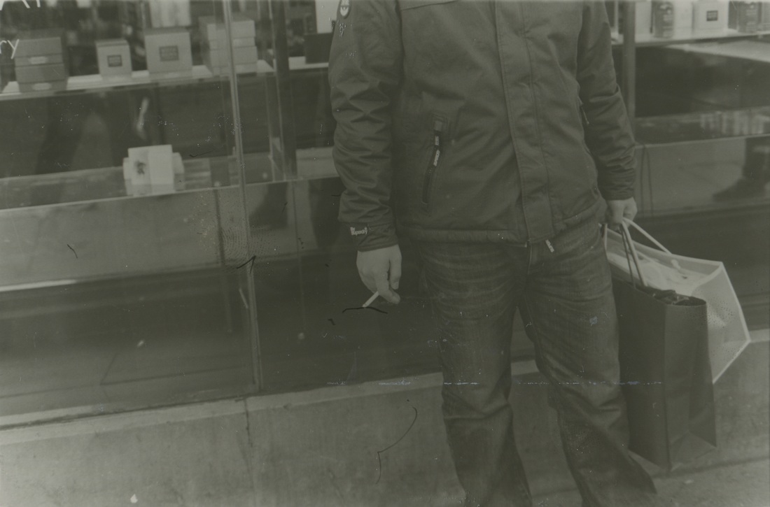
I have decided that I want to pursue the theme of smokers. This is due largely to the fact that I am drawn to them so very much when shooting in the street, as they stand still more, as they are performing an action, rather than walking to a destination, thus I find myself shooting them more. The images above are images I believe are of high quality formal elements-wise and are of smokers that I have taken beforehand, on the photography trip to the V&A museum and at other points in personal trips for street photography. I shall now craft them into diptychs for ideas for the book. I plan to shoot more images of smokers in a different style after.
pairing for layouts
|

|
In practicing the pairing of images that I have previously taken so as to find both an aesthetic quality resulting in their pairing and also resulting ideas in how I may shoot the images for the book. For the diptych above, it is successful in the contrast between the light and dark in the images, and the similarities in the subjects. Each image also has lines involved in contrasting the human figure, and in that way they are very similar as each subject interacts computationally with these lines.

|
|
This diptych I like as there is a great contrast in the content and overall colour in the images, and the almost optical illusion-esque transfer of the lines from one image into the other, making the pair surreal in nature. However overall, I'm not sure the images fit together well, as this is the only thing they do. There is no more similarity or difference in them other than this, and so I believe they may be more successful on their own.

|

|
The diptych has difference in scale, composition and angle, but retains similarity in expression and the subjects themselves, its simplicity and visual impact making it successful.

|
|
The images' angles of their shooting are made evident by the matching of the two images, amplifying and drawing attention to the similarity and contrasting the subjects, which are in a similar place compositionally. I feel that with this diptych, the above and some others, the atmosphere of the book may become disjointed, switching between spreads that are lively and melancholic, depressing and uplifting. I cannot be sure, but the intention of doing so persists, the photo book becoming a compilation perhaps more than a singular project/vision. In some ways it could be seen as a collage.

|
|
A similar time of day with elongated shadows due to highly directional light and filling one half of the image is what joins the images, allowing for a search for the viewer for them to find similarities between the heavily contrasting perspective of the images in the way in which they were taken.
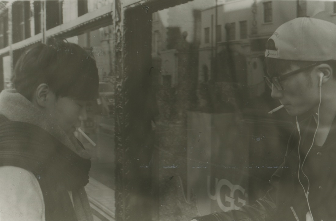
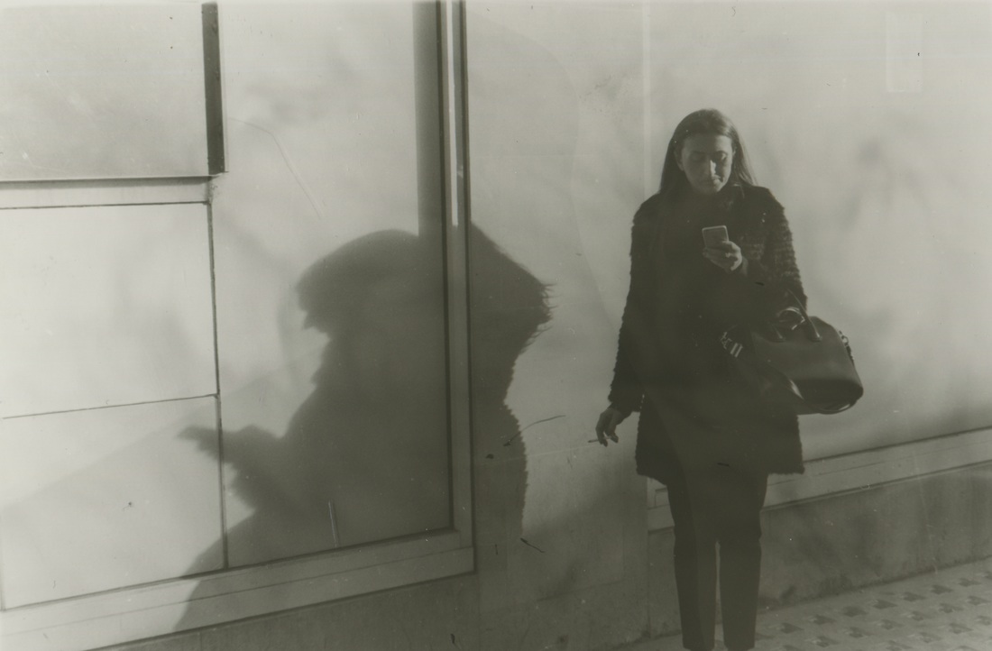
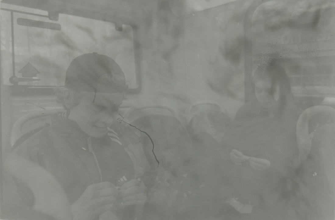
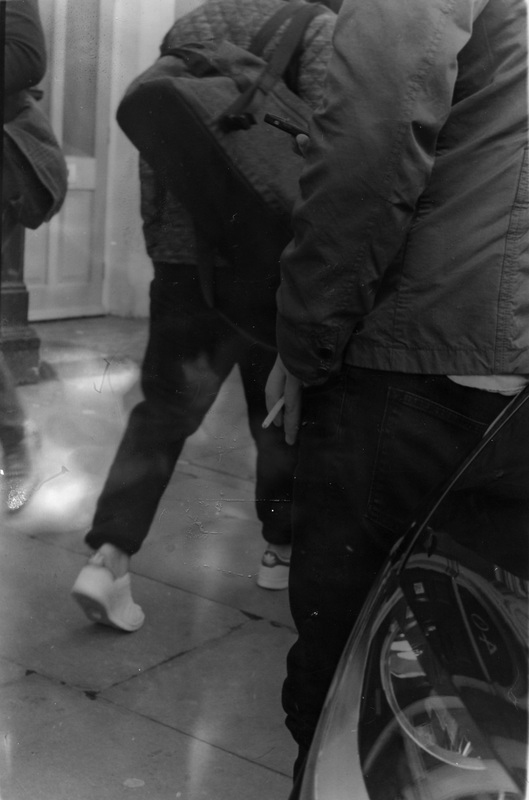
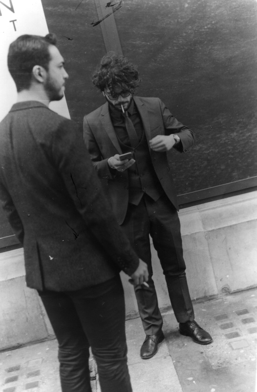
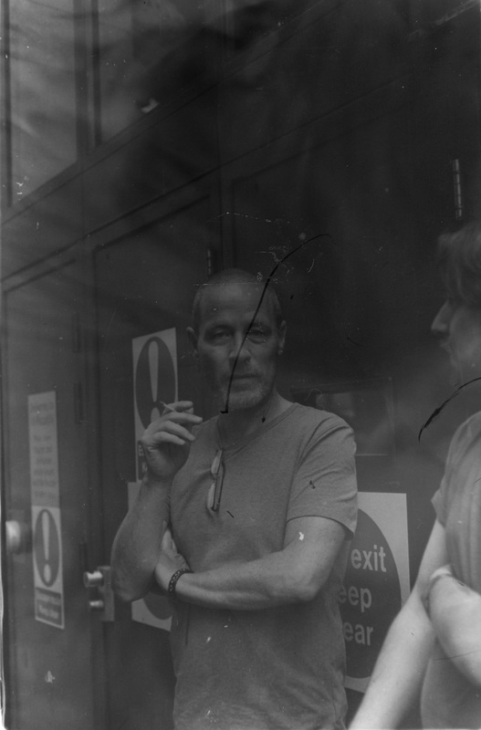
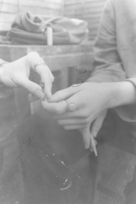
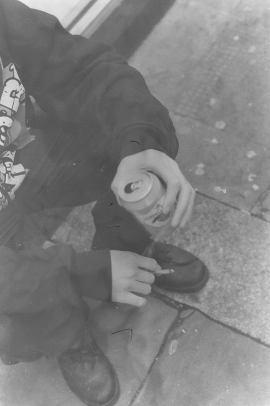
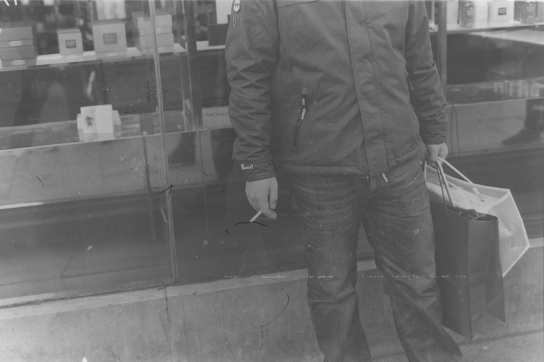
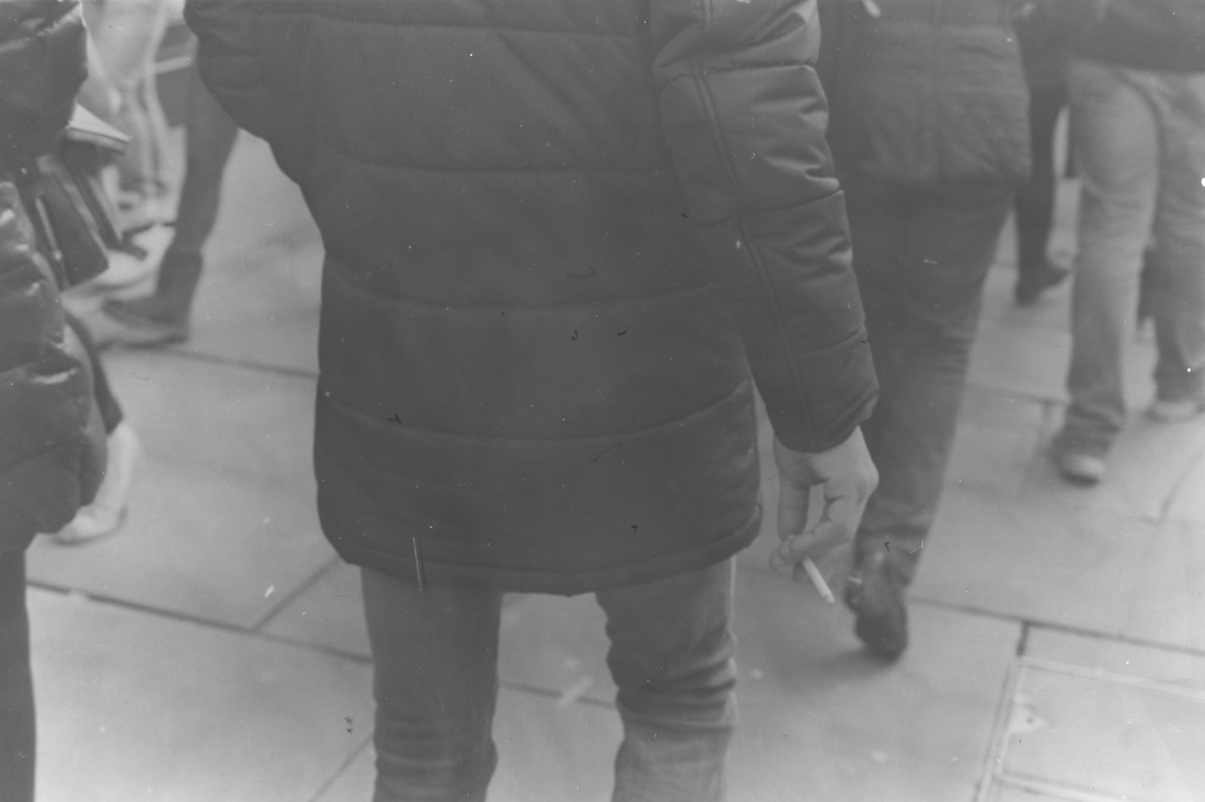
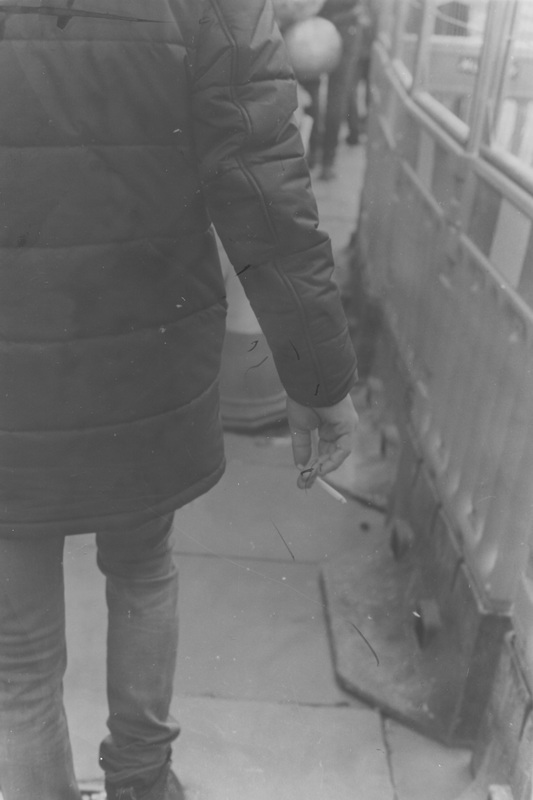
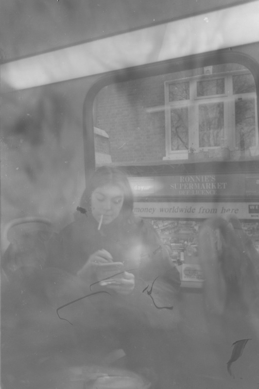
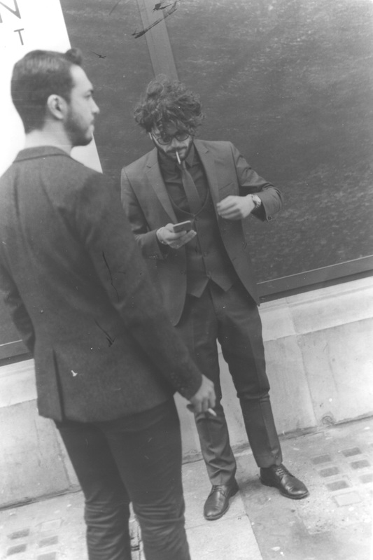
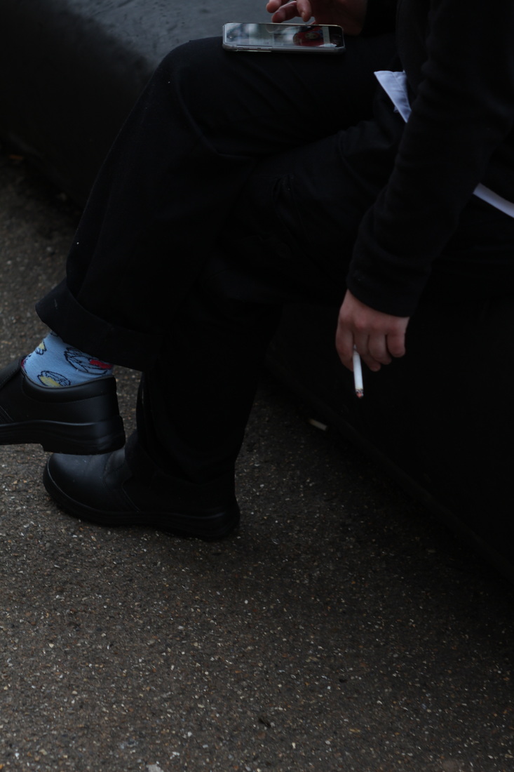
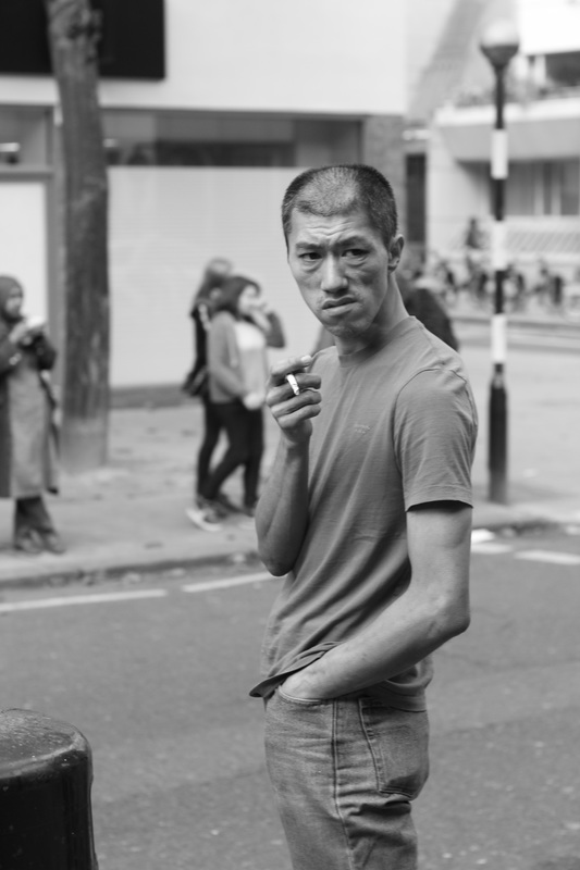
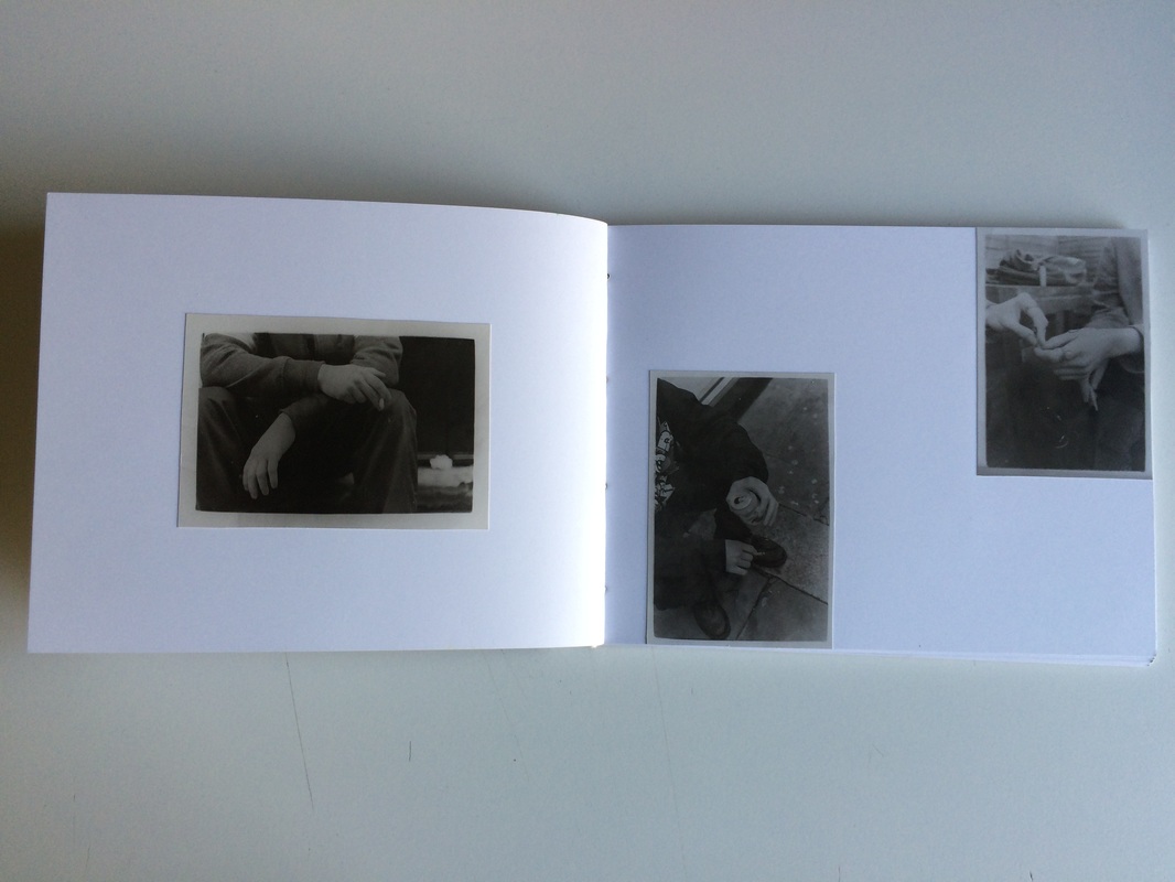
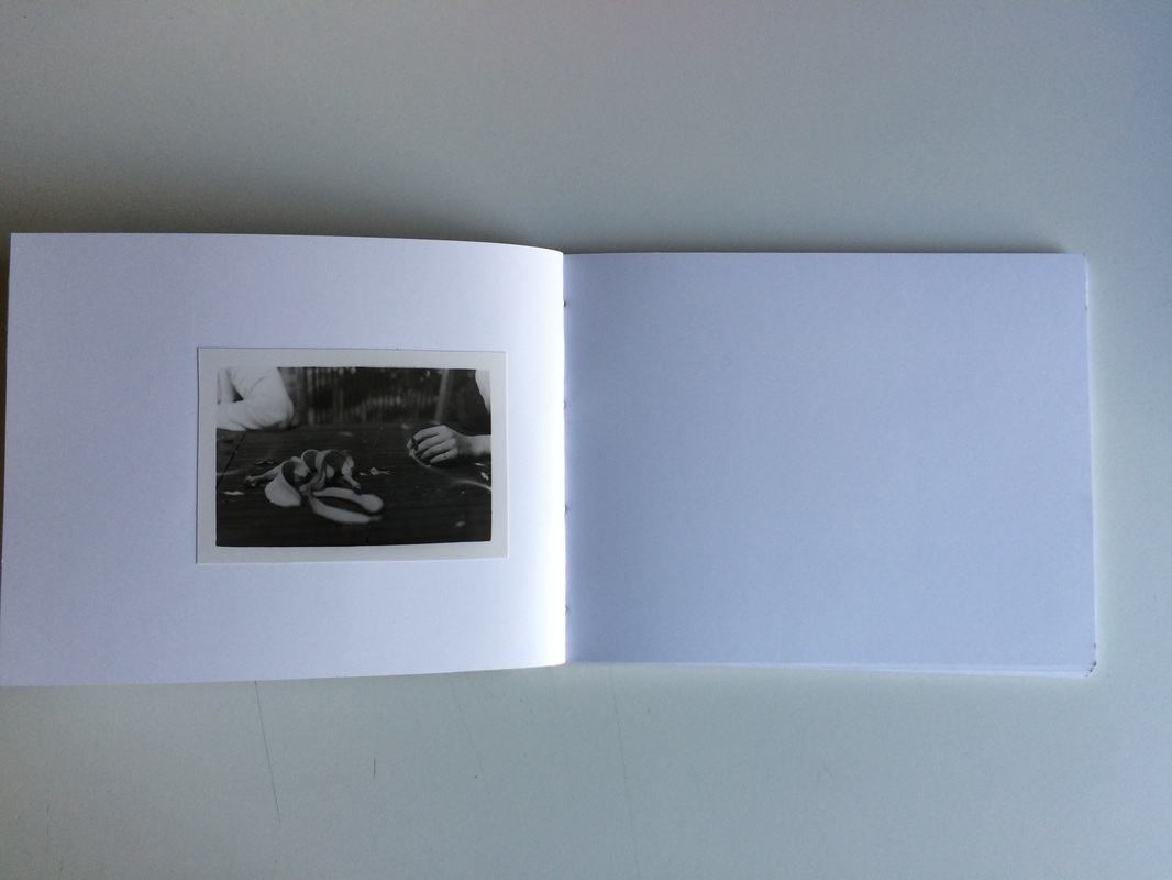
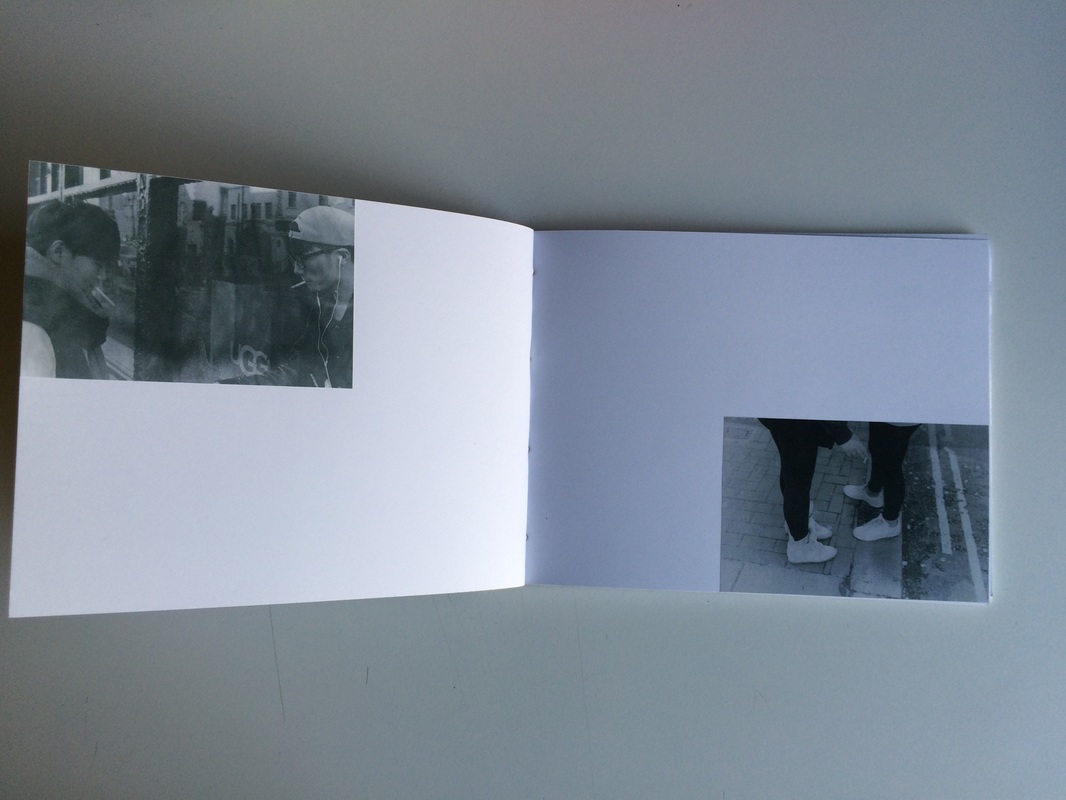
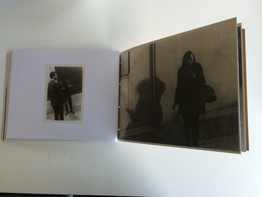
smokers: digital

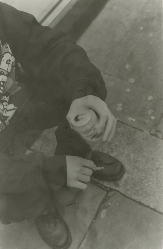
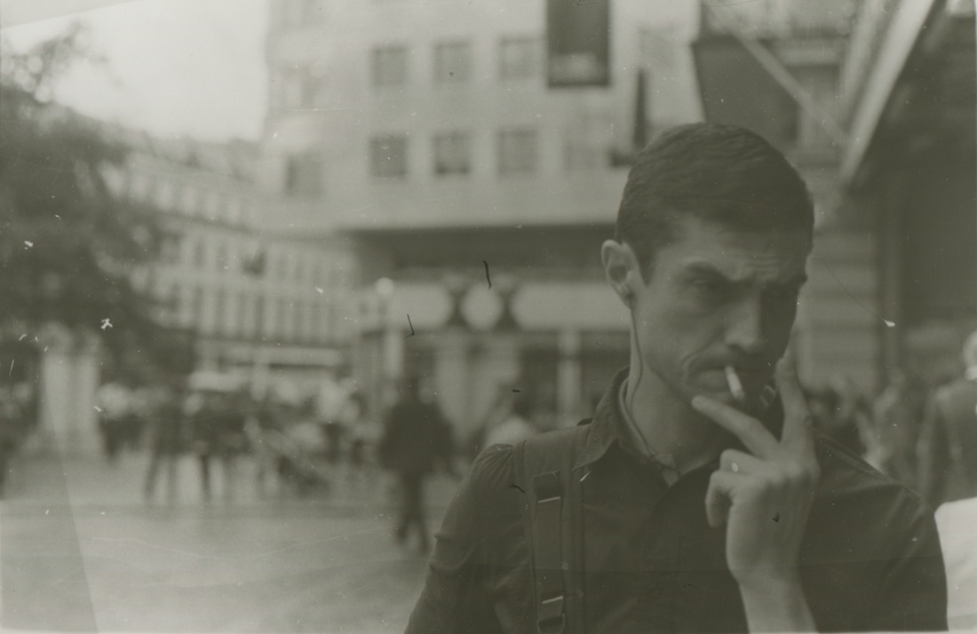
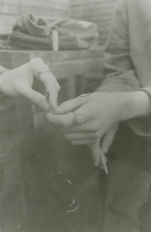
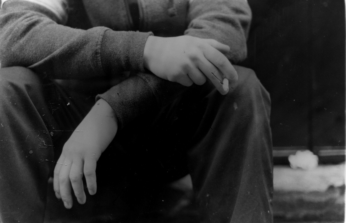
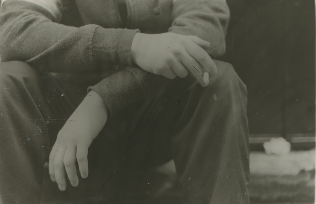
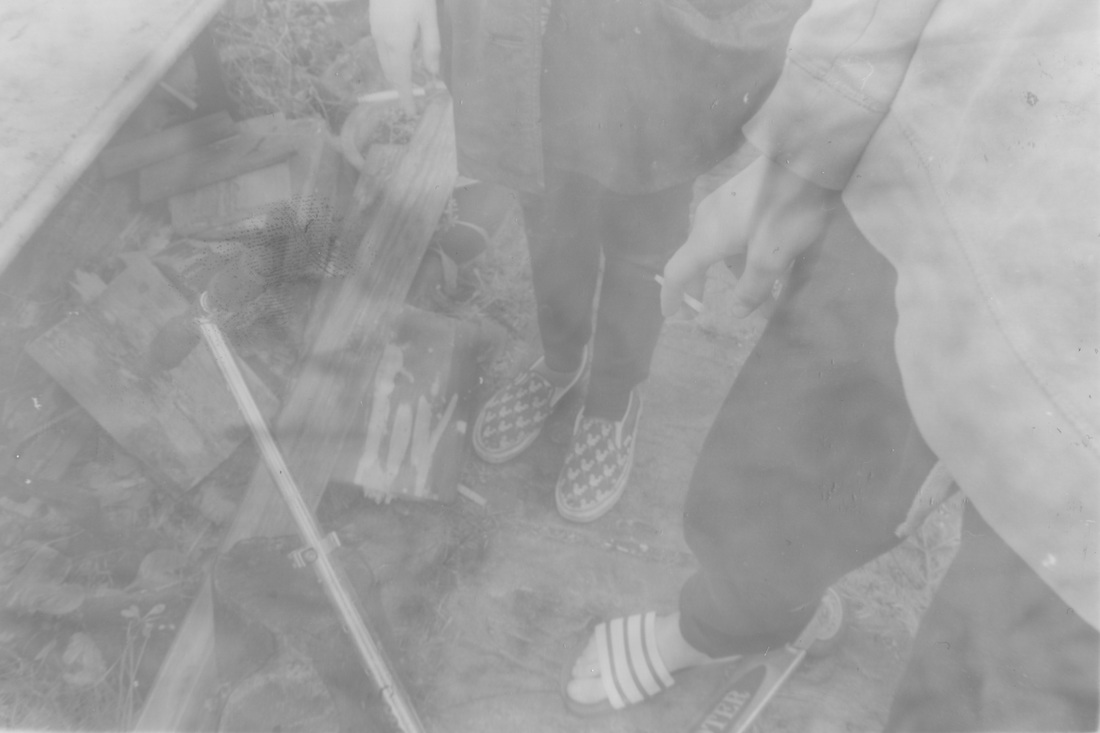
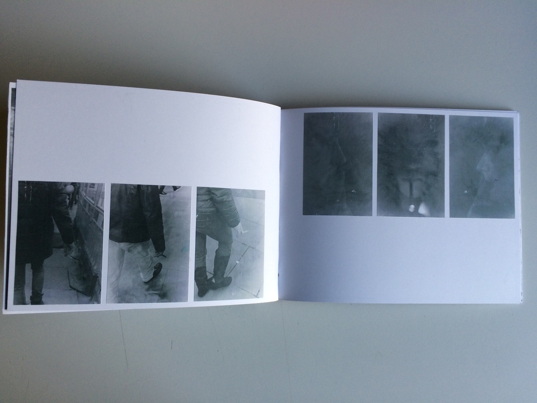
These images are some subsequent practice images with street photography while out in central london, so as to get to grips with how I wish to shoot 35mm film of smokers. Some of them may be included in the book. This was a brief response, and the shooting was difficult, but I managed to succeed in two of the images, the third and fifth, which would pair excellently. I think that shots of peoples hands are very interesting to me, and I would like to include them in a type of typological study as well as the majority of more portrait and scene based street photography that may fill most of the book.
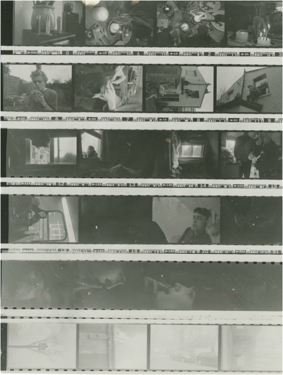
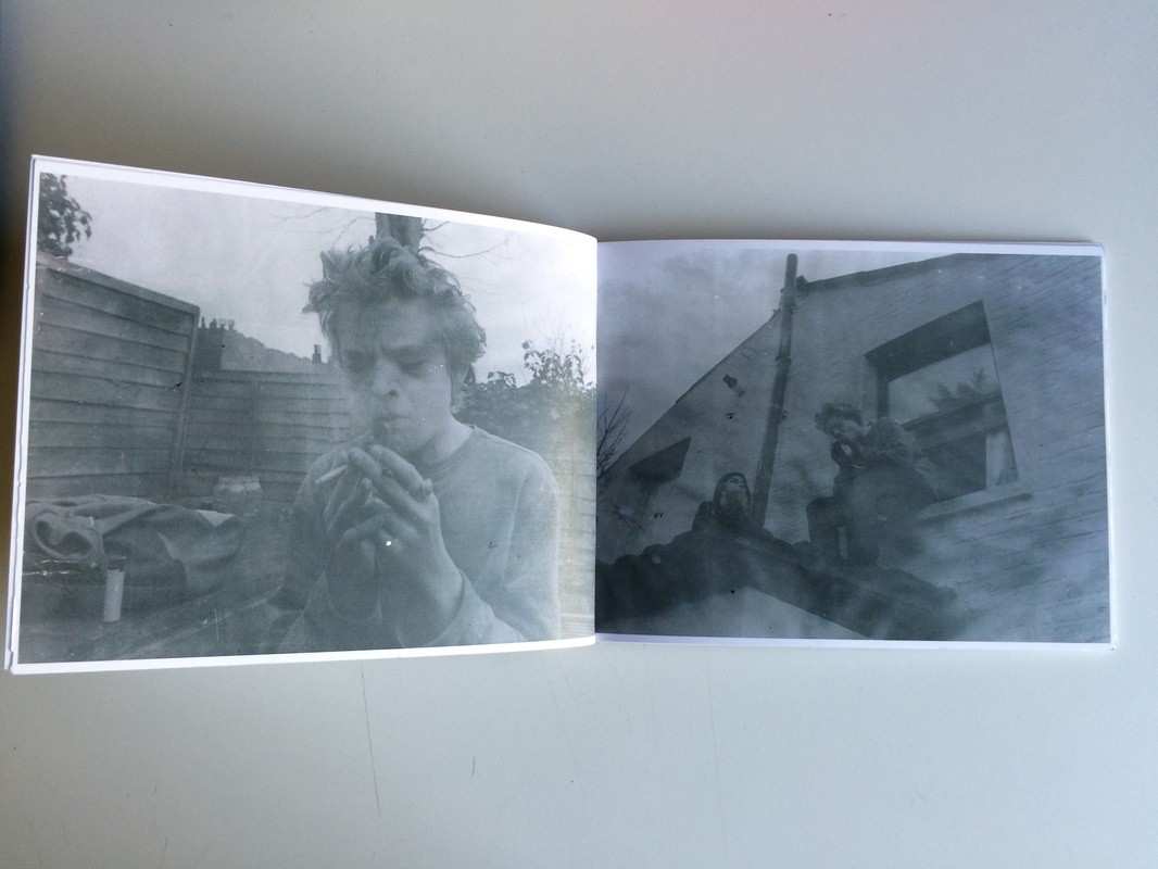
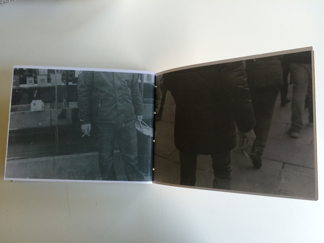
contact sheets: smokers on film
film 1
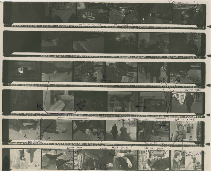
These contact sheets were made with negatives of my own street photography that had been developed by myself, therefore not having a high quality laboratory look. Yet, I seek to use this to my advantage, similarly to the ethos of Moriyama. It should be more about the image than its quality.
I have notated, after printing, some of the contact sheets in an attempt to pair some images so as to get ideas for pages and diptychs, although this is all changeable and perhaps will change if I find better alternatives once printing.
I have notated, after printing, some of the contact sheets in an attempt to pair some images so as to get ideas for pages and diptychs, although this is all changeable and perhaps will change if I find better alternatives once printing.
film 2
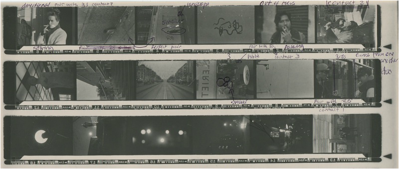
This contact sheet is short as only the first images of the roll contained images of smokers, so I did not add the non-smoker images to the sheet when printing.
film 3
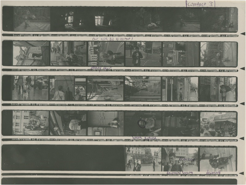
This contact sheet was almost all in London, containing very direct portrait street photography images of smokers and scenes.
film 4 1/2
film 4 2/2
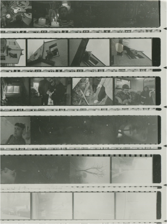
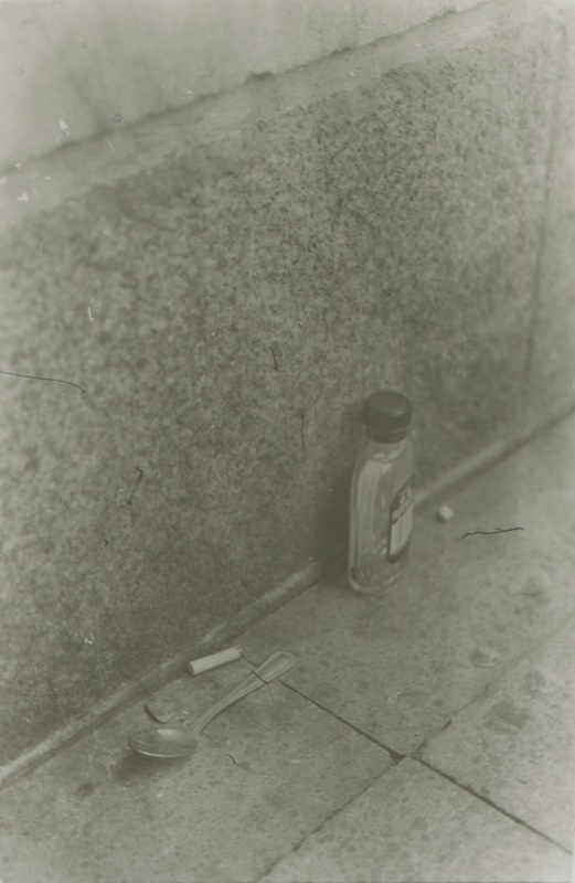
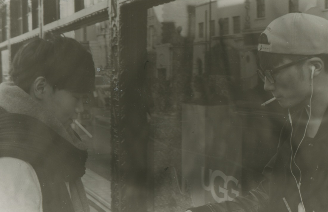
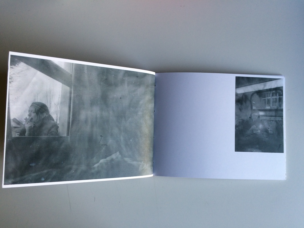
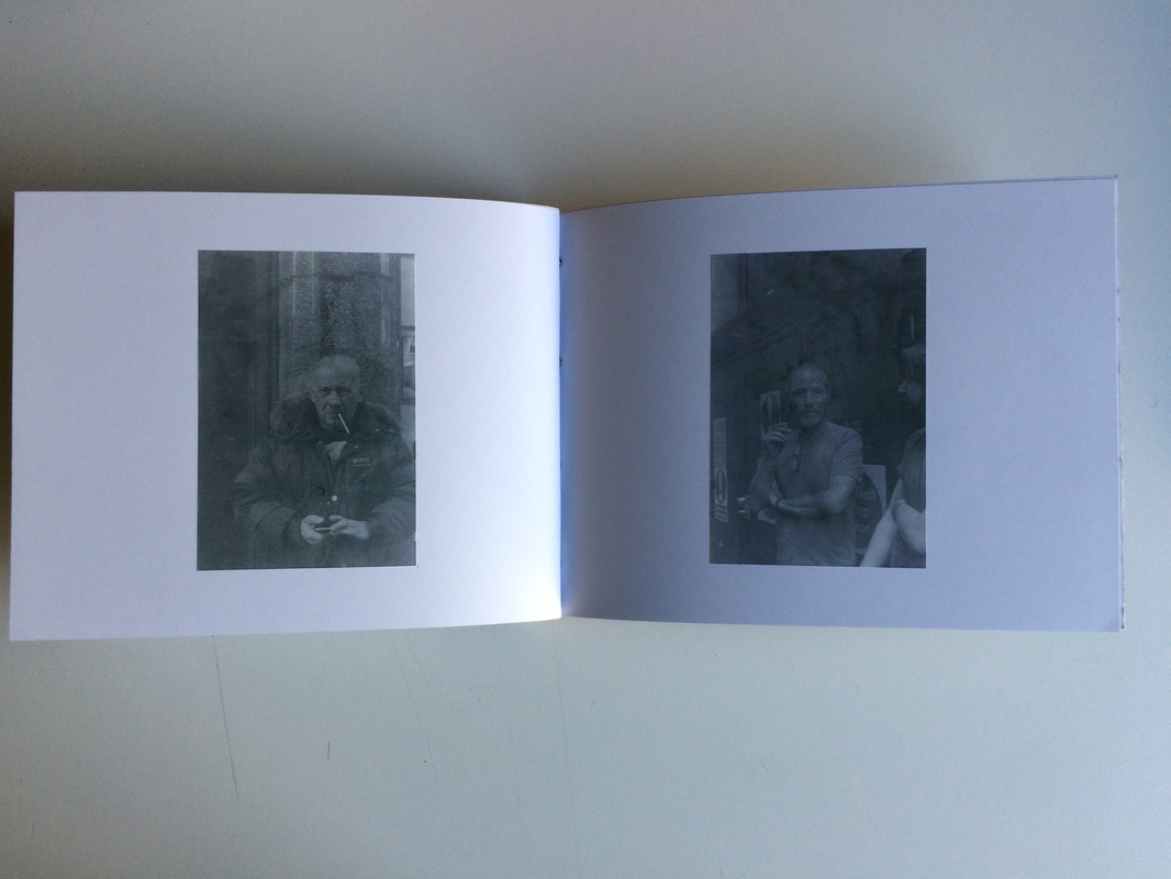
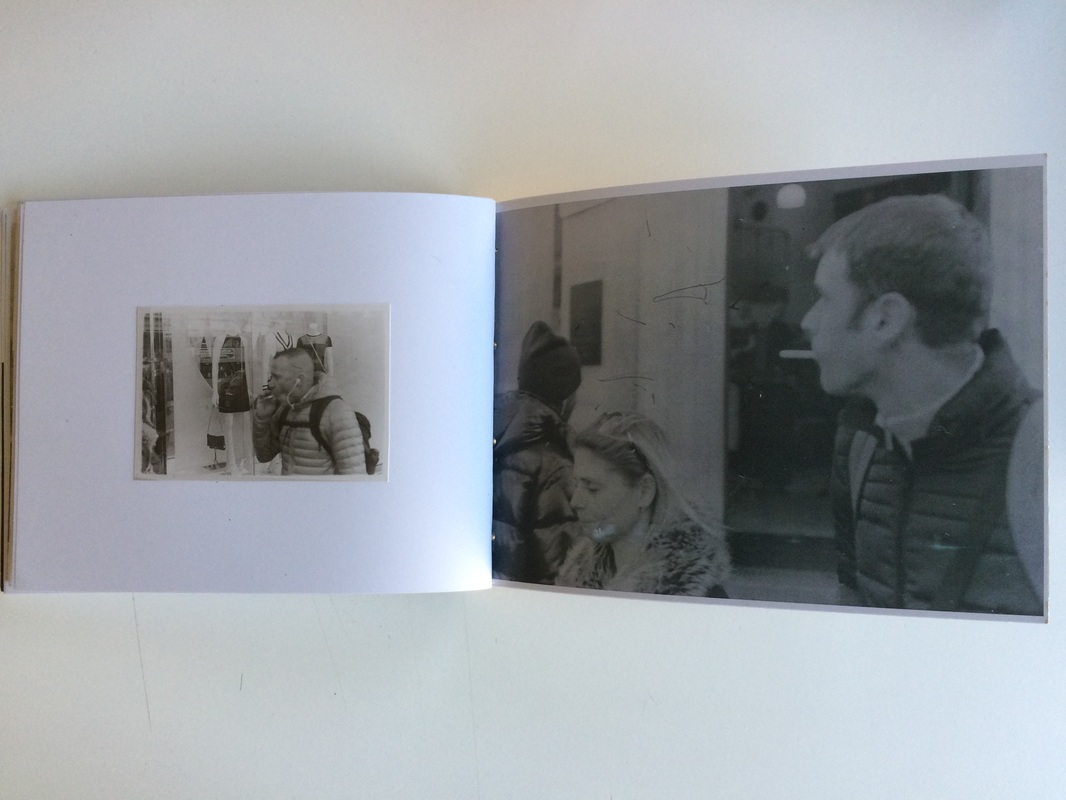
The contact sheets above resulted from the fact that I was forced to print a contact sheet of my film in two separate sheets as I did not have access to large enough paper, although this does not make much difference. The images taken in the above and below contact sheets are that of my friends and them smoking. I wanted to have, within the book the life of those who smoke from people whom I know personally, to total strangers, and in this way not exclude any age or lifestyle, while also in a way doing what Ed Templeton set out to do through his documentation of people he met and knew around him. The images were taken not on a shoot, but in a candid and passing way, giving them a feeling of homeliness but also reality, as they are not composed in a systematic way for viewer satisfaction, just taken for the fun of doing so and documenting. They tread a line for me between personal documentation and memories of my friends and pieces of art.
printing tests: achieving style
printing session 1
These are the first two images I attempted to print, which was on matt paper. They were each chosen as they contrast one another heavily in the conditions they were taken, and therefore the action of the light. There were many problems however with the fact that the contrast was not high enough to view them. Therefore I decided to switch paper so as to attain a more regular and viewable image.
printing session 2


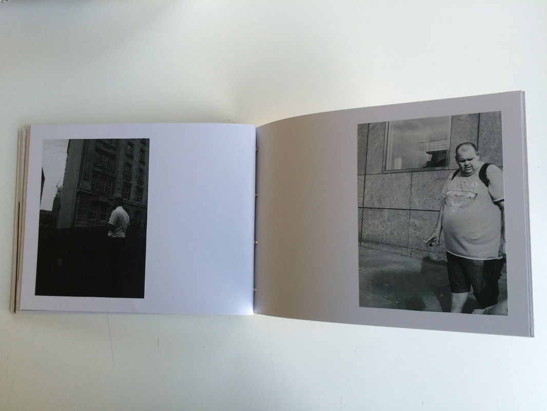
The images above are the enlarged images from the first three contact sheets consisting of mainly street photography of smokers. There are within some printed twice. Through the use of the contact sheets, it may seem that I am not determining which images specifically to print, however in fact I have printed all of my smokers images as shown above as many images taken on film which were on the contact sheet were not of the subject matter of smokers, and thus were excluded as they could not be kept in the book.
As is evident, the quality of the print depends on the conditions in the darkroom, some images coming out clear due to the darkness of their exposure and their order of use in the chemical baths. Although, even though the quality of the prints are low, a low attention to detail would allow me to print more, and I also hold the view that the flaws in the images actually improve them somewhat, giving them a natural worn and aged look, time and therefore time period becoming irrelevant and indefinable.
As is evident, the quality of the print depends on the conditions in the darkroom, some images coming out clear due to the darkness of their exposure and their order of use in the chemical baths. Although, even though the quality of the prints are low, a low attention to detail would allow me to print more, and I also hold the view that the flaws in the images actually improve them somewhat, giving them a natural worn and aged look, time and therefore time period becoming irrelevant and indefinable.
printing session 3

These are simply a few images I have chosen to reprint in an attempt to clear them up so as to make the scans cleaner and the subject matter more recognizable.
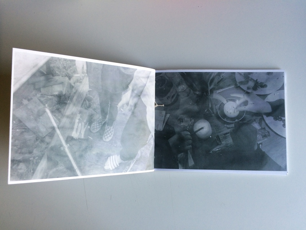
printing session 5
I am not sure whether it is due to the processing of the film or the process of the printing, but I printed these images from the roll of film of my friends and they came out extreme in style, looking as if the smoke surrounds the subjects.
printing session 6
Similarly the sixth printing session came out even more obscured, but I'm sure it can be edited slightly in post. I am very sure however that this effect will be beneficial to the book and present a perspective on this specific roll of film in the way in which it contrasts the rest of the body of work. The smoke-like effect that is produced by the printing of these images is magnificent in how it compliments the images themselves within the subject matter of smoking.
editing practice and idea formation
This is an image by Moriyama I find to be a very successful use of his very specific grainy style. I would like to attempt replicating it in the editing of my own images to view whether the book would be improved by such a stylistic turn.
|
The series of images on the right are examples of my editing in the style of Daido Moriyama my images through a conversion of the scanned images to monochrome and a chosen higher level of contrast.
|
|

|
I do like the effect the images here are being given by being put through what could be called an artificial copy of Moriyama's process in the creation of his images, as they gain a rather more dark but expressive quality in their extremes.
|
all images edited in moriyama's style


I do find them to be a little too much as they begin to force me to question my choice of using film processing in the first place, as they become almost digital-looking and harsh. I would perhaps benefit from also trying to edit them in the fashion of Wakabayashi to also have a look at the result, as his images have a similar feel but are edited in a way which is very different from Moriyama's, that is more melancholic than dark and emotional, which I feel suits the subject matter.
diptych possibilities and choices
|
|

|

|
|

|
|
|
|

|
|
|

|
|
The above images are some of my best examples of diptych and triptych pairing I am to include in the book in whatever way I end up doing so. I believe they speak for themselves in the sense that they are almost perfectly paired and fit together so well I would believe they were intended to be so.
creating the zine
images for the book
prints to be placed in as prints

scanned and edited images
I decided, that attempting a stylistic choice such as that of the provoke movement was too extreme for the nature of the images as passing moments. Rather a compromise in Wakabayashi's style I believe works best, editing images in a light, high contrast grey so as to accentuate the smoke in the images and the marks produced by printing, and not also overshadow colour photographs in intensity, but rather flow between them.
colour digital

b&w digital


colour film scans


The images in the categories above are all the images I plan to have within the photobook, not in order but all fully edited ready for printing. I have removed some previous prints, digital photographs and one colour film photograph as I felt they did not fit correctly into the book as a body. I have also, after editing the scanned body of prints, increased their exposure simply to compensate for the darkening effect of the printer I am to use.
cover
I have decided that I would like to use a simple cover for my book, without the use of a print or any similar thing. I would like each image to be seen as equal, rather than having one that is chosen as the cover, seeing to be representative of the book as a whole. It is more of a story, my book than an artwork in which people may pick favourites. I may therefore simply use a brown or black cover for my book.
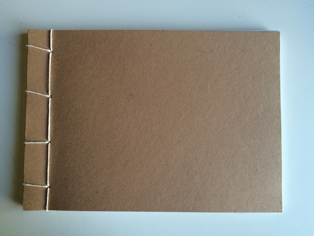
binding method
This is a method I have found which I believe will allow me to create a book that is clean and bound tightly, without the possibility of the binding failing over time in any way, and also being fixable.
The book would also work well with heavy paper, which I plan to use.
The book would also work well with heavy paper, which I plan to use.
the finished book
evaluation
During this project I have researched a number of artists that explore not only the theme I ended up using, but aesthetics and perspectives that related to how I wanted to guide my work. I explored the work of Daido Moriyama, Nobuyuki Wakabayashi, Ed templeton, Shoji Ueda, Luke Fowler, and also had small investigative looks at the diptych work of Osma Harvilahti and Mike Terry.
I already my own prior liking for Moriyama’s work before I studied him within the context of this project. I had studied his work before through art and photography practice, so I felt it would be a comfortable way to approach the creation of my book with inspiration I am already familiar with that has influenced my photographic style. I have learnt from studying Moriyama’s work that fine art photography should not be a confined genre that assesses worth and artistic value on the Bresson-esque philosophy within photography of perfect composition, focus and exposure. Moriyama rejects this, in composition and perspective specifically and in that way produces emotionally evocative photography that focuses on sequence and subject, feeling and what we are drawn to subconsciously. What influences your work I believe is your ideas, rather than preconceived ideals being forced upon your work, dictating what is ‘good’.
I found Wakabayashi in an online photobook library, and used a book that was produced as a type of cheap softcover book that could be bought in stores. The subject matter was of prostitutes in poor Tokyo neighbourhoods. The book uses complex compositional and relational curation, solarized images, diptychs, larger groups of images, and the use of both purely blue and monochromatic full bleed pages. The images, often blurry, have very few highlights and a lot of mid-tone values, depicting not only prostitutes but objects and scenery related to the subject matter. Wakabayashi’s work showed me the effect of putting images through multiple processes to distort and create effects, as it seems he does in his work and as could be practiced by myself in the darkroom. The images become distorted almost to an unrecognisable level. I also like the concept of photojournalism flowing and combining with fine art photography practice, which would perhaps be perceived by many as polarities within photography at the time, perhaps rendering the book genreless, but all the more interesting as a result. I also was drawn to the combination of monochromatic work with colour as it allows exploration of many different perspectives on events and subjects. Wakabayashi and Moriyama both inspired the photobook through the aesthetic values they promote in their work, which took on board for some of the shooting of photographs for my book but also for the processes and media I used for developing the look of my photographs.
I found the work of the skater, artist and photographer Ed Templeton by seeing his ‘Teen Smokers’ book in a gallery. He photographed, when skating at parks and other places, teenagers who had decided to take up smoking. He found himself intrigued by the fact that they would take up such an uncomfortable activity at such an age simply to elevate their social status. Templeton’s style in the book is primary concerned with typologies, which he utilises to explore an idea. Not necessarily following a restricted process, but a wide way of shooting his subject matter that still retains similarities with ease but promotes variation. It in a sense therefore is journalistic and anthropological, giving insights into the human condition and our own rationale concerning events without promoting anything romantically as an action. I wanted specifically to make a book that was typological in nature as this fits neatly with how I work, documenting and finding related subject matter.
Shoji Ueda is another photographer I looked at, which I found on an online photobook library. I looked specifically at his post-mortem self-titled book of his work. Although it is not his personal curation, it presents a mix of his different practices, or even perspectives on things during his life as a photographer, ranging from black and white street photography, to fine art still lifes to out of focus portraits and landscapes. I wanted to attempt to achieve something similar to this in my book, presenting a mix of varied harmonising and discordant work in colour and subject matter, so as to fully explore experience in as many aspects as possible, whether it be of life or a theme.
Luke Fowler was an artist I discovered through a book within school. His book named ‘Two Frame Films’ is a collection joined by the camera it was photographed on, splitting 35mm film into two frames, creating a diptych that is fixed as two images, questioning whether it is one or two images as a result. The subjects he chooses seem to communicate an intimate and biographical way of looking at beauty and those around himself, photographing scenery and people in a candid fashion. The books images can be said to be less important than the editorial and sequencing aspect of the book, as this is highly important to its effect and subsequent narrative. I wanted to use the aspect of intimacy somewhat in the book, while still exploring a theme through my diptychs rather than the practice of using the camera itself.
Osma Harvilahti and Mike Terry were two artists whose books I did not look at, but whose diptychs I did. Harvilahti producing colour matched and correlating diptychs that only amplify the images’ beauty and Terry producing diptychs that are opposed in both colour and subject matter as much as possible. Both photographers demonstrate that both similarities and opposites are important to the formation of diptychs for my book. I wished to integrate this philosophy into the relationship between the images in my book, both in diptychs and in their sequence across different spreads.
I also looked quickly at the impact of Eisenstein's theory of montage and how it affects our interpretation of sequences of images. Very simply, I learnt that sequence in essence provokes the mind to believe there is movement, regardless of the relationship between the images, thus we form links naturally between images, even if unrelated, as if they happen in sequence as they do in real life.
I chose for my book to explore the theme of smoking, as I felt it lent itself to a grainy or lo-fi aesthetic as well as images that were highly romanticised and upright in their conformity to the view of what typically makes a good photograph, reflecting both views of smoking people in the present and past have held on the subject and the change in that perspective.
My first thoughts about the theme were that it was almost to be an anthropological study as well as one that would produce questions not answers. The idea of smoking is complicated to deconstruct, as it both mentally, socially and physically implements itself upon the person. It becomes like eating or sleeping, as it is needed, yet is not treated by many as an addiction. It forces rational humans to produce irrational explanation for the action. Smoking was an action I had been photographing through my street photography since I had began doing so, yet I had never reflected in depth its meaning, aesthetic value and societal commentary it was capable of through studying.
My initial ideas did not change throughout the project per se, but did in many ways expand and come to incorporate other aspects of the act. It became apparent to me through experience the breadth of what is not only a problem, but simply an act in itself, how it affects social interaction, and how the smokers themselves feel about their habit, due to their reactions when being photographed while smoking.
I addressed throughout the creation of the book some threshold concepts. The first concepts I put into practice was number one and three, that photography has many genres and that it is multidisciplinary. I believe that ultimately my book tiptoes on definitions such as street photography, photojournalism and elements of social science, so I chose ultimately to not try and define it when working and after, and if it is to be defined, that is the choice of the viewer. The second threshold concept I applied was that it is unlike other visual arts in that photography manages to select from the world information rather than producing it, which was an intrinsic part to both the street photography aspect and the photographing of only one single act. One other very important concept I entertained was that chance plays a significant role within photographing, and to a large extent my project ran through this idea, as all of my diptychs were not planned, but pieced together by the chance of their similarity. As well as this, chance plays a general role in the taking of street photographs themselves. Other concepts I had in mind during the creation of the book were that the photographs can never have fixed meanings and therefore cannot be ideologically neutral, as they will always be perceived in a varied and contextual way. The book I produced sat, hopefully, between that of romanticisation and the opposite of such a view, as well as many of the images being overall rather neutral. This plays a big part in the viewing of the book, as I do not wish to impose opinion, but let it in some sense be formed by the book in combination with the perception of the person viewing.
I aimed to, when experimenting, produce work that sat easily within the large space that my style encompasses as a photographer personally, that was also as varied and out of my usual shooting perspective into new and varied areas before and during the exploration of the act of smoking. The project therefore I guess became an amalgamation of all these influences in hopefully a clean and orderly way. Although, I think there is some dissonance between the digital and film images in the way in which they interact, the digital images sobering the viewer after dreamy light-grey images. However this may or may not work in my favour depending on the viewer and their taste, as I did ultimately set out to create a dissonant feeling.
The first experiment I carried out in the project was a response to Daido Moriyama’s work, using a small digital olympus camera and at one point a canon DSLR, posing a stylistic restriction. Even though Moriyama uses black and white images at most times, his most recent work uses digital colour photographs, thus, I chose to use colour, so to add an extra element for diptych pairing of the photos from the finished task. The restriction posed helped me to in many ways understand how I shoot intuitively in a given time, which I found interesting and I find myself drawn to compositional oddities and abstractions rather than figures, although I wish to apply this aspect to the act of shooting people. There were other images I produced that were less compositionally based but I believe this was due to the speed of my shooting, and at a rate as fast as the response was, I could easily whittle down to the images I wanted to use.
The pairing of the diptychs was another way of developing the way in which I wanted to present diptychs in my book, which I found through this process for myself to be a study of opposites and similarities. I find myself pairing colours and compositional shapes, along with opposing or relating compositional lines. I find the relationship between the shapes in each image when performed well makes both images greater when combined in that specific fashion. However, I knew that it would not be practical to attempt to study smokers in such an abstract way with the time I had, so I wanted to apply this compositionally, but simply with recognisable shapes instead of geometry.
The pairing of these previously taken images was also important in giving me ideas on both what to include in the book, in what order to include it, and to what extent I wanted to use digital as a medium for the photographs in the book. The pairings I found intuitively fell together depending on two factors, the subject within the two images or their compositional relationship, as often the subject affects their composition, such as smokers often being centered as they are still, or directional light producing diagonal light in the same direction in each photograph. This task influenced my style in pairing diptychs and was influential in allowing me to do so with ease and affected the film photographs I eventually chose to print for the project.
Another task I underwent was the shooting of a few digital images of smokers, not as a large task but simply a test before shooting film to deem myself capable of doing so, and to form ideas as to how I wanted to shoot. I only shot six good images, but this gave me the idea for studies of hands holding the cigarettes of the subject along with the type of street portraiture and figurative photography I had in mind for the project. I wanted the experiences to appear fleeting and transient above all else, even though the photographs are permanent moments in time.
For the main bulk and the rest of the photographs for the project, I chose black and white 35mm film to shoot on and develop at home, myself, my shooting encompassing both friends and street photography. The street photography being mostly compositional, high quality well focused images that reflected the work of Shoji Ueda as photo documentary-like, with a small amount of street scenes. The shooting of film of friends and acquaintances however was different. The images became close and personal, and in that way I felt I was photographing social situations and people for myself rather than the book, presenting a simple and readable feeling for the viewer. The style changed from the differences of these shooting styles and thus, I wanted to combine them in a book to present the two different perspectives. I thought the relationship between these two areas of perspective were successful in their combination.
When printing, I first created contact sheets of all the rolls of film I had shot. I then annotated and paired many of the images through the studying of these. I found that, as I have mentioned, I combine intuitively. Therefore similar poses, themes, people, and compositions were all paired or put into groups. Of course there were some exceptions to the rule but it stood for the vast majority of the work. In this way, I believe the images flowed, and presented a view of smoking subconsciously that the people were changing, but the pose, or act was not. There was similarity between the different subjects in the small damaging tragedy of the act.
These photographs I chose from all of those that I had taken. They were the ones I considered not the best, but of acceptable quality for my aims, before then choosing the best from my subsequent prints. When printing I found what I first thought to be a large problem. Often the chemicals and printing process, combined with the negatives I had developed myself, even when using pink contrast filters, came out washed and uneven in tone, with smoke and wave-like forms upon the image. I tried to fight this at first and produce perfect images, which some images needed. But others and the vast majority were actually made more interesting by this process and aesthetic that was forced upon me, thus I chose to accept it as a stylistic effect. The images had dust in printing, weird tones, discolouration, and general obscurity due to many factors. Not only I realised, did the images become timeless through the process, seeming aged but modern, but they also produced through the smoke-like effect, images that appeared full of smoke, almost visually choking you. This became a major aesthetic turn that the book took in my work towards it as it could not be shown in the image what was smoke and what was not. The images became obscured in a way that could be paralleled with Wakabayashi, with the whole project still falling under the umbrella theme of Templeton’s smokers.
If I could describe the final outcome of the photobook, I would describe it as an almost comprehensive study of the act of smoking, in the streets and the home, with different styles and types of photographs places throughout the book, containing both colour and black and white. The diptychs in the book are paired intuitively in their composition, relating to one another to form narrative connections. Each spread or two is to be seen as a detached and separate experience to the collection as a whole, each individual spread forming its own transient and fleeting experience, yet still relating compositionally and sequentially with the next step in the sequence of the books spreads.
This description, I believe, was what I hoped to create in a very pure way, and I believe I managed to achieve that, with a few alterations and changes along the way towards it. I know this due to the fact that when I viewed the finished book, it felt as I had envisioned it in the look and feel of the images.
The way I chose to display the work in the book were varied from page to page, as I felt simply presenting diptychs or any other number of images in the same way across every page in the book was both bland and uninventive. I wanted, as Shoji Ueda and Wakabayashi used, varied and interesting compositional curation that lends itself to both the image and the overall book. However, I didn’t have the need, time or number of images to form such complex compositions, thus it needed to be kept simple. I wanted therefore to have a mix of full bleed pages, of those that correspond best in that format, but also diptychs and triptychs set out in a simple but interesting way. This then became in the book, a varied mix of typical centered diptychs, full bleed pages, smaller collections of images, and also combinations of these where I saw fit.
My work is personal as it reflects not simply just what I see within an event or subject on the theme of smoking, but how I interpret it in that moment, and how that subconscious feeling I had translates to the viewer is interesting to me as it is wholly contextual, as people will interpret these images on the basis of their experience. I wanted to tiptoe the line between romanticisation and disapproval. Providing an almost neutral viewpoint for the viewer and forcing them to question their preconceived ideas on the subject. My style of working through deduction as well as my aesthetic value also, especially in this book are present through the choice itself of my subject matter, their backdrop and the compositional rules I impose upon the images. I hope that viewers of the book will understand my personal perspective on the subject, along with simply their own ideas related to my work, as communication of ideas is not pure, it becomes relational.
If I had had more time to create the book, I would have liked to have attempted a more documentary themed exploration of cigarettes and smoking, such as taking still lives of the persons paraphernalia, following people about their daily lives, and perhaps even using smoke and cigarettes in the darkroom in cameraless photography so as to experiment, although I can have no idea what would become of the tests. I think however that with the time scale I had, I managed to explore smoking to a very reasonable degree of depth, with first and second layer meanings to each of the spreads and individual images.
